
The best farmhouse scrapbook ideas come down to three things: a muted warm palette, real-looking textures like linen and kraft, and barn or botanical clipart used in small doses. Get those right and almost any photo reads rustic and cosy.
Below are concrete page recipes you can copy straight onto your canvas, plus the colour and texture choices behind them and where the clipart helps versus where it tips the page into clutter.
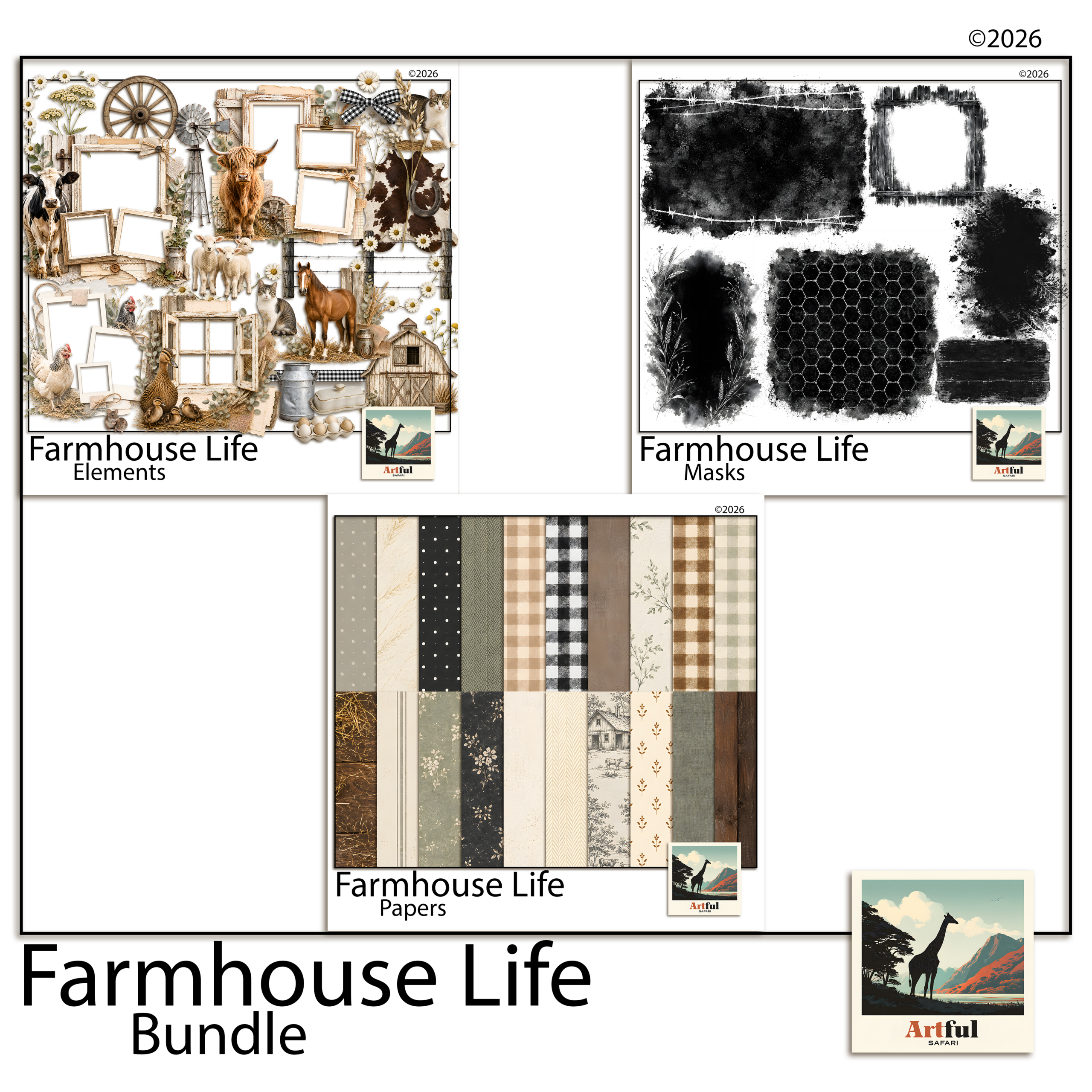
The papers and elements for pages like these are in the Farmhouse Life collection.
Table of Contents
Farmhouse scrapbook ideas: what makes a page read rustic?
A farmhouse scrapbook page leans on restraint, not decoration. The look is built from texture and warmth rather than bright colour or busy patterns.
Three things do most of the work:
- Muted, warm colour: cream, oatmeal, sage, dusty blue, soft terracotta, charcoal instead of black.
- Texture you can almost feel: linen weave, kraft, aged paper, ticking stripe, a hint of wood grain.
- Honest subject matter: barns, jars, eggs, wildflowers, enamelware, handwriting.
A matched set saves you guessing. The Farmhouse Life Digital Scrapbook Bundle ships papers, frames and clipart that already share one palette, so pages sit together across a whole album.
What colours and textures hold a farmhouse scrapbook together?
Pick one neutral base and two soft accents, then repeat them across every page. That repetition is what makes a stack of pages feel like one album rather than a pile of one-offs.
| Role | Use it for | Good choices |
|---|---|---|
| Base neutral | Page background, large mats | Cream, oatmeal, soft kraft |
| Accent one | Photo mats, title bar | Sage green, dusty blue |
| Accent two | Small details, berries, ribbon | Soft terracotta, mustard |
| Texture layer | Behind photos, under journaling | Linen, ticking stripe, aged paper |
Keep black off the page. Swap it for deep charcoal or warm brown and the whole spread softens.
5 farmhouse scrapbook layouts you can build today
Each of these is a recipe, not a rule. Adjust photo counts to fit what you have.
1. The recipe page
Kraft background, a linen-textured card in the centre for the handwritten or typed recipe, one photo of the finished dish top-right, a sprig of botanical clipart in the opposite corner. Title across the top in a relaxed script.
2. The family-history page
Aged cream paper, an old photo matted on soft brown, a journaling block telling who and when. Add a small jar or key element so the page feels collected rather than printed.
3. The seasonal-on-the-farm page
A three-photo grid (planting, growing, harvest) on a sage mat, with a barn motif anchoring the lower corner and a date stamp. Good for a garden or allotment year.
4. The everyday-life page
One large photo, a wide cream border, two lines of writing underneath. Nothing else but a single wildflower stem. The space is the design.
5. The keepsake-recipe-box spread
Two facing pages of small recipe cards laid like index cards on a ticking-stripe background, tied together with a ribbon graphic down the gutter. Number the cards or add little handwritten tabs so it reads like a real recipe box someone has thumbed through for years.
One habit makes all five layouts easier: build the background first, drop the photos second, and only add clipart and titles last. Most cluttered pages happen because the decoration went on before the photos had claimed their space. Lay the bones, then season.
And leave more empty room than feels comfortable. A wide cream margin around a single photo does more for the rustic mood than another graphic ever will. When a page feels off, the fix is almost always to take something away rather than add.
Where does barn and botanical clipart work, and where is it too much?
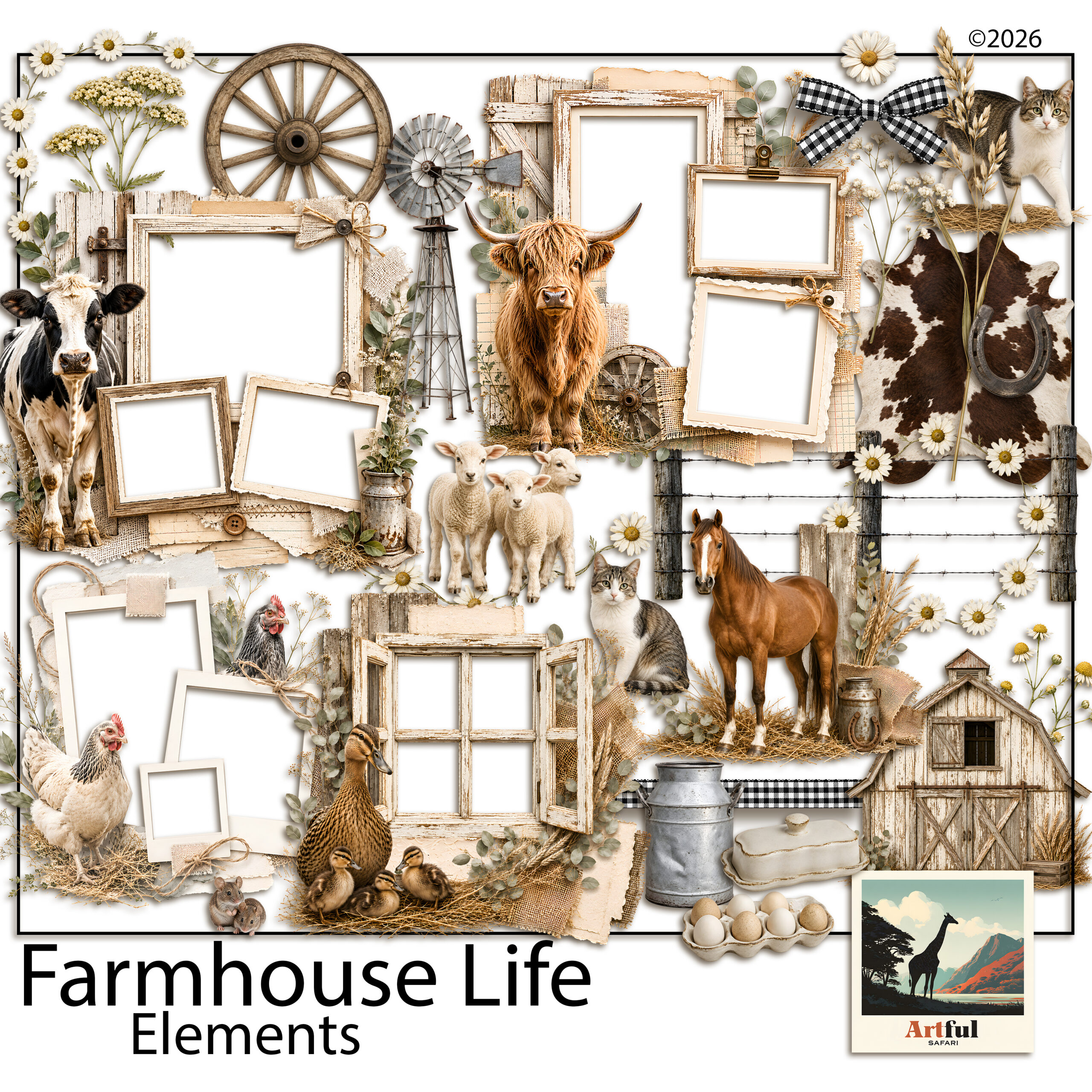
Clipart is seasoning. One or two well-placed pieces anchor a page; a scattered handful turns it into a sticker sheet.
- Works: a single barn or windmill low in a corner as a quiet anchor; a botanical sprig softening a hard photo edge; a jar or egg as a full stop at the end of a journaling block.
- Too much: clipart in every corner, three different animals on one page, or elements bigger than the photos. If the eye doesn’t know where to land first, pull pieces off.
The Farmhouse Barn Clipart Digital Scrapbook set gives you barns, jars and botanicals as separate transparent pieces, so you can place one at a time instead of fighting a busy patterned paper.
Which fonts and titles suit a farmhouse scrapbook page?
Type carries a surprising amount of the mood. Get the lettering wrong and a careful page suddenly looks modern or generic.
Two pairings do most farmhouse work:
- A relaxed handwritten script for titles and short captions, the kind that looks like a marker pen rather than a wedding invitation.
- A plain typewriter or slab serif for journaling and dates, which reads like an old label or recipe card.
Keep titles short. “Sunday roast”, “The first eggs”, “Nan’s kitchen”. A long title fights the photo for attention. If your kit includes an alphabet, a hand-lettered set of letters often beats a font for that pinned-on, made-by-hand feel.
How do you turn single pages into a cohesive farmhouse scrapbook?
A run of farmhouse pages should feel like chapters of one book, not separate cards. Three habits do that.
- Repeat the palette. Same base neutral and same two accents on every page, even when the photos change.
- Reuse a signature element. Pick one motif, say a small sprig or a ticking-stripe strip, and let it turn up somewhere on most pages as a thread tying them together.
- Keep one title style. Same script, same size and placement, so the eye knows where to look as it moves through the album.
This matters most when you build pages weeks apart. Without a repeated palette and motif, a farmhouse scrapbook drifts and the early pages stop matching the later ones. Decide the three above before page one and the whole thing holds together on its own.
How do you adapt the look for the seasons?
Farmhouse style carries through the year if you shift the accents rather than the whole palette. The cream and kraft base stays put; the small details change with the season.
- Spring: sage greens, eggs, hens, the first blossom, pale washing-line scenes.
- Summer: sun-faded denim blue, wildflowers, jam jars, harvest baskets.
- Autumn: warm terracotta and mustard, pumpkins, wheat, preserving and baking pages.
- Winter: deep charcoal and pine, candles, woollen textures, the kitchen at its busiest.
Because the base never changes, a year of seasonal pages still reads as one album. That’s the trick to a twelve-month farmhouse scrapbook that doesn’t look like four different projects bolted together.
Recipe and family-history pages pair naturally with the looser, layered junk journal style. If you want to mix the two, my What Is a Junk Journal? guide explains how that approach works.
Key takeaways
- Farmhouse scrapbook pages are built from muted warm colour and real-looking texture, not bright patterns.
- Pick one neutral base and two soft accents, then repeat them across the album for cohesion.
- Use the five recipes (recipe, family-history, seasonal, everyday, keepsake-box) as starting layouts.
- Treat barn and botanical clipart as one or two anchors per page, never wall-to-wall.
Frequently asked questions
What colours work for a farmhouse scrapbook?
Muted warm tones: cream and oatmeal as a base, with sage, dusty blue, soft terracotta or mustard as accents. Swap black for deep charcoal or warm brown to keep it soft.
How do I make a farmhouse scrapbook page without it looking cluttered?
Limit clipart to one or two anchor pieces per page, leave generous border space, and repeat the same palette across the album so each spread feels considered.
What clipart suits a farmhouse theme?
Barns, windmills, mason jars, eggs, enamelware, wildflowers and botanical sprigs. Transparent PNG pieces you can place one at a time work better than busy patterned paper.
What textures give the rustic farmhouse look?
Linen weave, kraft, aged paper, ticking stripe and a hint of wood grain. Layer a textured sheet behind photos and under journaling blocks.