
The best purple scrapbook ideas start by treating purple as a family, not one colour: pick a lead shade from lavender, violet, plum or mauve, anchor it with a neutral like cream or warm grey, and add a single warm accent such as gold.
Do that and a purple page looks designed. Skip it and it reads childish. Here is how to choose and build.
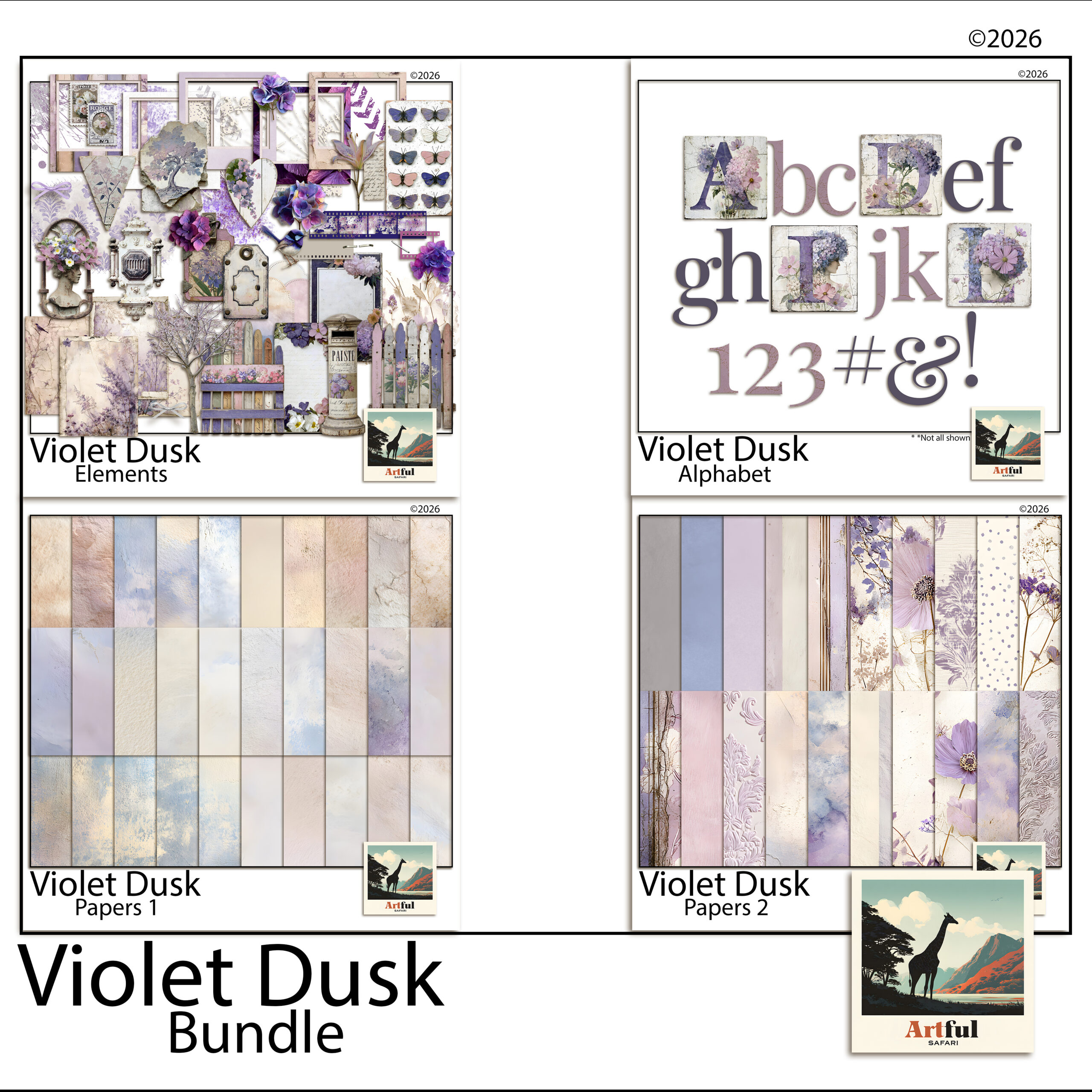
For more purple papers, see the Violet Dusk collection.
Table of Contents
Purple scrapbook ideas that actually hold together
Purple goes wrong when you treat it as one colour. It is a family, and the family runs from pale lilac to near-black aubergine. Pick a lane before you start a page, then build around it.
Purple scrapbook ideas that work pair one shade as the lead, one supporting neutral, and a single accent. The pages that fail use four purples at full strength and read like a bruise. Restraint is the whole game here.
| Shade | Mood | Pairs well with |
|---|---|---|
| Lavender / lilac | Soft, airy, spring | Cream, sage, warm grey |
| Violet | Bright, cheerful | White, soft yellow, blush |
| Plum / aubergine | Moody, autumnal, rich | Gold, charcoal, dusty rose |
| Mauve / dusty purple | Vintage, quiet | Taupe, antique brass, off-white |
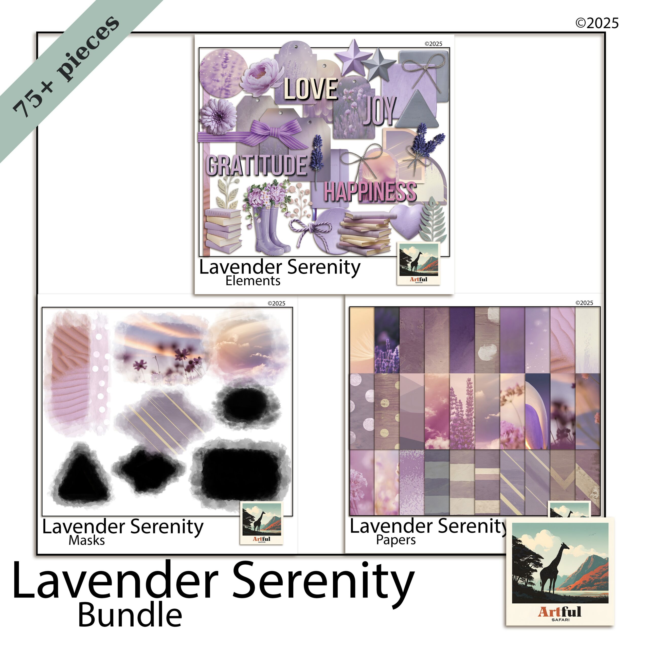
Lavender vs violet vs plum: which to reach for
The three get muddled, so here is how I choose.
Lavender for soft, everyday spreads
Lavender is the low-key one. Use it for spring photos, garden days, slow weekends and anything you want to read as light. It plays nicely with lots of white space, so do not crowd it.
Violet for energy
Violet has more punch. It suits celebration pages, birthdays and bright summer shots. Because it is loud, give it a clean neutral background or it competes with your photos.
Plum for depth
Plum and aubergine carry weight. They are made for autumn pages, evening events and anything you want to feel rich. Lift plum with a metallic gold accent so it does not go flat.
How do you pair purple without it looking childish?
The fastest way to make purple look grown-up is to mute it and ground it with a neutral.
- Cut the saturation. Dusty, greyed purples read as designed; primary purple reads as a school folder.
- Anchor with a neutral. Cream, taupe or warm grey gives the eye somewhere to rest.
- Add one warm accent. Gold, brass or dusty rose stops a purple page going cold.
- Keep one purple dominant. Let the others support at smaller sizes or lower opacity.
For more on why the soft-purple look took off and how to lean into it, my Lavender Scrapbooking Trend post covers the background.
Five purple scrapbook ideas to try
Concrete purple scrapbook ideas you can build tonight.
- Lilac wash + single photo. A pale lavender paper, one large focal photo, a thin cream mat, a script title. That is the whole page. The space does the work.
- Plum grid. Aubergine background, a 2×2 grid of photos with narrow white gutters, gold journaling tags between them.
- Floral border. Cream centre, lavender florals trailing down one side, photos stacked in the open space.
- Ombre tones. Move lilac to violet to plum across a two-page spread, lightest on the left, to carry the eye through a day of photos.
- Mauve memory page. Dusty purple paper, a vintage frame PNG, one photo, and a long journaling block. Low-key and quiet.
Which florals and elements suit a purple page?
Purple loves botanicals, but the wrong flower fights the palette. Match the bloom to the shade.
- Lavender sprigs and wisteria for lilac pages, since they echo the colour without adding a clashing hue.
- Roses and peonies in blush or cream to warm up a violet spread that risks going cold.
- Dark dahlias, thistle and dried seedheads for plum and aubergine, which suit a moodier, autumnal page.
- Greenery in sage or eucalyptus rather than bright leaf green, which sits more easily next to muted purples.
For metallic touches, gold and antique brass flatter every purple. Silver works with cool lilac but can look cold against plum, so test before you commit.
Fonts and titles
A flowing script in a deeper purple than the background reads as elegant. For a punchier page, a clean serif in cream or gold over a violet block holds up better than another purple, which would vanish into the paper.
Seasonal purple scrapbook ideas
The same family carries you through the year if you shift which shade leads.
- Spring: lavender and lilac with cream and sage, for garden and Easter pages.
- Summer: bright violet with white and soft yellow, for festival and holiday shots.
- Autumn: plum and aubergine with gold and charcoal, for cosy evening and harvest pages.
- Winter: deep violet with silver and icy grey, for a frosted, quiet feel.
Purple scrapbook ideas for a digital workflow
Working in Procreate, Photoshop or Canva makes the purple family easy to test, because you can recolour and re-tone without committing.
- Drop opacity on a purple paper layer to mute it instantly, instead of hunting for a duller sheet.
- Use a colour-fill layer set to a low percentage over a neutral paper to tint it lilac.
- Sample from a coordinated bundle so your title text and elements share the same purples as your papers.
- Keep a swatch page of your three chosen purples plus the neutral, and pull from it for every spread in the album.
A coordinated lavender or violet bundle does the palette work for you, since the papers, florals and elements are already toned to sit together. That is the part that takes longest to get right by hand.
Key takeaways
- Treat purple as a family: lavender, violet, plum and mauve each set a different mood.
- Pick one purple to lead, anchor with a neutral, and add a single warm accent.
- Mute the saturation to keep purple looking designed rather than childish.
- Digital tools let you tone and test purples fast, and a coordinated bundle pre-solves the palette.
- The strongest purple scrapbook ideas repeat one palette across the whole album.
Frequently asked questions
What colours go with purple in a scrapbook?
Cream, taupe and warm grey ground purple well, and a warm accent like gold, brass or dusty rose keeps it from going cold. Match the neutral to the purple’s depth: cream for lavender, charcoal and gold for plum.
What is the difference between lavender, violet and plum?
Lavender is pale and soft for low-key pages, violet is brighter with more energy for celebrations, and plum or aubergine is deep and rich for autumn and evening pages.
How do I stop purple looking childish on a page?
Cut the saturation so you are using dusty, greyed purples rather than primary ones, anchor the page with a neutral, and let one purple dominate while the others support at smaller sizes.
Which purple scrapbook ideas suit autumn pages?
Plum and aubergine. They carry weight and pair beautifully with gold, charcoal and dusty rose, which suits evening events and autumn photos far better than pale lavender.