
A regency scrapbook captures the Bridgerton look through damask and watercolour-rose papers, pearl and gold accents, flowing script fonts, and wax-seal or handwritten-letter ephemera, kept soft so the page reads romantic rather than busy. Think drawing-room elegance, not a costume drama crammed onto one spread.
(Bridgerton is a Netflix series. These are styling ideas in the same spirit, not an official tie-in.)
Table of Contents
What makes a regency scrapbook look “Bridgerton”?
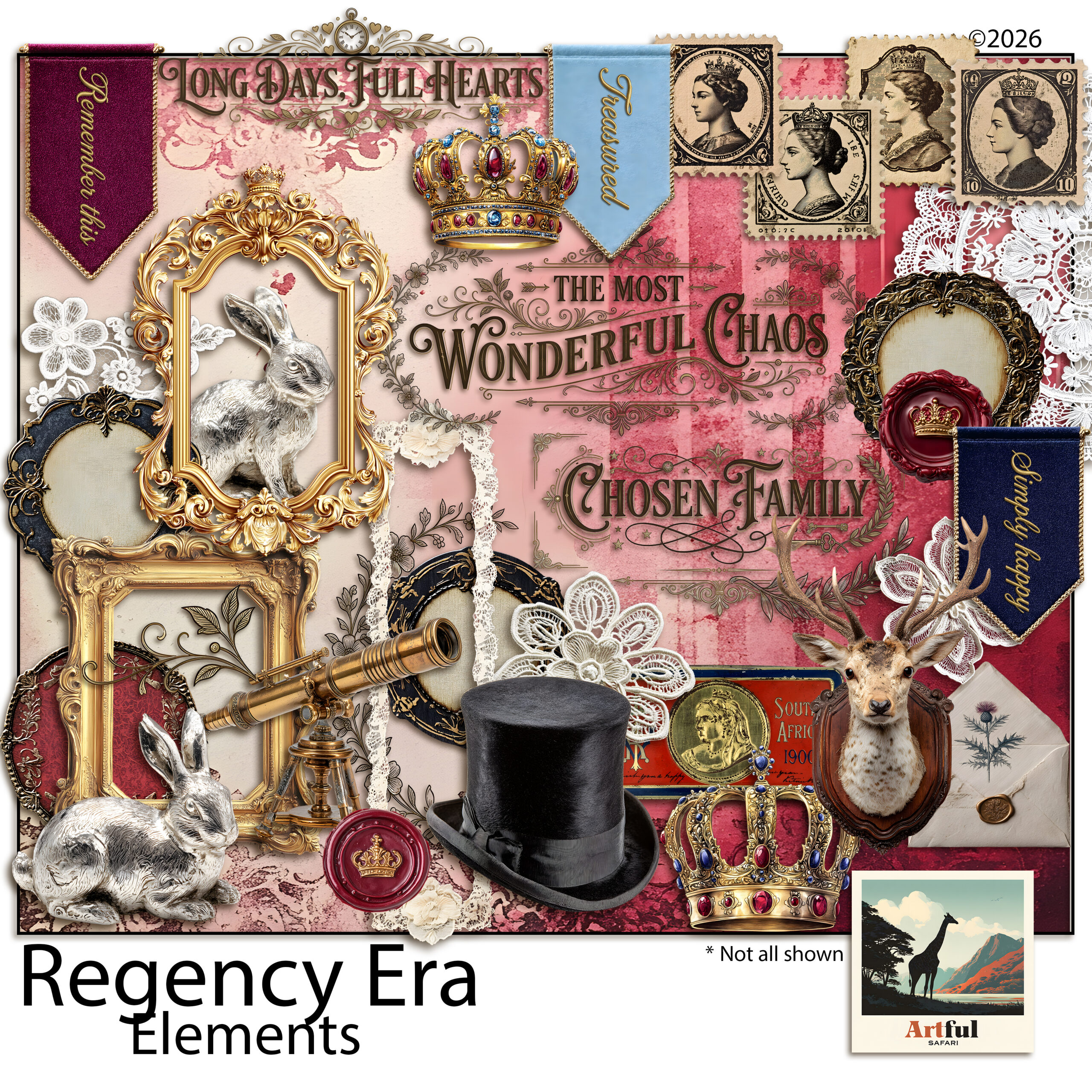
The on-screen revival of the Regency era, roughly the 1810s, brought a particular palette and set of motifs back into fashion. A regency scrapbook recreates it with a handful of recognisable pieces:
- Damask and floral papers in dusty blue, blush, lavender and cream.
- Roses and peonies, painted in soft watercolour rather than bright botanical.
- Pearls, gold filigree and ribbon as small accents and frame corners.
- Script or copperplate fonts for titles and quotes.
- Wax seals, letters and calling cards as ephemera.
Restraint is what separates elegant from theme-party. One or two of these per spread is plenty. The show itself pairs ornate detail with a lot of open, airy space, and that ratio is the part worth borrowing.
The look suits more than a TV-themed album. It carries a wedding or engagement spread, a tea-party page, a Jane Austen reading journal, or a Mother’s Day keepsake. Anything you want to feel a little ceremonial sits well in this palette.
It also reads as timeless rather than tied to one show, which matters if you are keeping the album for years. The damask and rose vocabulary predates Bridgerton by two centuries, so a regency scrapbook page will not look dated the way a sharply on-trend theme can. You are borrowing the era, not the series.
Choosing damask, rose and watercolour papers
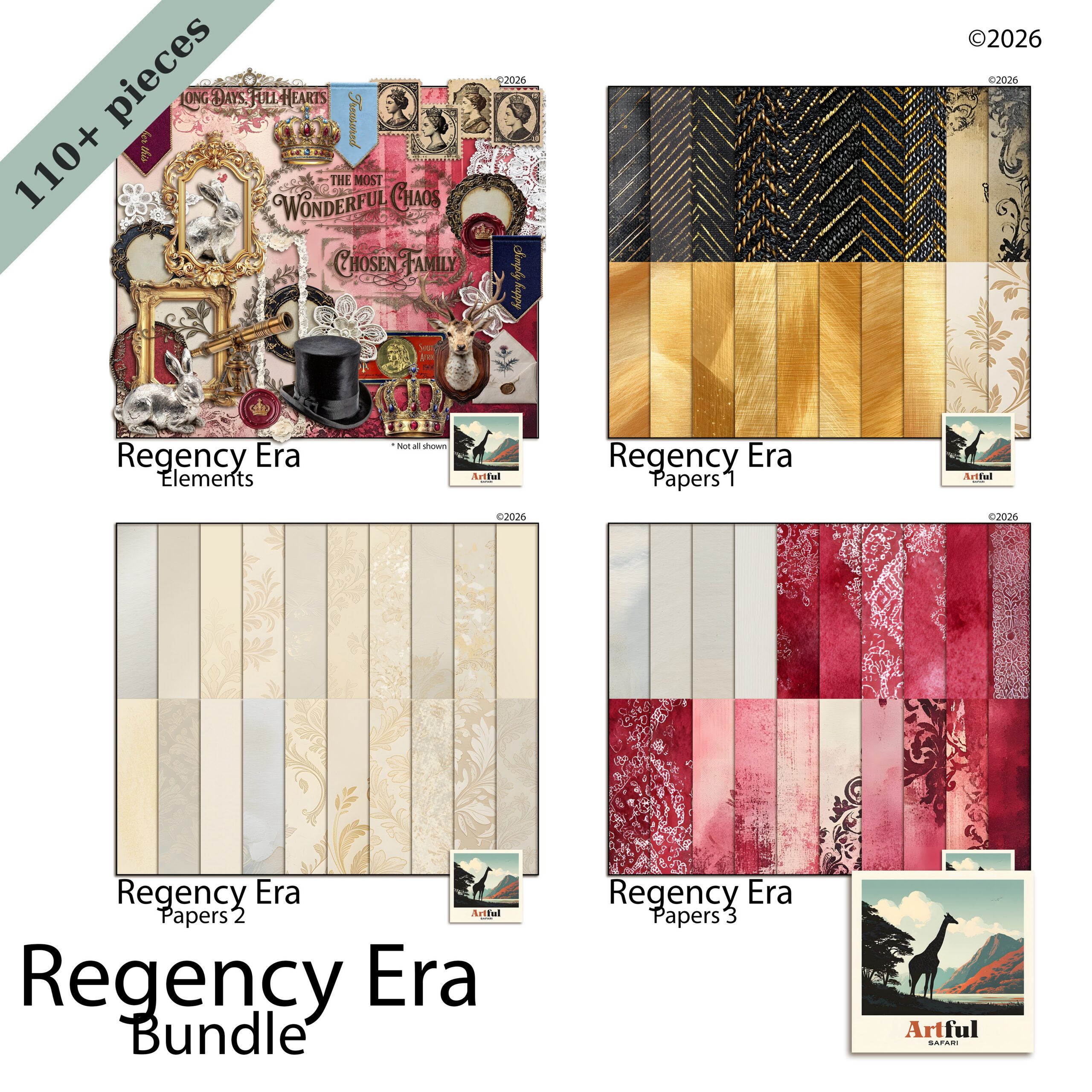
Papers do most of the styling, so pick them first and build the page around them. A page reads as Regency from the background up, so the paper choice settles the mood before a single photo or title goes down. For a regency scrapbook, lean on:
- Damask for a formal backdrop. Use it on one panel, not the whole spread, or it overwhelms.
- Watercolour florals as the softer, photo-friendly base.
- Plain textured cream or blush as a resting space behind journaling.
A safe formula: one patterned paper, one soft solid, and a small floral cluster to link them. Let the damask be the loudest thing and keep everything else quiet. If two patterns must share a page, separate them with a band of plain colour so they do not clash.
Watch the scale of the pattern, too. A large damask repeat suits a full-page background, while a tiny repeat works better as a thin border or a journaling-card backing. Mixing one large pattern with one small one reads as designed; two patterns at the same scale tend to fight.
Motifs that sell the era: pearls, wax seals, script
Small details carry the theme more than big patterns do. These are the accents that read instantly as Regency:
| Motif | Where it works | Keep it tasteful |
|---|---|---|
| Pearl strands | Photo corners, dividing lines | One short strand, not a full border |
| Wax seal | Pinning a journaling card or letter | One per page as a focal point |
| Gold filigree | Frame corners and flourishes | Thin lines; avoid heavy gilding |
| Script title | Page heading, short quotes | Pair with a plain font for the body |
| Ribbon and bow | Tying a stack of cards together | Muted satin tones, not glossy |
Fonts that feel period-correct
Two fonts are enough. Use a flowing script or copperplate for the title and a clean serif for dates and body text. Skip anything chunky or modern sans-serif; it pulls the page straight out of the era. For a real letter look, set the body text slightly grey rather than pure black, the way faded ink reads.
Give the title room. A script font crammed edge to edge loses its shape, so let the curls and tails have space around them. If the script is hard to read at a glance, sit it on a plain cream band or add a faint shadow, and keep the longer journaling in the simpler serif where legibility matters more than flourish.
Letter and ephemera pages
The letter is the signature Bridgerton image, so a correspondence spread feels right at home in a regency scrapbook. Layer a handwritten-style letter under a tilted photo, add a wax seal and a calling card, and let a single rose spill over one corner. The slight tilt is what stops it looking like a form; real letters are never laid down perfectly straight.
A junk-journal kit makes this easy because it already includes the ephemera, tags and pockets. To take the vintage-ephemera approach further, my steampunk junk journal ideas use the same layering logic with a different palette.
For the journaling itself, lean into the letter conceit. Date the entry in the top corner, open with a line like a real note, and sign off at the bottom. Even a short paragraph reads as a keepsake when it is framed as correspondence rather than a caption.
Pockets earn their keep on these pages. Tuck a folded note, a pressed-flower tag or a ticket from the day behind a corner of paper, and the spread gains something to open and read later. A length of ribbon or a small wax seal holds the pocket closed and adds one more period detail without crowding the layout.
Five regency scrapbook page ideas to try
If you want a starting point, copy one of these and swap in your own photos. Each leans on a single focal idea, so none of them tip into clutter:
- The ballroom invite: damask panel, a script title, a wax seal pinning a single photo.
- The garden walk: soft floral paper, two framed photos, a trailing rose along one edge.
- The love letter: a handwritten-style letter as the base, a calling card and pearl strand on top.
- The portrait page: plain cream paper, one photo in a gold filigree frame, a short quote beneath.
- The keepsake pocket: a tucked tag and pressed-flower clipart in a journal pocket, ribbon tie.
Colour palettes for a regency scrapbook
The era reads as muted and romantic, never neon. Build from one of these palettes and the whole album stays cohesive:
- Drawing room: dusty blue, cream, soft gold.
- Garden party: blush, sage, antique rose.
- Evening ball: deep plum, lavender, pearl grey.
Pick three colours, use the lightest as your main background, the mid tone for panels, and the darkest only for accents and titles. That ratio keeps pages soft and stops any single spread from shouting.
Stick to one palette across the album rather than a new colour scheme every page. A run of spreads in the same three tones reads as a collection, and it makes the few gold or wax-seal accents feel like a deliberate thread running through the book.
Key takeaways
- Damask, watercolour roses, pearls, gold filigree and script fonts are the core regency scrapbook ingredients.
- Limit the loud elements to one or two per spread so it reads elegant, not crowded.
- Letter-and-seal spreads are the most recognisable Bridgerton-style page.
- Choose a three-colour muted palette and reuse it across the album.
Frequently asked questions
What is a regency scrapbook?
It is a scrapbook styled around the Regency era of the early 1800s, using damask and watercolour-floral papers, pearls, gold filigree, script fonts and wax-seal or letter ephemera. The look has surged in popularity thanks to Bridgerton.
What colours suit a Bridgerton-style scrapbook?
Muted, romantic tones: dusty blue, blush, lavender, sage, cream, soft gold and pearl grey. Use the lightest shade as your background and the deepest only for accents and titles.
What papers do I need for a regency theme?
Damask patterns for formal backdrops, watercolour florals for softer bases, and plain textured cream or blush for journaling space. Use one patterned paper per spread so it does not overwhelm.
What fonts look right for a regency scrapbook?
Pair a flowing script or copperplate for titles with a clean serif for dates and body text. Avoid modern sans-serif fonts, which break the period feel.
Is this affiliated with Bridgerton?
No. Bridgerton is a Netflix series. These are styling ideas inspired by the same Regency aesthetic, not an official or licensed product.