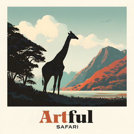
A safari scrapbook theme works on one idea: warmth held with restraint. Build pages on sand and cream bases, lift them with sunset golds and burnt orange, ground the text in deep brown, and use animal clipart like seasoning rather than a parade.
Get that balance and a safari scrapbook feels like golden hour, not a gift shop. Here are the palettes, frames and prompts I reach for.
Table of Contents
What makes a safari scrapbook theme work
A safari theme lives or dies on warmth. Think the half hour before the sun drops: golds, dusty oranges, deep browns and a sky that goes from amber to rose. Get the colours right and the rest falls into place.
The trap is treating it like a zoo gift shop, every animal on every page, bright green grass, cartoon giraffes. Restraint is the whole skill. One strong animal motif per spread, a warm paper behind it, and your photos doing the heavy lifting.
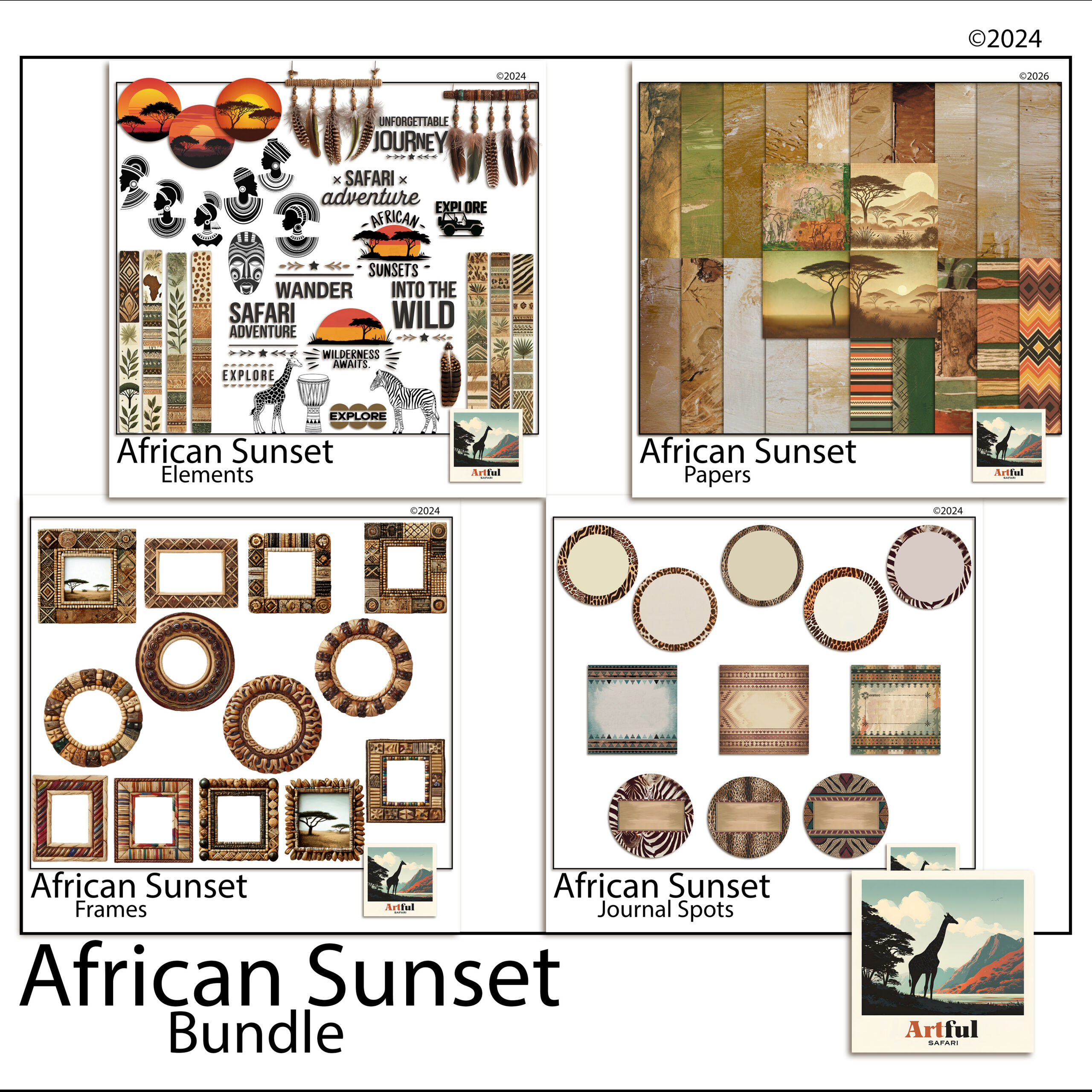
This theme suits more than a real safari. Zoo days, wildlife parks, a child’s animal-mad birthday, even a golden-hour camping trip all sit happily under the same warm palette.
What ties all of those together is the light. A safari scrapbook page is really a golden-hour page with animals in it. If you keep coming back to that idea, the colour choices and the clipart restraint both start to make sense, because everything you add either supports that warm low sun or fights it.
Building a warm safari scrapbook theme palette
A safari scrapbook theme works best on four or five colours, not ten. Pick a base, a feature and an accent, then hold the line across every page.
- Base papers: sand, dust, warm cream. These sit behind everything and let photos breathe.
- Feature tones: sunset gold, burnt orange, terracotta. Use these for title bars and frames.
- Grounding darks: deep brown, charcoal, the colour of an acacia silhouette. A little goes a long way for text and edges.
- One accent: a dusty rose or a faded teal, used sparingly, stops the page going flat.
If you only remember one thing: warm base, warmer feature, dark text. That three-layer build covers most safari pages on its own.
A word on greens. Real savanna is dry and dusty for much of the year, so bright grass green is the fastest way to make a page look like a cartoon. If you want a green, pull it toward olive or khaki and use it small. The eye reads muted green as real and bright green as a sticker.
To pull a palette straight from your own trip, open one of your sunset photos and sample three colours from it: the brightest part of the sky, a mid tone, and a shadow. Those three almost always make a workable safari palette, because they came from the light you were actually standing in.
Using animal clipart with restraint
Animal clipart is where safari scrapbook pages tip into kitsch fastest. The fix is to treat it like seasoning.
One silhouette of a giraffe or an elephant in a corner reads as confident. Five animals marching across the top reads as a sticker sheet. Place a single motif where the eye already wants to rest, near a title or a photo corner, and leave the rest of the page clear.
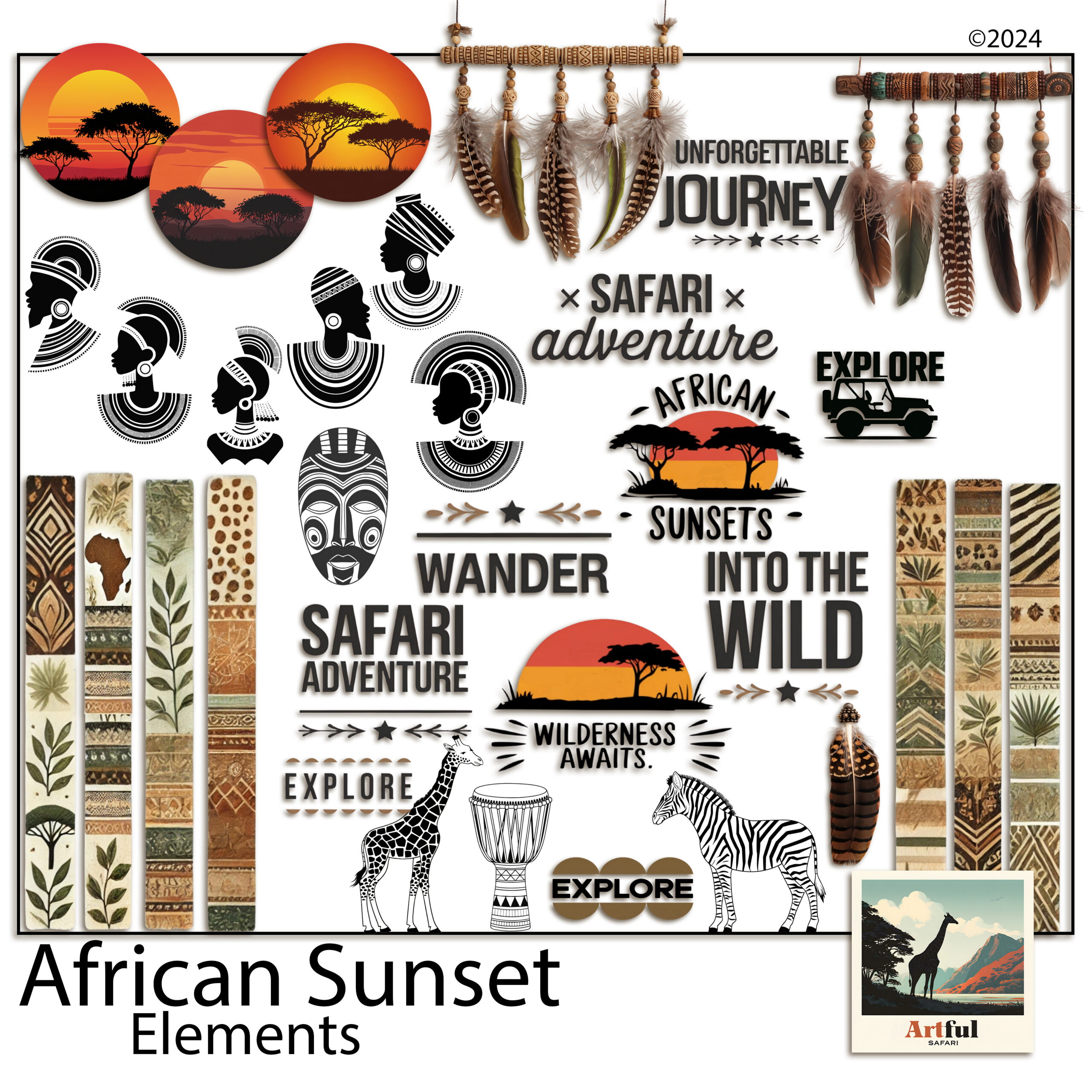
Silhouettes age better than full-colour cartoon animals. They sit against any warm paper, they never clash with a photo, and they keep the focus on your trip rather than the artwork.
A handy ratio: for every piece of clipart on a page, ask whether it earns its place or just fills a gap. If it fills a gap, the gap was probably doing useful work. Empty space around a photo is part of the design, not a problem to solve with another giraffe.
Safari scrapbook pages beyond the wildlife
Animals are the headline, but a full album needs the quieter pages too, and these are where a safari theme often outshines a plain photo dump.
- The camp page. The tent, the early coffee, the view from the deck. Warm neutrals suit these and they slow the pace between big-animal spreads.
- The landscape page. Wide shots of the plains with no animals at all. Let one photo run large with a thin gold rule and a single line of journaling.
- The detail page. Tracks, feathers, the pattern on a zebra, a tree against the sky. Small close-ups grouped together add texture to the album.
- The map page. A route line across the reserve with pins for each sighting. A footprint or jeep accent keeps it on theme.
Spread these between the wildlife pages and the album breathes. A book that is all big cats, page after page, tires the eye faster than you would think. The quiet pages are also where your own voice comes through, since anyone can photograph a lion but only you were there for the coffee at dawn and the long drive in.
Beaded frames, gold accents and journaling cards
The details are what lift a safari spread above a coloured background with photos on it.
Beaded and woven frame styles nod to the craft of the region without leaning on cliche. A thin gold rule around a title block catches the sunset idea. Journaling cards in a kraft or aged-paper finish give you somewhere to write that does not fight the warm palette.
Keep the metallics quiet. A hairline of gold reads as warmth. A thick gold border on every photo reads as a wedding invitation. The trick is to suggest the shine, not pour it on. One framed hero photo per spread is plenty, with the rest sitting on the paper directly or in a plain mat.
Journaling prompts that suit a safari or a zoo day:
- The first animal we saw and how everyone reacted.
- The sound at dawn or the moment the light turned gold.
- What the youngest in the group remembers most.
- The one photo that almost did not happen.
Write the prompts on a card before you place photos, not after. A blank journaling card stays blank, but a card with a question already on it pulls a sentence out of you while the day is still fresh in your head.
A safari page plan you can copy
Here is a layout plan for a safari scrapbook or wildlife album. Match it to your photo count rather than forcing every row.
| Page | Palette move | Clipart and accents |
|---|---|---|
| Title page | Sand base, sunset-gold title bar | One acacia or animal silhouette, gold rule |
| The journey in | Warm cream base | Map line, small jeep or footprint accent |
| Big-five spread | Burnt-orange feature blocks | One silhouette per photo cluster, no more |
| Golden-hour page | Amber-to-rose gradient paper | Beaded frame, minimal clipart |
| People page | Dust and charcoal | Journaling card, faces over wildlife |
| Closing page | Sand base, one hero photo | Gold rule, a few lines of journaling |
If you are pairing this theme with a longer trip album, my guide on how to make a travel scrapbook covers the page-by-page workflow that this palette drops straight into.
Key takeaways
- Build a safari scrapbook theme on warmth: sand and cream bases, sunset golds, dark grounding text.
- Hold the palette to four or five colours across every page.
- Use animal clipart like seasoning, one silhouette per spread, not a parade.
- Beaded frames and a thin gold rule carry the theme without cliche.
- Journaling cards and prompts keep the people in the story, not just the animals.
Frequently asked questions
What colours suit a safari scrapbook theme?
Sand, warm cream and dust for the base, sunset gold and burnt orange as features, and deep brown or charcoal for text. Hold it to four or five colours across the whole album.
How much animal clipart should I use?
Less than you think. One silhouette per spread reads as confident. Several animals across a page tips into a sticker-sheet look and pulls focus off your photos.
Does a safari theme work for a zoo day, not just a real safari?
Yes. The warm palette suits zoo trips, wildlife parks, animal-themed birthdays and golden-hour camping just as well as an actual safari.
What frames suit a safari scrapbook?
Beaded or woven frame styles nod to the region’s craft, and a thin gold rule around a title block echoes the sunset without leaning on cliche.