The spring scrapbooking trends I’m seeing most in 2026 are pressed botanicals, blush-and-cream neutrals, soft purple, torn-paper collage edges, oversized script titles, and clean one-photo focal pages.
None of them need a new skill. They’re mostly about palette and restraint, which makes spring a good season to refresh how your pages look without relearning a thing.
Table of Contents
What’s behind the shift this spring?
Before the list, one thread runs through all six spring scrapbooking trends: less is winning. The maximalist, every-corner-decorated page that ruled a couple of years ago is quietly going out of fashion, and a softer, more pared-back look is taking its place. Muted palettes, more white space, textures that feel handmade. If you only take one thing from this post, take that. Most of these trends are really the same instinct showing up in different ways.
The other reason these stick around is time. The pared-back styles are simply faster to make, and a page you can finish in fifteen minutes is a page that actually gets done. That’s half of why they’re spreading.
1. Pressed botanicals and meadow florals
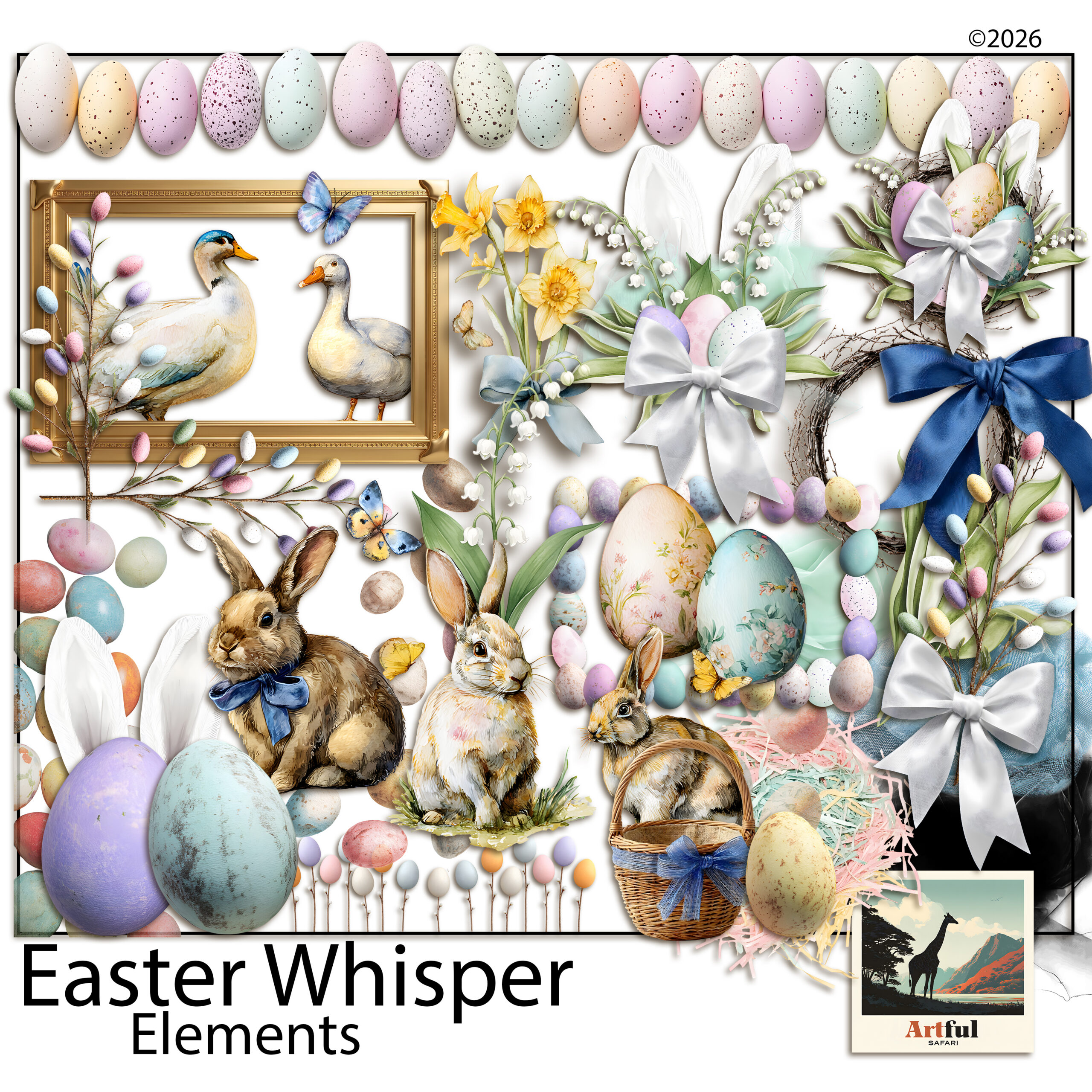
The biggest shift in spring scrapbooking this year is away from bright, busy florals toward botanicals that look pressed, almost faded, like something kept in a book for a decade. Sprigs, ferns and single stems, scattered with space around them rather than packed into a border.
Try it: place two or three botanical sprigs at the corners of a photo and leave the middle of the page quiet. The restraint is the whole point.
Why the shift? After a few years of maximalist, sticker-everywhere pages, a lot of us are tired of the noise. Pressed botanicals feel quieter to make and easier to live with, and they let the photo stay the subject. They also pair with almost anything, so a single botanical pack stretches across a whole album.
2. Blush and warm neutrals, not just pastels
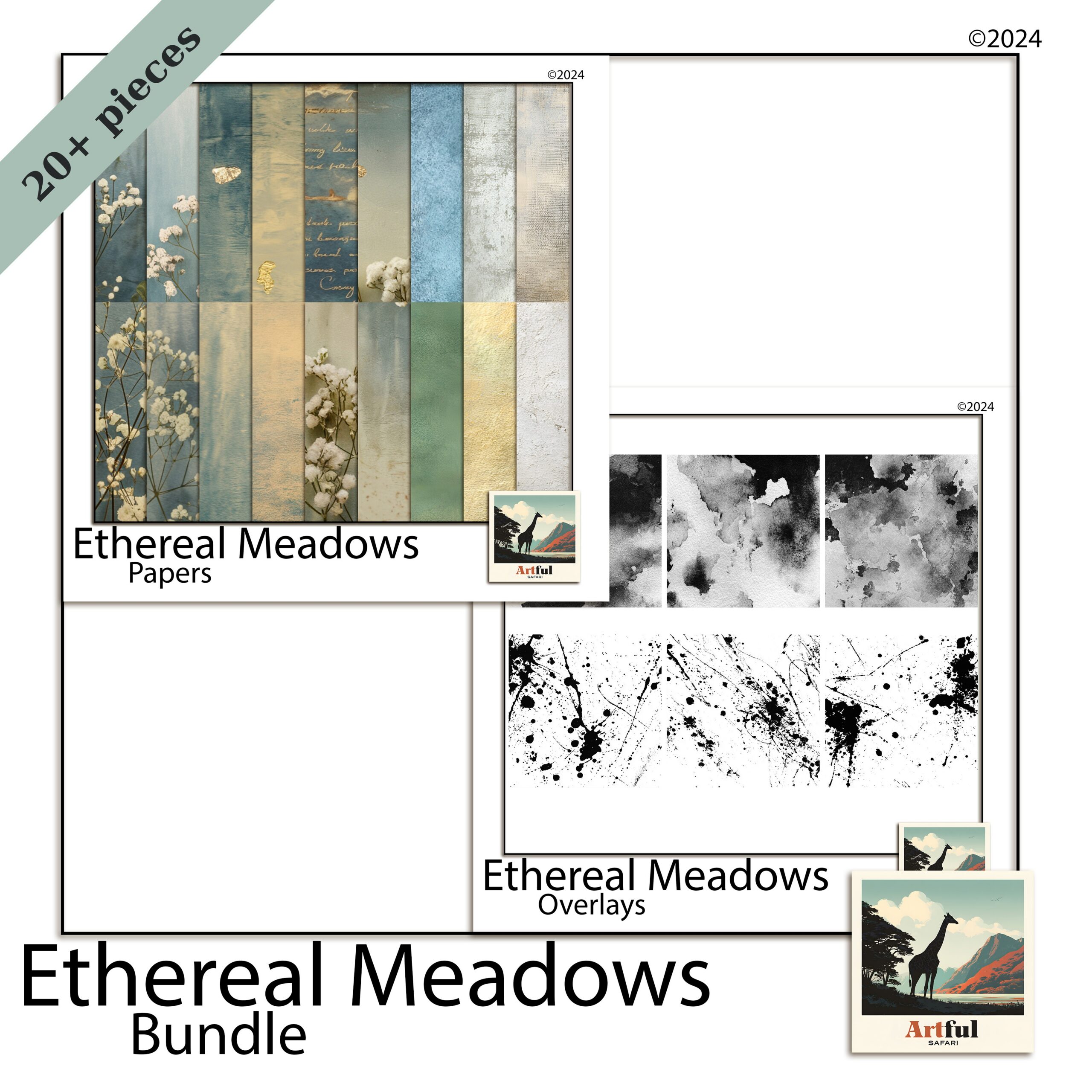
Spring scrapbooking used to mean sugary pastels. In 2026 the warmer, dustier end is winning: blush, oat, clay and soft cream. They photograph beautifully behind everyday snapshots and don’t fight your photos for attention.
Try it: build a page on a blush or oat background, then pull one slightly deeper tone from a photo for your title. Tonal, not matchy.
The reason warm neutrals work so hard: they’re forgiving. A bright pastel can clash with a photo taken in odd light, but blush and oat sit behind almost any snapshot without a fight. That makes them the workhorses of an album, the pages you reach for when the photo is the star and you just want a quiet backdrop.
3. Soft purple keeps spreading
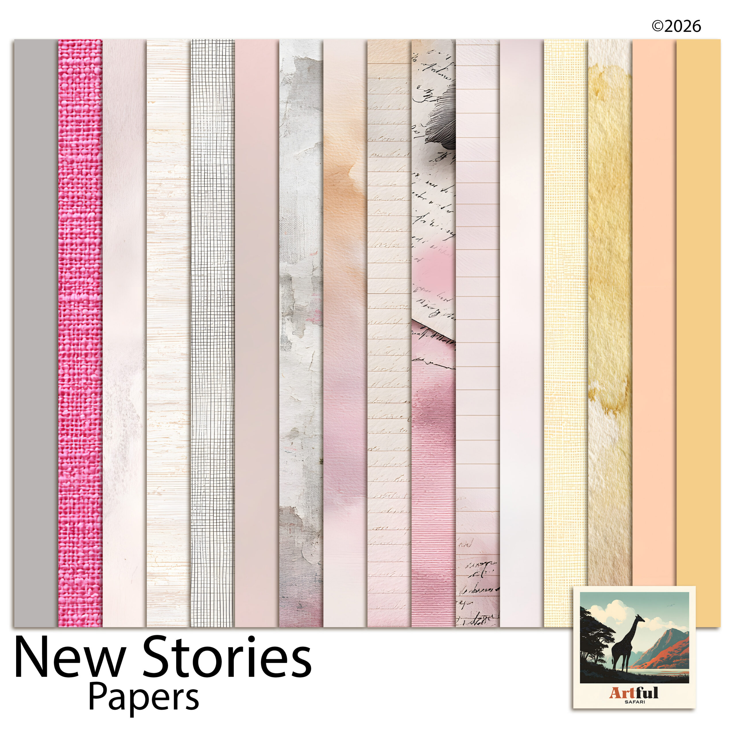
Lavender and soft lilac aren’t slowing down. They’ve crossed from a niche colour into a full spring palette, often paired with sage or warm grey to keep them from going too sweet. If you want the background on why this one stuck, I went into it in my piece on the Lavender Scrapbooking Trend.
Try it: use lilac as the base and sage as the accent, never the other way round. Purple leads, green supports.
If lilac feels too sweet for your photos, drop in a warm grey as a third tone. It grounds the whole page and stops the purple reading as a nursery palette, which is the usual worry people have with it.
4. Torn-paper and layered collage edges
Clean digital edges are giving way to torn, deckled and rough-cut looks borrowed from junk journaling. Layered paper with a frayed edge adds texture that flat rectangles can’t, and it suits the pressed-botanical mood perfectly.
Try it: stack two or three papers behind your photo, each slightly off-square, with a torn-edge overlay on top. Mind the layer order so the photo still sits clearly on top.
This is one place digital and paper scrapbookers are borrowing from each other. The torn, layered look came up through junk journaling, and it’s now bleeding into clean digital pages because it adds the one thing flat layouts lack: a sense that hands made it. A little imperfection reads as warmth.
5. Oversized handwritten and script titles
Titles are getting bigger and more personal. Large hand-lettered or script titles, sometimes running off the edge of the page, are replacing tidy small captions. They turn the words into part of the design instead of an afterthought.
Try it: set one short title, three or four words, at a size you’d normally think is too big. Then take it up one more notch.
The trick that makes a big title look designed rather than shouty: let it overlap. Run the tail of a script word slightly behind the photo, or let one letter slip off the page edge. That small overlap ties the title to the image instead of leaving it floating above like a label.
6. One-photo focal pages with breathing room
After years of photo grids, a lot of people are paring back to a single hero photo with plenty of space around it. It feels current, it’s quicker to make, and it lets a really good shot actually breathe.
Try it: one photo, one title, two small botanical accents, and a wide margin. Resist the urge to fill the gap.
There’s a practical bonus here. A one-photo page takes ten minutes, not an hour, so you actually finish your album instead of leaving it half-done. If you’ve got a backlog of photos and not much time, this is the trend I’d start with. It keeps you moving.
Spring scrapbooking trends at a glance
If you want to pick one and start tonight, here’s the spring scrapbooking shortlist with a palette and a use for each.
| Trend | Palette | Best for |
|---|---|---|
| Pressed botanicals | Sage, cream, soft green | Garden and nature photos |
| Blush neutrals | Blush, oat, clay | Everyday and family pages |
| Soft purple | Lilac, sage, warm grey | Softer mood spreads |
| Torn-paper edges | Kraft, cream, muted tones | Layered, textured layouts |
| Oversized titles | One bold accent colour | Single-event or milestone pages |
| One-photo focal | Any, kept minimal | Your best single shot |
How to pull these spring scrapbooking trends into one page
You don’t need all six. The strongest spring scrapbooking pages usually borrow two, not five. A combination I keep coming back to: a blush-neutral background, one large script title, a single photo, and two pressed-botanical sprigs in the corners. That’s it. Four moves, and it reads as current without looking like it’s trying.
If you’re newer to this and want a starting point rather than a palette, my walkthrough on getting set up pairs well with these ideas.
One last note before you dive in: don’t chase all of these at once across an album. A book where every page tries a different trend looks restless. Pick a palette and one or two looks, hold them across the whole album, and the spreads will sit together like they belong. The trend is the seasoning. Your photos and your story are still the meal.
Key takeaways
- Spring scrapbooking in 2026 leans muted and textured, not bright and busy.
- Blush neutrals and soft purple are the season’s safest, most flexible palettes.
- Pressed botanicals and torn-paper edges add texture without adding clutter.
- Combine two trends per page, not all six, and leave breathing room.
Frequently asked questions
What are the spring scrapbooking trends for 2026?
The main ones are pressed botanicals, blush and warm neutrals, soft purple, torn-paper collage edges, oversized script titles, and clean one-photo focal pages.
What colours are popular for spring scrapbook pages this year?
Warmer, dustier tones lead: blush, oat and clay neutrals, plus soft purple paired with sage. The sugary pastel palette is fading in favour of muted, tonal combinations.
How do I make a spring scrapbooking page look current without redoing my whole style?
Pick two trends, not all six. A blush background, one large script title, a single photo and two botanical sprigs is enough to feel fresh while staying simple.
Are torn-paper edges hard to do digitally?
No. Many kits include torn or deckled-edge overlays you layer over your papers. Stack a couple of papers slightly off-square and drop the torn edge on top.
Do these trends work for both digital and paper scrapbooking?
Yes. Most spring scrapbooking trends this year come down to palette and restraint, so they translate to either. The torn-edge look in particular comes straight from junk journaling, so it suits both.