
Lavender scrapbooking is the soft purple look that’s spread across stationery, weddings and memory-keeping over the last year, built on dusty lilac and faded violet rather than bright purple.
Done well, lavender scrapbooking reads quiet and nostalgic. Done badly it tips straight into birthday-card. The difference is which purples you pick and how much white space you leave them.
Table of Contents
Why is lavender scrapbooking everywhere right now?
Soft purple slipped into homewares, weddings and stationery over the last couple of years, and scrapbook supplies followed close behind. The shade reads quiet and a little nostalgic, which suits the slow, unhurried memory-keeping people are drawn to at the moment. It also photographs beautifully on a screen, so digital makers picked it up fast and ran with it.
The look is built around faded violet, dusty lilac and grey-leaning mauve rather than bright purple. Pair those with cream, warm grey and a touch of sage and you get a page that feels settled instead of loud. It sits somewhere between the blush-pink palettes that came before it and the moodier plum tones that tend to show up in autumn kits, which is part of why it works across so many seasons.
What colours actually sit in a lavender palette?
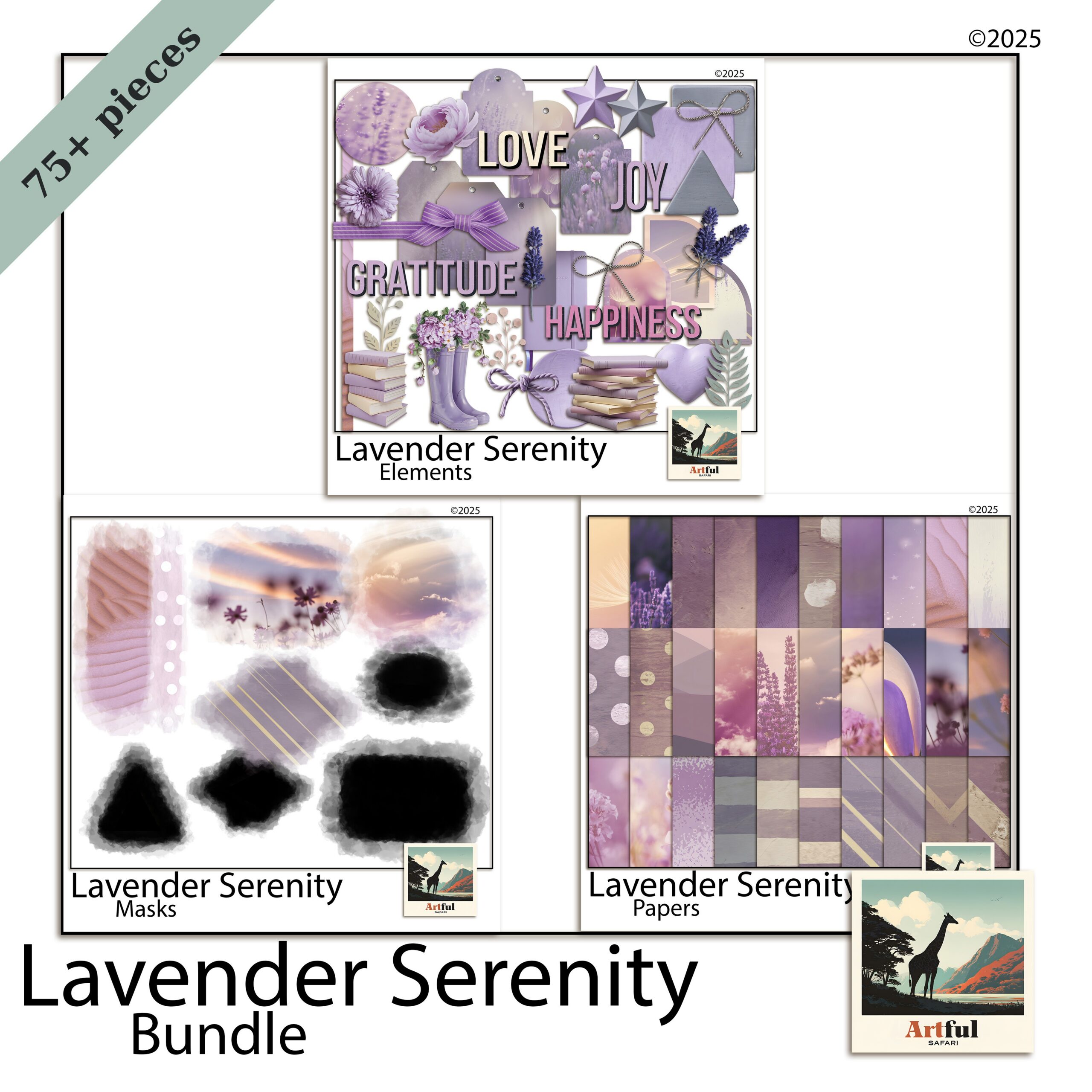
Lavender, violet and plum get used as if they mean the same thing. They don’t, and mixing them up is the quickest way to make a page look muddy. Here is how I separate them when I’m pulling papers for a lavender scrapbooking spread.
| Shade | What it looks like | Best used for |
|---|---|---|
| Lavender / lilac | Pale, grey-tinted, almost dusty | Backgrounds, large paper areas, mats behind photos |
| Violet | Truer purple, more saturated | Accents, journaling cards, title text |
| Plum / aubergine | Deep, brown-leaning, moody | Borders, shadows, anchoring a busy page |
| Mauve | Soft purple-pink halfway to rose | Florals, ribbons, bridging purple and blush |
A page that works usually has one pale lavender doing the heavy lifting, one deeper violet or plum for contrast, and a neutral to settle the whole thing. Three purples all fighting for attention is a page nobody finishes. If you only remember one rule, make it that: one light, one dark, one neutral.
What pairs well with soft purple?
Lavender is a cool tone, so the colours that flatter it are mostly warm or muted neutrals that stop it feeling icy. Cream and oatmeal are the reliable ones. Sage and eucalyptus green sit beside it naturally because purple and green are opposite each other on the colour wheel, so they balance. A dusty rose or mauve bridges purple into pink if you want a softer, more romantic page. Gold, used as a thin line rather than a flood, gives a small lift. The combination to avoid is lavender with a cold blue-grey, which can read clinical and washed-out.
How to build a soft purple page without it going sickly
Purple tips into birthday-card territory fast. A few habits keep it grown-up.
- Knock the saturation back. Reach for the dusty, greyed versions of each shade. Clean bright purple is the one that reads childish.
- Add a warm neutral. Cream, oatmeal or warm grey stops the cool tones feeling clinical.
- Let white space breathe. Soft palettes need room. Crowding the page is what makes lavender look fussy.
- Use one metallic, sparingly. A thin gold line or a single foil sticker lifts the page. Cover it in foil and you lose the quiet that made the palette work.
Texture matters more than pattern
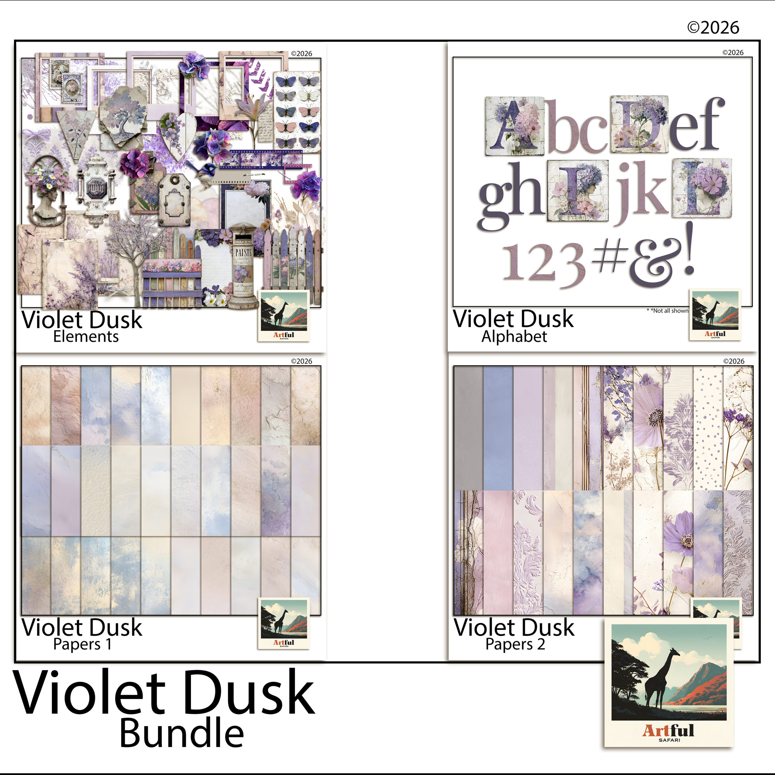
Lavender scrapbooking palettes are soft enough that busy florals everywhere will swallow your photos. I lean on textured solids, watercolour washes and a couple of small botanical accents, then let the photo be the loudest thing on the page. A linen or watercolour-paper texture under a flat lavender does more for the page than another patterned sheet ever will, because it adds interest without adding noise.
Which photos suit lavender layouts?
Lavender scrapbooking flatters some photos and clashes with others. Soft purple sits naturally behind:
- Garden and flower shots, especially wisteria, hydrangea, jacaranda and actual lavender fields
- Wedding and engagement photos
- Quiet at-home moments, reading, slow mornings, golden-hour windows
- Newborn and christening pages
It fights harder against high-contrast action shots and anything with a lot of red or orange in it. If your photo is warm and busy, drop the purple back to a thin border and let a neutral paper carry the page. A good test before you commit: lay the photo on the lavender paper at full size and squint. If the photo still reads clearly, the pairing works. If the two start to blur into each other, the page needs more contrast somewhere.
Is lavender scrapbooking only a spring thing?
It leans spring, but it doesn’t have to stay there. Pale lilac with fresh green and blush is unmistakably a spring palette and it suits Easter, garden days and early-year pages. Push the same purple deeper toward plum and aubergine, add charcoal and a touch of gold, and the palette carries straight into autumn and even quiet winter spreads. The mistake is treating lavender as a one-season novelty. Treat it as a base you can warm up or cool down, and it earns a place in the album all year.
Lavender scrapbooking on a digital canvas
This is where lavender scrapbooking gets easy. On a digital page you can recolour, fade and layer purple papers endlessly without buying a thing twice, which matters when the palette lives or dies on getting the exact shade right.
A workflow I use in Procreate, Photoshop or Canva:
- Lay your palest lavender paper as the base layer.
- Drop a textured violet or plum paper on top and mask it into a strip or block for contrast.
- Add photos in clipping masks so they sit inside frames cleanly.
- Tuck two or three small florals near the photo corners, not scattered across the whole page.
- Set the title in a deeper violet so it actually reads against the soft background.
The recolour trick is the one worth knowing. If a paper is close to the shade you want but a touch too bright, a low-opacity grey layer set over it knocks it back into that dusty range without you needing a different file. That single move is most of what separates a page that looks like a soft purple trend and one that looks like a child’s birthday. The same trick works in reverse: a too-flat lavender comes alive with a faint violet wash dropped over the top at low opacity, which gives the paper depth without changing the base colour.
If you want the full set of layout recipes for this palette, I broke them down in Purple & Lavender Ideas. This post is the why; that one is the how.
Key takeaways
- Lavender scrapbooking works because it’s soft and nostalgic and easy on a screen, not because purple is loud.
- Separate lavender, violet, plum and mauve, then use one pale shade, one deep one, and a warm neutral.
- Knock saturation back and leave white space, or soft purple slides into birthday-card territory.
- Digital pages let you nail the exact shade and recolour freely, which is the whole advantage with a palette this fussy.
Frequently asked questions
What colours go with lavender in a scrapbook?
Cream, warm grey and oatmeal keep it grown-up, while sage green and dusty mauve sit happily beside it. A single gold accent lifts the page without crowding it.
Is lavender the same as purple in scrapbooking?
No. Lavender is a pale, grey-tinted purple used for backgrounds, while violet and plum are deeper and work better as accents and titles. Mixing them up is what makes a page look muddy.
What photos suit a lavender scrapbook page?
Garden and flower shots, weddings, newborns and quiet at-home moments all sit naturally on soft purple. High-contrast action shots and warm red-orange photos tend to fight it.
Can I do lavender scrapbooking digitally?
Yes. Lavender scrapbooking is easier digitally because you can recolour and fade purple papers until the shade is exactly right. Layer a pale lavender base, add a deeper violet for contrast, then drop photos into clipping masks.