
A good frame PNG has a genuinely see-through centre, stays sharp at 300 DPI and matches the style of your kit. Before you buy one, check those three things plus the edge quality and the licence.
Get any of them wrong and the frame either buries your photo under a white block or leaves a pale halo on every page. Both are easy to spot up front if you know where to look.
Table of Contents
What is a frame PNG, and why does the format matter?
A frame PNG is a decorative border saved with a see-through middle. You sit it over a photo and the photo shows through the hole, so the frame looks like it’s wrapped around the picture.
The format is the whole trick. A JPG can’t hold transparency, so a frame saved as a JPG comes with a solid white block in the centre that buries your photo. PNG keeps the centre genuinely empty. That single difference is what lets a frame drop cleanly onto anything underneath.
This is also why you can’t just screenshot a frame off the internet and expect it to work. Most of those have a white or chequered centre baked in. A proper frame PNG has been cut out so the middle is real empty space, and that cut-out is exactly the bit cheap sets get wrong.

What to check before you buy a frame PNG
Most frames look fine on a product cover. The problems show up once you’re using them, usually after you’ve already paid. Run through this list before you buy and you’ll dodge the ones that look good in the thumbnail and fall apart on the page.
| Check | What good looks like | What to avoid |
|---|---|---|
| Transparent centre | The middle is fully see-through, no white haze | A faint grey or white fill where your photo should sit |
| Resolution | 300 DPI, large enough to sit at full page size | Small files that go soft the moment you enlarge them |
| Edge quality | Clean, slightly soft edges that don’t look cut out with scissors | Hard pixel stair-steps or a white halo around the frame |
| Style match | Frames that suit the kit and era you’re working in | One frame that fights every other element on the page |
| Licence | A clear note on personal vs commercial use | No licence stated at all |
The halo test
The most common fault in a cheap frame PNG is a pale outline left over from a sloppy cut-out. Drop the frame onto a dark background and look at its outer edge. If you can see a thin white line tracing it, the cut-out was rushed and it’ll show on every page.
The licence is part of the buy
If you make anything you sell, or even just share widely, the licence matters as much as the look. A set sold for personal use only can’t legally go on a card you’re selling. A good listing states it plainly. If you can’t find a word about licensing anywhere, treat that as a reason to walk, not a detail to sort out later.
How many frames do you actually need?
Fewer than the big bundles suggest. A working frame PNG set is small:
- One or two ornate frames for hero photos and title pages.
- A couple of simple frames for everyday photos and clusters.
- One odd shape — oval, arch or torn-edge — for variety.
You’ll reach for the same two or three over and over. That’s normal, and it’s a sign you bought well. A frame you trust is worth ten you have to think about.
That’s it. Five or six frames you actually like will outwork a pack of fifty you have to hunt through every time.
Big packs look like better value on the listing, and sometimes they are, but only if the frames inside are varied. Thirty near-identical gold ovals isn’t thirty frames, it’s one frame you paid for thirty times. Look past the count and check how different the shapes and weights actually are. A small set with real range beats a fat set of near-duplicates every day.
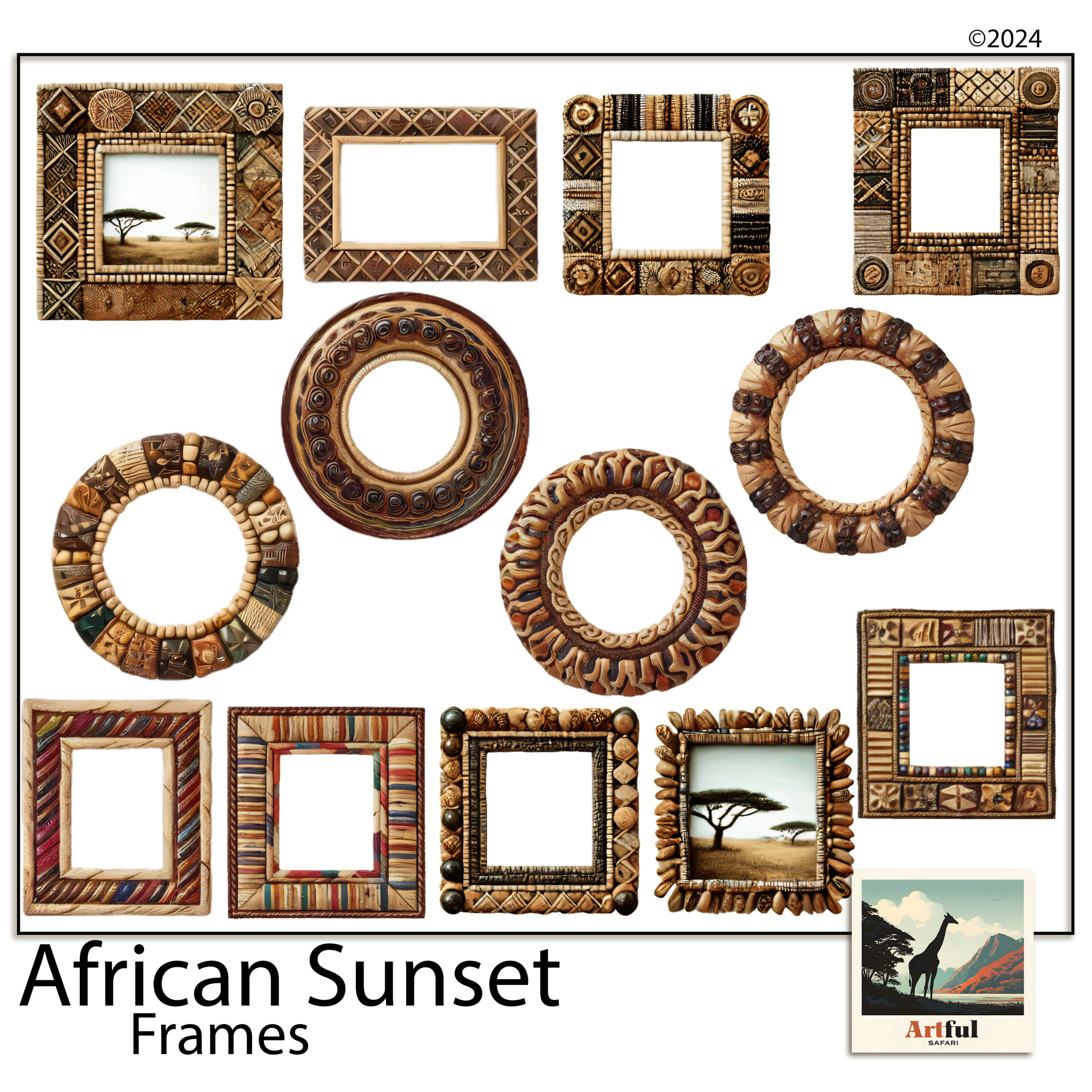
Ornate vs simple: matching a frame PNG to your photo
Busy photo, plain frame. Plain photo, you can afford an ornate one. A beaded or carved frame around a cluttered market shot makes the eye give up. The same frame around a single quiet portrait looks considered.
The rule of thumb I use: the frame and the photo shouldn’t both be loud. If the photo already has a lot going on, the frame’s job is to hold it, not compete with it. Save the showy frames for your quietest, strongest shots, the ones that can stand the attention.
Colour matters as much as shape
A frame that’s the right shape but the wrong colour still fights the page. A cool silver border on a warm ochre layout sits there like a guest who wandered into the wrong party. Pick frames whose tone already lives somewhere in your kit, a gilt that echoes a gold in the paper, a beaded brown that picks up a wood texture. When the frame shares a colour with the page, it stops looking added on and starts looking like it belongs.
Match the era, not just the colour
A painterly gilt frame suits a Tuscan or vintage page. A beaded frame suits something warm and earthy. Putting a sleek modern border on an aged-paper layout is the thing that quietly makes a page look wrong without you being able to say why.
Once you’ve chosen well, placement is its own small craft: resizing without squashing, layering over paper, mixing styles. I walk through all of that in How to Use Photo Frame PNGs.
Where do people go wrong with frame PNGs?
The frames themselves are rarely the problem. The way they get used is. Four mistakes show up again and again.
- Stretching to fit. Dragging a square frame to fit a tall photo squashes the corners. Resize from a corner handle so it keeps its shape, then crop the photo to the frame instead.
- Framing everything. If every photo on the spread has an ornate border, none of them stands out. Frame one, let the rest sit plain.
- Fighting the paper. A heavily patterned paper under a heavily detailed frame turns to noise. Give one of them room: busy frame, quiet paper.
- Buying for the cover. The product image is styled. Open the frames at full size and check the centre and edges yourself before you commit to a whole album’s worth.
None of these are about taste. They’re the difference between a frame that looks placed and one that looks pasted. Fix them and even a modest set of frames will carry a whole album.
Key takeaways
- Always PNG, never JPG — only PNG holds the transparent centre a frame needs.
- Before buying, check the centre, the resolution, the edges, the style fit and the licence.
- Run the halo test on a dark background to catch a lazy cut-out.
- Five or six frames you like beat a pack of fifty you never reach for.
Frequently asked questions
Why does a frame have to be a PNG and not a JPG?
JPG files can’t store transparency, so a JPG frame comes with a solid white centre that hides your photo. PNG keeps the middle see-through, which is the whole point of a frame.
What resolution should a frame PNG be?
Look for 300 DPI and a file large enough to sit at full page size. Small frames go soft as soon as you enlarge them, and the blur shows around every edge.
How do I spot a poorly made frame?
Drop it onto a dark background. If a thin white outline traces the frame, the cut-out was rushed and that halo will appear on every page you use it on.
How many frames do I need for an album?
Five or six is plenty: one or two ornate frames, a couple of simple ones, and one odd shape for variety. A huge pack mostly slows you down.