Category: Buying Guides

Guides to buying digital scrapbook papers, clipart, frames and alphabets – what to look for before you buy.

  • Paris Scrapbook Kit Ideas: 6 Beautiful Pages for a Travel Album

    Paris Scrapbook Kit Ideas: 6 Beautiful Pages for a Travel Album

    A good Paris scrapbook kit hands you everything to build a page in one place: background papers, Paris clipart beyond the Eiffel Tower, photo frames and a few journaling cards.

    Buy one that’s all landmarks and no papers and you’ll spend the project filling gaps. The rest comes down to following the trip’s shape and holding one palette across the album.

    What goes in a good Paris scrapbook kit?

    A Paris scrapbook kit should give you everything to build a page without hunting for extras. That means papers for the backgrounds, clipart for the Paris feel, and frames or mats to sit your photos in. If a kit is all Eiffel Towers and no papers, you’ll spend the project filling gaps.

    For a trip album I look for four things before I buy.

    • Plenty of plain-ish papers in the palette, not just heavily patterned ones
    • Clipart beyond the Eiffel Tower: cafe scenes, macarons, street signs, perfume, books
    • Photo frames so images drop in cleanly
    • A few journaling cards for dates and notes

    The papers are the part people undervalue. You’ll use far more background than you expect, and a kit that’s heavy on decoration but light on plain sheets runs out of room to breathe halfway through the album. A bundle that covers all four bases saves you stitching pieces together from three different sets that don’t quite match.

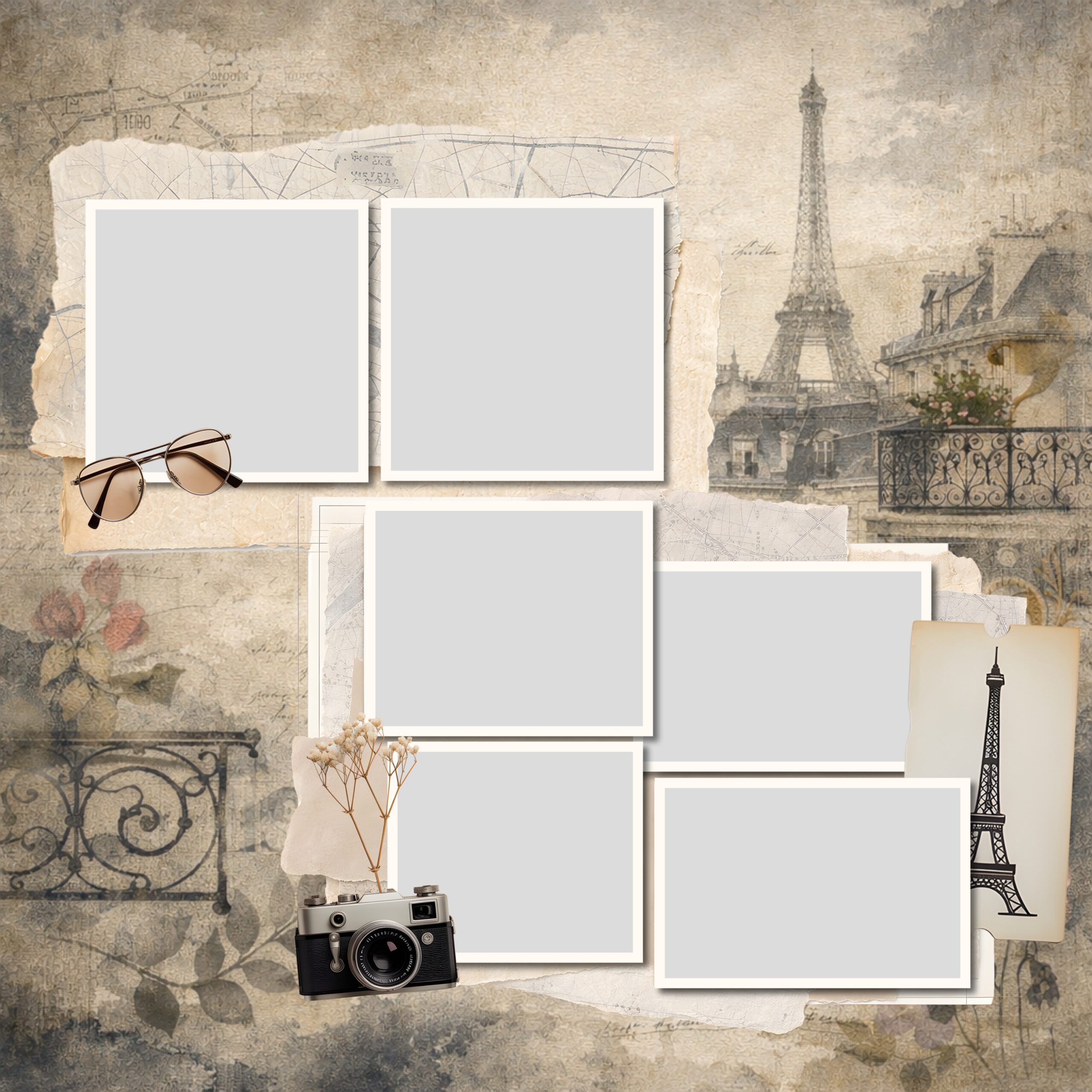
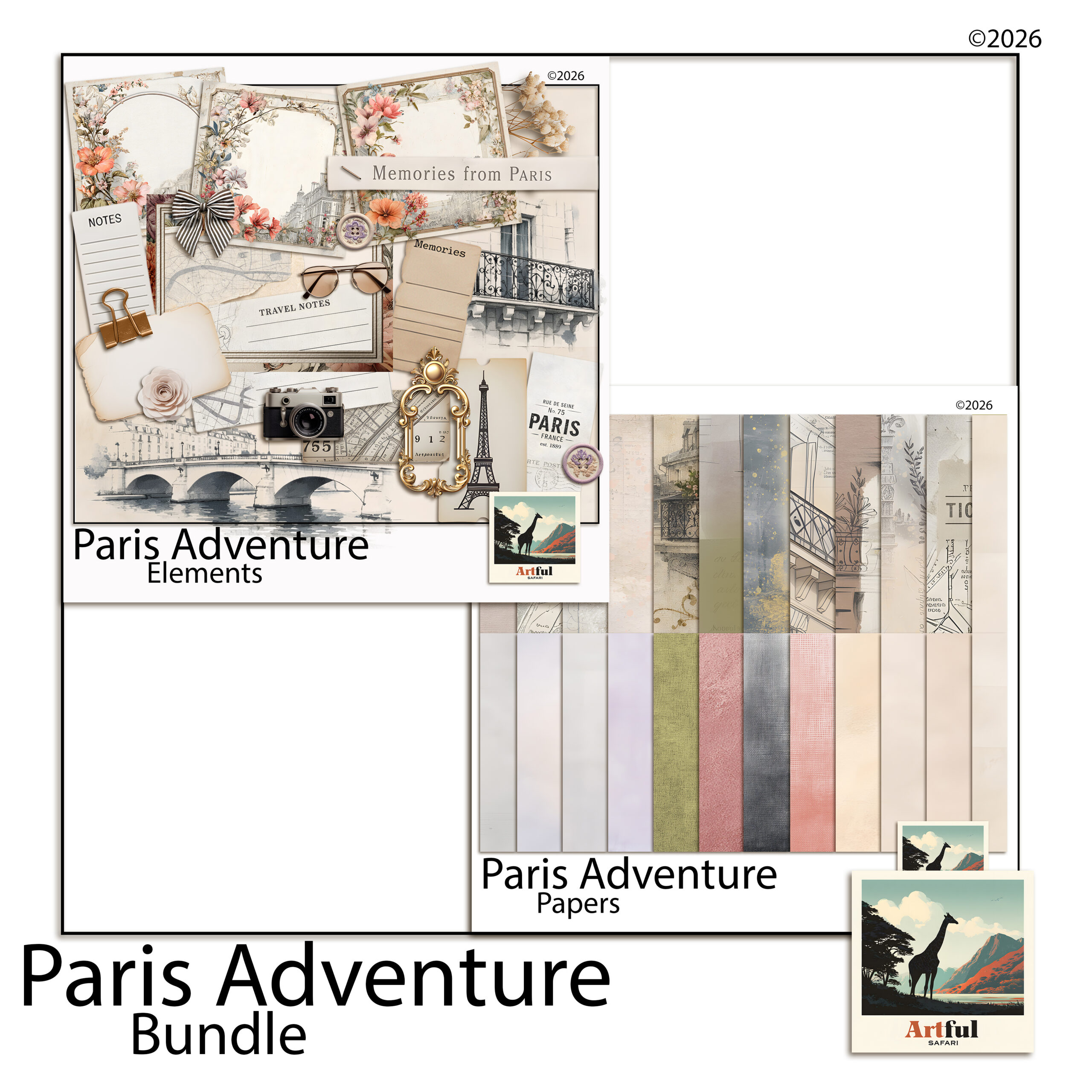
    Paris scrapbook kit with Eiffel Tower clipart, cafe papers and travel frames
    A Paris scrapbook kit with papers, clipart and frames in one place: the Paris Adventure Digital Scrapbook Bundle.

    Page ideas from one Paris scrapbook kit

    A trip has a shape, and the album reads better if the pages follow it. Here is a running order that holds together.

    1. Title page. One hero photo, the word “Paris” big, the dates underneath.
    2. Getting there. Boarding passes, the plane window, the first metro sign.
    3. The landmarks. Eiffel Tower, Notre-Dame, the Louvre, one strong shot each rather than ten small ones.
    4. The food. Croissants, a cafe table, the patisserie window. Food pages age really well.
    5. The streets. Doors, balconies, a quiet corner you stumbled on.
    6. Closing page. A favourite photo, a few lines on what you’d go back for.

    Don’t fill every page with the Eiffel Tower

    It’s the obvious motif and it gets old fast across a whole album. Use it on the title page and one landmark spread, then let the small details carry the rest: a street name, a metro ticket, a cafe awning. Those are the bits that actually take you back. The tower will be in plenty of your photos already, so you rarely need the clipart version more than once or twice.

    Pages people forget to make

    The landmarks photograph themselves. The pages you’ll be glad of later are the smaller ones: a list of where you ate, the metro map with your route traced on it, the view from the room you stayed in, the one rainy afternoon you spent in a museum. A trip album that’s only highlights reads like a postcard rack. The in-between pages are what make it yours.

    What colour palette suits Paris pages?

    Paris has a few palettes depending on the mood you’re after. Pick one and hold it across the album so the pages feel like a set.

    MoodPaletteSuits
    Soft romanticCream, dusty rose, pale grey, goldHoneymoons, anniversaries, spring trips
    Classic chicBlack, white, charcoal, one red accentCity breaks, fashion-leaning pages
    Vintage ParisianSepia, aged cream, faded blue, brown inkOld-postcard feel, cafe and book pages
    Bright springBlush, sky blue, fresh green, soft yellowGarden, market and outdoor days

    The soft romantic palette is the safe one and it’s what most Paris scrapbook kits lean toward. If your photos are moody and grey-skied, the classic black-and-white route flatters them more than pastels will. Holding one palette across the album is the single thing that makes a stack of pages feel like a finished book rather than a pile of loose layouts.

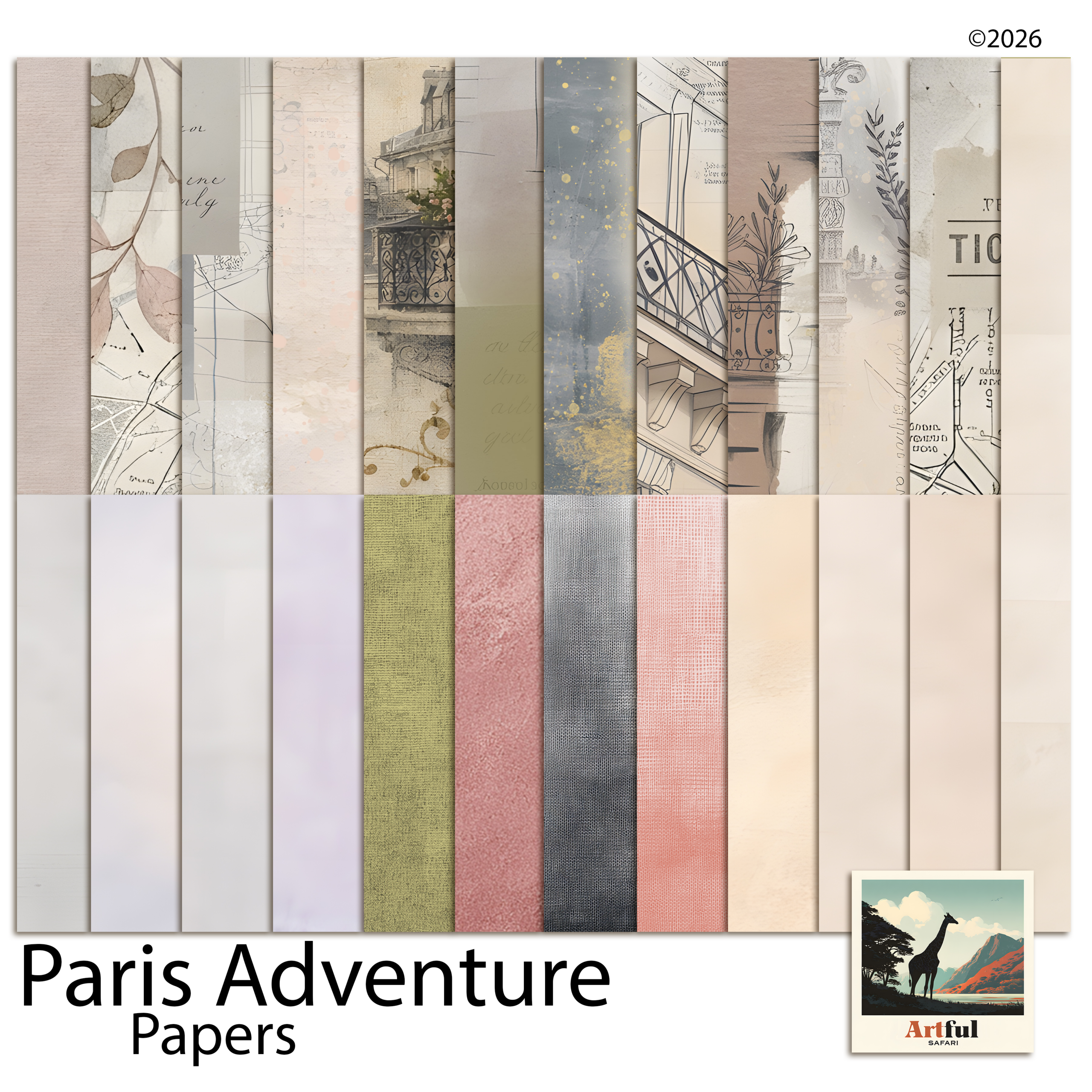
    Soft Parisian papers in cream, dusty rose and grey for a travel album
    If you mainly need backgrounds, the Paris Adventure Digital Scrapbook Papers cover the page on their own.

    How do you lay out the iconic shots without cliche?

    Everyone has the same Eiffel Tower photo. The layout is what makes yours yours.

    • Crop in. A detail of the ironwork beats the full postcard view you’ve seen a thousand times.
    • Pair the big with the small. One landmark photo next to a cafe receipt or a metro ticket tells more of a story than two landmarks side by side.
    • Leave white space. A single photo with room around it on a Parisian paper looks more considered than a packed collage.
    • Add your own words. A line about getting lost on the way there is what stops the page being a brochure.

    Mementoes do a lot of quiet work here. A scanned ticket, a torn menu, a pressed flower from the Tuileries gives the page texture that no amount of clipart can fake, because it was actually there. Scan the paper bits the day you get home, while you still have them.

    Building the album from a digital Paris scrapbook kit

    A digital Paris scrapbook kit makes this far less precious. You can try a layout, undo it, recolour a paper and reuse the same Eiffel Tower clipart across pages without it ever running out. Drop your papers as the base, sit photos in clipping masks inside the frames, then tuck clipart around the edges.

    Work at a standard page size from the start, usually a 12×12 digital page, so every spread matches and you’re never resizing at the end. Build one page you’re happy with, then save it as a template: same paper, same frame positions, same title spot. Swap the photos and you have the next page in minutes instead of starting from a blank canvas each time.

    The other advantage of going digital is that nothing is final. If you decide halfway through that the romantic palette is too sweet for your grey-skied photos, you can swap the papers across every page rather than starting the album over. You can also build the whole thing once and keep it as a file to revisit, add to after the next trip, or share with whoever travelled with you. Physical pages don’t forgive a change of mind the way a layered file does.

    If you’ve not built a trip album before, my full walk-through is in How to Make a Travel Scrapbook. This post is the Paris-specific layer on top of it.

    Key takeaways

    • A good Paris scrapbook kit gives you papers, varied clipart, frames and journaling cards, not just Eiffel Towers.
    • Follow the trip’s shape: title, getting there, landmarks, food, streets, closing page.
    • Pick one palette and hold it across the album, whether that’s soft romantic, classic chic, vintage or bright spring.
    • Crop in, pair big shots with small mementoes, and add your own words to keep pages from reading like a brochure.

    Frequently asked questions

    What should be in a Paris scrapbook kit?

    Background papers in a Parisian palette, clipart beyond the Eiffel Tower such as cafes, macarons and street signs, photo frames, and a few journaling cards. A kit that’s only landmarks leaves you filling gaps.

    What colours suit a Paris travel album?

    Soft romantic creams, dusty rose and gold are the popular choice. Classic black, white and a red accent suit moody city shots, while sepia and aged cream give an old-postcard feel.

    How do I avoid cliches in a Paris scrapbook?

    Crop in on details rather than the full Eiffel Tower view, pair landmark photos with small mementoes like tickets, leave white space, and add your own words about the day.

    Can I make a Paris scrapbook digitally?

    Yes. A digital Paris scrapbook kit lets you try a layout, undo it and reuse the same clipart across pages without it running out. Drop papers as the base, sit photos in clipping masks, then add clipart around the edges.

  • Greek Island Scrapbook Paper: 4 Easy Checks Before You Buy

    Greek Island Scrapbook Paper: 4 Easy Checks Before You Buy

    Before you buy Greek island scrapbook paper, check four things: the resolution (300 DPI at 12 x 12 inches), the file format, whether the blues and whites really look like the Cyclades, and what the licence lets you do. Get those right and the set will carry your whole holiday album.

    This is a digital-paper buying guide, so every point below is about the files you download, not about printing anything.

    What makes good Greek island scrapbook paper?

    Good Greek island scrapbook paper gets two things right: the colours and the file quality. The colours are the whole reason you searched for it. Whitewashed walls, that specific deep Aegean blue, warm stone, the pink of bougainvillea. If a pack looks like generic “blue and white”, it will not say Santorini on your page.

    The file quality is the part most people forget to check. A gorgeous-looking preview means nothing if the actual file is small, low-resolution or saved at the wrong size. You only find out after you have paid and the paper turns soft the moment you use it full-page.

    So before you buy, run a quick four-point check. It takes two minutes and saves you the frustration of a set that looked perfect in the listing and disappointed in the app. I use the same checklist on every paper pack I bring into the shop, Greek island or not.

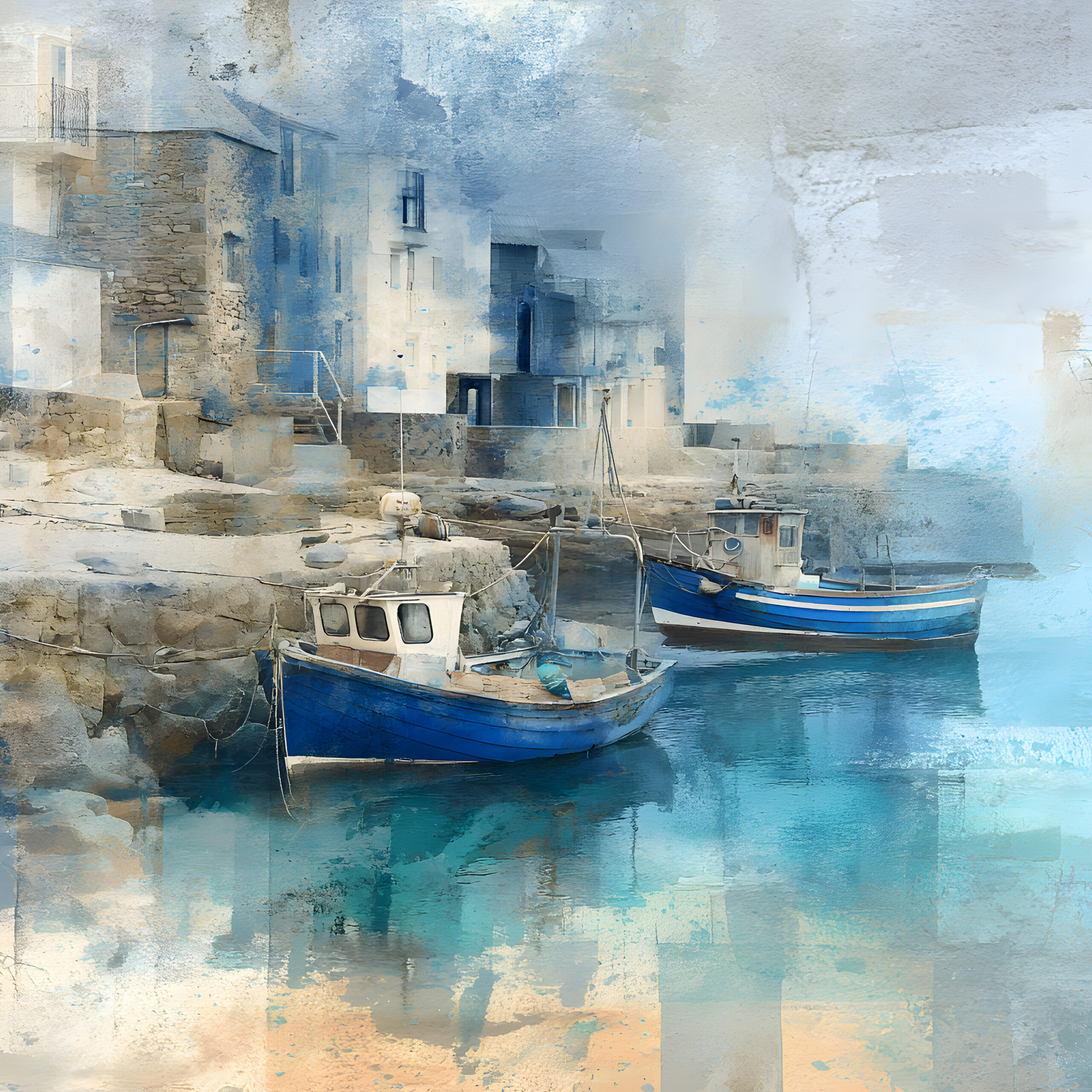
    Greek island scrapbook paper in Santorini blue and whitewash tones
    Greek island scrapbook paper that leans on whitewash, sea blue and warm stone, from the Santorini set.

    1. Resolution: is it 300 DPI at full size?

    This is the one that bites people. Aim for 300 DPI at 12 x 12 inches, which works out to about 3600 x 3600 pixels per sheet. At that size a paper stays crisp when you zoom in or crop a corner.

    If a listing only says “high quality” with no numbers, ask. A paper that is 1000 px wide looks fine as a thumbnail and turns soft and blocky the moment you use it full-page. The listing should state the dimensions and the DPI plainly.

    2. File format: PNG, JPG, and is anything transparent?

    Papers are usually flat JPGs, and that is correct. A paper is a full background, so it has no transparent areas and JPG keeps the file size sensible. Some makers supply PNGs instead, which is also fine, just a bigger file.

    Where format matters is the extras. Frames, borders and cut-out elements should be transparent PNGs so you can layer them over a paper without a white box around them. If a Greek island scrapbook set bundles in frames or ephemera, check those are PNGs, not JPGs. A bougainvillea spray saved as a JPG arrives with a white rectangle behind it, and you will spend ten minutes trying to cut it out by hand. Here is the quick version.

    PieceFormat you wantWhy
    Background papersJPG (or PNG)Full sheet, no transparency needed, smaller file
    Frames & bordersTransparent PNGLayers cleanly over paper with no white block
    Elements / clipartTransparent PNGTuck into a layout without a hard edge
    Whole-kit previewJPGJust a catalogue image, not a working file

    3. Colour: does it actually look like the Cyclades?

    Open the preview at full size and look hard at the blues. Real Cycladic blue sits somewhere between cobalt and a soft denim, paired with a warm off-white, not a cold grey-white. Sets that go too bright or too teal start to look like a swimming pool rather than Santorini.

    It is also worth glancing at the whites. The Cyclades are famous for whitewashed walls, and a good set carries a few near-white textures with the faintest warmth in them. A flat, pure digital white looks plasticky next to a photo and gives the page away as generic.

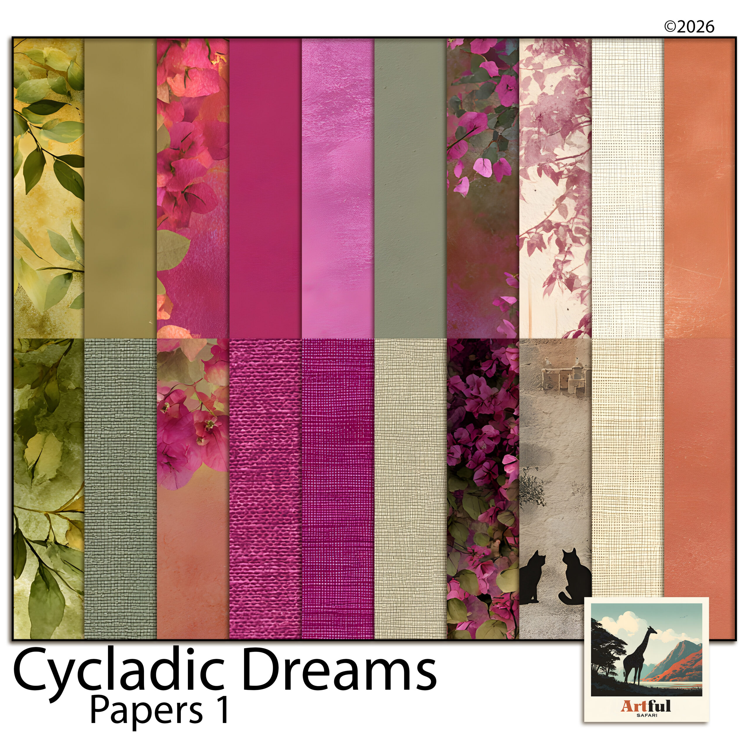
    Check the papers sit together as a family too. A good Cycladic Dreams Santorini Bundle uses one palette across every sheet, so a blue tile, a whitewash texture and a stone wall all belong on the same page. Mismatched packs make every layout a fight.

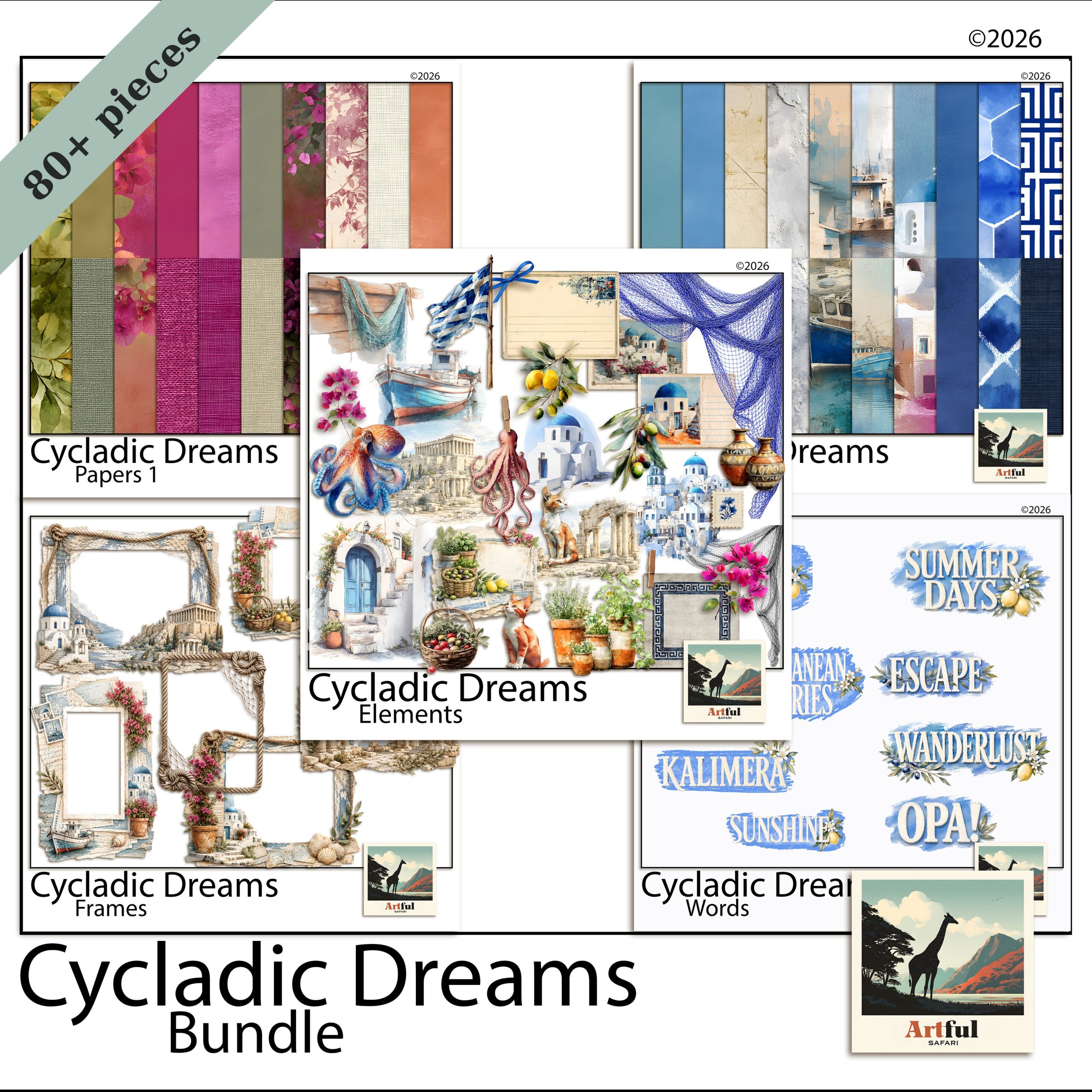
    Cycladic Dreams Santorini bundle with papers, elements and frames
    A full set like the Cycladic Dreams Santorini Bundle pairs papers with matching elements and frames.

    4. What’s included, and what does the licence allow?

    Two practical questions before you pay.

    How many papers, and what else comes with them?

    A paper pack might be 12 sheets. A bundle usually adds elements, frames and sometimes an alphabet for titles. If you want to build full holiday spreads, a bundle saves you buying the matching pieces separately later.

    Personal or commercial use?

    Most kits are personal-use by default: your own albums, gifts, pages you keep. If you plan to sell anything you make with the paper, you need a commercial licence, and the listing should spell out what that covers. Do not assume. Check the terms on the listing or ask the maker.

    Where do you buy Greek island scrapbook paper?

    You will find Greek island scrapbook paper on the maker marketplaces and on individual shop sites. A few things separate a pack worth buying from one you will regret.

    • Read the file details, not just the preview. The listing should tell you the dimensions, the DPI and the file types. If it does not, that is a small red flag.
    • Look at the full-size images. Zoom in. Thumbnails hide softness and colour casts.
    • Check the reviews for “as described”. Buyers will tell you fast if the files arrived smaller or muddier than the preview.
    • Prefer a maker with a matched range. If the same shop sells a coordinating elements pack and frames, your pages will hang together.

    Papers on their own, or a full bundle?

    This depends on what you are making. If you only want backgrounds to sit behind your holiday photos, a Greek island scrapbook paper pack is enough and costs less. If you want to build full spreads with framed photos, tucked-in elements and a title, a bundle is better value than buying each piece separately.

    My rule of thumb: buy the papers alone if you already own frames and elements you like in the same palette. Buy the bundle if you are starting a Greek island scrapbook from scratch, because everything will match out of the box and you will not be hunting for a frame that happens to be the right blue.

    One more thing worth a look: whether the set includes journaling cards or a title alphabet. Those are the pieces people forget they need until they are halfway through a page with nowhere to write the date.

    How to use Greek island scrapbook paper once you’ve bought it

    A few quick pointers so the set earns its keep:

    • Let one whitewash texture be your base, then layer a blue tile or door paper on top at an angle.
    • Keep photos warm and bright so they sit with the Mediterranean palette instead of fighting it.
    • Use the deep blue sparingly as an accent. Too much of it and the page goes heavy.
    • Pair it with simple, rounded fonts. Ornate script can tip the whole thing into a postcard cliche.
    • Leave breathing room. The white walls of the Cyclades work because of the space around them, and your page wants the same.

    For more layout ideas in the same family, see my Coastal & Nautical Scrapbook Ideas, which covers sand-and-sea palettes that sit nicely beside a Greek island scrapbook set.

    Key takeaways

    • Check the resolution first: 300 DPI at 12 x 12 inches (around 3600 x 3600 px) keeps papers sharp.
    • Papers are fine as JPGs, but frames and elements should be transparent PNGs so they layer cleanly.
    • Judge the blues at full size. True Cycladic colour is cobalt-to-denim with a warm white, not teal or grey.
    • Know what is included and whether the licence is personal or commercial before you buy.

    Frequently asked questions

    What resolution should Greek island scrapbook paper be?

    Look for 300 DPI at 12 x 12 inches, which is roughly 3600 x 3600 pixels per sheet. At that size the paper stays sharp when you crop or zoom in on a layout.

    Are digital scrapbook papers JPG or PNG?

    Background papers are usually JPGs because they fill the whole sheet and need no transparency. Frames, borders and cut-out elements should be transparent PNGs so they layer over a paper without a white box.

    What colours say ‘Greek island’ on a scrapbook page?

    Whitewashed walls, a cobalt-to-denim Aegean blue, warm stone, and touches of bougainvillea pink. Avoid sets that go too teal or use a cold grey-white, since those read more like a pool than Santorini.

    Can I sell pages I make with Greek island scrapbook paper?

    Only if the kit comes with a commercial licence, and the listing should state what that covers. Most digital papers are personal-use by default, so check the terms or ask the maker before selling anything.

  • Uppercase Alphabet Clipart: 5 Easy Rules for Scrapbook Titles

    Uppercase Alphabet Clipart: 5 Easy Rules for Scrapbook Titles

    Alphabet clipart is a set of individual letter PNGs you place one at a time to build a title, and it works best for short, uppercase headlines of three words or fewer, where each letter can be sized and spaced by hand.

    For anything longer than a headline, a normal font is faster and easier to read. Clipart letters are for the title thatโ€™s meant to be the feature of the page.

    What is alphabet clipart, and when should you use it?

    Alphabet clipart is a set of letters saved as individual PNG files, one per character, usually with a painted, foiled or textured finish. You place them one at a time to spell out a title, instead of typing in a font.

    So when do you reach for it over a normal typeface? When the title is the feature. A few decorated capitals as a page header carry weight a plain font canโ€™t. For a full sentence of journaling, though, a font is faster and far easier to read.

    Use alphabet clipart for short, loud titles. Use a font for everything you actually want people to read.

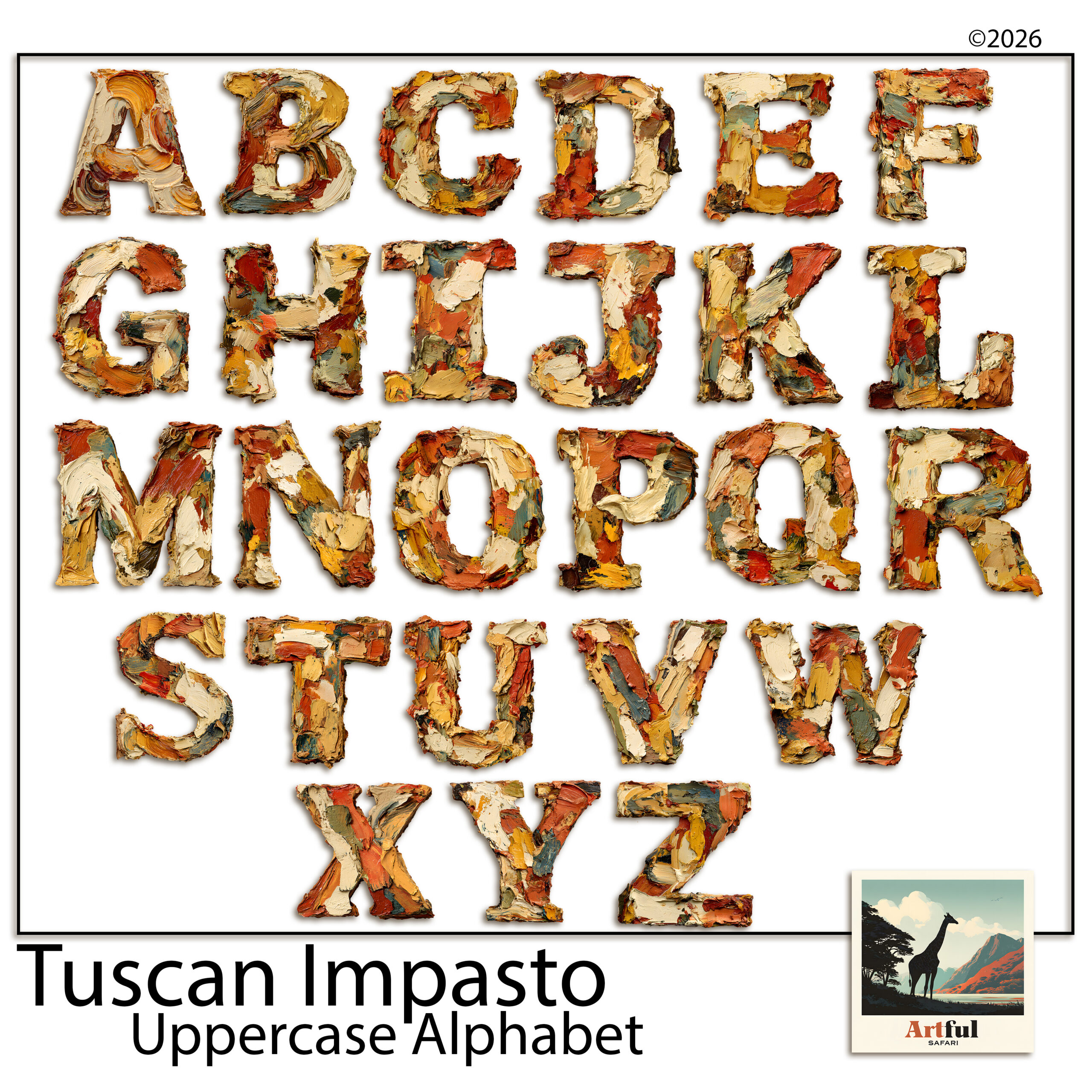
    Uppercase Italian oil-paint alphabet clipart letters for scrapbook titles
    Painterly capitals: the Tuscan Alphabet Clipart Italian Oil set.

    Where alphabet clipart works best on a page

    Itโ€™s worth being clear about where these letters earn their place, because thatโ€™s also where the spend is justified.

    • Page titles. The obvious one. โ€œSUMMERโ€, โ€œTUSCANYโ€, โ€œHOMEโ€ across the top of a spread.
    • Single-letter monograms. One big decorated initial in a corner, used as a graphic rather than a word. A surprising amount of mileage from one letter.
    • Year and date markers. A big โ€œ2026โ€ on a cover page does a lot of work for very little effort.
    • Album covers. The front of a memory book is exactly where a decorated title belongs, and itโ€™s the page people see first.

    What theyโ€™re not for: body text, captions, or anything more than a few words. The moment youโ€™re placing the tenth letter you should be reaching for a font instead.

    A trick I lean on: pair one clipart word with a plain typed word. โ€œOURโ€ in a quiet font, โ€œADVENTUREโ€ in big decorated capitals underneath. You get the decorative impact where it counts and keep the rest readable and quick to set.

    How to choose alphabet clipart for titles

    Three things decide whether a set earns its place.

    1. It has to match the kit

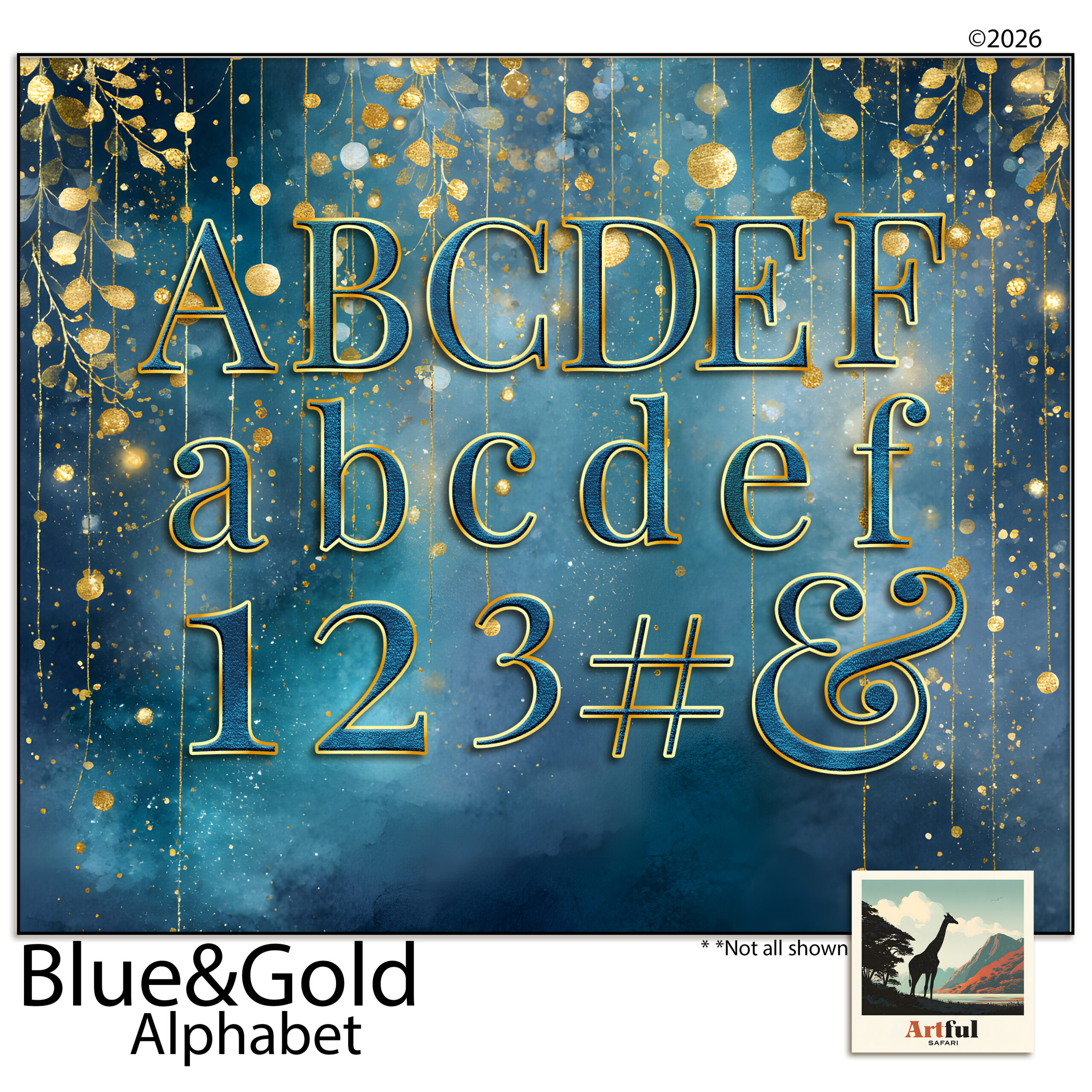
    Painterly capitals suit a Tuscan or rustic page. Blue-and-gold letters suit something formal or festive. A set that clashes with your papers will sit on the page like a sticker that wandered in from another album.

    2. Uppercase does the heavy lifting

    Most decorative titles are short and set in capitals, so a strong uppercase set covers nearly everything youโ€™ll do. Lowercase decorative letters are fiddly to line up and rarely needed for a header.

    3. Check itโ€™s a real PNG set

    Each letter should arrive on a transparent background as a proper PNG, at 300 DPI, so it drops onto your paper with no white box behind it. If the preview shows letters sitting on a white square, walk away.

    4. Make sure you get the whole alphabet

    Sounds obvious, but check. Some sets skip the rarer letters, or hand you capitals with no numbers. If you want to title a page โ€œJOURNEYโ€ and the set has no J, youโ€™re stuck. A complete A to Z plus 0 to 9 and a couple of punctuation marks covers anything youโ€™ll want to spell.

    Title lengthBest approachWhy
    1โ€“3 wordsAlphabet clipart, uppercaseEach letter can be sized and placed by hand for impact
    4โ€“6 wordsOne clipart word + a font for the restKeeps the feature without the fiddle
    A full phraseA font, every timeReadable, fast, and it wonโ€™t wander off the line

    How to build a title letter by letter

    This is the part people find slow until they have a method. Hereโ€™s the one I use.

    1. Drop in the first letter and size it to roughly what you want.
    2. Add the next letter on its own layer, sitting it close but not touching.
    3. Repeat across the word, eyeballing the gaps as you go.
    4. Once the word is built, select all the letters and align them along the bottom, so they sit on one line.
    5. Group them. Now you can move or resize the whole word as one piece.

    Build each word as its own group. A two-word title is then two blocks you can slide around the page until the spacing feels right.

    One habit that saves a lot of grief: size the letters once the word is grouped, not one by one. If you resize each letter individually youโ€™ll never get them to match. Group first, then scale the whole word up or down as a single object, and they stay in proportion.

    Blue and gold decorative alphabet letters for album titles
    Richer and more formal: the Blue Gold Digital Scrapbook Alphabet.

    If your set comes in more than one colour or finish, pick one per title and stick to it. A word that mixes gold and blue letters reads as a ransom note, not a header.

    Spacing, kerning and the mistakes that make it look off

    Hand-placed letters can look brilliant or clumsy, and the difference is almost always spacing. A font handles the kerning for you behind the scenes; with clipart youโ€™re the one doing it, so it pays to know what to watch for.

    • Even gaps beat equal gaps. An A next to a V can sit closer than two flat-sided letters. Trust your eye over the ruler.
    • Mind the baseline. Decorated letters often have flourishes that throw off where the letter โ€œsitsโ€. Line up the main body, not the curl.
    • Donโ€™t mix two decorated sets in one title. One ornate alphabet plus a plain font for the small words. Two ornate sets together just shout.
    • Give it air. A title crammed edge to edge loses its impact. Leave space around it so it reads as the headline of the page.
    • Overlap on purpose, not by accident. Letters that just barely touch look like a mistake. Either keep a clear gap, or overlap them properly so it reads as a deliberate style. The halfway house is the one that looks wrong.

    If a title still looks off after all that and you canโ€™t say why, try this: step back from the screen, or zoom out so the page is small. Spacing problems jump out at thumbnail size that youโ€™d never spot up close. Itโ€™s the quickest fix I know.

    Titling is a whole skill in itself, and clipart is only one route into it. For the wider picture, including font pairings and placement, see Scrapbook Page Titles.

    Key takeaways

    • Alphabet clipart is for short, loud titles โ€” three words or fewer. Use a font for anything longer.
    • Match the set to your kit and lean on uppercase; it covers nearly every header youโ€™ll build.
    • Build each word as a group, align to the baseline, then move the whole thing as one piece.
    • Space by eye, not by ruler, and never stack two decorated alphabets in one title.
    • Buy a complete A to Z with numbers, and pick one colour per title so it reads clean.

    Frequently asked questions

    What’s the difference between alphabet clipart and a font?

    A font is typed and flows automatically. Alphabet clipart is individual decorated letter PNGs you place by hand, which gives a richer look but only suits short titles.

    Should alphabet clipart be uppercase or lowercase?

    Uppercase covers nearly everything. Most decorative titles are short and set in capitals, and lowercase decorative letters are fiddly to line up for a header.

    Why do my clipart letters look uneven?

    It’s almost always spacing. Space letters by eye rather than with equal gaps, and align the main body of each letter to one baseline rather than the flourishes.

    Can I mix two alphabet sets in one title?

    Better not to. One decorated alphabet plus a plain font for the small words reads clean. Two ornate sets in the same title fight each other.

  • Frame PNG: 5 Easy Checks Before You Buy One

    Frame PNG: 5 Easy Checks Before You Buy One

    A good frame PNG has a genuinely see-through centre, stays sharp at 300 DPI and matches the style of your kit. Before you buy one, check those three things plus the edge quality and the licence.

    Get any of them wrong and the frame either buries your photo under a white block or leaves a pale halo on every page. Both are easy to spot up front if you know where to look.

    What is a frame PNG, and why does the format matter?

    A frame PNG is a decorative border saved with a see-through middle. You sit it over a photo and the photo shows through the hole, so the frame looks like itโ€™s wrapped around the picture.

    The format is the whole trick. A JPG canโ€™t hold transparency, so a frame saved as a JPG comes with a solid white block in the centre that buries your photo. PNG keeps the centre genuinely empty. That single difference is what lets a frame drop cleanly onto anything underneath.

    This is also why you canโ€™t just screenshot a frame off the internet and expect it to work. Most of those have a white or chequered centre baked in. A proper frame PNG has been cut out so the middle is real empty space, and that cut-out is exactly the bit cheap sets get wrong.

    Ornate Italian oil-paint frame PNG set for digital scrapbooking
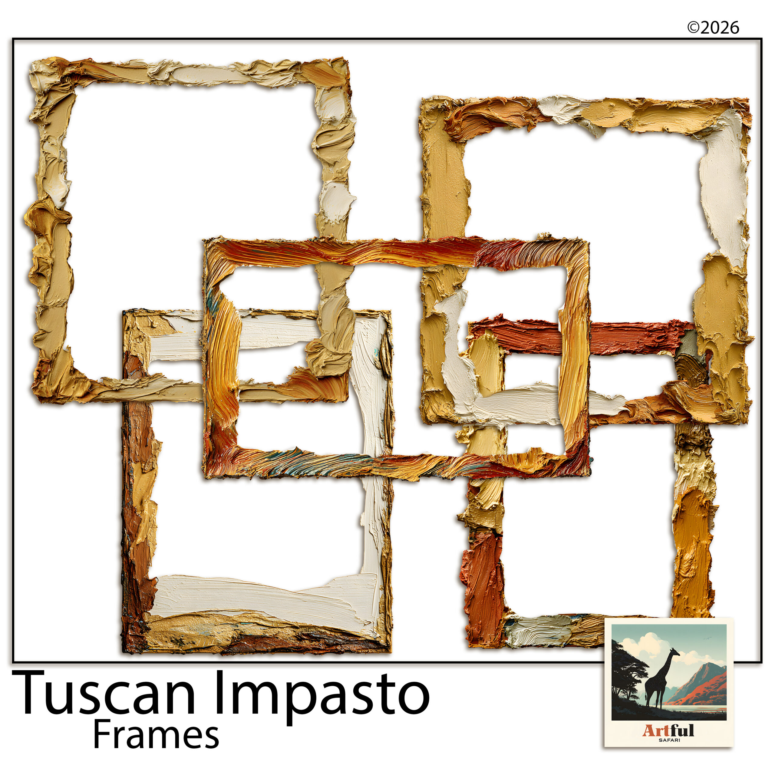
    Painterly and ornate: the Tuscan Frame Clipart Italian Oil Paint set.

    What to check before you buy a frame PNG

    Most frames look fine on a product cover. The problems show up once youโ€™re using them, usually after youโ€™ve already paid. Run through this list before you buy and youโ€™ll dodge the ones that look good in the thumbnail and fall apart on the page.

    CheckWhat good looks likeWhat to avoid
    Transparent centreThe middle is fully see-through, no white hazeA faint grey or white fill where your photo should sit
    Resolution300 DPI, large enough to sit at full page sizeSmall files that go soft the moment you enlarge them
    Edge qualityClean, slightly soft edges that donโ€™t look cut out with scissorsHard pixel stair-steps or a white halo around the frame
    Style matchFrames that suit the kit and era youโ€™re working inOne frame that fights every other element on the page
    LicenceA clear note on personal vs commercial useNo licence stated at all

    The halo test

    The most common fault in a cheap frame PNG is a pale outline left over from a sloppy cut-out. Drop the frame onto a dark background and look at its outer edge. If you can see a thin white line tracing it, the cut-out was rushed and itโ€™ll show on every page.

    The licence is part of the buy

    If you make anything you sell, or even just share widely, the licence matters as much as the look. A set sold for personal use only canโ€™t legally go on a card youโ€™re selling. A good listing states it plainly. If you canโ€™t find a word about licensing anywhere, treat that as a reason to walk, not a detail to sort out later.

    How many frames do you actually need?

    Fewer than the big bundles suggest. A working frame PNG set is small:

    • One or two ornate frames for hero photos and title pages.
    • A couple of simple frames for everyday photos and clusters.
    • One odd shape โ€” oval, arch or torn-edge โ€” for variety.

    Youโ€™ll reach for the same two or three over and over. Thatโ€™s normal, and itโ€™s a sign you bought well. A frame you trust is worth ten you have to think about.

    Thatโ€™s it. Five or six frames you actually like will outwork a pack of fifty you have to hunt through every time.

    Big packs look like better value on the listing, and sometimes they are, but only if the frames inside are varied. Thirty near-identical gold ovals isnโ€™t thirty frames, itโ€™s one frame you paid for thirty times. Look past the count and check how different the shapes and weights actually are. A small set with real range beats a fat set of near-duplicates every day.

    Beaded African sunset photo frames with transparent centres
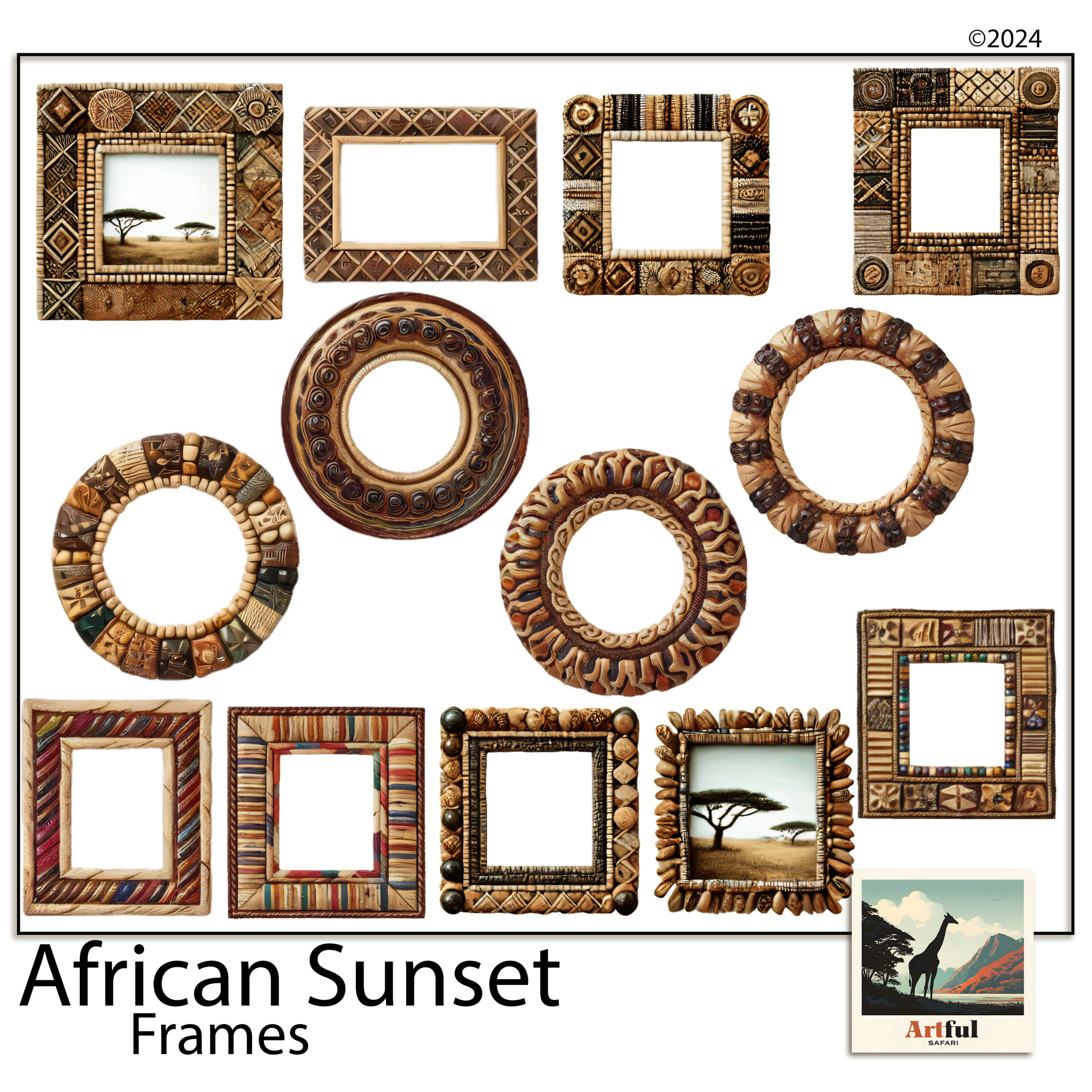
    A frame PNG set in a warmer register: the African Sunset Photo Frames PNG Beaded set.

    Ornate vs simple: matching a frame PNG to your photo

    Busy photo, plain frame. Plain photo, you can afford an ornate one. A beaded or carved frame around a cluttered market shot makes the eye give up. The same frame around a single quiet portrait looks considered.

    The rule of thumb I use: the frame and the photo shouldnโ€™t both be loud. If the photo already has a lot going on, the frameโ€™s job is to hold it, not compete with it. Save the showy frames for your quietest, strongest shots, the ones that can stand the attention.

    Colour matters as much as shape

    A frame thatโ€™s the right shape but the wrong colour still fights the page. A cool silver border on a warm ochre layout sits there like a guest who wandered into the wrong party. Pick frames whose tone already lives somewhere in your kit, a gilt that echoes a gold in the paper, a beaded brown that picks up a wood texture. When the frame shares a colour with the page, it stops looking added on and starts looking like it belongs.

    Match the era, not just the colour

    A painterly gilt frame suits a Tuscan or vintage page. A beaded frame suits something warm and earthy. Putting a sleek modern border on an aged-paper layout is the thing that quietly makes a page look wrong without you being able to say why.

    Once youโ€™ve chosen well, placement is its own small craft: resizing without squashing, layering over paper, mixing styles. I walk through all of that in How to Use Photo Frame PNGs.

    Where do people go wrong with frame PNGs?

    The frames themselves are rarely the problem. The way they get used is. Four mistakes show up again and again.

    • Stretching to fit. Dragging a square frame to fit a tall photo squashes the corners. Resize from a corner handle so it keeps its shape, then crop the photo to the frame instead.
    • Framing everything. If every photo on the spread has an ornate border, none of them stands out. Frame one, let the rest sit plain.
    • Fighting the paper. A heavily patterned paper under a heavily detailed frame turns to noise. Give one of them room: busy frame, quiet paper.
    • Buying for the cover. The product image is styled. Open the frames at full size and check the centre and edges yourself before you commit to a whole albumโ€™s worth.

    None of these are about taste. Theyโ€™re the difference between a frame that looks placed and one that looks pasted. Fix them and even a modest set of frames will carry a whole album.

    Key takeaways

    • Always PNG, never JPG โ€” only PNG holds the transparent centre a frame needs.
    • Before buying, check the centre, the resolution, the edges, the style fit and the licence.
    • Run the halo test on a dark background to catch a lazy cut-out.
    • Five or six frames you like beat a pack of fifty you never reach for.

    Frequently asked questions

    Why does a frame have to be a PNG and not a JPG?

    JPG files can’t store transparency, so a JPG frame comes with a solid white centre that hides your photo. PNG keeps the middle see-through, which is the whole point of a frame.

    What resolution should a frame PNG be?

    Look for 300 DPI and a file large enough to sit at full page size. Small frames go soft as soon as you enlarge them, and the blur shows around every edge.

    How do I spot a poorly made frame?

    Drop it onto a dark background. If a thin white outline traces the frame, the cut-out was rushed and that halo will appear on every page you use it on.

    How many frames do I need for an album?

    Five or six is plenty: one or two ornate frames, a couple of simple ones, and one odd shape for variety. A huge pack mostly slows you down.

  • Where to Buy Tuscan Clipart (and 5 Easy Checks First)

    Where to Buy Tuscan Clipart (and 5 Easy Checks First)

    You can buy Tuscan clipart from dedicated digital shops, Etsy, subscription libraries and free sites, but for one themed project a matched set or bundle from a maker beats hunting a giant library. Whichever you choose, check the file type, resolution, cut-out quality and licence before you pay.

    The preview image is what sells the set. The file details are what tell you whether it will actually hold up on your page.

    Where can you buy Tuscan clipart?

    Tuscan and Italian clipart turns up in a few places, and they are not all equal. Knowing the difference saves you from a set that looks lovely on the cover and falls apart the moment you zoom in.

    • Dedicated digital shops. Smaller makers who design matched sets, usually with the frames, papers and alphabet built to go together. You tend to get cleaner cut-outs and a consistent palette.
    • Etsy. The widest choice and the widest range in quality. Read the listing for file type and resolution before you trust the preview.
    • Big subscription sites. Endless libraries for a monthly fee. Handy if you buy constantly, wasteful if you want one good Tuscan set.
    • Free clipart sites. Tempting, but the licence is often vague and the files are usually low resolution. Fine for a quick mock-up, risky for anything you keep.

    For a single themed project, a matched set or bundle from a maker beats hunting through a giant library. You spend less time fixing mismatched styles, and the pieces already look like they came from the same place. A library can still earn its keep if you make a lot of pages across many themes, but for one Tuscany album it is more choice than you need, and more sifting than you want.

    Tuscan clipart set of Italian olives, lemons and oil on a transparent background
    Tuscan clipart in practice: the Italian Fruit Clipart Olives Lemons Oil set ships as transparent PNGs you can drop straight onto a page.

    What to check before you buy Tuscan clipart

    The preview image sells the set. The file details tell you whether it will hold up. Run through this before you pay:

    CheckWhat you wantWhy it matters
    File typeTransparent PNGJPG clipart comes with a white box you can’t remove cleanly.
    Resolution300 DPILow-res art looks soft and pixelated once you enlarge it.
    Cut-out qualityClean edges, no white haloA rough cut-out leaves a fuzzy outline on every element.
    What’s includedElement count listed“Tuscan clipart” can mean five pieces or fifty. Check the number.
    LicenceStated clearlyYou need to know if you can use it on things you sell.

    Style matters as much as the file

    Italian clipart swings between two looks: crisp watercolour and loose oil-paint. Decide which suits your project before you buy. Watercolour olives sit well on a soft, pale page. Brushy impasto lemons want a warmer, textured background. Mixing the two in one layout usually reads as a clash, so pick a lane and stay in it.

    Tuscan or generic Italian: does the difference matter?

    “Tuscan” and “Italian” get used as if they mean the same thing, and for clipart they mostly overlap. The Tuscan label tends to bring a specific palette: olive green, terracotta, soft gold, dusty cream, with cypress and rolling-hill cues. Generic Italian clipart casts wider, picking up Amalfi blues, Venice motifs and bright lemon yellows.

    It matters when you have a clear scene in mind. A Tuscan farmhouse album wants the muted, sun-warmed palette. A Mediterranean coast page wants the brighter blues. Buying the wrong one isn’t fatal, but you’ll fight the colours the whole way.

    Transparent PNGs vs flat images

    This is the detail people skip, then regret. A transparent PNG has nothing behind the artwork, so an olive branch drops onto your page with only the branch showing. A flat JPG carries a background, usually white, that boxes the art in.

    You want PNGs. They layer over papers, photos and frames with no extra work. If a listing only offers JPGs, or won’t say which it is, treat it as a flat image set and move on.

    Red flags worth spotting in a listing

    A few signs tell you a Tuscan clipart set will disappoint before you’ve spent a penny:

    • No file type or size named. If the seller won’t say PNG and won’t give the resolution, assume the worst.
    • One glossy mock-up and no flat-lay of the pieces. The styled photo hides the cut-out quality. You want to see the elements on a plain background.
    • The same art you’ve seen in ten other shops. Cheap resold packs float around everywhere, usually low-res and with a murky licence.
    • A licence link that goes nowhere, or no licence at all. For anything you sell, that is a deal-breaker.

    None of these are about taste. They are about whether the file does what the picture promises once it lands on your page.

    What a good Tuscan clipart set includes

    A set worth buying gives you enough range to build several pages, not just one. Look for:

    • Fruit and produce: olives, lemons, grapes, a bottle of oil.
    • A few botanicals: olive branches, cypress, herbs.
    • One or two larger feature pieces for a focal point.
    • Smaller filler elements for corners and borders.

    If you want the papers and frames to match without guesswork, a full bundle solves it in one go. Everything shares a palette, so the page hangs together from the start. The same logic carries into wedding work, which I cover in Italian Clipart for Wedding Stationery.

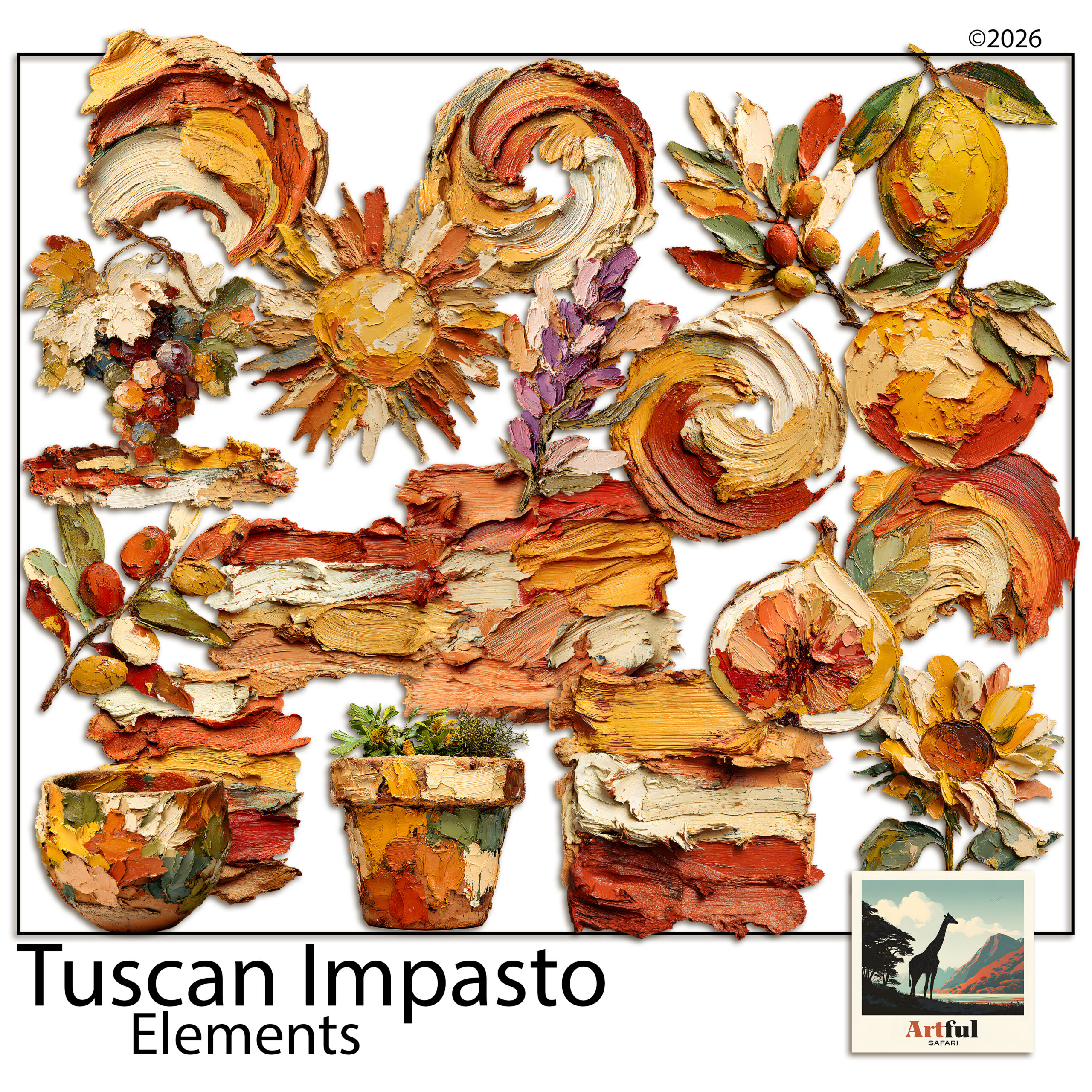
    Tuscan Impasto digital scrapbook bundle with papers, frames, alphabet and clipart
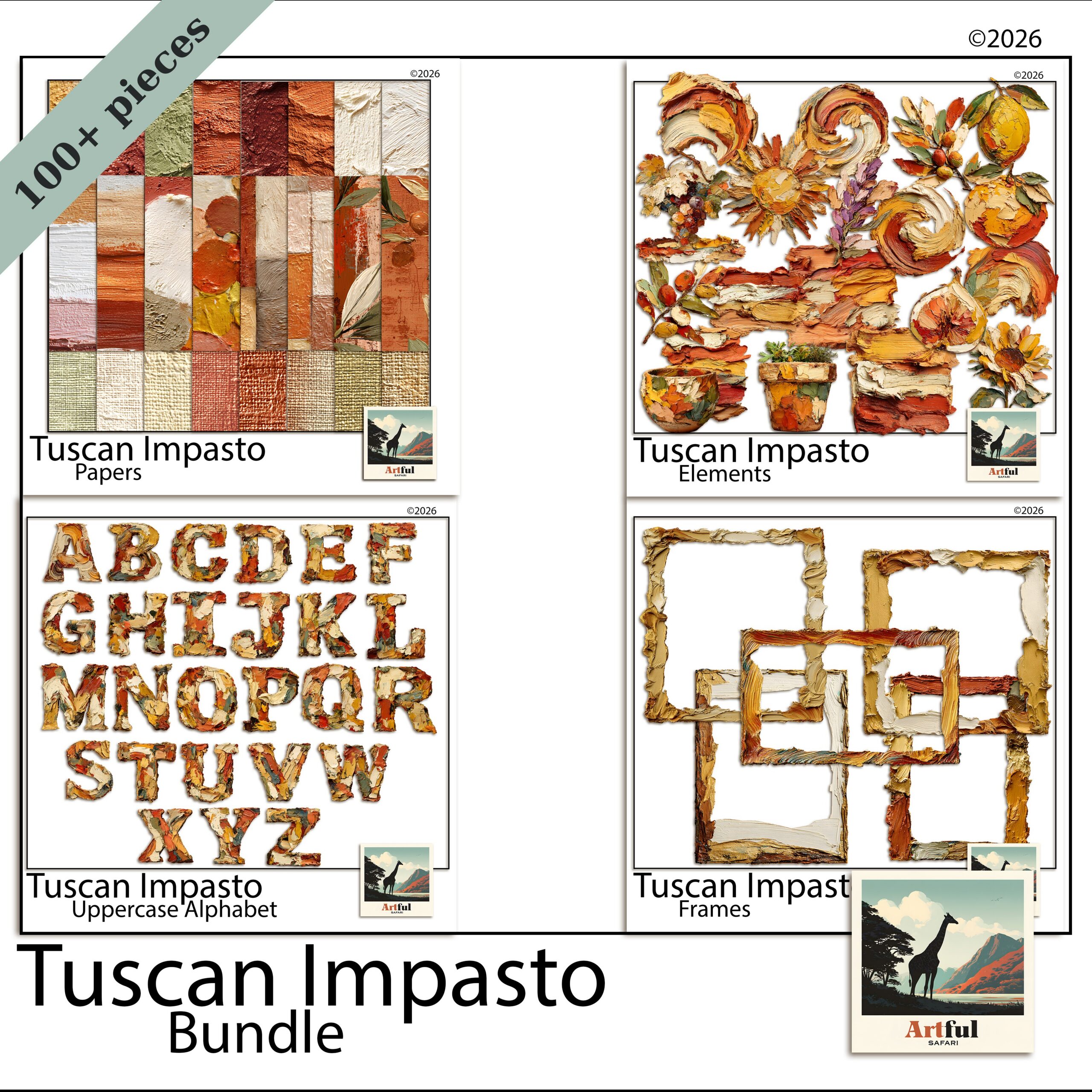
    A full kit like the Tuscan Impasto Digital Scrapbook Bundle keeps papers, frames and clipart in one matched palette.

    How to test a set before you commit

    If a shop has a free sample or a single low-cost element, grab that first. Drop it onto a dark background and look hard at the edges. A clean cut-out stays crisp; a rough one shows a pale fringe you’ll see on every page. Zoom to full size and check the art doesn’t go blocky. Five minutes of testing saves you from a set you never use.

    Where will you actually use it?

    Match the set to the job, because a pack built for one use can be a poor fit for another. A few common ones:

    • Digital scrapbook pages. You want transparent PNGs you can layer over papers and frames, plus a few larger feature pieces.
    • Wedding stationery and invitations. Look for delicate line-and-wash pieces and corner motifs that frame text without crowding it.
    • Recipe cards and menus. Small produce icons and borders earn their keep; big busy scenes fight the words.
    • Junk journal pages. Here printing is the point, so resolution matters even more. A 300 DPI olive branch prints crisp; a low-res one prints fuzzy.

    Knowing the use up front stops you buying a gorgeous set of huge feature illustrations when what you needed was twenty small fillers.

    How much should Tuscan clipart cost?

    For a digital download, a focused element set usually lands in the few-pounds range, and a full matched bundle costs more because you get papers, frames and an alphabet alongside the clipart. Free sets exist, but you pay in low resolution and unclear licensing.

    The real cost is your time. A cheap set with rough cut-outs makes you clean up every element by hand. A well-made one drops straight in. For anything you care about keeping, the made-for-purpose set is the cheaper choice once you count the hours.

    Key takeaways

    • Buy from a maker or a matched bundle for a single Tuscan project; libraries suit constant buyers.
    • Insist on transparent PNGs at 300 DPI with clean, halo-free edges.
    • Pick the palette that fits your scene, muted Tuscan or brighter Italian, and one style not both.
    • Check the element count and the licence before you pay, not after.

    Frequently asked questions

    Where is the best place to buy Tuscan clipart?

    For a single themed project, a dedicated digital shop or a matched bundle gives you cleaner cut-outs and a consistent palette. Etsy has the widest choice but the most variable quality, so read the file details first.

    What file format should Tuscan clipart be?

    Transparent PNG at 300 DPI. PNGs layer over papers and photos with no white box behind them, and 300 DPI keeps the edges sharp when you enlarge an element.

    Is free Tuscan clipart any good?

    It is fine for a quick mock-up, but free sets are often low resolution with a vague licence. For anything you keep or sell, a made-for-purpose set is safer and saves cleanup time.

    What is the difference between Tuscan and Italian clipart?

    They overlap, but Tuscan usually means a muted olive, terracotta and gold palette with cypress and hill cues. Generic Italian casts wider, with Amalfi blues, Venice motifs and brighter lemon yellows.

    What should a good Italian clipart set include?

    Enough range to build several pages: produce like olives and lemons, a few botanicals such as olive branches and cypress, one or two larger feature pieces, and smaller filler elements for corners and borders.