
The best coastal scrapbook ideas start with restraint: pick a sand-to-sea colour palette, let one or two photos carry the page, and add nautical clipart sparingly so it reads as a real beach memory rather than a gift-shop tea towel.
Here are the layout ideas, palettes and layering tricks I reach for when I’m building a coastal scrapbook of a summer holiday.
Table of Contents
What makes a coastal scrapbook page work?
A coastal scrapbook page works when the photos feel like the holiday and the design stays out of their way. Beach photos are already busy, with water, sky and people, so the layout should give them air rather than crowd them.
Three habits do most of the work:
- Leave plenty of white or pale space around photos
- Stick to one soft texture as the background, not three
- Let a single anchor photo dominate, with smaller shots around it
The mistake I see most often is treating every photo as equal. Twelve beach shots at the same size turns into wallpaper. Pick the one photo that says the day best, run it large, and let the rest be supporting cast at half the size. The page reads as a memory instead of a contact sheet.
Which colour palette suits a beach album?
The safest coastal palettes pull from the shoreline itself: sand, sea-glass, driftwood and a single deeper accent. Skip bright primary blues unless your photos are genuinely that saturated.
| Palette | Use it for | Mood |
|---|---|---|
| Sand + sea-glass + ivory | Quiet beach mornings, family days | Soft, airy |
| Navy + white + rope tan | Boats, harbours, nautical trips | Crisp, classic |
| Driftwood + dusty teal + coral | Sunset swims, rock pools | Warm, lived-in |
Pull the accent colour from something already in the photo, a striped towel or a red bucket, and the whole spread looks deliberate.
One palette trap worth flagging: pure white. On a beach page, crisp white can look harsh next to warm sand tones. Swap it for ivory, shell or the palest grey and the whole spread softens. Save real white for the rare page where your photos are already cool and bright.
How do you layer sand and sea papers without muddying them?
Layering is where coastal scrapbook pages go wrong. Two textured papers fighting each other turn into mud. Keep one paper as the hero and let the others whisper underneath.
A layering order that holds up
- Lay a plain or lightly textured sand paper as the base.
- Add a torn strip of a sea or wave paper along one edge only, not the whole page.
- Drop your photos on top inside simple frames.
- Reduce the opacity of any busy paper to 60-70% so it sinks back.
If you want the full layering walk-through, How to Make a Travel Scrapbook covers building a holiday album from photos to finished pages.
Add a sense of water without a literal wave
You don’t need a photo of the sea to say sea. A pale wash of teal along the bottom third, a band of ripple texture set low, or a single watercolour splash behind a photo all read as water without competing with your snapshots. Suggest the coast, don’t shout it.
The same trick works for sand. A grainy off-white texture under the whole page, kept low and quiet, gives the spread a beachy feel before you’ve added a single shell. Texture does the theme work so your clipart doesn’t have to.
Where does nautical clipart work, and where does it tip into kitsch?
Nautical clipart works in small doses as punctuation, not decoration. A single rope corner, one small shell, a thin striped border. It tips into kitsch the moment you ring the page with anchors, lighthouses and seagulls all at once.
My rule: one nautical element per page, two at most, and never as the loudest thing on the spread. The Coastal Nautical Digital Scrapbook kit has rope and shell pieces that sit quietly in a corner instead of taking over.
- Works: rope as a thin divider, a shell tucked behind a photo corner, a faint compass rose watermark
- Tips into kitsch: cartoon anchors everywhere, three lighthouses, a banner that shouts AHOY
Coastal scrapbook ideas for different trips
Match the layout to the kind of coast you visited.
- Family beach week: a photo grid of the same spot across days, with a sandy base and one shell accent.
- Sailing or harbour trip: navy and rope-tan, a single boat photo enlarged, thin rope dividers.
- Rock-pool and coastal-walk day: driftwood tones, small detail shots of finds, a journaling card listing what you spotted.
Don’t skip the journaling
Coastal scrapbook pages lean so hard on pretty papers that the words get forgotten. A short note ages better than any sticker: the name of the beach, who you went with, the thing that made everyone laugh. Drop it on a small card so it sits on the page without fighting the photos. In a few years that line is the part you’ll reread.
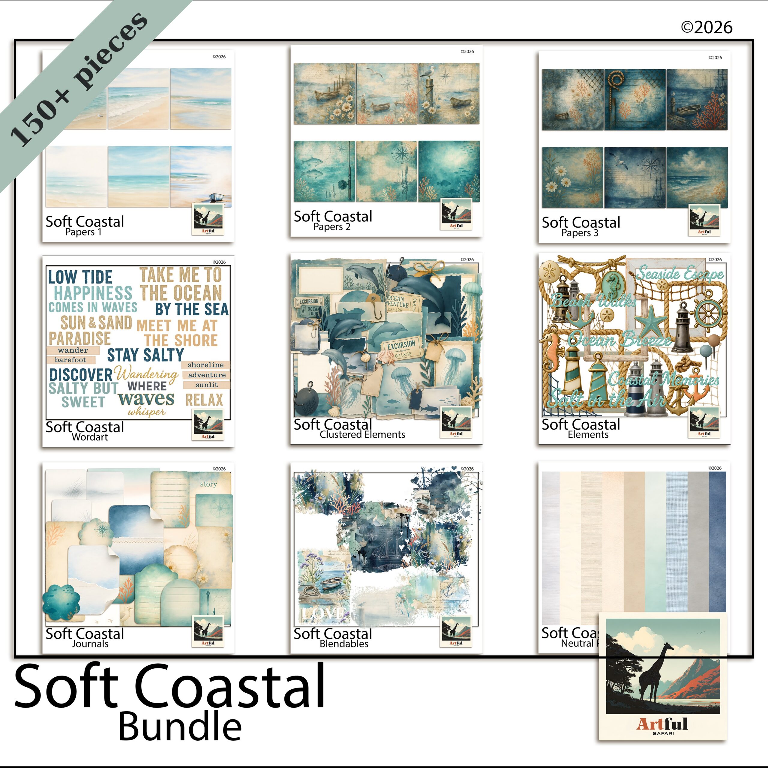
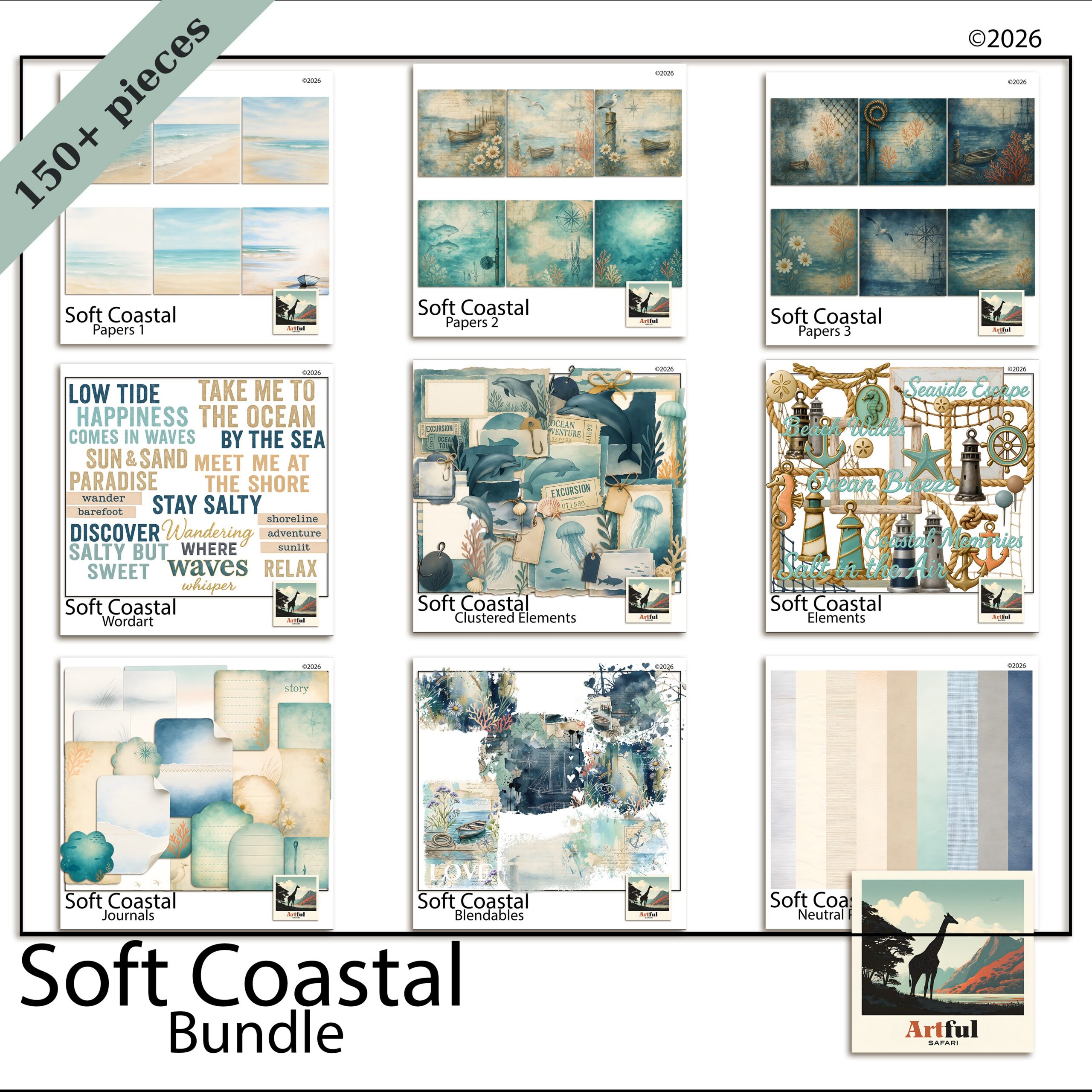
Build the Soft Coastal Digital Scrapbook Bundle as your base and add nautical pieces only where a page needs a little punctuation.
How do you keep a whole coastal scrapbook from looking samey?
The risk with a single themed kit is fourteen pages that blur into one. The fix is varying the layout while keeping the palette steady, so the album feels related without feeling repetitive.
- Switch the photo count: a one-photo full-bleed page next to a six-photo grid gives the eye somewhere to rest and somewhere to browse.
- Move the title around: top-left on one spread, running up the side on the next, small in a corner on a third.
- Change the breathing room: alternate a busy, layered page with a near-empty one that’s mostly sand paper and a single photo.
- Rotate the accent: lean coral on one page, dusty teal on the next, both pulled from the same family.
Hold the palette and the paper family constant and you can vary everything else freely. That’s what makes a holiday album look designed rather than churned out.
What about the title and lettering?
Coastal titles work best when the lettering feels relaxed rather than formal. A loose script or a soft rounded font suits a beach page far better than anything sharp and corporate. Keep the wording simple too: the place name, the year, or a half-sentence you actually said on the day.
- Colour the title from the palette: a driftwood brown or muted navy reads better than black, which can feel heavy against pale sand.
- Give it room: a title squeezed into a corner gets lost. Let it sit across the top third or run quietly down one side.
- One decorative touch, not five: a small shell beside the first letter is plenty. Don’t bury the words under clipart.
If you want the title to anchor the page, set it large and let a single photo do the rest. Restraint is the whole game with coastal scrapbook pages, in the lettering as much as the layout.
Key takeaways
- Pull the coastal scrapbook palette from the shoreline: sand, sea-glass, driftwood, one deeper accent.
- Keep one textured paper as the hero and fade the rest to 60-70% opacity.
- Use nautical clipart as punctuation, one or two pieces per page.
- Match the layout to the trip, and vary layouts to keep the album fresh.
Frequently asked questions
What colours work best for a coastal scrapbook?
Pull from the shoreline: sand, sea-glass, driftwood and ivory, with a single deeper accent like navy or coral. Match the accent to something already in your photo and the coastal scrapbook page looks intentional.
How much nautical clipart should I use on a page?
One element, two at most. Use rope, a shell or a thin stripe as punctuation rather than decoration. Ringing a page with anchors and lighthouses is what pushes it into kitsch.
How do I layer beach papers without them looking muddy?
Keep one paper as the hero and reduce the opacity of any busy paper to 60-70% so it sits back. Add textured papers as torn strips along one edge instead of covering the whole page.
Do coastal scrapbook kits work for sailing and harbour trips too?
Yes. Switch to a navy, white and rope-tan palette, enlarge a single boat photo and use thin rope dividers. The same kit covers soft beach days and crisp nautical trips.