
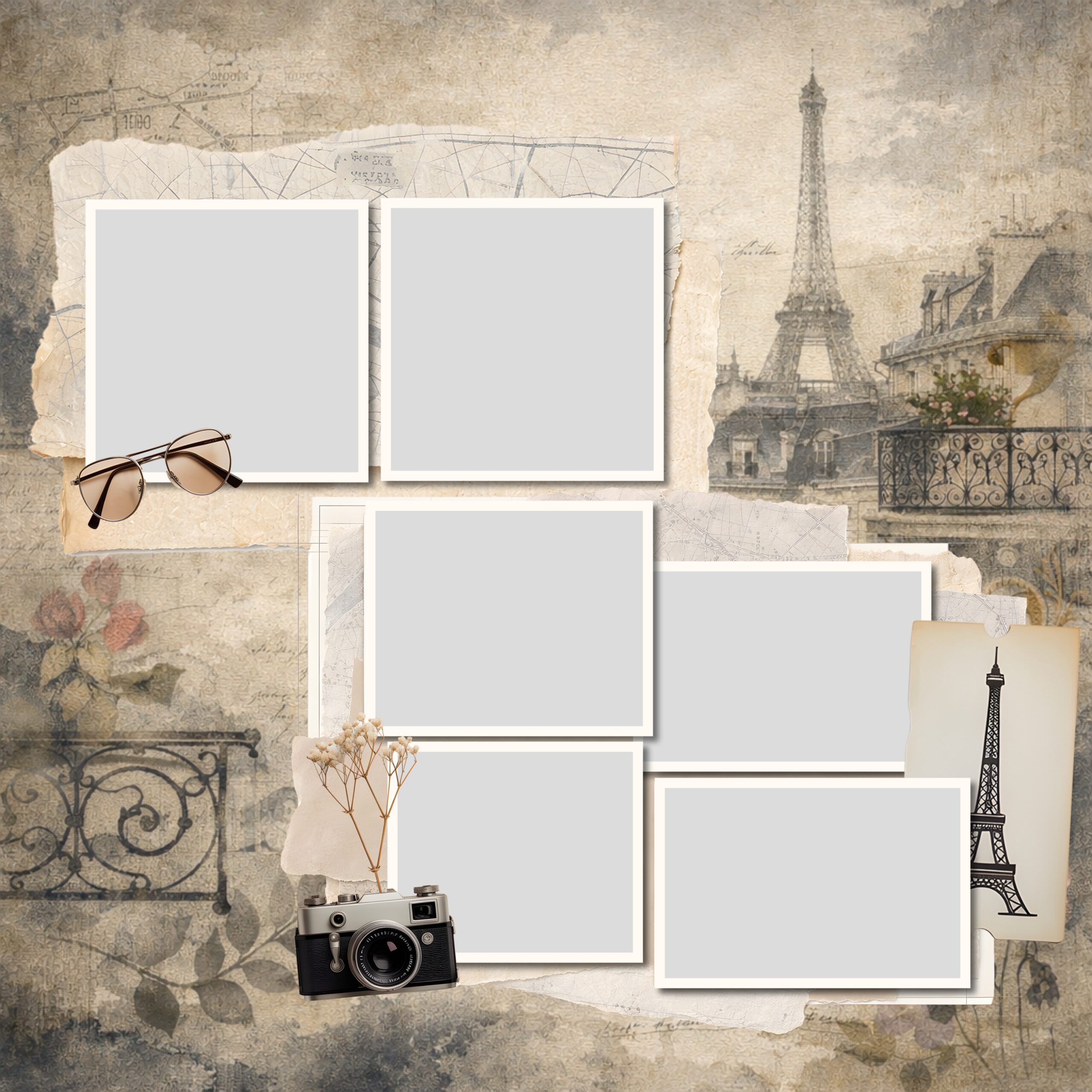
A good Paris scrapbook kit hands you everything to build a page in one place: background papers, Paris clipart beyond the Eiffel Tower, photo frames and a few journaling cards.
Buy one that’s all landmarks and no papers and you’ll spend the project filling gaps. The rest comes down to following the trip’s shape and holding one palette across the album.
Table of Contents
What goes in a good Paris scrapbook kit?
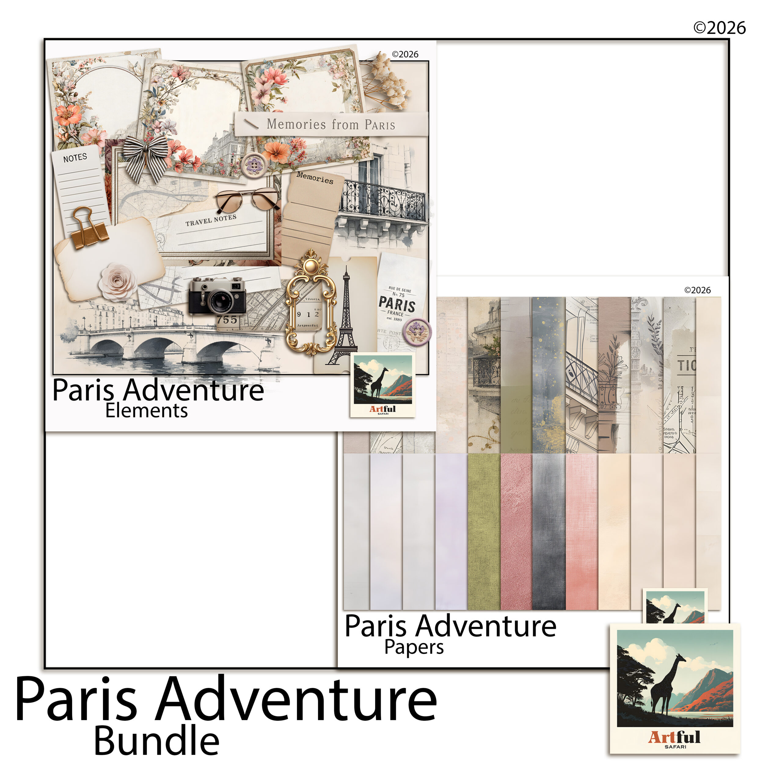
A Paris scrapbook kit should give you everything to build a page without hunting for extras. That means papers for the backgrounds, clipart for the Paris feel, and frames or mats to sit your photos in. If a kit is all Eiffel Towers and no papers, you’ll spend the project filling gaps.
For a trip album I look for four things before I buy.
- Plenty of plain-ish papers in the palette, not just heavily patterned ones
- Clipart beyond the Eiffel Tower: cafe scenes, macarons, street signs, perfume, books
- Photo frames so images drop in cleanly
- A few journaling cards for dates and notes
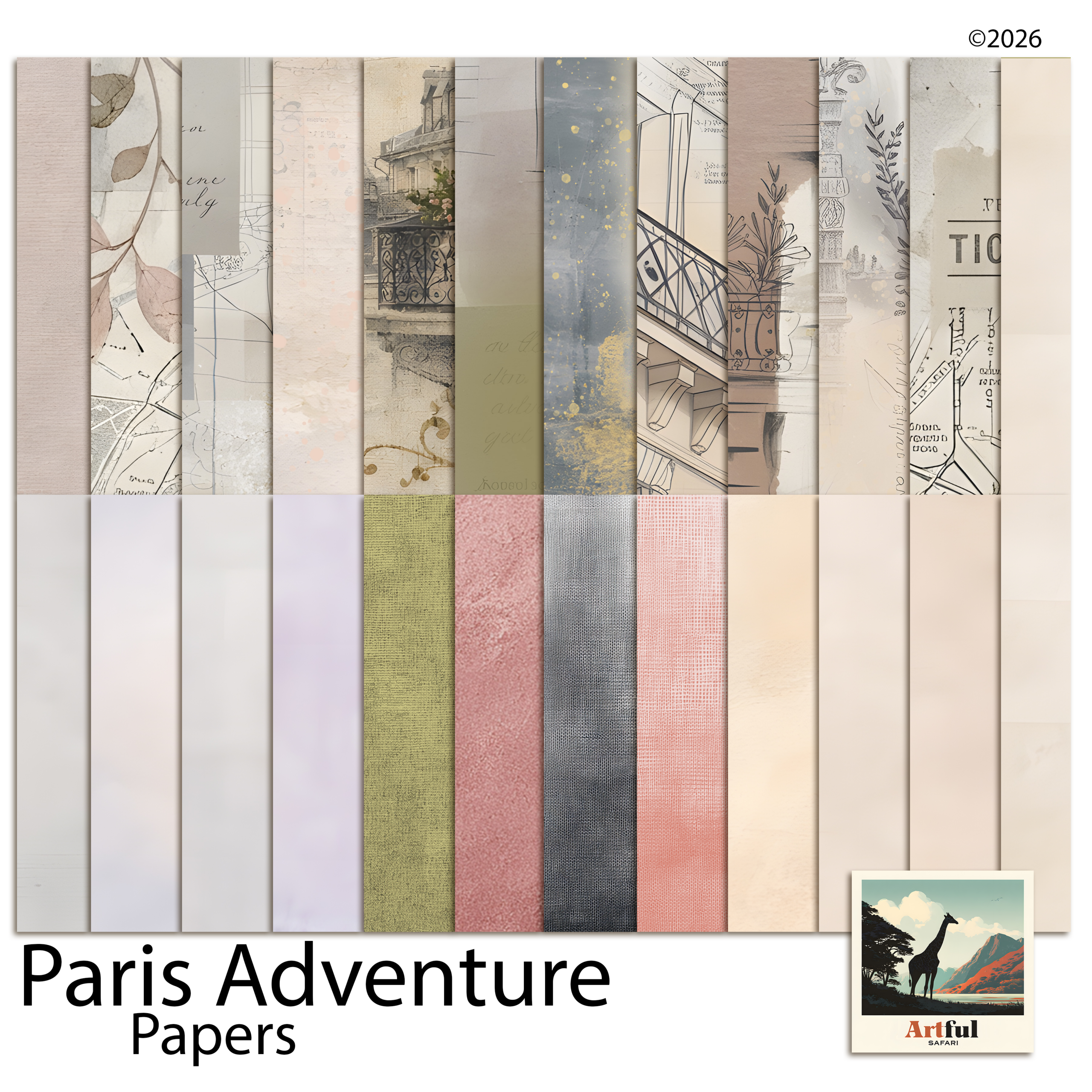
The papers are the part people undervalue. You’ll use far more background than you expect, and a kit that’s heavy on decoration but light on plain sheets runs out of room to breathe halfway through the album. A bundle that covers all four bases saves you stitching pieces together from three different sets that don’t quite match.
Page ideas from one Paris scrapbook kit
A trip has a shape, and the album reads better if the pages follow it. Here is a running order that holds together.
- Title page. One hero photo, the word “Paris” big, the dates underneath.
- Getting there. Boarding passes, the plane window, the first metro sign.
- The landmarks. Eiffel Tower, Notre-Dame, the Louvre, one strong shot each rather than ten small ones.
- The food. Croissants, a cafe table, the patisserie window. Food pages age really well.
- The streets. Doors, balconies, a quiet corner you stumbled on.
- Closing page. A favourite photo, a few lines on what you’d go back for.
Don’t fill every page with the Eiffel Tower
It’s the obvious motif and it gets old fast across a whole album. Use it on the title page and one landmark spread, then let the small details carry the rest: a street name, a metro ticket, a cafe awning. Those are the bits that actually take you back. The tower will be in plenty of your photos already, so you rarely need the clipart version more than once or twice.
Pages people forget to make
The landmarks photograph themselves. The pages you’ll be glad of later are the smaller ones: a list of where you ate, the metro map with your route traced on it, the view from the room you stayed in, the one rainy afternoon you spent in a museum. A trip album that’s only highlights reads like a postcard rack. The in-between pages are what make it yours.
What colour palette suits Paris pages?
Paris has a few palettes depending on the mood you’re after. Pick one and hold it across the album so the pages feel like a set.
| Mood | Palette | Suits |
|---|---|---|
| Soft romantic | Cream, dusty rose, pale grey, gold | Honeymoons, anniversaries, spring trips |
| Classic chic | Black, white, charcoal, one red accent | City breaks, fashion-leaning pages |
| Vintage Parisian | Sepia, aged cream, faded blue, brown ink | Old-postcard feel, cafe and book pages |
| Bright spring | Blush, sky blue, fresh green, soft yellow | Garden, market and outdoor days |
The soft romantic palette is the safe one and it’s what most Paris scrapbook kits lean toward. If your photos are moody and grey-skied, the classic black-and-white route flatters them more than pastels will. Holding one palette across the album is the single thing that makes a stack of pages feel like a finished book rather than a pile of loose layouts.
How do you lay out the iconic shots without cliche?
Everyone has the same Eiffel Tower photo. The layout is what makes yours yours.
- Crop in. A detail of the ironwork beats the full postcard view you’ve seen a thousand times.
- Pair the big with the small. One landmark photo next to a cafe receipt or a metro ticket tells more of a story than two landmarks side by side.
- Leave white space. A single photo with room around it on a Parisian paper looks more considered than a packed collage.
- Add your own words. A line about getting lost on the way there is what stops the page being a brochure.
Mementoes do a lot of quiet work here. A scanned ticket, a torn menu, a pressed flower from the Tuileries gives the page texture that no amount of clipart can fake, because it was actually there. Scan the paper bits the day you get home, while you still have them.
Building the album from a digital Paris scrapbook kit
A digital Paris scrapbook kit makes this far less precious. You can try a layout, undo it, recolour a paper and reuse the same Eiffel Tower clipart across pages without it ever running out. Drop your papers as the base, sit photos in clipping masks inside the frames, then tuck clipart around the edges.
Work at a standard page size from the start, usually a 12×12 digital page, so every spread matches and you’re never resizing at the end. Build one page you’re happy with, then save it as a template: same paper, same frame positions, same title spot. Swap the photos and you have the next page in minutes instead of starting from a blank canvas each time.
The other advantage of going digital is that nothing is final. If you decide halfway through that the romantic palette is too sweet for your grey-skied photos, you can swap the papers across every page rather than starting the album over. You can also build the whole thing once and keep it as a file to revisit, add to after the next trip, or share with whoever travelled with you. Physical pages don’t forgive a change of mind the way a layered file does.
If you’ve not built a trip album before, my full walk-through is in How to Make a Travel Scrapbook. This post is the Paris-specific layer on top of it.
Key takeaways
- A good Paris scrapbook kit gives you papers, varied clipart, frames and journaling cards, not just Eiffel Towers.
- Follow the trip’s shape: title, getting there, landmarks, food, streets, closing page.
- Pick one palette and hold it across the album, whether that’s soft romantic, classic chic, vintage or bright spring.
- Crop in, pair big shots with small mementoes, and add your own words to keep pages from reading like a brochure.
Frequently asked questions
What should be in a Paris scrapbook kit?
Background papers in a Parisian palette, clipart beyond the Eiffel Tower such as cafes, macarons and street signs, photo frames, and a few journaling cards. A kit that’s only landmarks leaves you filling gaps.
What colours suit a Paris travel album?
Soft romantic creams, dusty rose and gold are the popular choice. Classic black, white and a red accent suit moody city shots, while sepia and aged cream give an old-postcard feel.
How do I avoid cliches in a Paris scrapbook?
Crop in on details rather than the full Eiffel Tower view, pair landmark photos with small mementoes like tickets, leave white space, and add your own words about the day.
Can I make a Paris scrapbook digitally?
Yes. A digital Paris scrapbook kit lets you try a layout, undo it and reuse the same clipart across pages without it running out. Drop papers as the base, sit photos in clipping masks, then add clipart around the edges.