Alphabet clipart is a set of individual letter PNGs you place one at a time to build a title, and it works best for short, uppercase headlines of three words or fewer, where each letter can be sized and spaced by hand.
For anything longer than a headline, a normal font is faster and easier to read. Clipart letters are for the title that’s meant to be the feature of the page.
Table of Contents
What is alphabet clipart, and when should you use it?
Alphabet clipart is a set of letters saved as individual PNG files, one per character, usually with a painted, foiled or textured finish. You place them one at a time to spell out a title, instead of typing in a font.
So when do you reach for it over a normal typeface? When the title is the feature. A few decorated capitals as a page header carry weight a plain font can’t. For a full sentence of journaling, though, a font is faster and far easier to read.
Use alphabet clipart for short, loud titles. Use a font for everything you actually want people to read.
Where alphabet clipart works best on a page
It’s worth being clear about where these letters earn their place, because that’s also where the spend is justified.
- Page titles. The obvious one. “SUMMER”, “TUSCANY”, “HOME” across the top of a spread.
- Single-letter monograms. One big decorated initial in a corner, used as a graphic rather than a word. A surprising amount of mileage from one letter.
- Year and date markers. A big “2026” on a cover page does a lot of work for very little effort.
- Album covers. The front of a memory book is exactly where a decorated title belongs, and it’s the page people see first.
What they’re not for: body text, captions, or anything more than a few words. The moment you’re placing the tenth letter you should be reaching for a font instead.
A trick I lean on: pair one clipart word with a plain typed word. “OUR” in a quiet font, “ADVENTURE” in big decorated capitals underneath. You get the decorative impact where it counts and keep the rest readable and quick to set.
How to choose alphabet clipart for titles
Three things decide whether a set earns its place.
1. It has to match the kit
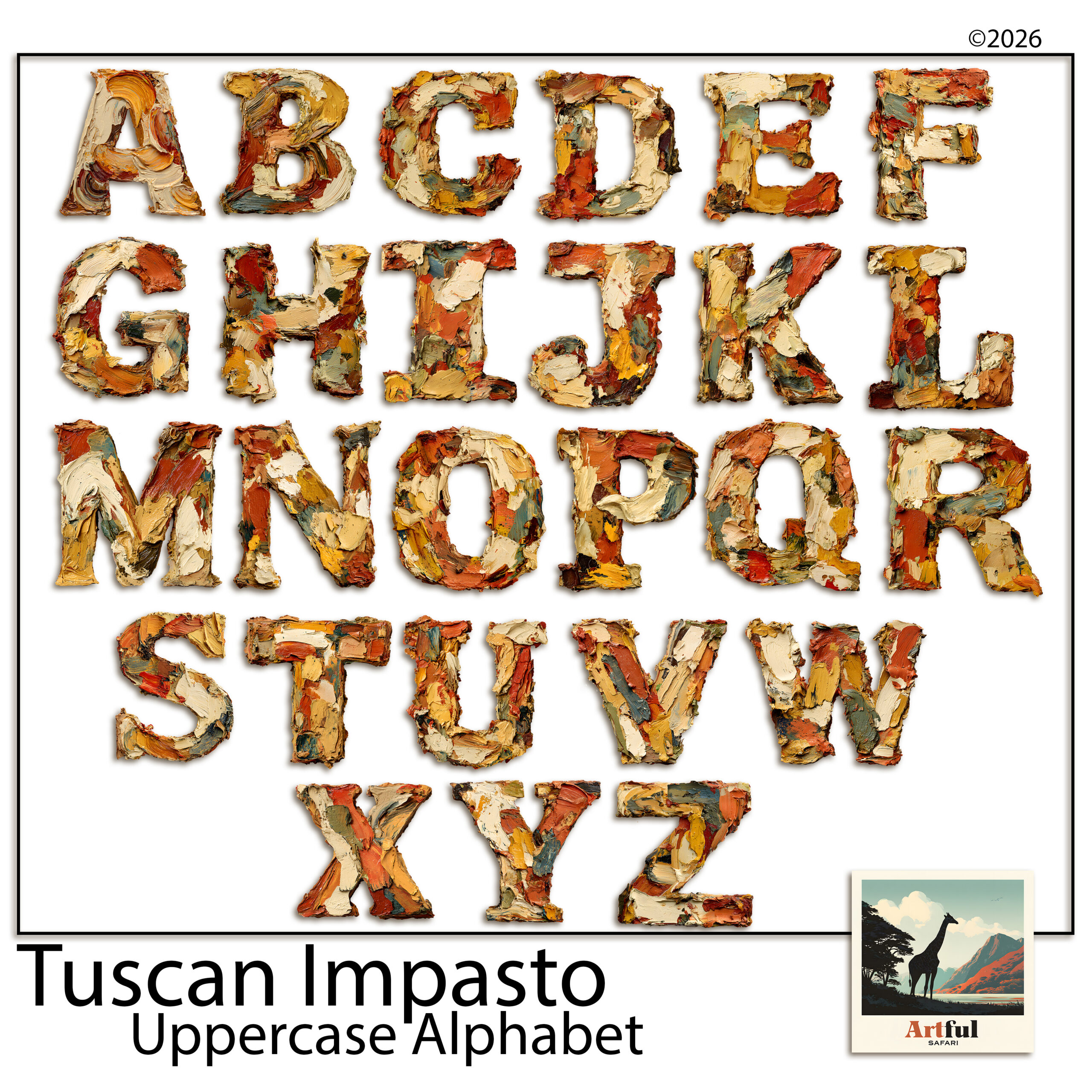
Painterly capitals suit a Tuscan or rustic page. Blue-and-gold letters suit something formal or festive. A set that clashes with your papers will sit on the page like a sticker that wandered in from another album.
2. Uppercase does the heavy lifting
Most decorative titles are short and set in capitals, so a strong uppercase set covers nearly everything you’ll do. Lowercase decorative letters are fiddly to line up and rarely needed for a header.
3. Check it’s a real PNG set
Each letter should arrive on a transparent background as a proper PNG, at 300 DPI, so it drops onto your paper with no white box behind it. If the preview shows letters sitting on a white square, walk away.
4. Make sure you get the whole alphabet
Sounds obvious, but check. Some sets skip the rarer letters, or hand you capitals with no numbers. If you want to title a page “JOURNEY” and the set has no J, you’re stuck. A complete A to Z plus 0 to 9 and a couple of punctuation marks covers anything you’ll want to spell.
| Title length | Best approach | Why |
|---|---|---|
| 1–3 words | Alphabet clipart, uppercase | Each letter can be sized and placed by hand for impact |
| 4–6 words | One clipart word + a font for the rest | Keeps the feature without the fiddle |
| A full phrase | A font, every time | Readable, fast, and it won’t wander off the line |
How to build a title letter by letter
This is the part people find slow until they have a method. Here’s the one I use.
- Drop in the first letter and size it to roughly what you want.
- Add the next letter on its own layer, sitting it close but not touching.
- Repeat across the word, eyeballing the gaps as you go.
- Once the word is built, select all the letters and align them along the bottom, so they sit on one line.
- Group them. Now you can move or resize the whole word as one piece.
Build each word as its own group. A two-word title is then two blocks you can slide around the page until the spacing feels right.
One habit that saves a lot of grief: size the letters once the word is grouped, not one by one. If you resize each letter individually you’ll never get them to match. Group first, then scale the whole word up or down as a single object, and they stay in proportion.
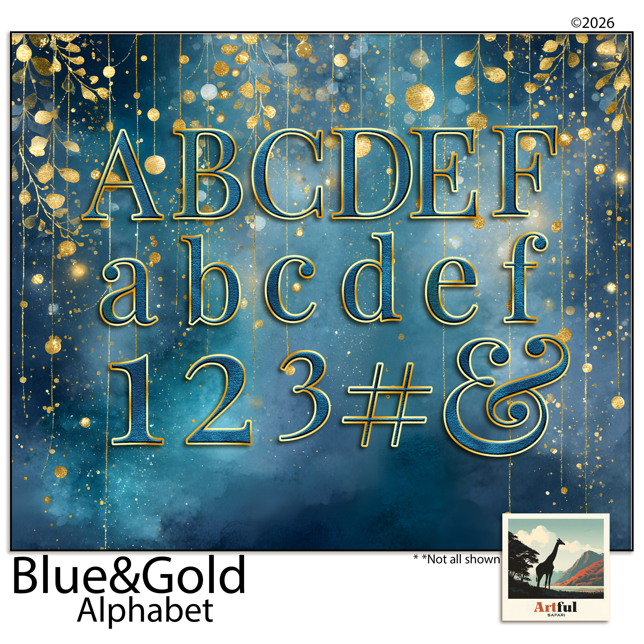
If your set comes in more than one colour or finish, pick one per title and stick to it. A word that mixes gold and blue letters reads as a ransom note, not a header.
Spacing, kerning and the mistakes that make it look off
Hand-placed letters can look brilliant or clumsy, and the difference is almost always spacing. A font handles the kerning for you behind the scenes; with clipart you’re the one doing it, so it pays to know what to watch for.
- Even gaps beat equal gaps. An A next to a V can sit closer than two flat-sided letters. Trust your eye over the ruler.
- Mind the baseline. Decorated letters often have flourishes that throw off where the letter “sits”. Line up the main body, not the curl.
- Don’t mix two decorated sets in one title. One ornate alphabet plus a plain font for the small words. Two ornate sets together just shout.
- Give it air. A title crammed edge to edge loses its impact. Leave space around it so it reads as the headline of the page.
- Overlap on purpose, not by accident. Letters that just barely touch look like a mistake. Either keep a clear gap, or overlap them properly so it reads as a deliberate style. The halfway house is the one that looks wrong.
If a title still looks off after all that and you can’t say why, try this: step back from the screen, or zoom out so the page is small. Spacing problems jump out at thumbnail size that you’d never spot up close. It’s the quickest fix I know.
Titling is a whole skill in itself, and clipart is only one route into it. For the wider picture, including font pairings and placement, see Scrapbook Page Titles.
Key takeaways
- Alphabet clipart is for short, loud titles — three words or fewer. Use a font for anything longer.
- Match the set to your kit and lean on uppercase; it covers nearly every header you’ll build.
- Build each word as a group, align to the baseline, then move the whole thing as one piece.
- Space by eye, not by ruler, and never stack two decorated alphabets in one title.
- Buy a complete A to Z with numbers, and pick one colour per title so it reads clean.
Frequently asked questions
What’s the difference between alphabet clipart and a font?
A font is typed and flows automatically. Alphabet clipart is individual decorated letter PNGs you place by hand, which gives a richer look but only suits short titles.
Should alphabet clipart be uppercase or lowercase?
Uppercase covers nearly everything. Most decorative titles are short and set in capitals, and lowercase decorative letters are fiddly to line up for a header.
Why do my clipart letters look uneven?
It’s almost always spacing. Space letters by eye rather than with equal gaps, and align the main body of each letter to one baseline rather than the flourishes.
Can I mix two alphabet sets in one title?
Better not to. One decorated alphabet plus a plain font for the small words reads clean. Two ornate sets in the same title fight each other.