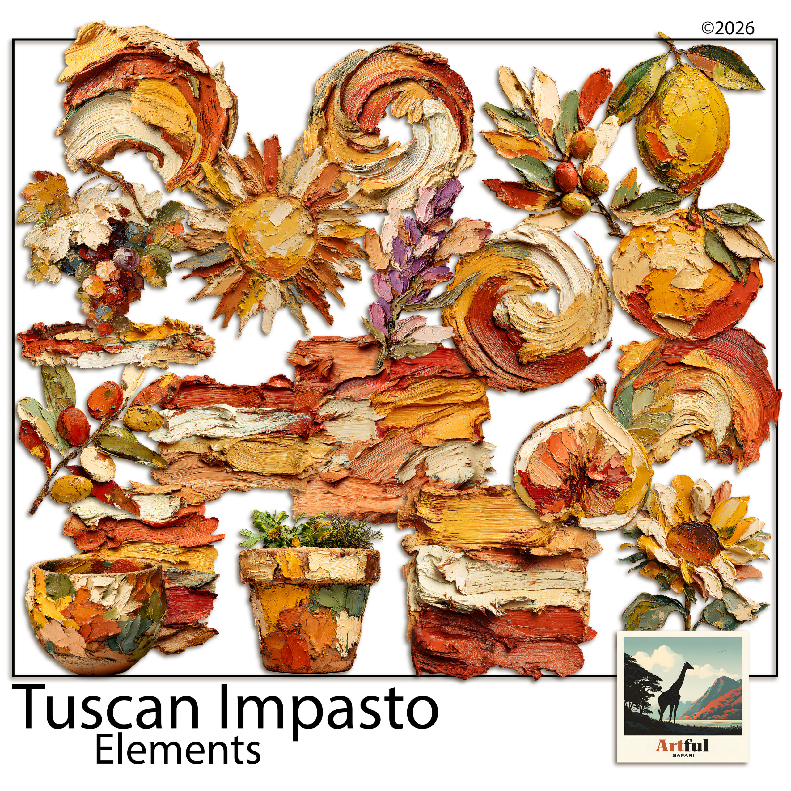
Italian wedding clipart is a set of illustrations, think olive branches, lemons, terracotta and hand-painted florals, that you drop into your invitation design to give the whole suite a Tuscan, Mediterranean feel.
It works because an Italian wedding already has a ready-made look: sun-warmed gardens, long tables, citrus and olive. A few well-placed motifs carry that mood across the save-the-date, the invite and the menu without a single word of explanation.
Table of Contents
What is Italian wedding clipart and where does it fit?
Italian wedding clipart is digital art, usually transparent PNGs, that you layer into a design tool like Canva, Photoshop or Procreate. You build the invitation suite on screen, then either keep it digital or export it at full quality and send it to a printer. The clipart is the decoration; your layout, fonts and photos do the rest.
It sits at the heart of any Tuscan, Amalfi or Italian-garden theme. Couples reach for it when they want warmth and a sense of place rather than a stiff, formal card. A destination wedding in Puglia, a back-garden party with a long table and string lights, a vineyard ceremony: the same handful of motifs reads right for all of them.
It also stretches well past the invite. The same olive branch can carry through to the order of service, the welcome sign, the table plan and the favour tags, which is exactly what gives a wedding that pulled-together feel on the day.
The pieces of a stationery suite
A full suite usually runs to a handful of matching pieces, and the clipart is what holds them together:
- Save-the-date
- Main invitation
- RSVP card
- Details or information card
- Menu and place cards
- Thank-you card
Which Italian wedding clipart motifs suit stationery?
Not every illustration earns its place on a wedding invite. Some carry elegance, others tip into a fruit-stall look fast. Here’s how I’d sort the usual Tuscan motifs.
| Motif | Mood it sets | Best placement |
|---|---|---|
| Olive branch | Understated, timeless | Border, corner sprig, monogram wreath |
| Lemon & citrus | Bright, summery, relaxed | Save-the-date, welcome sign, menu accent |
| Fig & grape vine | Rich, late-summer, rustic | Menu header, table numbers |
| Hand-painted florals | Romantic, soft | Top of the invitation, RSVP |
| Terracotta jug or urn | Earthy, characterful | Detail card, single feature spot |
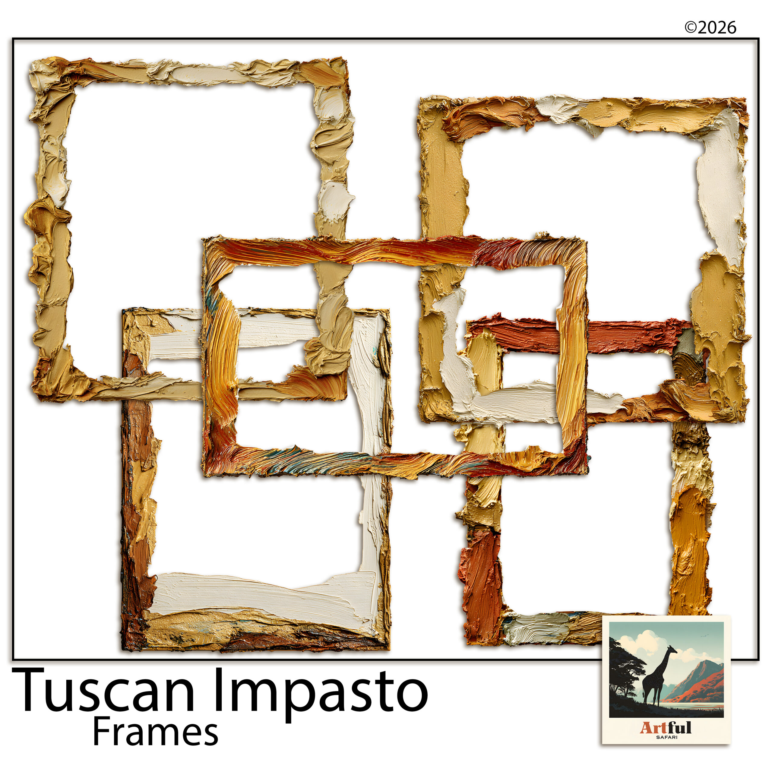
| Oil-paint frame | Formal, framed | Around names or a monogram |
Building an invitation suite with Tuscan clipart
Once you’ve picked the Italian wedding clipart you’re working with, the build is straightforward. I work in this order:
- Settle the palette first. Two or three colours from the clipart, no more.
- Design the main invitation before anything else. It sets the tone every other piece copies.
- Pick one hero motif. An olive wreath or a single floral spray. Let it lead.
- Repeat it smaller across the suite. A corner sprig on the RSVP, a sprig on the menu. Repetition is what makes a set look like a set.
- Leave breathing room. White space reads as expensive. Crowding reads as a flyer.
- Export at full quality, 300 DPI. If the pieces are going to a printer, this is the difference between crisp and fuzzy.
Build the save-the-date last, not first. By then you’ve made every design decision on the main invite, so the save-the-date becomes a five-minute job: same motif, same palette, a few words swapped. Working in that order saves you redoing the look twice.
Colour palettes for a Tuscan wedding theme
Italian wedding clipart already gives you a palette. These three combinations almost never miss:
- Olive, cream and soft gold for a classic, garden-formal feel.
- Lemon yellow, white and navy for a brighter Amalfi-coast summer wedding.
- Terracotta, sage and ivory for an earthy, autumn-leaning Tuscan day.
Whichever you pick, hold the line at three colours. The art carries the warmth, so the page itself can stay mostly cream or white with the motifs doing the talking.
Which fonts pair with Italian wedding clipart?
Clipart sets the scene, but typography is what makes a suite feel grown-up or homemade. The pairing I trust: one elegant script for the couple’s names, and one clean serif for everything else. The script brings the romance, the serif keeps the details legible, which matters most on the part where Aunt Sandra needs to read the date and the postcode.
Two small habits keep it tidy:
- Use the script sparingly. Names and a heading, not the body text. Script in long paragraphs is hard work to read.
- Give the type room. Let the clipart frame the words rather than crowd them, so the page doesn’t feel stuffed.
Digital invitations or printed: does it change anything?
Italian wedding clipart works either way, but the finish differs. For a digital invite sent by email or a wedding-website graphic, export as a PNG or JPEG at screen size and you’re done. For printed stationery, set your canvas at the final card size, keep everything at 300 DPI, and leave a few millimetres of bleed if your printer asks for it. Same design, two exports.
One thing to watch with print: deep terracotta and navy can shift slightly on uncoated card. If the colour really matters, a test print before the full run saves a nasty surprise.
Where Italian wedding clipart tips into kitsch
The fastest way to cheapen an Italian suite is to use everything at once. Lemons and olives and figs and a jug and a frame on one card, and suddenly it’s a tablecloth, not a wedding invite. A few rules keep it on the right side:
- One hero motif per piece, supporting motifs kept small.
- Skip cartoonish, glossy art. Hand-painted and oil-paint styles read grown-up.
- Let the typography do the formal work; the clipart only sets the scene.
If you’re stuck, take the rule of thumb most stationers swear by: design the card, then remove the last thing you added. Nine times out of ten it was one motif too many. An invite that feels a touch too plain in your editor almost always looks elegant printed and in someone’s hand. Busy rarely does.
What to check before you use Italian wedding clipart on stationery you sell
If you’re a stationer designing for paying couples, the licence matters as much as the look. Designing invitations for clients is commercial use, so you need a commercial licence, not a personal one. Check whether there’s a cap on the number of finished suites, and never pass the original PNGs on to the couple as files. You sell them the finished, flattened stationery, not the art.
One more for stationers: keep your working files and a copy of the licence together, per couple. If a client comes back a year later wanting a thank-you card to match, you’ll be glad you can find the exact pack and the exact terms without guessing.
Not sure where to source good packs in the first place? I put together a guide on Where to Buy Tuscan Clipart that covers what to look for before you buy.
Key takeaways
- Italian wedding clipart gives a stationery suite an instant Tuscan, Mediterranean feel.
- Olive branches and hand-painted florals are the safest, most elegant motifs.
- One hero motif per piece, repeated small across the suite, keeps it cohesive.
- Selling stationery to clients needs a commercial licence; never hand over the source files.
Frequently asked questions
What is Italian wedding clipart used for?
It’s digital art you layer into a design tool to decorate wedding stationery, from save-the-dates to menus, giving the suite a Tuscan or Mediterranean look. You can keep it digital or export it for printing.
Which Italian motifs look most elegant on invitations?
Olive branches and hand-painted florals are the safest choices for an elegant feel. Lemons and figs work well too, but keep them small so the suite doesn’t tip into a fruit-stall look.
Can I sell wedding invitations I design with the clipart?
Yes, if you have a commercial licence. Designing stationery for paying couples is commercial use, so check the licence covers it and never hand the original art files to the client.
What colours suit a Tuscan wedding theme?
Olive, cream and soft gold for a classic look; lemon, white and navy for a bright Amalfi feel; or terracotta, sage and ivory for an earthier, autumn-leaning palette.
What size or quality should wedding clipart be for printing?
Use transparent PNGs and export your finished design at 300 DPI. That keeps the art crisp when the stationery goes to a printer.