
A dark academia scrapbook page fails in a very specific way: you pick beautiful moody papers, layer them up, and the whole spread turns into one dark smudge. The photo disappears. The journaling disappears. Everything you liked about the individual pieces cancels out.
The fix isn’t lighter papers. It’s contrast — and there are only a handful of places you need to put it.
The dark academia papers, elements and word art are all in the Enchanted Hours collection.
Table of Contents
Why a dark academia scrapbook page goes flat
Dark academia as an aesthetic borrows from old libraries, natural-history cabinets and candlelit portraiture. If you want the background, the style’s origins sit in classic-literature and campus-novel imagery, which is why it leans so hard on ink, oxblood, brass and faded olive.
Those colours all share a problem. They’re mid-to-dark in value, and they’re all slightly desaturated. Put two of them next to each other and your eye can’t find an edge.
Painters solved this centuries ago with chiaroscuro — deliberately extreme light against deliberately extreme dark, with very little in between. A layout works the same way. You need a genuine light and a genuine dark on the page, not four shades of “quite dark”.
1. Give every dark academia scrapbook layout one true light
Pick one element that is properly pale — parchment, bone, unbleached cream — and let it carry the photo and the journaling.
It doesn’t need to be large. A single cream card floating on an ink-black ground reads as intentional. The same card on a mid-olive ground reads as a mistake.
The practical test: squint at the page. If you can still see a clear light shape, it works. If it all mushes together, your lightest element isn’t light enough.
2. Use pattern scale to separate your layers
When two papers sit at similar darkness, scale does the work colour can’t.
- Large, open pattern underneath — a wide damask, a loose botanical, a big harlequin diamond.
- Tight, dense pattern on top — fine lace, small repeating motifs, a close cobweb lattice.
- Plain between them — a solid or near-solid mat that stops the two patterns arguing.
The jump in scale is what your eye reads as depth. Two patterns at the same scale, however different their motifs, will always look like one busy sheet — which is the single most common reason a dark academia scrapbook layout stalls.
3. Borrow the toile trick for scene-setting
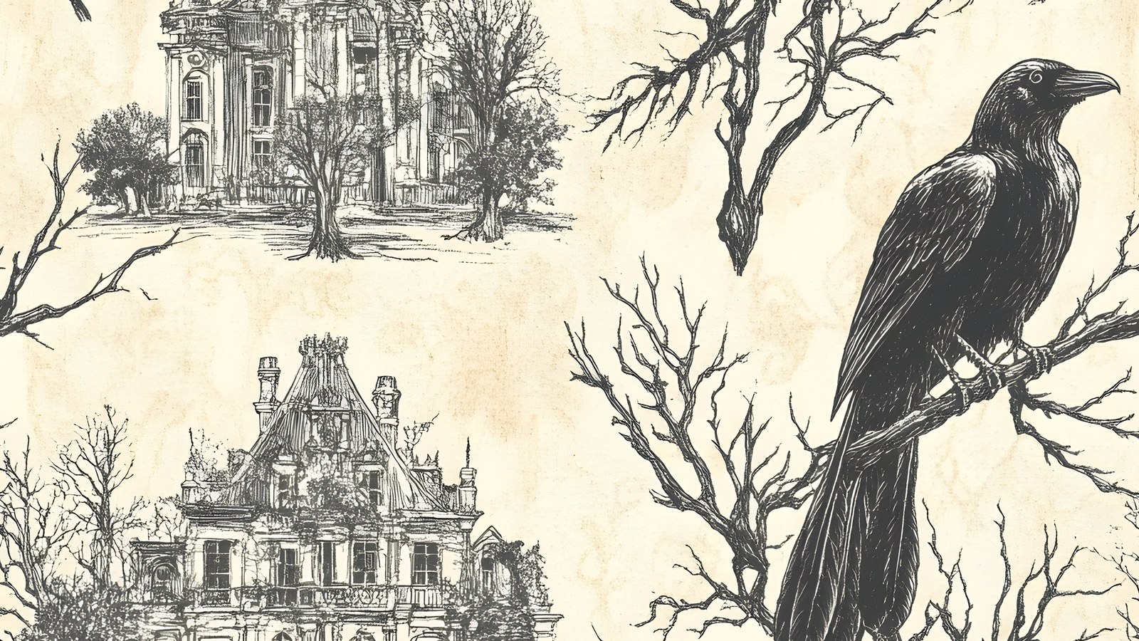
Line-drawn scenic papers — houses, bare branches, birds — are the closest thing this aesthetic has to a cheat code. Toile prints put detailed dark line work on a pale ground, so they’re simultaneously busy and light.
That combination is rare and very useful. A toile paper can be your “true light” from point one while still carrying enough detail to set a mood, which means it can sit directly behind a photo without needing another mat.
4. Add metal, not colour
The instinct when a page feels dull is to add a brighter colour. In this palette that usually backfires — a clean bright hue looks modern and snaps the spell.
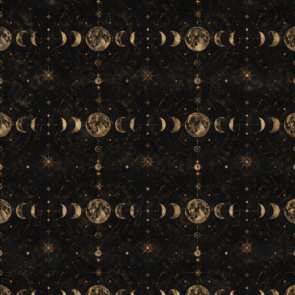
Add a metallic instead. Antique gold, tarnished brass and dull silver read as highlights rather than as new colours, so they lift the page without breaking the period feel.
Keep it to two or three placements. Metallics work as punctuation; used as a wash they turn everything ornamental and a dark academia scrapbook page loses the quiet that makes it convincing.
5. Leave one area genuinely empty
This is the hardest one and it matters most on a dark spread. Dense dark layouts need somewhere for the eye to rest, and “rest” means empty, not “filled with a subtler texture”.
The still-life painters knew this. A vanitas composition is mostly shadow with a few objects catching light — the emptiness is what makes the objects read.
Aim for roughly a quarter of your page carrying nothing but background. It will feel wrong while you’re building it and right when you step back — and on a dark academia scrapbook spread it’s usually the change that finally makes the photo read.
Putting a dark academia scrapbook page together
Working through those five points in order, a spread comes together quickly: pick your true light, choose two patterns at different scales, set the mood with a scenic or celestial paper, add two touches of metal, then protect the empty quarter.
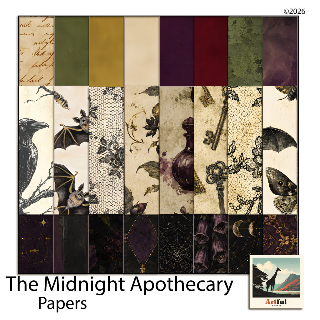
For a worked example I’ve been using the Midnight Apothecary paper collection, which was built around exactly this problem — it pairs genuinely dark grounds with pale toile and parchment sheets, so the light and dark ends are both actually there.
A quick palette that works
- Ground — ink black or deep olive, large open pattern.
- Mat — deep plum or oxblood, plain.
- Light — parchment or cream toile, carrying photo and journaling.
- Highlight — antique gold, two or three placements only.
If you want to push it warmer for autumn spreads, the same structure holds with the ground swapped — the burnt orange palettes post covers how to keep a warm dark from going muddy.
Choosing papers for a dark academia scrapbook
Most digital paper packs in this aesthetic are sold on mood, and mood is not the thing that determines whether a layout works. When you’re assessing a set, ignore the styled preview and count value ranges instead.
A usable dark academia scrapbook set needs at least three things, and a surprising number of packs only have two.
- Genuinely dark grounds — not “deep grey”, but papers that read as near-black or near-black-green at a glance.
- Genuinely pale sheets — parchment, bone, aged cream. These are what most moody packs skip, and their absence is why the layouts go flat.
- Plain or near-plain mats — solid-ish papers with texture but no motif, to sit between two patterns.
Patterned mid-tones are the easy part and every pack has plenty. If a set is all mid-tones, you can still use it, but you’ll be supplying the light from elsewhere every single time.
The other thing worth checking is whether the scenic sheets are usable as backgrounds or only as focal pieces. A scenic paper with a busy centre can’t sit under a photo; one with detail around the edges and a quieter middle can do both jobs, which is much better value in a dark academia scrapbook context.
How many papers you actually need
Fewer than you’d think. A double-page dark academia scrapbook spread rarely uses more than five papers — a ground, two patterns at different scales, a mat and a light. Everything beyond that is choice, not necessity.
Which is why a mid-sized pack with genuine range beats a huge pack of variations on one value. Count the distinct value steps, not the file count.
Common mistakes worth avoiding
A few things come up again and again on moody layouts.
- Dark photo on a dark ground. If your photograph is low-key, the mat has to be the light, not the ground.
- Black text on a dark paper. Use the parchment card. Dark-on-dark journaling is unreadable in print and worse on screen.
- Every element aged. If the papers, the frames and the ephemera are all distressed, nothing looks old — it just looks noisy. Keep one clean element.
- Too many motifs. Moths, ravens, moons, keys, bottles and skulls on one page is a catalogue, not a layout. Pick two motifs and repeat them.
None of this is specific to one palette, incidentally — the same contrast logic rescues any dark scheme. The purple layouts post works through the lighter end of the same idea.
Where to start
If you’ve had a dark academia scrapbook page sitting half-finished because it went muddy, don’t rebuild it. Pull one element out and replace it with something genuinely pale, then clear a corner.
Most flat layouts are one true light and one empty quarter away from working.