Scrapbook page titles work when they’re short, sized to be seen and clearly contrasted against the paper behind them, so the title names the page in a second and then steps aside for the photos.
The fiddly part is alphabet clipart, where each letter is its own PNG and you assemble the word by hand. Get the spacing and contrast right and it lifts a page; get them wrong and it reads unfinished.
Table of Contents
How do you make a scrapbook page title that actually reads?
A scrapbook page title earns its place by telling you what the page is in a second, then getting out of the way of the photos. The two jobs people get wrong are size and contrast. A title that’s too small disappears, and one that sits in the same tone as the paper behind it turns to mush.
Pick a short phrase, give it room, and make sure it stands clearly off the background. Everything else is styling. A title is a signpost, not the destination, so if you’re spending longer on the lettering than on the layout, you’ve got the balance backwards.
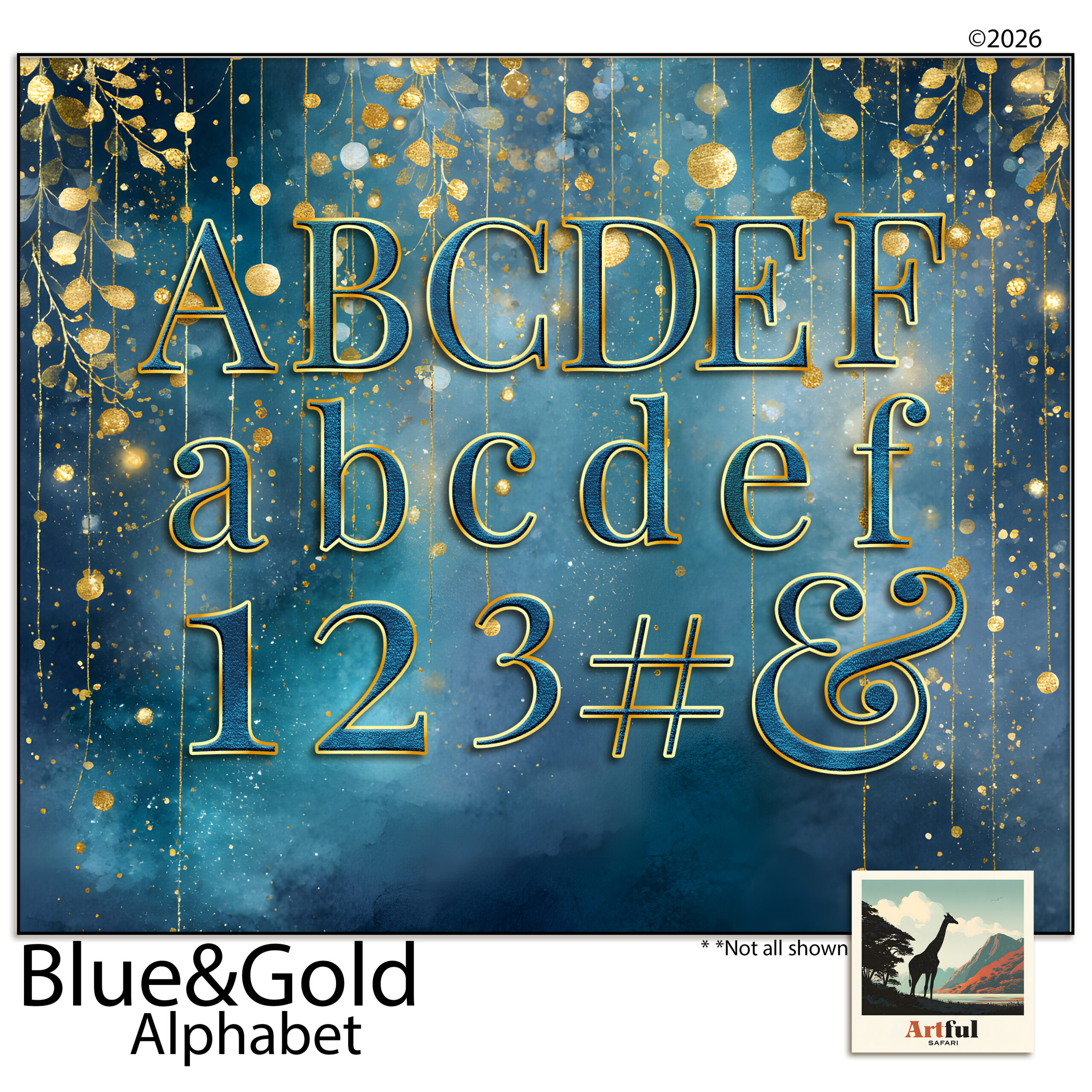
Where to put scrapbook page titles on the layout
There are really only a handful of spots that work, and they all leave the photos as the main event.
- Top-left or top corner. We read left to right and top down, so a title here gets seen first without a fight.
- Across the bottom. Reads like a caption and leaves the upper page to a big photo.
- Tucked into a quiet corner of the photo. Works when the image has empty sky, water or wall to sit on.
- On a banner or journaling card. A solid shape behind the letters gives instant contrast on a busy paper.
Whatever you choose, keep a clear margin around the word. Letters jammed against a photo edge look like an accident. If the page already has a strong focal point, a single hero photo say, put the title near it but not on top of it, so the eye lands on the photo and the title confirms what it’s looking at.
Alphabet clipart vs a font: which should you use?
Both can set a scrapbook page title. They behave differently once you’re on the page.
| Alphabet clipart | A font | |
|---|---|---|
| Texture | Painted, foiled, dimensional, matches a kit | Flat colour unless you add effects |
| Spacing | You place each letter, full control | Type and go, faster |
| Best for | Big feature titles, the hero word | Subtitles, dates, journaling |
| Effort | A little fiddly, letter by letter | Quick |
My usual move is alphabet clipart for the one big word and a plain font underneath for the date or the place. The textured letters carry the mood; the font keeps the details legible. Trying to set a whole long title in clipart letters is where people lose an afternoon and end up with wonky spacing, so reserve the clipart for the word that matters.
Step by step: building a scrapbook page title with alphabet clipart
Alphabet clipart comes as one PNG per letter, so you’re assembling the word rather than typing it. In Procreate, Photoshop or Canva the steps are the same.
- Drop in your first letter and size it to roughly the height you want the whole title.
- Bring in the rest, one at a time, on their own layers so you can nudge each one.
- Even out the spacing. Trust your eye over a ruler, since a rounded letter like O needs to sit a touch closer than a straight one like I.
- Sit the baseline level, or deliberately stagger it for a playful look, but commit to one or the other.
- Group the letters once it reads right, then resize the whole word as a unit.
- Add a soft shadow if the letters fade into the paper. A small drop shadow lifts them off the background.
Mind the letter spacing
Uneven gaps are the giveaway that a title was built by hand. Step back from the screen, or shrink the canvas right down. Spacing problems jump out at a small size that you’ll miss up close. The eye reads the gaps between letters as much as the letters themselves, so aim for even visual space rather than even measured space. Two straight letters need a little more room; a letter that opens outward, like an L or a T, can tuck closer to its neighbour.
How do you match the lettering to the page?
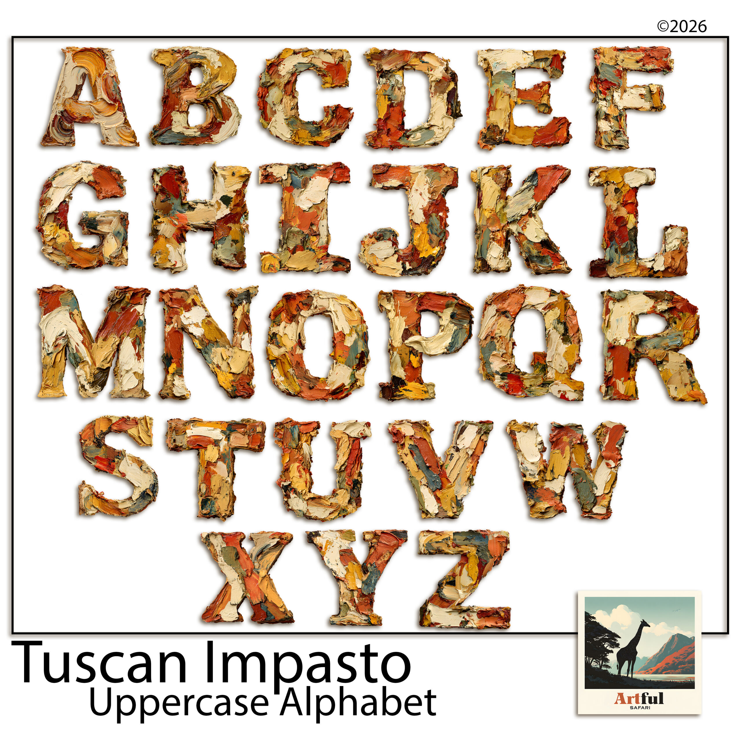
A scrapbook page title should belong to the same world as the rest of the layout. A painted, oil-textured alphabet looks at home on a warm Mediterranean or vintage page and out of place on a crisp, modern one. A few quick checks before you commit:
- Colour. Pull the title colour from somewhere already on the page, a tone in a paper or a photo, so it ties in rather than floating.
- Weight. A heavy clipart alphabet wants a bold, simple layout. A fine script wants more white space around it.
- Era. A serif or hand-lettered style suits heritage and travel pages; clean sans-serif suits everyday and modern ones.
Do you need a title on every page?
No, and trying to is part of what makes albums feel repetitive. A scrapbook page title’s job is to mark a new chapter or a page that needs context. A run of everyday photos on matching paper often reads better with a single date or a one-word label than a full decorative title fighting for attention on every spread.
A good rhythm across an album is a strong title on the opening page of each section, smaller labels or dates on the pages in between, and the occasional page left to speak for itself. If every page shouts, none of them stands out. Save the big lettering for the moments that earn it, and the album gets a sense of pace instead of feeling like the same page on repeat.
What are the most common scrapbook page title mistakes?
- Too many words. “Our wonderful family summer holiday by the sea” is a sentence. “Summer by the Sea” is a title.
- Clashing styles. A painted Mediterranean alphabet on a sleek modern page reads off. Match the lettering to the kit.
- No contrast. Pale gold letters on a cream paper vanish. Put a banner or shadow behind them.
- Centred everything. A centred title over a centred photo on a symmetrical page is flat. Shift the title off-axis.
If you want a full breakdown of choosing letter sets, I went deeper in Uppercase Alphabet Clipart.
Key takeaways
- Good scrapbook page titles are short, sized to be seen, and clearly contrasted against the paper.
- Use alphabet clipart for the one hero word and a plain font for dates and journaling.
- Build clipart titles letter by letter on separate layers, then group and resize as a unit.
- Uneven spacing and weak contrast are the two faults that make a hand-built title look unfinished.
Frequently asked questions
How do you make a scrapbook page title?
Pick a short phrase, place it top-left or along the bottom, and make sure it contrasts with the paper. Use alphabet clipart or a bold font for the main word and a plain font for the date underneath.
What is alphabet clipart for scrapbooking?
It’s a set of decorative letters supplied as one transparent PNG per letter, so you build a word by dropping in each letter on its own layer. It gives painted or foiled titles that match a themed kit.
How many words should a scrapbook page title have?
Two to four works best. A long sentence reads as journaling, not a title, so trim it to the shortest phrase that still says what the page is.
Why does my clipart title look off?
Usually uneven letter spacing or weak contrast. Shrink the canvas to spot gap problems, and add a soft shadow or a banner behind pale letters so they lift off the paper.