
There is a particular kind of photo that never quite suits a busy layout — the quiet ones. A walk under bare trees, a cabin weekend, first snow, an autumn trail with the light coming sideways through the branches. Crowd those pictures with bright patterns and confetti and you lose the very thing that made you keep them. A woodland scrapbook page works the other way round: it gives the memory room to sit still.
This guide walks through how to build a woodland scrapbook page from the background up — choosing papers, pairing a soft forest palette, and layering photos so the page feels restful rather than empty. The examples use painted birch tree paper, because birch is about as forgiving a starting point as this style gets, but the same thinking carries across any nature-led spread.
Table of Contents
Start your woodland scrapbook page with a background that can breathe
Most crowded pages are crowded because the background is already doing too much. A restful woodland scrapbook page usually pairs one expressive sheet with several near-plain ones, and lets the plain sheets carry most of the surface area.
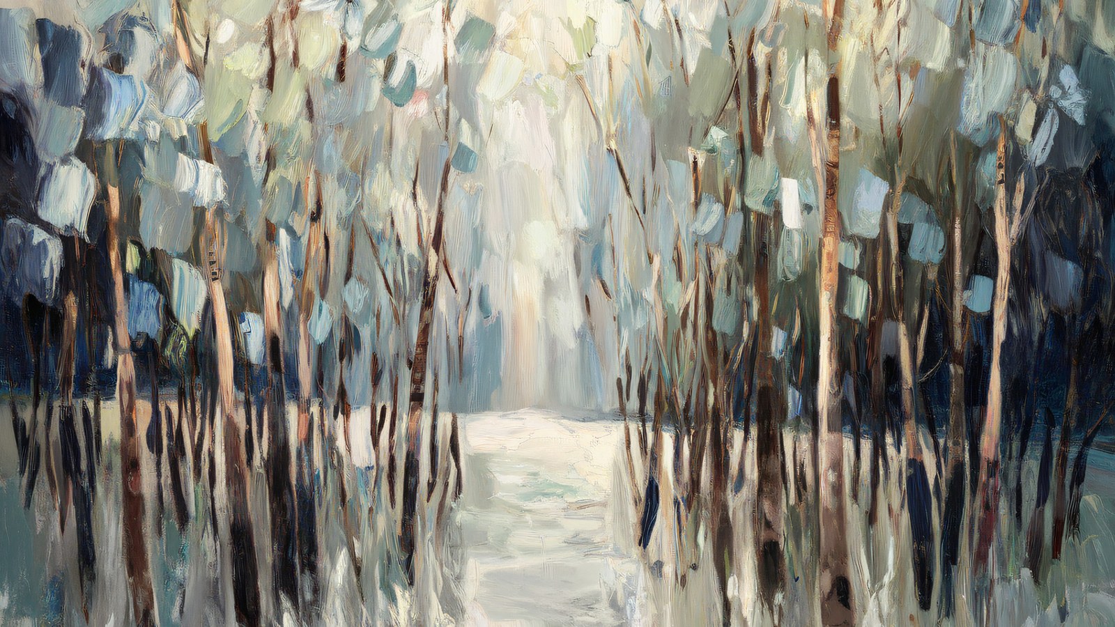
So it helps to think of your papers in two jobs. The painted scenes — a birch grove, a misty tree line, a single trunk against a pale sky — are your feature sheets. They are lovely, and they are loud enough that one is usually plenty per spread. The textured solids — bark white, warm grey, sage mist, a dusty blue — are your quiet sheets. They read almost as a single colour from arm’s length, which is exactly what you want behind a photo or a block of journaling.
A simple rule of thumb: if you can read text comfortably laid over a paper, it can go behind your words. If it fights the text, keep it as a feature and mat your photo onto a quiet sheet instead.
The colour logic of a woodland palette
Woodland colours already coordinate in nature, which does half the work for you. The trick to keeping a woodland scrapbook page quiet is restraint in the proportions, not the number of colours.
The old decorator’s 60/30/10 split translates neatly to a scrapbook page. Give roughly 60 per cent of the page to a dominant quiet tone — bark white or a soft grey is ideal because it behaves like a neutral. Give about 30 per cent to a supporting colour from the same family, say sage or a muted blue, on mats and borders. Then keep the last 10 per cent for an accent: a deeper charcoal or a slate blue used sparingly, on a title strip or a small tag, to stop the whole thing drifting into pastel soup.
That single darker accent matters more than people expect. A page built entirely from pale sage and cream can look washed out on screen; a thin charcoal edge or a dark journaling block gives the eye somewhere to land and makes every soft colour beside it read as deliberate.
Layering without crowding the page
Layering is where a woodland scrapbook page is won or lost. The instinct is to fill the space; the better move is to build a small stack in one area and leave the rest open.
- Anchor with the photo. Mat it on a quiet textured sheet, slightly larger than the photo, so a thin border of paper frames it. One mat is elegant; three stacked mats start to shout.
- Let a painted scene sit behind, not around. If you use a birch grove as the background, keep photos and text over the calmer part of the image — the misty middle distance rather than the busy trunks — so nothing competes.
- Give journaling its own quiet block. A rectangle of near-solid paper behind your words reads as intentional and keeps the text legible over any texture.
- Leave one corner empty. Negative space is a design element. An open corner is what makes the difference between “minimal” and “unfinished” — it frames everything else.
Putting the woodland scrapbook page together
Here is how those ideas stack on a real spread. Start with a bark-white texture across the full 12 × 12 page as the base. Drop a painted birch scene into the top two-thirds as a feature band, and mat your main photo onto a soft sage sheet placed over the calmer lower third. Add a slim charcoal strip beneath the photo for the date, and a small block of dusty-blue paper for a line or two of journaling. That is five papers doing five clearly different jobs — and the page still feels quiet, because only one of them is trying to be the star.
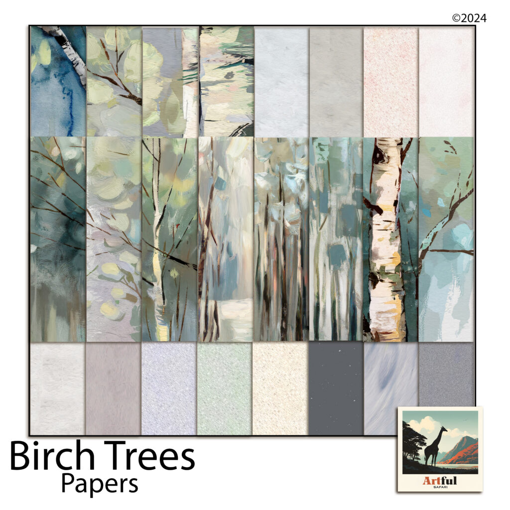
Because these are digital papers, the whole process is non-destructive — drag a sheet in, resize it, swap it for a different texture if the balance feels off, and nothing is wasted. It is the fastest way to test the 60/30/10 idea, since you can recolour a mat or trade a sage sheet for a blue one and see the page shift in seconds. Everything drops straight into Procreate, Photoshop, Canva, or GoodNotes at the standard 12 × 12 size.
A few finishing touches
Once the structure works, small details make the woodland scrapbook page feel considered. Round the corners of a mat by a pixel or two so it sits softer against the painted background. Add the faintest drop shadow under photos and journaling blocks to lift them off the page — woodland pages suit a light touch here, just enough to suggest depth. And keep your title small; on a restful page, a quiet title in a single accent colour says more than a large one.
The point of a woodland scrapbook page isn’t to decorate the memory — it’s to stay out of its way. Choose one feature, keep the rest quiet, mind your proportions, and leave a little room to breathe. The photos of the quiet moments have been waiting for a page that lets them stay quiet.