
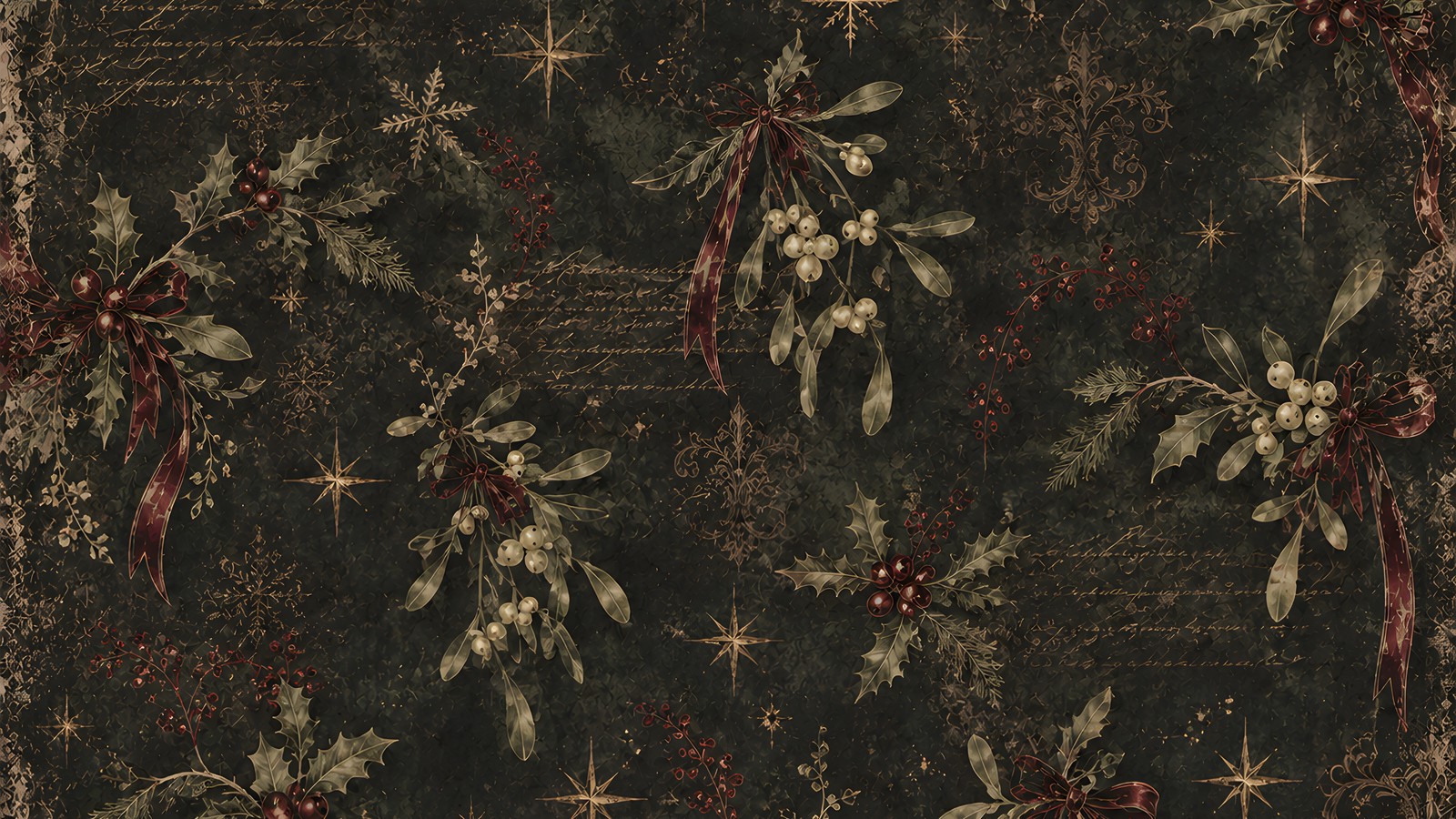
A gothic scrapbook page is easy to want and awkward to finish. You lay down a black damask ground, add holly and a raven, and by the third layer the page has drifted away from Christmas and landed somewhere near Halloween.
The fix is almost never more decoration. What has usually gone wrong is contrast, plus the question of where the warm colour is allowed to sit.
Below are six rules I keep coming back to when I build a gothic scrapbook page for Christmas, with a worked example at the end.
Table of Contents
Why a gothic scrapbook page stops reading as Christmas
On a bright kit the paper does the festive work for you. Cream and pine green announce the season before you have placed a single element.
A dark ground announces nothing at all. It hands you atmosphere and takes away every seasonal cue the eye normally leans on, so each cue has to be put back deliberately.
The second problem is value rather than colour. Value is simply how light or dark a thing is, and charcoal ivy on charcoal paper is technically present and effectively invisible, and a page built from near-misses like that reads as a smudge from across the room.
What the eye actually reads as Christmas
Shape carries more of it than colour does. A bauble silhouette or a star with long points will do the job on its own, even in near-black.
Warmth carries the rest. Put one warm source somewhere on the page, whether that is a candle, a lantern or the rim of a gold label, and the eye reads midwinter indoors rather than a graveyard at dusk.
Rule 1: commit to one dark ground
Pick a single dark paper and let it run the whole gothic scrapbook page. Bottle green, charcoal or oxblood all work as that ground. The mistake is using two of them as grounds on the same layout, because then neither one is the background the rest of the page can sit on.
If you want variety, change the pattern rather than the colour. A damask and a plain sheet in the same bottle green will layer happily, where a bottle green damask over a charcoal plain fights for the eye.
Plain grounds are worth more than people expect in a gothic scrapbook layout. A photograph on a plain slate sheet with one sprig in the corner looks composed; the same photograph on a busy pattern looks stranded.
Rule 2: red is a spice, and it should be oxblood
Bright, saturated Christmas red is the fastest way to make a dark page look like fancy dress. Against black it jumps forward off the paper and starts to buzz at the edges.
Oxblood, a deep brownish red, does everything red needs to do here. It looks like a red that has been sitting in a dark room for a century, so it reads as festive without shouting.
Keep it to small things. Berries, a ribbon tail, one bauble and the edge of a torn label add up to enough red for a whole page, and that restraint is what keeps a gothic scrapbook page looking designed.
Rule 3: put the gold where you want the eye to land
Tarnished gold behaves like light on a dark gothic scrapbook layout, which makes it the most directional thing you have. Whatever you gild is where the eye goes first.
So gild on purpose. A gold rim on the frame around your photograph pulls attention to the photograph; gold scattered evenly across the background pulls attention to nothing.
Two or three small placements are plenty. If you find yourself adding a fourth, take one away from somewhere else instead.
Rule 4: layer lace over plain, not over pattern
Black lace on a black damask is the trap everyone falls into once. Both are fine-detailed and roughly the same value, so the lace disappears into the damask and you have spent a layer on nothing.
Lace needs a quiet neighbour. Lay it over a plain ground, or over an aged cream paper where its edges can actually be seen, and it turns into the Victorian texture a gothic scrapbook page is usually reaching for.
The same logic applies to toile, marbling and any small repeating print. One busy paper per area of the page, with everything else kept plain underneath.
Rule 5: age a paper with a blendable, not a brush
A blendable is a cluster with feathered edges that fade out rather than stopping at a hard line. Drop one at 40 to 60 per cent opacity across a corner and the paper underneath looks older, softer and less like a flat digital fill.
Blendables also solve the problem of where a gothic scrapbook page ends. A lace band or a holly garland running off the edge of the sheet makes the layout feel continuous, rather than like a rectangle of decoration floating in the middle.
Use them under your elements, not over them. A blendable on top of a frame fogs the very thing you wanted sharp.
Rule 6: check a dark gothic scrapbook page on a second screen
This is the rule most of us skip, and it is the one that costs. Dark layouts look different on every panel they land on, and your own screen is the one flattering the page most.
Open the finished page on your phone at low brightness. If the raven has vanished into the ivy, brighten that one element on its own layer rather than the whole page, because lifting the brightness of everything will grey out the ground you worked so hard to keep deep.
If the page is heading for print, expect a dark sheet to come out heavier and flatter than it looks backlit. Leaving a little paper texture visible in the darkest areas gives the ink somewhere to go.
A worked example: one gothic scrapbook page, built in order
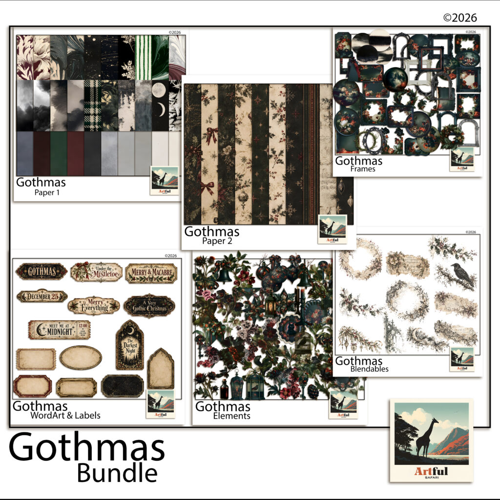
Here is the order I build a gothic scrapbook page in, using the papers and cut-outs from my own Gothmas bundle as the example. Any dark kit you already own will follow the same sequence.
Start with the ground. A bottle green damask fills the whole 12 x 12 inch sheet, and nothing else touches the background from here on.
Add the frame next, before any greenery. An ornate black arch with a tarnished gold rim goes slightly off-centre, which leaves one side of the page free for layering.
Then the botanicals, coming in from one corner. Hellebores and a mistletoe sprig tuck behind the frame edge so the arrangement looks like it grew there rather than being posted on afterwards.
Hellebores are worth knowing about if you are choosing your own. They flower in the middle of winter, which is why the RHS growing guide files them as a midwinter plant and why they belong on a Christmas page more than a rose does.
Now the red. Three small berry clusters, no bigger than a fingertip each, spaced so they lead the eye around the frame.
Word art goes last, and it goes small. A plaque reading Merry & Macabre at the base of the frame closes the page, and a blank label beside it leaves room to write the year in by hand.
That arch shape is borrowed rather than invented. Pointed arches and dark carved ornament came back into Victorian homes through the Gothic Revival, which is the same well these frames are drawn from.
Where to take it next
A gothic scrapbook page rewards restraint far more than a bright one does. Two patterns and one warm accent colour will carry a whole album on their own.
If you want the same mood without the Christmas, the rules transfer almost unchanged to dark academia pages, where the ground is usually ink or oxblood and the light comes from a lamp instead of a candle.
And if you would rather keep the season but soften the dark, the Victorian Christmas junk journal approach uses aged cream as its ground and puts the black into the ink and the lace instead.
Build one gothic scrapbook page with these six rules before you commit to a set. Once the palette and the gold placement are settled, the rest of the album follows the same recipe.