Burnt orange has a reputation problem in scrapbooking. Everyone buys it in September, uses it on two autumn layouts, and then leaves it sitting in the folder until the following year. Meanwhile it’s one of the most useful colours in a digital kit, and the reason it feels seasonal has almost nothing to do with the orange itself.
What makes a page read as October is the company the colour keeps. Change what sits next to burnt orange and the same papers will carry a wedding album, a travel spread or a plain family page in March without anyone thinking about pumpkins.
Table of Contents
Why burnt orange reads as autumn
Burnt orange is a dark, desaturated orange with brown underneath it. On its own that’s just a warm earth tone, and earth tones are seasonally neutral. Terracotta pots, clay, brick and rust all sit in this range and none of them say October.
The autumn signal comes from three specific companions: deep gold, forest green and near-black brown. Put those around burnt orange and you’ve built a harvest palette, because that combination is what leaves actually do. Take them away and the colour goes quiet again.
The two accents to avoid year-round
If you want a burnt orange page that isn’t seasonal, keep mustard yellow and dark olive off it. Those two do more autumn signalling than the orange ever does, and they’re often hiding in a kit’s element pack rather than in the papers, which is why a page can tip seasonal even when the background looked fine.
Three pairings that move it out of autumn
Each of these keeps burnt orange as the warm note and changes what it’s read against.
- Burnt orange with soft grey and cream. The most useful of the three. Grey strips the warmth out of the surrounding page, so the orange reads as a single considered accent rather than as a season. This is the combination that carries wedding and portrait pages.
- Burnt orange with dusty blue. Blue and orange sit opposite each other on the colour wheel, so this has real contrast in it. Keep both desaturated and it looks vintage rather than sporty. Good for travel and coastal spreads.
- Burnt orange with sage and stone. The quietest option. Sage is green but it’s a cool, grey-leaning green, so it doesn’t trigger the harvest read the way forest green does. Works all year for garden and everyday pages.
Let the orange be the smallest thing on the page
Warm colours advance, which means burnt orange takes up more visual room than it physically occupies. A strip of it will hold its own against half a page of grey. Once you know that, you can stop using it as a background and start using it as punctuation.
In practice: a burnt orange title on a cream page, a thin torn strip along one edge, a single bloom in a cluster of otherwise neutral flowers, or the mat behind a small photo. Any one of those carries the colour without committing the layout to it.
The pages that end up looking dated are usually the ones where burnt orange is doing the background job as well as the accent job. Pick one.
Photos matter more than papers here
This is the bit most colour advice skips. Burnt orange sits very close to skin tones, which is why it’s flattering behind portraits and why it can also go badly wrong. If your photo has warm indoor lighting, a burnt orange page will make the whole thing look like it was shot through a filter.
Two fixes, both easy. Put a cream or grey mat between the photo and the paper so the two warm surfaces never touch. Or pick the cooler papers from your kit for the photo area and keep the orange to the edges of the spread. If a page feels overcooked and you can’t work out why, this is nearly always it.
Putting it together
As a worked example, here’s a kit built around this range. Persimmon Calla Bells is 24 papers of terracotta calla lilies, white lily-of-the-valley bells and dried botanicals, and it’s a good test case because it pairs the burnt orange with white and warm grey rather than with gold and forest green.
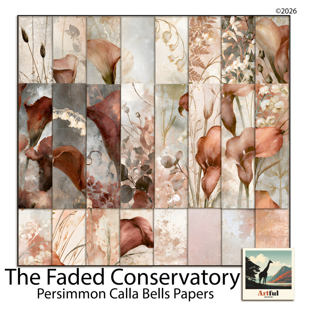
The white bell sprays are what keep it out of autumn. White is a cool interruption in a warm palette, and the kit uses it constantly, so the burnt orange never gets to build a harvest run with gold and green. That’s a deliberate choice you can copy with any kit by adding white or cream elements to a warm cluster.
A page from it might be: a plain persimmon blender at low opacity as the base, a botanical spray paper layered over the lower third, a warm grey mat under the photo, and the calla lilies used only as a corner cluster. The title goes in the darkest rust in the kit rather than in gold. Nothing about that page says October.
The short version
- Burnt orange isn’t seasonal, its usual companions are.
- Keep mustard, dark olive and forest green off the page if you want it year-round.
- Pair it with grey and cream, dusty blue, or sage and stone.
- Use it as an accent or as a background, never both on one page.
- Always put a cool mat between a warm photo and burnt orange paper.
Colours read in context rather than in isolation, and colour scheme choices do more work than the individual shades. Change the neighbours and burnt orange stops being a September colour and starts being one of the more flexible things in your folder.