
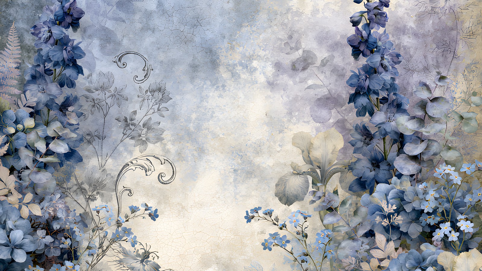
There’s a particular kind of scrapbook page that looks fine in the thumbnail and slightly sad up close. The papers are lovely, the layout is tidy, and the whole thing feels like a waiting room. Nine times out of ten the culprit is an all-cool palette with nothing warm anywhere in it.
Dusty blue is the usual suspect, partly because it’s so easy to work with. It layers beautifully, it never clashes with itself, and you can stack six papers from the same kit and get something coherent on the first try. That same obedience is what makes a page go flat. Below is how to keep the colour and lose the chill.
Table of Contents
What “cool” is actually doing to the page
Colour temperature isn’t decoration, it’s depth. Warm colours advance towards the viewer and cool colours recede. It’s the same trick landscape painters use to push a mountain range into the distance, and your eye reads it automatically without being told. If you want the underlying theory, colour temperature is worth a quick read.
So when every element on a spread is dusty blue, every element recedes. Nothing steps forward, and the page reads as one soft plane rather than as layers. Adding a warm note isn’t about making the page warmer in mood. It gives your eye something in the foreground to hold onto, so the blues finally read as background instead of as everything.
The 10% rule
You need far less warmth than you’d think. Roughly one tenth of the visible page is enough, and it works best concentrated in one or two places rather than sprinkled evenly.
Good places to put it, in rough order of how well they tend to work:
- The photo mat. A warm cream or soft kraft mat under the photo, instead of a white or grey one, does most of the job on its own.
- The title. Antique gold, warm brown or a soft rust for your page title against a dusty blue background is a reliable combination.
- Small hardware. A brass brad, an aged tag, a bit of twine. Tiny, but warm metals carry a lot of temperature for their size.
- One flower. If your kit has anything in a warmer tone, a single stem tucked into the cluster is often all a cool page needs.
What tends not to work is warming the dusty blue background paper itself. You lose the dusty blue you picked the kit for and end up somewhere muddy in the middle.
Use the cream that’s already in the paper
Here’s the shortcut most people miss. A good dusty blue paper is almost never pure blue. Look closely at a watercolour floral and you’ll usually find parchment, ivory or a warm grey sitting underneath the wash, especially in the areas the artist left open.
Zoom in, sample that cream directly with the eyedropper, and use it for your mats and journaling blocks. Because it’s already present in the paper, it never looks bolted on, and it’s warmer than any white you’d have reached for. This one habit fixes more cold-looking pages than any amount of colour theory.
Why plain white is the problem on a dusty blue page
Pure white next to dusty blue reads as blue-white, and it makes the surrounding paper look grubby by comparison. Warm cream does the opposite: it makes the same blue look deliberate and slightly aged. If a spread feels clinical, swap every white on it for cream before you change anything else.
Give the blues a range
A page built entirely from mid-tone dusty blue has no contrast to work with, and low contrast is what makes a layout look unfinished. You want three levels: something pale for the base, something mid for the middle layers, and something genuinely dark for anchoring.
The dark is the one people skip. Most dusty blue kits ship plenty of pale and mid tones and almost no deep ones. Indigo, deep slate or a near-black navy used sparingly, in the title text or a thin border, gives the eye somewhere to land. Without it, a soft blue spread drifts. With it, the same papers suddenly look intentional.
Putting it together
To show what this looks like in practice, here’s a kit built entirely in this range. Cool Blue Delphinium is 24 papers of watercolour delphinium spires, hydrangeas and grey scrollwork, and it’s a useful example precisely because it’s so committed to one temperature.
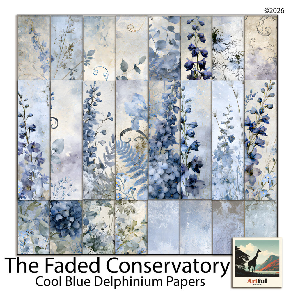
A page from it might run like this. Take a plaster blender as the base, so the busiest florals stay off the photo area. Sample the parchment out of the wash and build the photo mat from that rather than from white. Pull the deepest indigo out of a delphinium spire for the title text. Then add one warm thing that isn’t in the kit at all, usually a brass brad or a kraft tag, and let it sit near the photo.
The result still reads as a blue page. It just has a foreground now.
The quick version for dusty blue pages
- Keep the palette cool and add warmth at about 10%, concentrated in one or two spots.
- Eyedropper the cream out of your own papers instead of using white.
- Work in three values: pale, mid and one genuinely dark anchor.
- Warm the mat, the title and the hardware, never the background paper.
Dusty blue rewards a light touch here. One warm note on a cool spread reads as a considered choice, and three or four start pulling the page towards a different palette altogether. If you’re unsure whether you’ve gone too far, take the warmest element off and see whether you miss it.