
A cottage garden scrapbook page goes wrong in a specific way. You start with one lovely floral paper, add a spray of roses, add a second spray because the corner looked empty, tuck in a butterfly, and somewhere around the fourth element the page stops reading as a garden and starts reading as a pile. Everything on it is beautiful. Together they are noise.
The fix isn’t fewer flowers. Real cottage gardens are crowded — that’s the whole point of the cottage garden style, hollyhocks leaning over the path and roses swallowing the fence. What real gardens have that a flat layout doesn’t is depth: things sit in front of other things, at different distances, with air between them. Here are five ways to build that into a cottage garden scrapbook page.
Table of Contents
1. Decide where the ground is
Before you place a single element, decide which edge of the page is the ground. Almost every cottage garden scrapbook layout that falls flat has flowers floating at the same height all over it, like wallpaper.
Pick a horizontal line — usually the bottom third — and let the heavier elements sit on it. Benches, watering cans, baskets, jam jars. These are the objects with weight, and weight belongs low. Flowers can then climb up out of that line, which is what they actually do.
The exception is anything that trails or climbs. Honeysuckle, climbing roses and sweet pea want to come down from the top edge or across a corner, because in a garden they’re on a wall or an arch. A trailing stem entering from the top corner does more for a page than three more blooms in the middle.
2. Work in three depths, not one
This is the single biggest change you can make. Sort every element on your cottage garden scrapbook page into background, middle and foreground before you start:
- Background — soft, pale, slightly out of focus. Faded florals printed into the paper itself, a wash of leaves, a ghosted damask. Nothing here should have a hard edge.
- Middle — the working layer. Journal cards, photos, seed packets, postcards, tags. This is where the reader’s eye does its actual reading.
- Foreground — one or two sharp, saturated pieces sitting on top of everything. A single rose overlapping the corner of a photo. A butterfly on the edge of a card.
The foreground layer is the one most people skip, and it’s the one that sells the depth. A flower that overlaps a photo corner tells the eye that the photo is underneath, which instantly gives a cottage garden scrapbook page three dimensions instead of one.
3. Let things overlap badly on purpose
Tidy placement reads as digital. If every element sits neatly in its own space with a respectful margin, the page looks like a catalogue of stickers rather than a garden.
Overlap deliberately and unevenly. Let a leaf run off the edge of the page. Let a stem disappear behind a journal card and not come out the other side. Let one bloom half-cover a postmark so you can only read part of the date. Cottage garden scrapbook pages are at their best when they look slightly overgrown, because that’s the aesthetic you’re borrowing from.
The rule of thumb: if you can draw a clean box around every element without touching another one, you haven’t overlapped enough.
4. Keep the palette narrower than you want to
Cottage garden scrapbook kits are colourful by nature, and it’s tempting to use all of it. Don’t. Pick two dominant colours and one accent, and hold that line across the page.
Blush and sage with a warm cream accent is the classic pairing and it’s hard to get wrong — the pink reads as the flowers, the green as the foliage, the cream as light. If you want something warmer, swap the accent to soft gold. If you want it quieter, drop the pink to dusty rose and let the greens carry the page.
What breaks a cottage garden scrapbook page is a fourth colour arriving late. A bright blue element, a saturated red, a cool grey — any of them will pull the eye straight to itself and flatten everything else. If a piece you love doesn’t sit in the palette, it belongs on a different page.
5. Use paper ephemera as the quiet layer
Flowers are loud. Paper is quiet, and a cottage garden scrapbook page made only of flowers has nothing for the eye to rest on.
This is what seed packets, library cards, ticket stubs, bingo cards and postmarked envelopes are for. They’re rectangular, they’re muted, and they hold text — so they read as pauses between the florals. They also do something the flowers can’t: they suggest a story. A seed packet says somebody planted this. A postmark says somebody wrote about it.
Tuck them at slight angles — five to eight degrees is plenty, more starts to look like a mistake — and let the florals overlap their corners. A journal card sitting perfectly square in the middle of a page is the fastest way to make a layout look untouched.
Putting a cottage garden scrapbook page together
Here’s how those five ideas stack on one cottage garden scrapbook page. Start with a soft floral background paper, not a busy one — you want somewhere for the eye to rest. Lay a wash of pale foliage across the bottom third to establish the ground. Set your photo and one or two journal cards in the middle layer, slightly off square, overlapping each other at a corner. Add a bench or a watering can sitting on the ground line. Then bring one climbing stem down from the top corner and place a single sharp rose over the corner of the photo. Stop there.
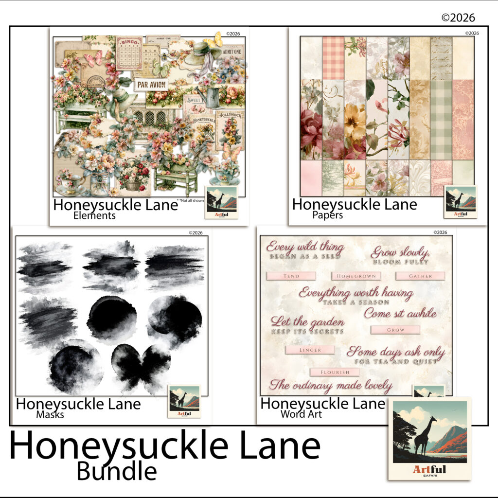
Working from a single kit makes the palette rule easy to keep, because the colours have already been decided for you. The Honeysuckle Lane collection was built for cottage garden scrapbook pages along these lines — watercolour florals and soft solids for the background layer, garden objects and paper ephemera for the middle, and cut-out roses, robins and butterflies sharp enough to sit on top.
A last thought on restraint
The hardest part of a cottage garden scrapbook layout is stopping. There’s always one more bloom that would look lovely in that gap, and the gap is usually the thing holding the page together.
If you’re unsure whether a page is finished, save it and come back the next day. Nine times out of ten the answer is that it was finished two elements ago — and the version you nearly made is still sitting in your undo history if you disagree.