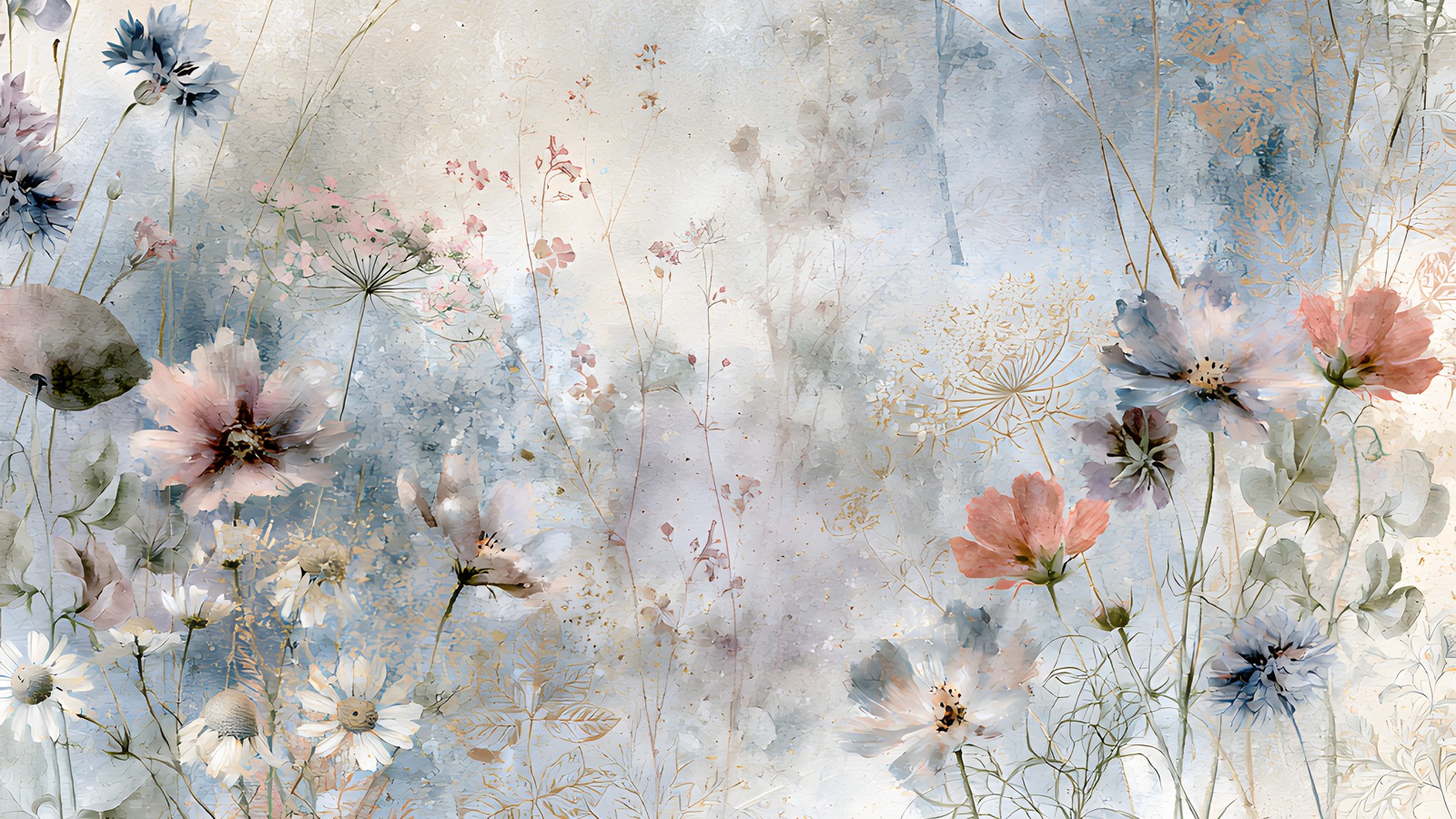
Soft floral papers are the easiest thing in the world to fall for and one of the harder things to actually build a page on. A wildflower scrapbook page starts out beautiful in the thumbnail, and then you add a photo, a title and a bit of journaling, and the whole thing turns to porridge. Nothing is wrong exactly. Nothing stands out either.
The cause is almost always contrast, not composition. Meadow papers are painted in a narrow band of value — everything sits in the pale-to-mid range, with no true darks and no true whites. That is what makes them restful, and it is also what makes a wildflower scrapbook layout collapse into one soft grey mass the moment you put something on top of it. Below are five fixes, in the order I would try them.
Table of Contents
Why wildflower scrapbook papers go mushy
Squint at a meadow paper. The flowers, the stems and the background wash all read as roughly the same lightness. Your eye has nothing to grab.
Photos make it worse, because a snapshot usually carries a full range of value — real blacks, real highlights. Drop that onto a low-contrast wildflower scrapbook background and the photo either shouts or, if it is also pale, disappears entirely. Every fix below is really the same fix: put back the contrast the paper deliberately left out.
1. Pick one flower to be the loudest
A meadow paper has ten or twelve flower types scattered across it. Choose one — the poppy, the cornflower, whichever colour you want the page to be about — and let everything else recede.
In practice that means cropping. Instead of using a whole 12×12 paper as a background, take a section where your chosen flower is dominant and enlarge it. You lose the busy edges and gain a page with an obvious subject. It is the cheapest way to make a wildflower scrapbook page feel designed rather than assembled.
If you want to know which flower you are actually looking at, the Wildlife Trusts’ cornflower page is a good reference for the blue one that turns up in nearly every meadow print.
2. Give the page one hard edge
Watercolour meadow papers have no edges at all. Everything fades. Add a single crisp rectangle — a photo with a clean border, a solid strip of colour behind your title — and the whole layout snaps into focus.
One is the number. Two hard edges start competing; three looks like a template. A wildflower scrapbook spread only needs one place where the softness stops.
3. Steal your text colour from the darkest flower
Black type on a faded meadow looks pasted on. Pure white vanishes. The colour you want is already in the paper: zoom in on the deepest flower centre, the darkest stem, the shadow under a petal, and use that.
On a dusty blue meadow that usually lands somewhere near a deep slate or indigo. On a warmer one it will be a bruised plum or a dark olive. If you want to check that the colour actually reads as a family with the rest of your palette, drop it into the Adobe Color wheel and look at its neighbours before you commit.
This one trick fixes more wildflower scrapbook titles than any font change will. The same principle applies to cool-toned pages generally — the paper already contains the answer.
4. Let the blender papers carry the weight
Most floral kits ship a handful of plain washed papers alongside the busy ones, and most of us ignore them. They are the reason the busy papers work.
Use a plain plaster-wash paper as your base layer, then bring in the flowered paper as a band along one edge, or as a torn strip behind the photo cluster. You get all the atmosphere of the meadow and a large calm area to put things on. A wildflower scrapbook page built this way holds two or three photos comfortably. The same page built on a fully flowered background holds one, badly.
5. Crop tighter than feels comfortable
Because the background is busy, a mid-distance photo has to fight it. A tight crop does not.
Faces, hands, a single object filling the frame — anything with a clear shape wins against a field of scattered petals. Try cropping to about half of what feels right, and you will usually find the wildflower scrapbook layout underneath was fine all along; the photo was just too quiet.
Putting it together
Here is what the five look like as one page. Plain blender paper as the base. A band of meadow paper across the bottom third. One photo, cropped tight, with a clean white border — the single hard edge. Title in a deep slate lifted out of the cornflowers. Journaling in the clear space at the top, where the paper was never busy in the first place.
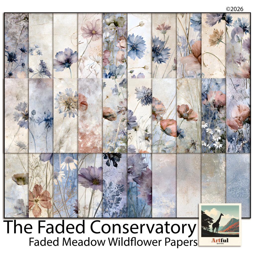
The kit I built that page from is Faded Meadow Wildflowers, from The Faded Conservatory series. It is set up for exactly this: eleven papers with the flowers along the bottom edge and the top left open, plus four plain plaster washes and four darker dusk versions for when a page needs more weight. Any meadow kit with a similar spread will do the same job.
Working digitally
All five fixes are quicker on a screen than on paper, because cropping and recolouring are non-destructive. In Procreate, Photoshop, Canva or Affinity, the workflow is the same: blender paper on the bottom layer, meadow paper above it with a layer mask to fade one edge, photo and text on top. If you are new to layering this way, the dusty rose layering guide walks through the same stack with a warmer palette.
The quick version for wildflower scrapbook pages
- Crop the paper so one flower dominates instead of twelve.
- Add exactly one hard edge — usually a bordered photo.
- Pull your text colour out of the darkest part of the paper, never black or white.
- Build on a plain blender and use the floral paper as a band, not a full background.
- Crop photos tighter than instinct says.
None of it is about adding more. A wildflower scrapbook page nearly always fails from too little contrast rather than too few elements, and the paper you already have contains everything you need to fix it.