40% off until 31 October on selected products·8 days left

Category: Trends & Ideas

  • Farmhouse Scrapbook Page Ideas: 5 Beautiful Rustic Layouts

    Farmhouse Scrapbook Page Ideas: 5 Beautiful Rustic Layouts

    The best farmhouse scrapbook ideas come down to three things: a muted warm palette, real-looking textures like linen and kraft, and barn or botanical clipart used in small doses. Get those right and almost any photo reads rustic and cosy.

    Below are concrete page recipes you can copy straight onto your canvas, plus the colour and texture choices behind them and where the clipart helps versus where it tips the page into clutter.

    The papers and elements for pages like these are in the Farmhouse Life collection.

    Farmhouse scrapbook ideas: what makes a page read rustic?

    A farmhouse scrapbook page leans on restraint, not decoration. The look is built from texture and warmth rather than bright colour or busy patterns.

    Three things do most of the work:

    • Muted, warm colour: cream, oatmeal, sage, dusty blue, soft terracotta, charcoal instead of black.
    • Texture you can almost feel: linen weave, kraft, aged paper, ticking stripe, a hint of wood grain.
    • Honest subject matter: barns, jars, eggs, wildflowers, enamelware, handwriting.

    A matched set saves you guessing. The Farmhouse Life Digital Scrapbook Bundle ships papers, frames and clipart that already share one palette, so pages sit together across a whole album.
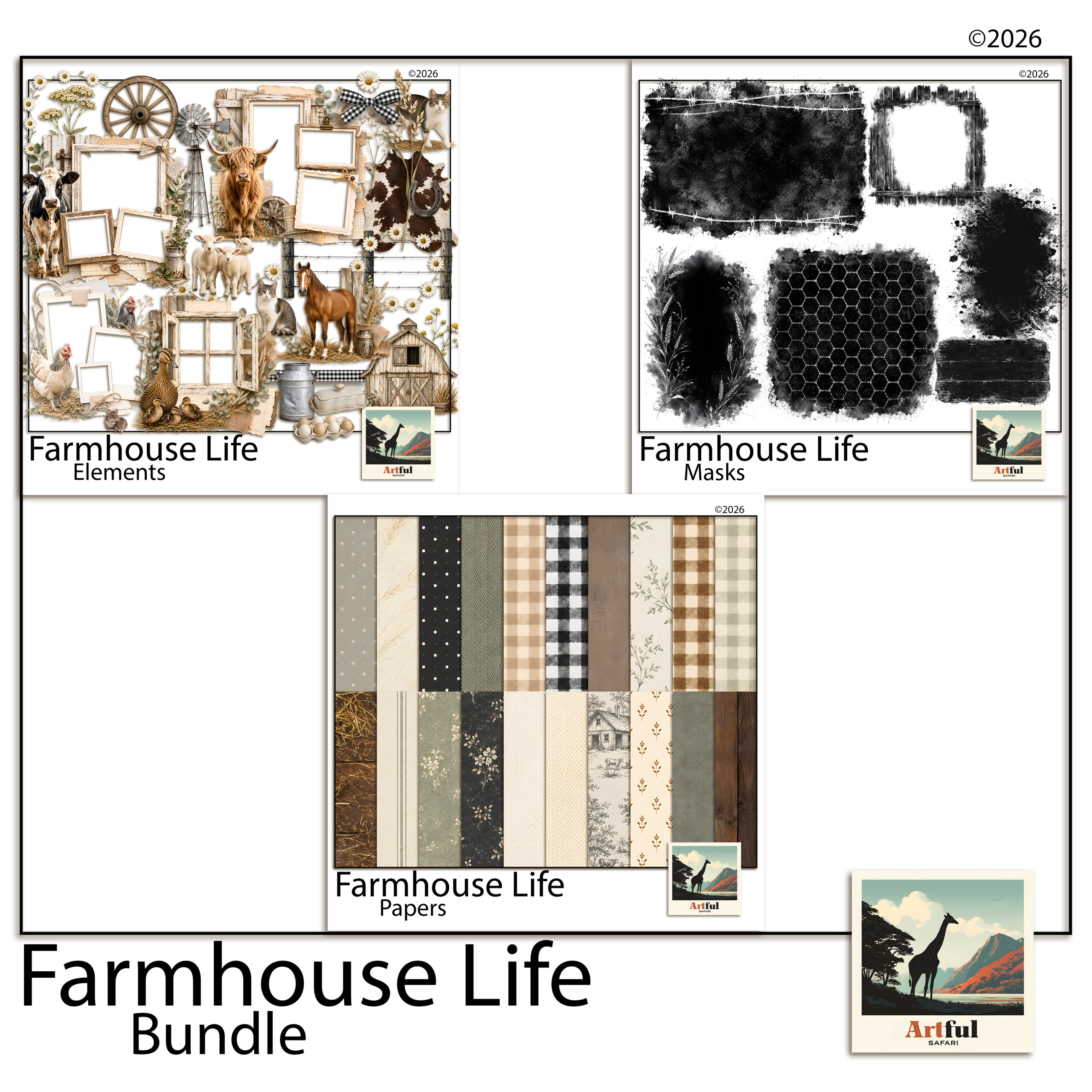
    Farmhouse scrapbook ideas built from the Farmhouse Life digital scrapbook bundle
    Matched farmhouse scrapbook papers, frames and elements in the Farmhouse Life Digital Scrapbook Bundle.

    What colours and textures hold a farmhouse scrapbook together?

    Pick one neutral base and two soft accents, then repeat them across every page. That repetition is what makes a stack of pages feel like one album rather than a pile of one-offs.

    RoleUse it forGood choices
    Base neutralPage background, large matsCream, oatmeal, soft kraft
    Accent onePhoto mats, title barSage green, dusty blue
    Accent twoSmall details, berries, ribbonSoft terracotta, mustard
    Texture layerBehind photos, under journalingLinen, ticking stripe, aged paper

    Keep black off the page. Swap it for deep charcoal or warm brown and the whole spread softens.

    5 farmhouse scrapbook layouts you can build today

    Each of these is a recipe, not a rule. Adjust photo counts to fit what you have.

    1. The recipe page

    Kraft background, a linen-textured card in the centre for the handwritten or typed recipe, one photo of the finished dish top-right, a sprig of botanical clipart in the opposite corner. Title across the top in a relaxed script.

    2. The family-history page

    Aged cream paper, an old photo matted on soft brown, a journaling block telling who and when. Add a small jar or key element so the page feels collected rather than printed.

    3. The seasonal-on-the-farm page

    A three-photo grid (planting, growing, harvest) on a sage mat, with a barn motif anchoring the lower corner and a date stamp. Good for a garden or allotment year.

    4. The everyday-life page

    One large photo, a wide cream border, two lines of writing underneath. Nothing else but a single wildflower stem. The space is the design.

    5. The keepsake-recipe-box spread

    Two facing pages of small recipe cards laid like index cards on a ticking-stripe background, tied together with a ribbon graphic down the gutter. Number the cards or add little handwritten tabs so it reads like a real recipe box someone has thumbed through for years.

    One habit makes all five layouts easier: build the background first, drop the photos second, and only add clipart and titles last. Most cluttered pages happen because the decoration went on before the photos had claimed their space. Lay the bones, then season.

    And leave more empty room than feels comfortable. A wide cream margin around a single photo does more for the rustic mood than another graphic ever will. When a page feels off, the fix is almost always to take something away rather than add.

    Where does barn and botanical clipart work, and where is it too much?

    Clipart is seasoning. One or two well-placed pieces anchor a page; a scattered handful turns it into a sticker sheet.

    • Works: a single barn or windmill low in a corner as a quiet anchor; a botanical sprig softening a hard photo edge; a jar or egg as a full stop at the end of a journaling block.
    • Too much: clipart in every corner, three different animals on one page, or elements bigger than the photos. If the eye doesn’t know where to land first, pull pieces off.

    The Farmhouse Barn Clipart Digital Scrapbook set gives you barns, jars and botanicals as separate transparent pieces, so you can place one at a time instead of fighting a busy patterned paper.
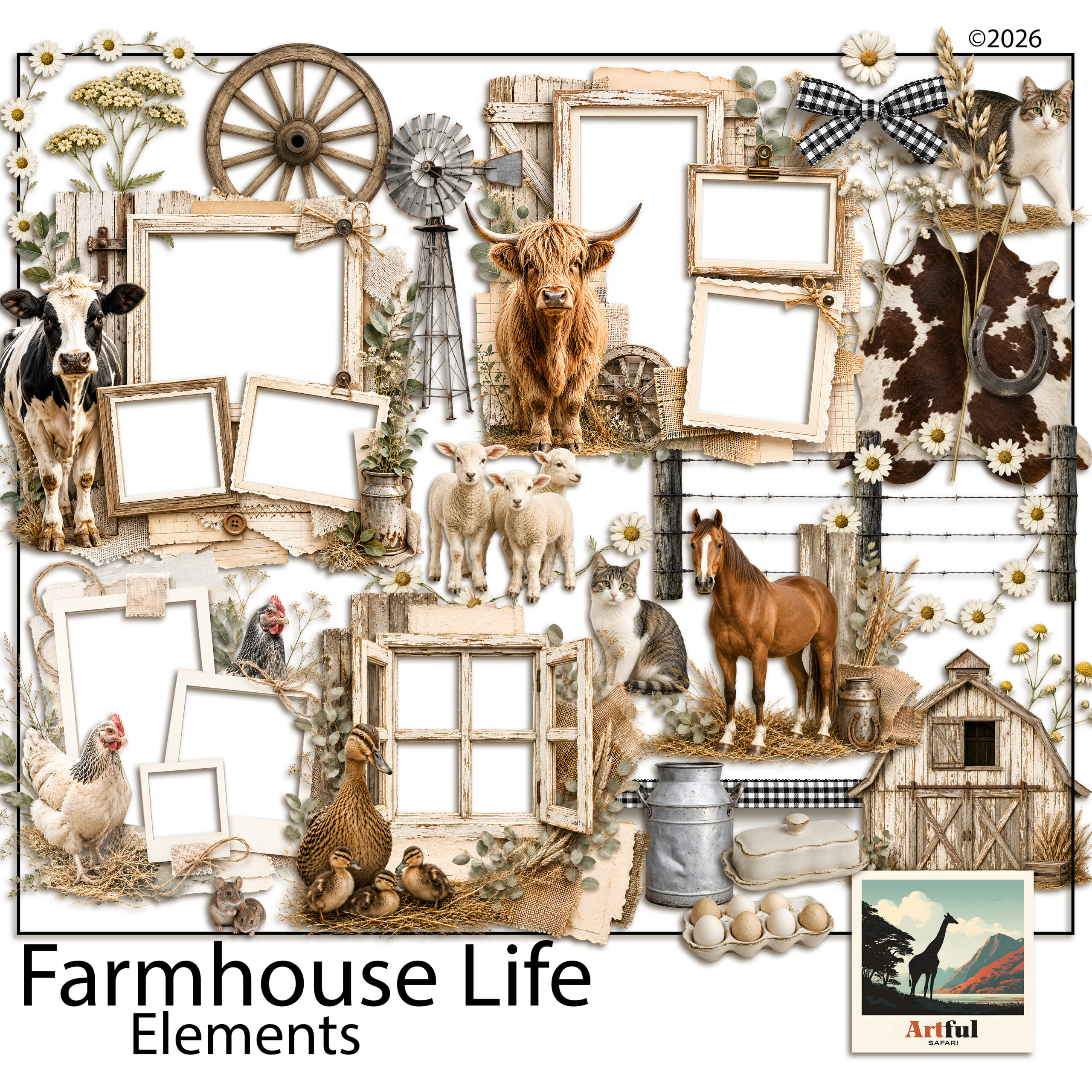
    Farmhouse barn and botanical clipart for rustic scrapbook pages
    Barn, jar and botanical pieces from the Farmhouse Barn Clipart Digital Scrapbook set.

    Which fonts and titles suit a farmhouse scrapbook page?

    Type carries a surprising amount of the mood. Get the lettering wrong and a careful page suddenly looks modern or generic.

    Two pairings do most farmhouse work:

    • A relaxed handwritten script for titles and short captions, the kind that looks like a marker pen rather than a wedding invitation.
    • A plain typewriter or slab serif for journaling and dates, which reads like an old label or recipe card.

    Keep titles short. “Sunday roast”, “The first eggs”, “Nan’s kitchen”. A long title fights the photo for attention. If your kit includes an alphabet, a hand-lettered set of letters often beats a font for that pinned-on, made-by-hand feel.

    How do you turn single pages into a cohesive farmhouse scrapbook?

    A run of farmhouse pages should feel like chapters of one book, not separate cards. Three habits do that.

    1. Repeat the palette. Same base neutral and same two accents on every page, even when the photos change.
    2. Reuse a signature element. Pick one motif, say a small sprig or a ticking-stripe strip, and let it turn up somewhere on most pages as a thread tying them together.
    3. Keep one title style. Same script, same size and placement, so the eye knows where to look as it moves through the album.

    This matters most when you build pages weeks apart. Without a repeated palette and motif, a farmhouse scrapbook drifts and the early pages stop matching the later ones. Decide the three above before page one and the whole thing holds together on its own.

    How do you adapt the look for the seasons?

    Farmhouse style carries through the year if you shift the accents rather than the whole palette. The cream and kraft base stays put; the small details change with the season.

    • Spring: sage greens, eggs, hens, the first blossom, pale washing-line scenes.
    • Summer: sun-faded denim blue, wildflowers, jam jars, harvest baskets.
    • Autumn: warm terracotta and mustard, pumpkins, wheat, preserving and baking pages.
    • Winter: deep charcoal and pine, candles, woollen textures, the kitchen at its busiest.

    Because the base never changes, a year of seasonal pages still reads as one album. That’s the trick to a twelve-month farmhouse scrapbook that doesn’t look like four different projects bolted together.

    Recipe and family-history pages pair naturally with the looser, layered junk journal style. If you want to mix the two, my What Is a Junk Journal? guide explains how that approach works.

    Key takeaways

    • Farmhouse scrapbook pages are built from muted warm colour and real-looking texture, not bright patterns.
    • Pick one neutral base and two soft accents, then repeat them across the album for cohesion.
    • Use the five recipes (recipe, family-history, seasonal, everyday, keepsake-box) as starting layouts.
    • Treat barn and botanical clipart as one or two anchors per page, never wall-to-wall.

    Frequently asked questions

    What colours work for a farmhouse scrapbook?

    Muted warm tones: cream and oatmeal as a base, with sage, dusty blue, soft terracotta or mustard as accents. Swap black for deep charcoal or warm brown to keep it soft.

    How do I make a farmhouse scrapbook page without it looking cluttered?

    Limit clipart to one or two anchor pieces per page, leave generous border space, and repeat the same palette across the album so each spread feels considered.

    What clipart suits a farmhouse theme?

    Barns, windmills, mason jars, eggs, enamelware, wildflowers and botanical sprigs. Transparent PNG pieces you can place one at a time work better than busy patterned paper.

    What textures give the rustic farmhouse look?

    Linen weave, kraft, aged paper, ticking stripe and a hint of wood grain. Layer a textured sheet behind photos and under journaling blocks.
  • Coastal Scrapbook Ideas: 12 Easy Tricks for Summer Albums

    Coastal Scrapbook Ideas: 12 Easy Tricks for Summer Albums

    The best coastal scrapbook ideas start with restraint: pick a sand-to-sea colour palette, let one or two photos carry the page, and add nautical clipart sparingly so it reads as a real beach memory rather than a gift-shop tea towel.

    Here are the layout ideas, palettes and layering tricks I reach for when I’m building a coastal scrapbook of a summer holiday.

    What makes a coastal scrapbook page work?

    A coastal scrapbook page works when the photos feel like the holiday and the design stays out of their way. Beach photos are already busy, with water, sky and people, so the layout should give them air rather than crowd them.

    Three habits do most of the work:

    • Leave plenty of white or pale space around photos
    • Stick to one soft texture as the background, not three
    • Let a single anchor photo dominate, with smaller shots around it

    The mistake I see most often is treating every photo as equal. Twelve beach shots at the same size turns into wallpaper. Pick the one photo that says the day best, run it large, and let the rest be supporting cast at half the size. The page reads as a memory instead of a contact sheet.

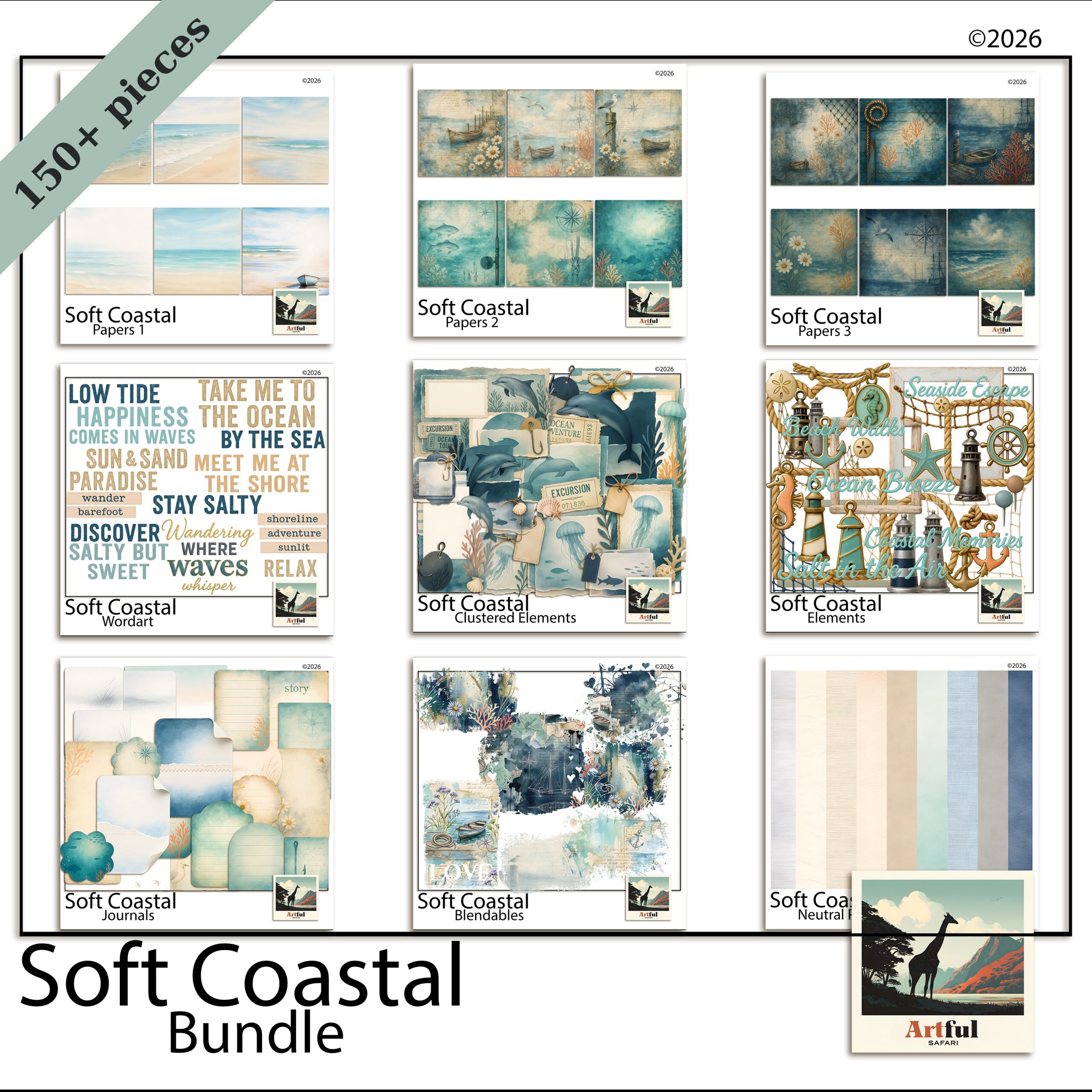
    Coastal scrapbook ideas using the Soft Coastal digital bundle papers and elements
    Pale, sandy papers for a coastal scrapbook base, from the Soft Coastal Digital Scrapbook Bundle.

    Which colour palette suits a beach album?

    The safest coastal palettes pull from the shoreline itself: sand, sea-glass, driftwood and a single deeper accent. Skip bright primary blues unless your photos are genuinely that saturated.

    PaletteUse it forMood
    Sand + sea-glass + ivoryQuiet beach mornings, family daysSoft, airy
    Navy + white + rope tanBoats, harbours, nautical tripsCrisp, classic
    Driftwood + dusty teal + coralSunset swims, rock poolsWarm, lived-in

    Pull the accent colour from something already in the photo, a striped towel or a red bucket, and the whole spread looks deliberate.

    One palette trap worth flagging: pure white. On a beach page, crisp white can look harsh next to warm sand tones. Swap it for ivory, shell or the palest grey and the whole spread softens. Save real white for the rare page where your photos are already cool and bright.

    How do you layer sand and sea papers without muddying them?

    Layering is where coastal scrapbook pages go wrong. Two textured papers fighting each other turn into mud. Keep one paper as the hero and let the others whisper underneath.

    A layering order that holds up

    1. Lay a plain or lightly textured sand paper as the base.
    2. Add a torn strip of a sea or wave paper along one edge only, not the whole page.
    3. Drop your photos on top inside simple frames.
    4. Reduce the opacity of any busy paper to 60-70% so it sinks back.

    If you want the full layering walk-through, How to Make a Travel Scrapbook covers building a holiday album from photos to finished pages.

    Add a sense of water without a literal wave

    You don’t need a photo of the sea to say sea. A pale wash of teal along the bottom third, a band of ripple texture set low, or a single watercolour splash behind a photo all read as water without competing with your snapshots. Suggest the coast, don’t shout it.

    The same trick works for sand. A grainy off-white texture under the whole page, kept low and quiet, gives the spread a beachy feel before you’ve added a single shell. Texture does the theme work so your clipart doesn’t have to.

    Coastal Nautical digital scrapbook clipart with rope, shells and stripes
    Rope, shells and stripes from the Coastal Nautical Digital Scrapbook kit.

    Where does nautical clipart work, and where does it tip into kitsch?

    Nautical clipart works in small doses as punctuation, not decoration. A single rope corner, one small shell, a thin striped border. It tips into kitsch the moment you ring the page with anchors, lighthouses and seagulls all at once.

    My rule: one nautical element per page, two at most, and never as the loudest thing on the spread. The Coastal Nautical Digital Scrapbook kit has rope and shell pieces that sit quietly in a corner instead of taking over.

    • Works: rope as a thin divider, a shell tucked behind a photo corner, a faint compass rose watermark
    • Tips into kitsch: cartoon anchors everywhere, three lighthouses, a banner that shouts AHOY

    Coastal scrapbook ideas for different trips

    Match the layout to the kind of coast you visited.

    • Family beach week: a photo grid of the same spot across days, with a sandy base and one shell accent.
    • Sailing or harbour trip: navy and rope-tan, a single boat photo enlarged, thin rope dividers.
    • Rock-pool and coastal-walk day: driftwood tones, small detail shots of finds, a journaling card listing what you spotted.

    Don’t skip the journaling

    Coastal scrapbook pages lean so hard on pretty papers that the words get forgotten. A short note ages better than any sticker: the name of the beach, who you went with, the thing that made everyone laugh. Drop it on a small card so it sits on the page without fighting the photos. In a few years that line is the part you’ll reread.

    Build the Soft Coastal Digital Scrapbook Bundle as your base and add nautical pieces only where a page needs a little punctuation.

    How do you keep a whole coastal scrapbook from looking samey?

    The risk with a single themed kit is fourteen pages that blur into one. The fix is varying the layout while keeping the palette steady, so the album feels related without feeling repetitive.

    • Switch the photo count: a one-photo full-bleed page next to a six-photo grid gives the eye somewhere to rest and somewhere to browse.
    • Move the title around: top-left on one spread, running up the side on the next, small in a corner on a third.
    • Change the breathing room: alternate a busy, layered page with a near-empty one that’s mostly sand paper and a single photo.
    • Rotate the accent: lean coral on one page, dusty teal on the next, both pulled from the same family.

    Hold the palette and the paper family constant and you can vary everything else freely. That’s what makes a holiday album look designed rather than churned out.

    What about the title and lettering?

    Coastal titles work best when the lettering feels relaxed rather than formal. A loose script or a soft rounded font suits a beach page far better than anything sharp and corporate. Keep the wording simple too: the place name, the year, or a half-sentence you actually said on the day.

    • Colour the title from the palette: a driftwood brown or muted navy reads better than black, which can feel heavy against pale sand.
    • Give it room: a title squeezed into a corner gets lost. Let it sit across the top third or run quietly down one side.
    • One decorative touch, not five: a small shell beside the first letter is plenty. Don’t bury the words under clipart.

    If you want the title to anchor the page, set it large and let a single photo do the rest. Restraint is the whole game with coastal scrapbook pages, in the lettering as much as the layout.

    Key takeaways

    • Pull the coastal scrapbook palette from the shoreline: sand, sea-glass, driftwood, one deeper accent.
    • Keep one textured paper as the hero and fade the rest to 60-70% opacity.
    • Use nautical clipart as punctuation, one or two pieces per page.
    • Match the layout to the trip, and vary layouts to keep the album fresh.

    Frequently asked questions

    What colours work best for a coastal scrapbook?

    Pull from the shoreline: sand, sea-glass, driftwood and ivory, with a single deeper accent like navy or coral. Match the accent to something already in your photo and the coastal scrapbook page looks intentional.

    How much nautical clipart should I use on a page?

    One element, two at most. Use rope, a shell or a thin stripe as punctuation rather than decoration. Ringing a page with anchors and lighthouses is what pushes it into kitsch.

    How do I layer beach papers without them looking muddy?

    Keep one paper as the hero and reduce the opacity of any busy paper to 60-70% so it sits back. Add textured papers as torn strips along one edge instead of covering the whole page.

    Do coastal scrapbook kits work for sailing and harbour trips too?

    Yes. Switch to a navy, white and rope-tan palette, enlarge a single boat photo and use thin rope dividers. The same kit covers soft beach days and crisp nautical trips.

  • Digital vs Paper Scrapbooking: Pick the Best Fit in 6 Questions

    Digital vs Paper Scrapbooking: Pick the Best Fit in 6 Questions

    Digital vs paper scrapbooking comes down to one trade: paper gives you a physical book you can hold, smell and pass around the table, while digital gives you supplies you never run out of, an undo button, and pages that can’t be lost to a spilled cup of tea.

    I make pages both ways, so here is the side-by-side I wish I’d had when I started, with the real costs, the storage reality, and what each one is genuinely better at.

    What’s the real difference between digital and paper scrapbooking?

    Paper scrapbooking is the classic version: cardstock, patterned paper, stickers, glue and a trimmer, all assembled by hand into an album. Digital scrapbooking does the same thing on a screen, in Procreate, Photoshop, Canva or GoodNotes, using digital papers, clipart and frames as the supplies.

    The page you build is the same idea. The materials and the workspace are what change. With paper you cut once and it’s gone. With digital, the same patterned paper sits in a folder and you can drop it onto a hundred pages without buying it twice.

    There’s a third thing people forget: the muscle you build is different. Paper teaches you to trim straight, line up edges and judge how much glue is too much. Digital teaches you layers, opacity and a few keyboard shortcuts. Neither is harder, they just ask different things of you. If you already edit photos on a phone, digital will feel closer to home. If you love a craft table, paper will.

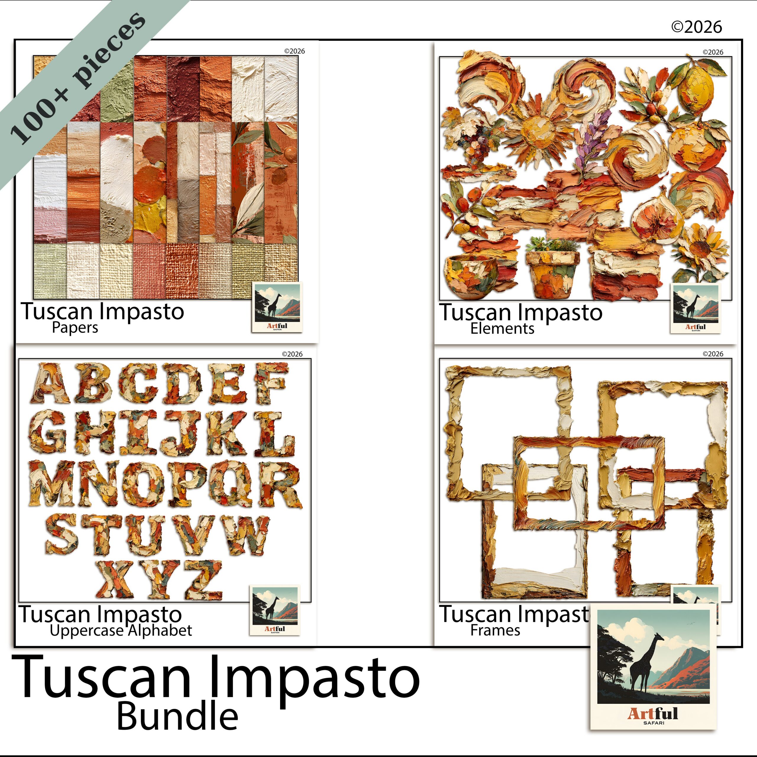
    Digital vs paper scrapbooking supplies from the Tuscan Impasto digital bundle
    One bundle, used again and again: the Tuscan Impasto Digital Scrapbook Bundle.

    Which costs more over a year?

    Paper scrapbooking costs more once you keep going, because every sheet, sticker and embellishment is consumed the moment you use it. Digital has a higher feeling of value per purchase: one bundle covers dozens of pages and never runs down.

    Here is a rough side-by-side for someone making a page or two a week.

    FactorPaper scrapbookingDigital scrapbooking
    Up-front kitTrimmer, glue, albums, paper stashAn app and one or two bundles
    Cost per pageAdds up, supplies get used upNear zero once you own the kit
    RestockingBuy more paper as you goReuse the same files forever
    MistakesA ruined sheet is money goneUndo and try again, no cost

    None of this makes paper a bad buy. You’re paying for a tactile object. It’s a different kind of value, and worth naming before you pick a side.

    One more cost most people miss with paper: the impulse stash. It’s easy to buy a sticker pack or a paper pad you love and never use, and that money is gone. Digital has its own version of this, the bundle you buy and forget, but at least it doesn’t take up a drawer and it’s still there waiting the day you need it.

    How does storage and mess compare?

    Paper scrapbooking takes physical room and stays a little messy by nature. Digital takes folder space and a backup habit. Pick the problem you’d rather manage.

    Paper scrapbooking storage

    • Paper trimmer, off-cuts, and a growing stash of patterned sheets
    • Finished albums that need shelf space
    • Sorting by theme means physical drawers and folders

    Digital storage

    • Folders on your iPad, laptop or cloud drive, sorted by theme
    • No off-cuts, no clean-up, no glue on the table
    • One rule that matters: back it up, or a dead drive takes the lot

    If you want a folder system that doesn’t fall apart after fifty kits, the Digital Scrapbooking for Beginners guide walks through a simple one.

    Worth saying plainly: the mess cuts both ways. Paper’s mess is visible, glue and off-cuts you tidy at the end. Digital’s mess is invisible until it bites, a thousand unsorted files and no idea which paper lives where. Whichever you pick, the tidy habit is the same job in different clothes.

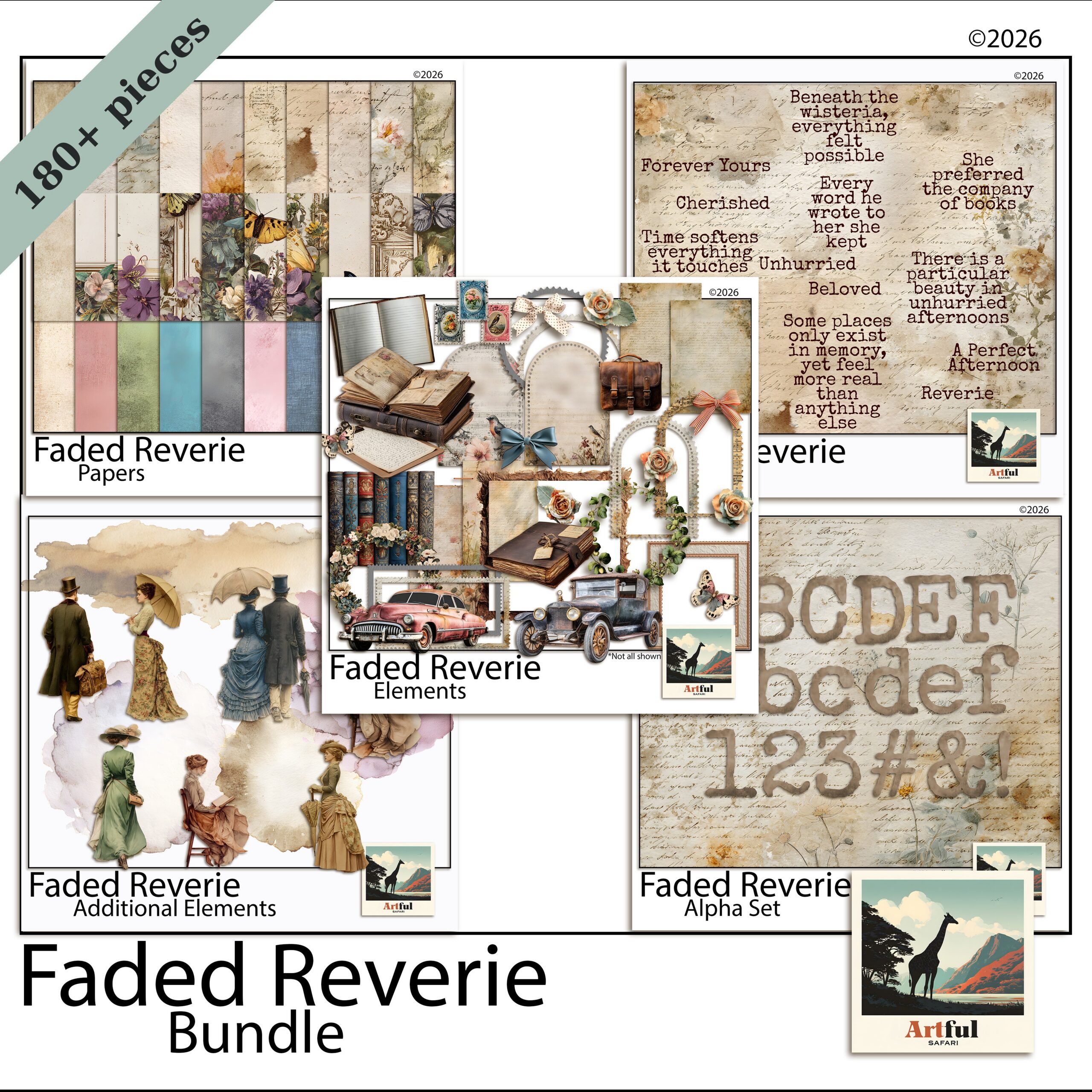
    Faded Reverie digital scrapbook bundle papers and elements
    Soft, reusable papers from the Faded Reverie Digital Scrapbook Bundle.

    What happens when you make a mistake or want to reprint?

    This is where the two part ways the most. On paper, a crooked photo or a smudge of glue means starting that section again. On digital, you nudge the layer, undo the step, or swap the photo, and the page is fixed in seconds.

    Reprinting is the same story. Want a second copy of a paper album for your mum? You rebuild it by hand. Want a second copy of a digital page? You export the file again. A bundle like the Faded Reverie Digital Scrapbook Bundle sits ready for the next project, the next gift, the next year.

    The catch for digital: you stare at a screen instead of touching paper, and some people miss the feel of cutting and gluing. That’s a real loss for some makers, not a small one.

    What is each one genuinely better at?

    Forget the tie-breakers for a second. There are jobs each version simply does better, and knowing them saves you fighting your tools.

    Paper scrapbooking is better at

    • A finished object you can wrap, gift or sit on a coffee table
    • Texture you can feel, like embossing, ribbon and layered card
    • Switching off, with no screen and no notifications

    Digital is better at

    • Reusing one kit across years of pages
    • Fixing a mistake or moving a photo in seconds
    • Making multiple copies for the whole family
    • Working in small pockets of time on an iPad, no setup or pack-down

    The setup gap is bigger than it sounds. Paper needs a clear table, supplies out and time to tidy up after. Digital you open the app, work for ten minutes on the sofa, and close it. For busy weeks, that alone decides it for a lot of people.

    Digital vs paper scrapbooking: which should you pick?

    Pick paper scrapbooking if the physical book is the whole point, you like working with your hands, and you don’t mind buying supplies as you go. Pick digital if you want to reuse kits, fix mistakes instantly, skip the mess, and keep everything backed up.

    Plenty of us do both. I draft a layout digitally because it’s fast to move things around, and I still keep a paper album for the trips that deserve a book on the shelf. You don’t have to marry one.

    Which is friendlier for a beginner?

    Digital, for most people, mainly because of the undo button. The first few paper pages can feel high-stakes when a wonky cut costs you a sheet you liked. On screen you experiment freely, drag a photo around, try three papers, and keep only what works. The learning curve is real either way, but digital lets you fail cheaply while you find your style. Once you’re confident, the choice goes back to taste rather than fear of wasting supplies.

    Quick way to decide

    • Love the craft table and the feel of paper? Start with paper.
    • Short on space, want unlimited supplies, work on an iPad? Start digital.
    • Making gifts or multiple copies? Digital wins on reprints.

    Key takeaways

    • Paper gives you a physical book; digital gives you reusable supplies and instant undo.
    • Over a year, paper scrapbooking costs more per page because supplies get used up.
    • Storage is shelf space versus folders plus a backup habit.
    • Digital wins on fixing mistakes and making second copies; paper wins on the tactile feel.

    Frequently asked questions

    Is digital scrapbooking cheaper than paper?

    Over time, yes. Paper scrapbooking supplies get used up each page, while a digital bundle is reused on as many pages as you like for no extra cost. Paper’s value is the physical book you end up with.

    Can I do both digital and paper scrapbooking?

    Plenty of makers do. A common approach is to plan or draft layouts digitally because it’s quick to move things around, then keep paper albums for the trips that deserve a book on the shelf.

    Do I need an expensive app for digital scrapbooking?

    No. People build pages in Procreate, Photoshop, Canva and GoodNotes. Canva has a free tier, so you can start with digital papers and clipart without buying pricey software.

    What’s the biggest risk with digital scrapbooking?

    Losing files to a dead drive or lost iPad. Keep your kits and finished pages backed up to a cloud drive or external disk and that risk goes away.

  • Lavender Scrapbooking: 5 Rules for the Soft Purple Trend

    Lavender Scrapbooking: 5 Rules for the Soft Purple Trend

    Lavender scrapbooking is the soft purple look that’s spread across stationery, weddings and memory-keeping over the last year, built on dusty lilac and faded violet rather than bright purple.

    Done well, lavender scrapbooking reads quiet and nostalgic. Done badly it tips straight into birthday-card. The difference is which purples you pick and how much white space you leave them.

    Why is lavender scrapbooking everywhere right now?

    Soft purple slipped into homewares, weddings and stationery over the last couple of years, and scrapbook supplies followed close behind. The shade reads quiet and a little nostalgic, which suits the slow, unhurried memory-keeping people are drawn to at the moment. It also photographs beautifully on a screen, so digital makers picked it up fast and ran with it.

    The look is built around faded violet, dusty lilac and grey-leaning mauve rather than bright purple. Pair those with cream, warm grey and a touch of sage and you get a page that feels settled instead of loud. It sits somewhere between the blush-pink palettes that came before it and the moodier plum tones that tend to show up in autumn kits, which is part of why it works across so many seasons.

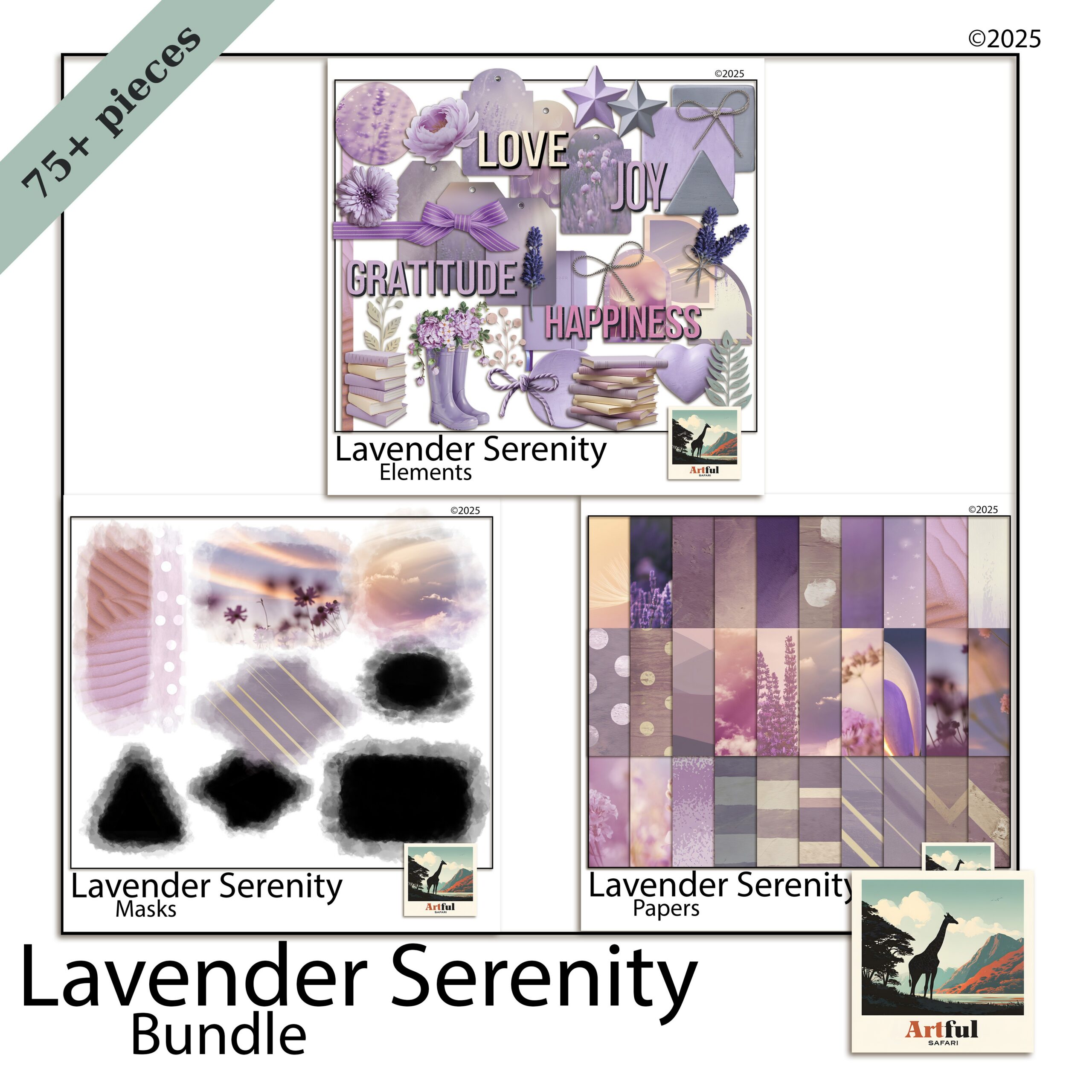
    Lavender scrapbooking page kit with soft purple papers and florals
    Soft washes and pressed florals for lavender scrapbooking, from the Lavender Serenity Digital Scrapbook Bundle.

    What colours actually sit in a lavender palette?

    Lavender, violet and plum get used as if they mean the same thing. They don’t, and mixing them up is the quickest way to make a page look muddy. Here is how I separate them when I’m pulling papers for a lavender scrapbooking spread.

    ShadeWhat it looks likeBest used for
    Lavender / lilacPale, grey-tinted, almost dustyBackgrounds, large paper areas, mats behind photos
    VioletTruer purple, more saturatedAccents, journaling cards, title text
    Plum / aubergineDeep, brown-leaning, moodyBorders, shadows, anchoring a busy page
    MauveSoft purple-pink halfway to roseFlorals, ribbons, bridging purple and blush

    A page that works usually has one pale lavender doing the heavy lifting, one deeper violet or plum for contrast, and a neutral to settle the whole thing. Three purples all fighting for attention is a page nobody finishes. If you only remember one rule, make it that: one light, one dark, one neutral.

    What pairs well with soft purple?

    Lavender is a cool tone, so the colours that flatter it are mostly warm or muted neutrals that stop it feeling icy. Cream and oatmeal are the reliable ones. Sage and eucalyptus green sit beside it naturally because purple and green are opposite each other on the colour wheel, so they balance. A dusty rose or mauve bridges purple into pink if you want a softer, more romantic page. Gold, used as a thin line rather than a flood, gives a small lift. The combination to avoid is lavender with a cold blue-grey, which can read clinical and washed-out.

    How to build a soft purple page without it going sickly

    Purple tips into birthday-card territory fast. A few habits keep it grown-up.

    • Knock the saturation back. Reach for the dusty, greyed versions of each shade. Clean bright purple is the one that reads childish.
    • Add a warm neutral. Cream, oatmeal or warm grey stops the cool tones feeling clinical.
    • Let white space breathe. Soft palettes need room. Crowding the page is what makes lavender look fussy.
    • Use one metallic, sparingly. A thin gold line or a single foil sticker lifts the page. Cover it in foil and you lose the quiet that made the palette work.

    Texture matters more than pattern

    Lavender scrapbooking palettes are soft enough that busy florals everywhere will swallow your photos. I lean on textured solids, watercolour washes and a couple of small botanical accents, then let the photo be the loudest thing on the page. A linen or watercolour-paper texture under a flat lavender does more for the page than another patterned sheet ever will, because it adds interest without adding noise.

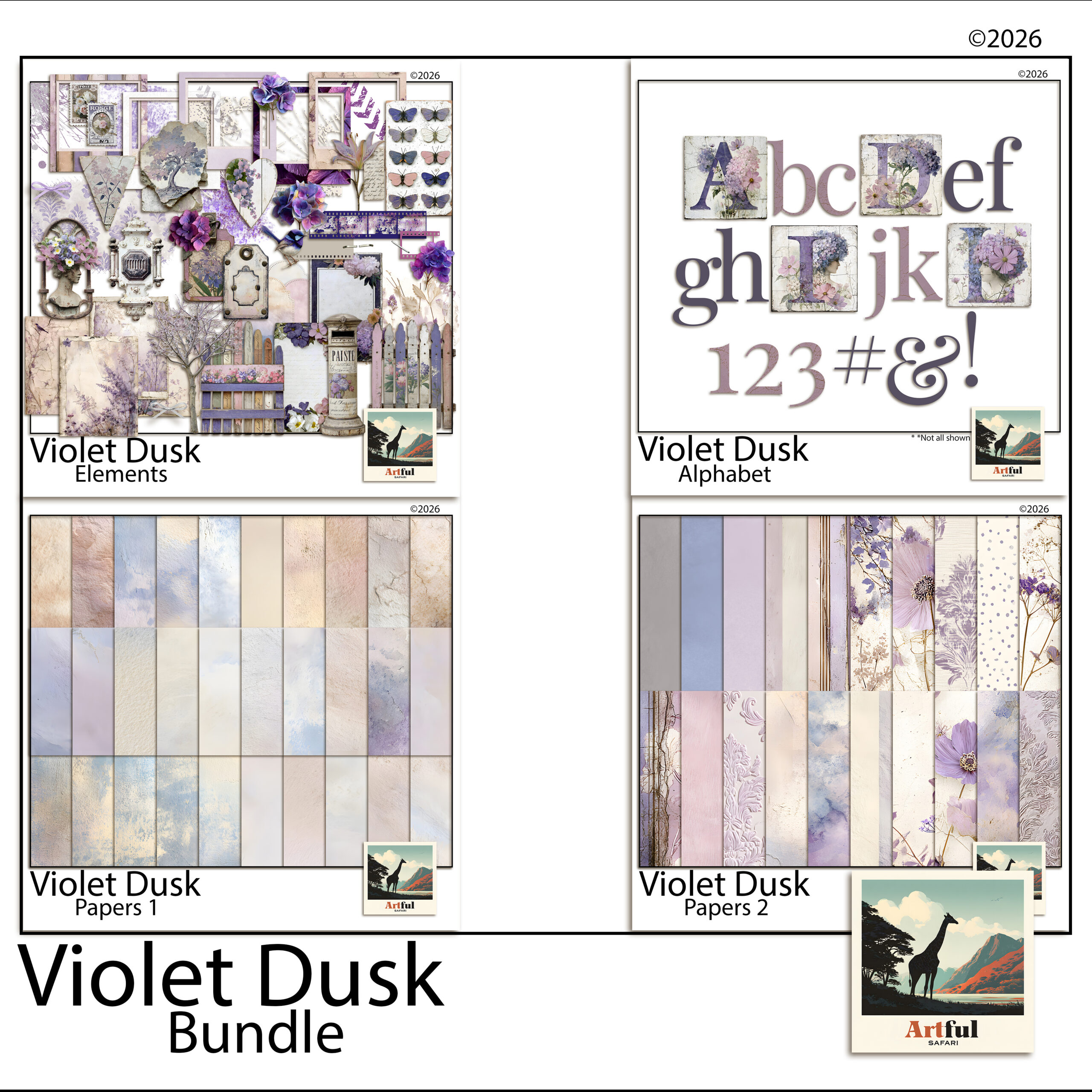
    Violet Dusk bundle with deeper plum and twilight purple papers
    When you want more depth, the Violet Dusk Digital Scrapbook Bundle leans plum and twilight.

    Which photos suit lavender layouts?

    Lavender scrapbooking flatters some photos and clashes with others. Soft purple sits naturally behind:

    • Garden and flower shots, especially wisteria, hydrangea, jacaranda and actual lavender fields
    • Wedding and engagement photos
    • Quiet at-home moments, reading, slow mornings, golden-hour windows
    • Newborn and christening pages

    It fights harder against high-contrast action shots and anything with a lot of red or orange in it. If your photo is warm and busy, drop the purple back to a thin border and let a neutral paper carry the page. A good test before you commit: lay the photo on the lavender paper at full size and squint. If the photo still reads clearly, the pairing works. If the two start to blur into each other, the page needs more contrast somewhere.

    Is lavender scrapbooking only a spring thing?

    It leans spring, but it doesn’t have to stay there. Pale lilac with fresh green and blush is unmistakably a spring palette and it suits Easter, garden days and early-year pages. Push the same purple deeper toward plum and aubergine, add charcoal and a touch of gold, and the palette carries straight into autumn and even quiet winter spreads. The mistake is treating lavender as a one-season novelty. Treat it as a base you can warm up or cool down, and it earns a place in the album all year.

    Lavender scrapbooking on a digital canvas

    This is where lavender scrapbooking gets easy. On a digital page you can recolour, fade and layer purple papers endlessly without buying a thing twice, which matters when the palette lives or dies on getting the exact shade right.

    A workflow I use in Procreate, Photoshop or Canva:

    1. Lay your palest lavender paper as the base layer.
    2. Drop a textured violet or plum paper on top and mask it into a strip or block for contrast.
    3. Add photos in clipping masks so they sit inside frames cleanly.
    4. Tuck two or three small florals near the photo corners, not scattered across the whole page.
    5. Set the title in a deeper violet so it actually reads against the soft background.

    The recolour trick is the one worth knowing. If a paper is close to the shade you want but a touch too bright, a low-opacity grey layer set over it knocks it back into that dusty range without you needing a different file. That single move is most of what separates a page that looks like a soft purple trend and one that looks like a child’s birthday. The same trick works in reverse: a too-flat lavender comes alive with a faint violet wash dropped over the top at low opacity, which gives the paper depth without changing the base colour.

    If you want the full set of layout recipes for this palette, I broke them down in Purple & Lavender Ideas. This post is the why; that one is the how.

    Key takeaways

    • Lavender scrapbooking works because it’s soft and nostalgic and easy on a screen, not because purple is loud.
    • Separate lavender, violet, plum and mauve, then use one pale shade, one deep one, and a warm neutral.
    • Knock saturation back and leave white space, or soft purple slides into birthday-card territory.
    • Digital pages let you nail the exact shade and recolour freely, which is the whole advantage with a palette this fussy.

    Frequently asked questions

    What colours go with lavender in a scrapbook?

    Cream, warm grey and oatmeal keep it grown-up, while sage green and dusty mauve sit happily beside it. A single gold accent lifts the page without crowding it.

    Is lavender the same as purple in scrapbooking?

    No. Lavender is a pale, grey-tinted purple used for backgrounds, while violet and plum are deeper and work better as accents and titles. Mixing them up is what makes a page look muddy.

    What photos suit a lavender scrapbook page?

    Garden and flower shots, weddings, newborns and quiet at-home moments all sit naturally on soft purple. High-contrast action shots and warm red-orange photos tend to fight it.

    Can I do lavender scrapbooking digitally?

    Yes. Lavender scrapbooking is easier digitally because you can recolour and fade purple papers until the shade is exactly right. Layer a pale lavender base, add a deeper violet for contrast, then drop photos into clipping masks.

  • Travel Scrapbook Ideas: 4 Easy Pages from Your Camera Roll

    Travel Scrapbook Ideas: 4 Easy Pages from Your Camera Roll

    You get home from a trip with a thousand photos and every intention of doing something with them. Then real life starts again, the camera roll scrolls down, and six months later you can’t remember the name of the little restaurant you swore you’d never forget. A travel scrapbook is how you stop that from happening — a few pages that hold the trip in one place instead of letting it dissolve into a folder called “July”.

    The travel scrapbook ideas below all work on a screen — in Procreate, Canva, Photoshop or GoodNotes — and that’s an advantage here. There’s no printing, no trimming, no waiting for supplies to arrive. You can build a page the same evening you land, while the details are still sharp. Below are four page formats that hold up, plus how to put them together digitally without needing to be a designer.

    For city trips, the Urban Travel collection has papers and elements for exactly these pages.

    Start before the details fade

    The hardest part of any travel page isn’t the design. It’s remembering what actually happened. Photos capture the view; they don’t capture the name of the waiter, the song in the taxi, or the fact that it rained for exactly ten minutes at the top of the hill. Those are the things you’ll want in a year, and they’re the first to go.

    So before you open any app, jot down the anchors while they’re fresh:

    • Dates, the city, who you were with, where you stayed.
    • The one moment each day that made you laugh or stop and stare.
    • A meal worth naming, the weather, a smell, what the street sounded like.
    • The ticket stub, the metro map, the price of a coffee, a phrase you kept mangling.

    Ten minutes of notes on your phone is enough. That list becomes the journaling on your pages, and it’s the difference between a photo album and a scrapbook you’ll actually reread.

    Travel scrapbook ideas that hold up

    You don’t need a new layout for every page. The best travel scrapbook ideas are repeatable formats: a handful of them will carry a whole trip, and mixing them keeps the album from feeling repetitive.

    The one-photo hero

    Pick the single best shot from a day and let it fill most of the page. One strong photo, a wide border of patterned paper, and a short line of journaling underneath with the date, the place, and why it mattered. It’s the fastest of these travel scrapbook ideas to make and often the page people linger on.

    The map-and-tickets page

    This is where the small stuff earns its place. Drop in a map of the neighbourhood you walked, a couple of ticket stubs, a museum pass, a scrap of a menu. Scatter three or four smaller photos around them. It reads like the contents of your pocket at the end of a day out, which is exactly the feeling you’re after.

    The day in order

    A simple grid that walks through one day start to finish — breakfast, the walk, the thing you queued an hour for, dinner. Six to nine photos in a clean arrangement with tiny time or place labels. Good for the big days you don’t want to reduce to a single image.

    The details you’ll forget

    A whole page for the things that never make the highlight reel: door handles, street signs, the exact blue of a shutter, your feet on a particular set of steps. These pages age the best of all the travel scrapbook ideas here. They put you back on the street more than a posed photo ever does.

    Turning travel scrapbook ideas into pages on screen

    On a screen, these pages all come down to layering, and every app does the same basic thing: a background, your photos, and decorative bits on top. Once you see it as layers, it stops being fiddly.

    • Start with a paper. A textured or patterned background instantly sets the mood — soft and vintage for an old European city, bright and warm for a beach trip. This one choice does most of the styling for you.
    • Drop your photos in. Use frames or clipping masks so photos sit inside a shape with a clean edge. In Procreate and Photoshop that’s a clipping mask; in Canva you drag a photo into a frame; in GoodNotes you crop and layer.
    • Add elements to tie it together. Transparent PNG pieces — florals, tape, stamps, journaling cards, word art — bridge the gap between photo and background so nothing floats. A little goes a long way; leave breathing room.
    • Write it in. Type or handwrite your journaling straight onto the page. This is where those ten minutes of notes go.

    A themed kit speeds up every one of these travel scrapbook ideas, because the papers and elements are already designed to sit together. You’re not hunting for a map graphic that matches your paper that matches your frames — the matching is done, and you spend your time arranging instead of sourcing.

    Putting a Paris page together

    Say you’ve just come back from Paris. You’ve got the notes, a folder of photos, and an evening free. Here’s how the travel scrapbook ideas above come together on one page.

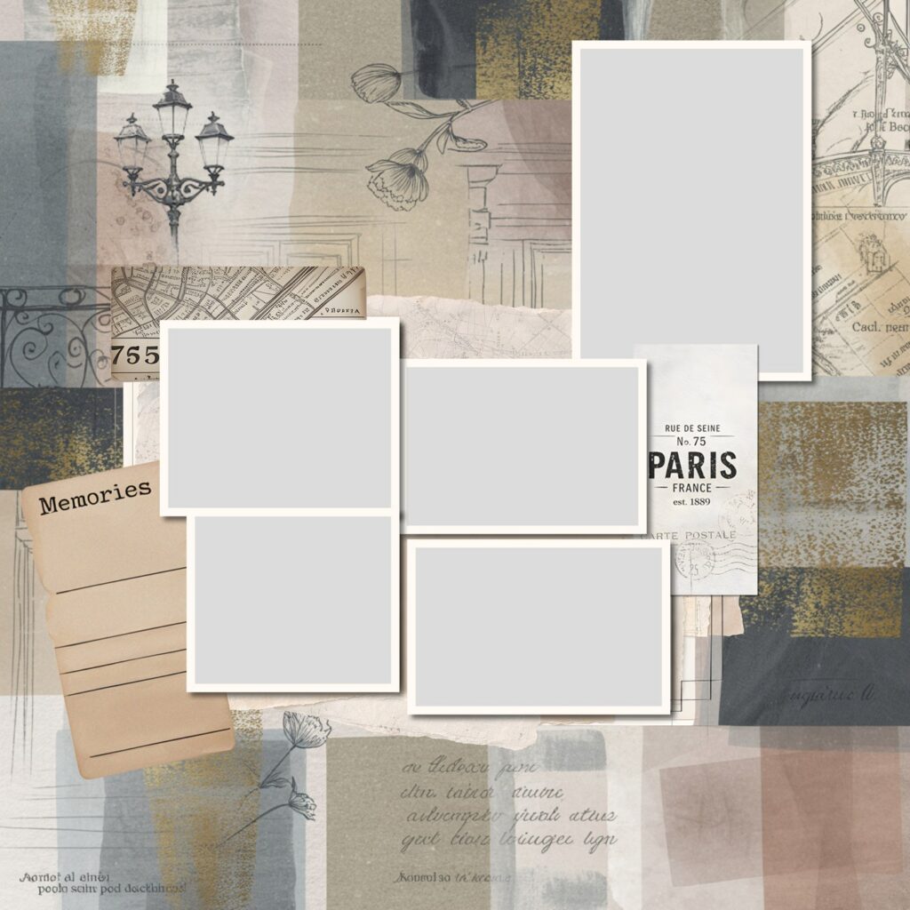
    Travel scrapbook ideas in practice: a digital Paris layout with papers, a street map, a vintage ticket, journaling cards and photo slots
    One of the fastest travel scrapbook ideas to build — photo slots, a map, a ticket and a journaling card already arranged, so you drop your own photos and words straight in.

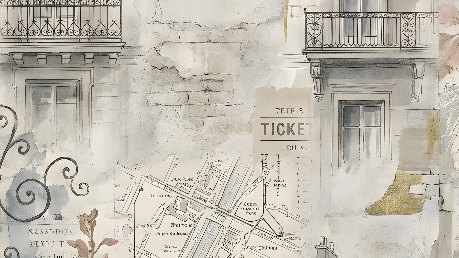
    Lay down a soft, aged paper as the background. Add a hand-drawn map of the arrondissement you stayed in, a vintage ticket, and a “Memories” journaling card for your notes. Slot your three or four favourite photos into frames — the café table, the view from Montmartre, the two of you squinting into the light. Finish with a line of small sketched details like a wrought-iron balcony or a street lamp so the page feels like the city, not just a template.

    If you’d rather not build every element from scratch, a themed set like the Paris Adventure digital scrapbook bundle gives you the papers, frames, maps and Parisian elements already designed to work together, plus page templates with the photo slots and journaling spots laid out. You bring the photos and the story; the styling is handled.

    Whatever tools you use, the goal of all these travel scrapbook ideas is the same. Get the trip out of your camera roll and onto a few pages while you still remember the small stuff — so years from now you open it and you’re right back there.

  • Spring Scrapbooking: 6 Easy Trends to Try in 2026

    Spring Scrapbooking: 6 Easy Trends to Try in 2026

    The spring scrapbooking trends I’m seeing most in 2026 are pressed botanicals, blush-and-cream neutrals, soft purple, torn-paper collage edges, oversized script titles, and clean one-photo focal pages.

    None of them need a new skill. They’re mostly about palette and restraint, which makes spring a good season to refresh how your pages look without relearning a thing.

    What’s behind the shift this spring?

    Before the list, one thread runs through all six spring scrapbooking trends: less is winning. The maximalist, every-corner-decorated page that ruled a couple of years ago is quietly going out of fashion, and a softer, more pared-back look is taking its place. Muted palettes, more white space, textures that feel handmade. If you only take one thing from this post, take that. Most of these trends are really the same instinct showing up in different ways.

    The other reason these stick around is time. The pared-back styles are simply faster to make, and a page you can finish in fifteen minutes is a page that actually gets done. That’s half of why they’re spreading.

    1. Pressed botanicals and meadow florals

    The biggest shift in spring scrapbooking this year is away from bright, busy florals toward botanicals that look pressed, almost faded, like something kept in a book for a decade. Sprigs, ferns and single stems, scattered with space around them rather than packed into a border.

    Try it: place two or three botanical sprigs at the corners of a photo and leave the middle of the page quiet. The restraint is the whole point.

    Why the shift? After a few years of maximalist, sticker-everywhere pages, a lot of us are tired of the noise. Pressed botanicals feel quieter to make and easier to live with, and they let the photo stay the subject. They also pair with almost anything, so a single botanical pack stretches across a whole album.

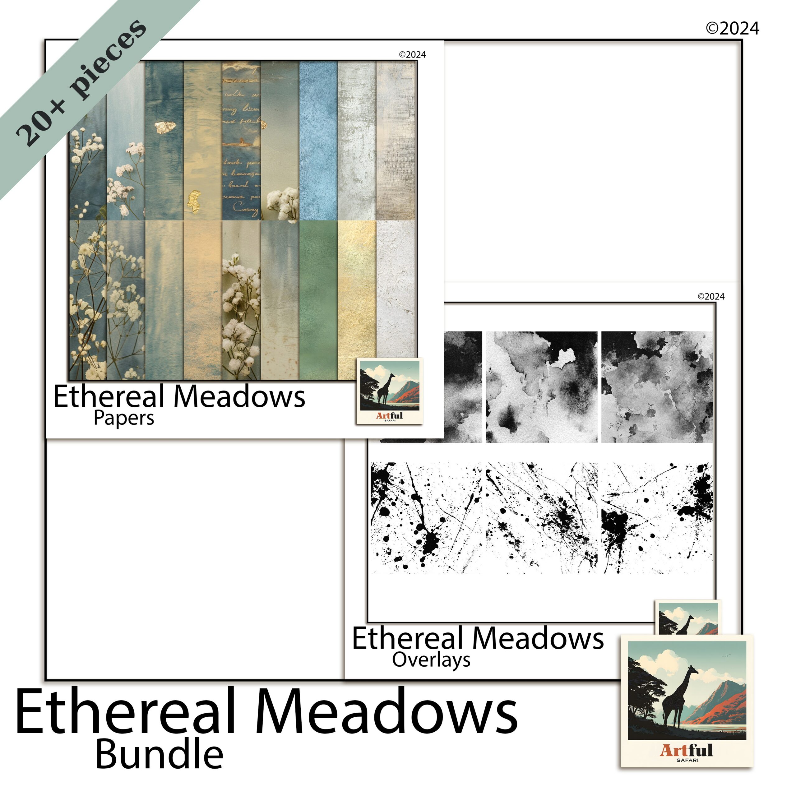
    Ethereal Meadow bundle for spring scrapbooking with pressed botanicals and florals
    Soft florals and meadow tones for spring scrapbooking, from the Ethereal Meadow Digital Scrapbook Bundle.

    2. Blush and warm neutrals, not just pastels

    Spring scrapbooking used to mean sugary pastels. In 2026 the warmer, dustier end is winning: blush, oat, clay and soft cream. They photograph beautifully behind everyday snapshots and don’t fight your photos for attention.

    Try it: build a page on a blush or oat background, then pull one slightly deeper tone from a photo for your title. Tonal, not matchy.

    The reason warm neutrals work so hard: they’re forgiving. A bright pastel can clash with a photo taken in odd light, but blush and oat sit behind almost any snapshot without a fight. That makes them the workhorses of an album, the pages you reach for when the photo is the star and you just want a quiet backdrop.

    Blush pink digital scrapbook papers for warm neutral spring layouts
    Warm neutral backgrounds from my Blush Pink Digital Scrapbook Papers.

    3. Soft purple keeps spreading

    Lavender and soft lilac aren’t slowing down. They’ve crossed from a niche colour into a full spring palette, often paired with sage or warm grey to keep them from going too sweet. If you want the background on why this one stuck, I went into it in my piece on the Lavender Scrapbooking Trend.

    Try it: use lilac as the base and sage as the accent, never the other way round. Purple leads, green supports.

    If lilac feels too sweet for your photos, drop in a warm grey as a third tone. It grounds the whole page and stops the purple reading as a nursery palette, which is the usual worry people have with it.

    4. Torn-paper and layered collage edges

    Clean digital edges are giving way to torn, deckled and rough-cut looks borrowed from junk journaling. Layered paper with a frayed edge adds texture that flat rectangles can’t, and it suits the pressed-botanical mood perfectly.

    Try it: stack two or three papers behind your photo, each slightly off-square, with a torn-edge overlay on top. Mind the layer order so the photo still sits clearly on top.

    This is one place digital and paper scrapbookers are borrowing from each other. The torn, layered look came up through junk journaling, and it’s now bleeding into clean digital pages because it adds the one thing flat layouts lack: a sense that hands made it. A little imperfection reads as warmth.

    5. Oversized handwritten and script titles

    Titles are getting bigger and more personal. Large hand-lettered or script titles, sometimes running off the edge of the page, are replacing tidy small captions. They turn the words into part of the design instead of an afterthought.

    Try it: set one short title, three or four words, at a size you’d normally think is too big. Then take it up one more notch.

    The trick that makes a big title look designed rather than shouty: let it overlap. Run the tail of a script word slightly behind the photo, or let one letter slip off the page edge. That small overlap ties the title to the image instead of leaving it floating above like a label.

    6. One-photo focal pages with breathing room

    After years of photo grids, a lot of people are paring back to a single hero photo with plenty of space around it. It feels current, it’s quicker to make, and it lets a really good shot actually breathe.

    Try it: one photo, one title, two small botanical accents, and a wide margin. Resist the urge to fill the gap.

    There’s a practical bonus here. A one-photo page takes ten minutes, not an hour, so you actually finish your album instead of leaving it half-done. If you’ve got a backlog of photos and not much time, this is the trend I’d start with. It keeps you moving.

    If you want to pick one and start tonight, here’s the spring scrapbooking shortlist with a palette and a use for each.

    TrendPaletteBest for
    Pressed botanicalsSage, cream, soft greenGarden and nature photos
    Blush neutralsBlush, oat, clayEveryday and family pages
    Soft purpleLilac, sage, warm greySofter mood spreads
    Torn-paper edgesKraft, cream, muted tonesLayered, textured layouts
    Oversized titlesOne bold accent colourSingle-event or milestone pages
    One-photo focalAny, kept minimalYour best single shot

    You don’t need all six. The strongest spring scrapbooking pages usually borrow two, not five. A combination I keep coming back to: a blush-neutral background, one large script title, a single photo, and two pressed-botanical sprigs in the corners. That’s it. Four moves, and it reads as current without looking like it’s trying.

    If you’re newer to this and want a starting point rather than a palette, my walkthrough on getting set up pairs well with these ideas.

    One last note before you dive in: don’t chase all of these at once across an album. A book where every page tries a different trend looks restless. Pick a palette and one or two looks, hold them across the whole album, and the spreads will sit together like they belong. The trend is the seasoning. Your photos and your story are still the meal.

    Key takeaways

    • Spring scrapbooking in 2026 leans muted and textured, not bright and busy.
    • Blush neutrals and soft purple are the season’s safest, most flexible palettes.
    • Pressed botanicals and torn-paper edges add texture without adding clutter.
    • Combine two trends per page, not all six, and leave breathing room.

    Frequently asked questions

    The main ones are pressed botanicals, blush and warm neutrals, soft purple, torn-paper collage edges, oversized script titles, and clean one-photo focal pages.

    Warmer, dustier tones lead: blush, oat and clay neutrals, plus soft purple paired with sage. The sugary pastel palette is fading in favour of muted, tonal combinations.

    How do I make a spring scrapbooking page look current without redoing my whole style?

    Pick two trends, not all six. A blush background, one large script title, a single photo and two botanical sprigs is enough to feel fresh while staying simple.

    Are torn-paper edges hard to do digitally?

    No. Many kits include torn or deckled-edge overlays you layer over your papers. Stack a couple of papers slightly off-square and drop the torn edge on top.

    Yes. Most spring scrapbooking trends this year come down to palette and restraint, so they translate to either. The torn-edge look in particular comes straight from junk journaling, so it suits both.