40% off until 31 October on selected products·8 days left

Category: Trends & Ideas

  • Sage Green Palette: 5 Easy Colour Pairings for Scrapbook Pages

    Sage Green Palette: 5 Easy Colour Pairings for Scrapbook Pages

    A sage green palette is one of the easiest colour schemes to fall for, and one of the easiest to get wrong. It photographs beautifully on someone else’s layout and then goes strangely lifeless on yours.

    The reason is almost always the same. Sage is a muted, low-saturation green, so a sage green palette built entirely from other muted, low-saturation colours has nothing to push against. Below are five pairings that fix it, and two colours worth keeping off the page.

    Why a sage green palette goes flat

    Sage sits between grey and green, which is exactly what makes it restful. It is a desaturated shade of green with a lot of grey mixed in, so its natural instinct is to recede.

    That works in your favour behind a photo. It works against you when every other element on the page is also receding.

    A page needs somewhere for the eye to land first. If your sage green palette is six soft greens and a cream, there is no first. The eye skims the whole thing and moves on, which is why the layout reads as pleasant but forgettable.

    The fix is not more colour. It is one or two deliberate points of contrast, placed where you want the reader to look.

    1. Warm cream does more than white

    White next to sage looks clinical. The green picks up the grey in the white and both go cold.

    Warm cream, ivory and unbleached paper tones do the opposite. They read as light without draining the warmth out of the green, and they give you somewhere to put journaling that is not fighting the background.

    If you are matting a photo, try a cream mat rather than a white one and compare the two side by side. The difference is larger than it sounds.

    2. Dusty rose, in small amounts

    Rose and sage sit near enough to opposite on the colour wheel to create contrast, but both are muted enough that it never turns loud. This is the pairing that rescues most soft green layouts.

    Keep the ratio uneven. Roughly one part rose to five parts green is plenty, applied as a flower, a strip of paper, or a bit of ribbon rather than a whole background sheet.

    We went into this pairing in more depth in our guide to layering dusty rose paper, and most of it transfers straight across.

    3. One charcoal anchor

    Every soft page benefits from one genuinely dark element. Not black, which reads as a hole, but a warm charcoal or a deep forest green pulled from the darkest part of your papers.

    Use it once. A charcoal title, a dark photo corner, or a single deep-toned leaf cluster gives the eye its landing point and makes everything around it look intentional.

    This is the single most effective change you can make to a sage green palette that feels washed out.

    4. Terracotta for warmth

    If rose is too sweet for the page, terracotta does a similar job with more earth in it. It suits travel pages, garden pages and anything with a photo taken in strong sunlight.

    Terracotta and sage together read as a sage green palette that has been outside. Rose and sage read as one that has been indoors near a window.

    Both are correct. They just set a different mood, so pick whichever matches the photograph.

    5. Brass rather than yellow gold

    Bright yellow gold sits badly against grey-greens. It looks like it was added afterwards, because tonally it was.

    Antique brass, aged gold and soft copper have enough brown in them to sit down properly into a sage green palette. A thin brass line, a small aged charm or a few flecks of metallic in the paper itself is usually all it takes.

    If you are building your combination from scratch, dropping your greens into the Adobe colour wheel and looking at the analogous and split-complementary sets is a quick way to test a metallic before you commit to it.

    Two colours to keep out of a sage green palette

    Bright white. Covered above, but it is worth repeating because it is the most common mistake. Swap it for cream everywhere, including your journaling cards.

    Navy. Navy and sage both want to be the calm, cool anchor on a page, so together they argue. If you want that depth, take it from a dark forest green or a warm charcoal instead, which keeps the page in one family.

    Dusty blue is the exception worth knowing about, since it is light enough not to compete. We wrote about warming up dusty blue pages separately, and the same warming tricks apply here.

    Which photos suit a sage green palette

    This is the step most people skip, and it decides more than the paper choice does.

    Sage flatters photographs taken in soft, indirect light. Overcast days, shade, window light, anything where the shadows are open rather than hard. Those photos already share the palette’s low contrast, so the page holds together without any effort from you.

    It fights bright, saturated photos. A midday beach shot or anything with strong primary colours in it will pull every bit of attention off the page, and no amount of careful layering wins that argument.

    Two ways round it if you love the photo. Print or export it slightly desaturated so it sits closer to the papers, or lean into the clash and treat the photo as the single loud element, keeping the rest of the sage green palette almost bare.

    Black-and-white photographs are the safe option and worth remembering. They pick up whatever warmth is around them, so a sage green palette makes them read as soft rather than stark.

    Putting a sage green palette on the page

    Here is the order that works, whether you are cutting paper or working in Procreate, Canva or Photoshop.

    • Start with the quietest sheet you have as the background. A plain wash, not a floral.
    • Mat the photo in warm cream, slightly larger than the photo itself.
    • Add one floral element, weighted to a corner rather than centred.
    • Place your single dark anchor opposite it, on the diagonal.
    • Finish with the metallic, sparingly, last.

    The floral corner is doing most of the work, so it is worth having sheets where the florals already sit around an open centre rather than across the middle of the page.
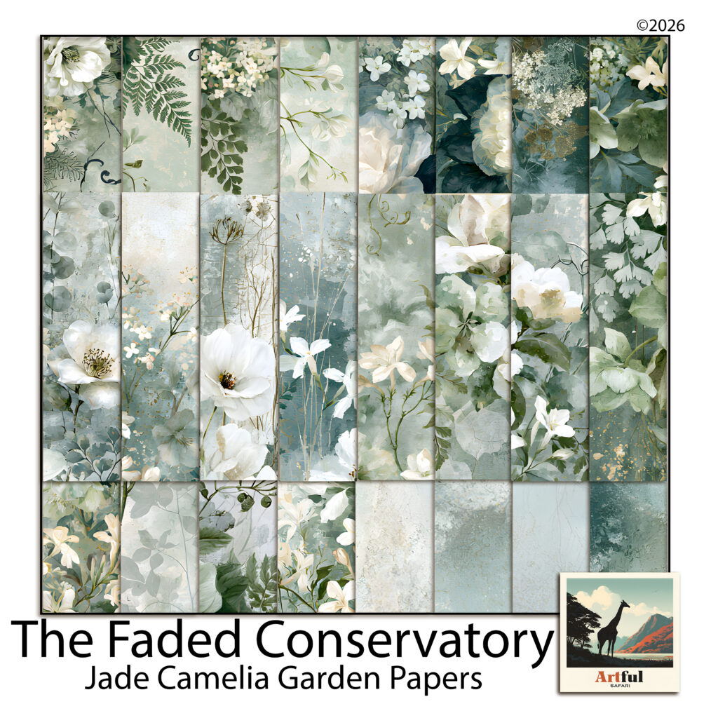
    Sage green palette papers with white camellias and ferns from the Jade Camelia Garden kit
    A sage green palette built from watercolour camellias, ferns and plain plaster washes.

    The pages above come from our Jade Camelia Garden paper kit, which was put together with exactly this problem in mind. Roughly a third of the sheets are near-plain washes, precisely so there is somewhere quiet to put a photo.

    Any set of soft green papers will do the same job. The thing to check before you buy or before you start cutting is that the collection includes blenders, not only florals.

    Where most people go wrong

    The instinct with a beautiful set of floral papers is to use the most beautiful sheet as the background. It almost never works, because the photo then has to compete with the paper for attention.

    Put the loudest sheet somewhere small. A strip along one edge, a mat behind a tag, the inside of a folded pocket. Give the background to the sheet you would otherwise skip.

    Do that, add the charcoal anchor, and a sage green palette stops being restful in the bad sense and starts being restful in the way you wanted.

  • Memory Keeping Ideas for August: 6 Easy Pages Worth Making

    Memory Keeping Ideas for August: 6 Easy Pages Worth Making

    The best August memory keeping ideas start with the photos already on your phone: a summer recap grid, a fuller back-to-school page, and one ordinary day you’d otherwise forget. Pick a theme, pull four or five photos, write one true line, and the page is done.

    August is an easy month to capture because the pace drops and the raw material is fresh. You don’t need a big album, just a few pages that tell the truth about where the month went.

    If you’d rather start with a complete set, our scrapbook bundles put matching papers, clipart and frames in one download.

    Why August is good for memory keeping

    August sits on a seam. Summer is winding down, the new school year is days away, and your phone is full of photos nobody has done anything with yet. That gap is the easiest time to make pages, because the raw material is fresh and the story half tells itself.

    You don’t need a big memory keeping project. One or two pages that capture where the month actually went will be worth more in five years than a perfect album you never finish. The aim is to get the month onto a page while you still remember the small details, not to build a museum.

    Simple memory keeping ideas for the end of summer

    Start with the photos you already have, not the ones you wish you’d taken. Pick a theme, pull four or five pictures, write one true line, done. Here are prompts that work without much fuss:

    • Summer recap grid. Nine small photos, one per week or one per outing, on a single page.
    • Last days of the holiday. The quiet end-of-summer shots: bare feet, late dinners, the messy car boot.
    • What we actually ate. Ice creams, barbecues, the same picnic three times. Food dates a summer better than almost anything.
    • The place we kept going back to. One beach, one park, one pool, photographed across the season.
    • Things they said. A page of overheard lines from the kids, no photos needed.
    • The summer reading pile. A photo of the stack, and a line about which one stuck.

    None of these need a special occasion behind them. That is the trick with August memory keeping: the ordinary stretch of the month is the story, so you don’t have to wait for an event to start a page.

    Stories Grow digital scrapbook bundle used for August memory keeping ideas
    Soft, everyday papers from the Stories Grow Digital Scrapbook Bundle suit recap and back-to-school pages.

    Back-to-school pages that aren’t just the first-day photo

    The doorstep first-day photo is lovely, but it is one shot. Build a page around it so the moment has some company:

    • The shoes, the bag and the lunchbox laid out the night before.
    • A “this year they are into” list: the song, the snack, the obsession.
    • Height against the doorframe, or a hand traced and scanned.
    • The walk to school, not just the pose at the gate.
    • A short note in your own words about how they seemed, nervous or itching to go.

    A memory keeping page plan you can fill in fast

    If a blank page stalls you, work from a simple plan. Decide the theme, then the photos, then one journaling line. The line is the bit future-you will actually read.

    Page promptPhotos to pullJournaling line
    Summer recapOne photo per week“The summer we mostly stayed home and it was better for it.”
    First day of schoolDoorstep, walk, gate“You wanted to go in on your own this year.”
    Everyday AugustBreakfast, garden, bedtime“Nothing happened today and I want to remember it.”
    The last beach dayThree or four wide shots“We stayed until the car park emptied.”
    What we ateMeals and treats“Ice cream three days running, no regrets.”

    Journaling lines when you’re stuck

    If the words won’t come, answer one small question instead of trying to sum up the whole day. What did it smell like. Who laughed. What was on in the background. What did you almost not photograph. One concrete detail beats a paragraph of “we had a lovely time”.

    How do you tell the story across a spread?

    A single memory keeping page captures a moment. Two facing pages can carry a whole stretch of the month. Give the left page the wide view, the right page the close detail, and let them talk to each other.

    • Left: the big group shot or the landscape. Right: the small things, the hands, the ticket, the sandy feet.
    • Keep one paper or colour running across both pages so they read as a pair.
    • Put the date once, on the left, rather than repeating it.

    Everyday memory keeping pages worth making

    The pages people treasure later are rarely the big events. They are the ordinary ones: the kitchen table, the dog asleep on the wrong chair, the view from the back step. August is full of these because the pace drops.

    Keep them plain. A single large photo, a soft paper behind it, one date, one line. Resist filling every corner. The story is the photo, and the page is just there to hold it.

    New Stories digital scrapbook bundle for everyday-life memory pages
    The New Stories Digital Scrapbook Bundle is built for everyday memory keeping, the ordinary days that turn out to matter most.

    Which papers and colours suit August pages?

    End-of-summer memory keeping pages tend to look right in warm, slightly faded tones: sand, sun-bleached blue, soft green, a touch of gold. Back-to-school pages can take a sharper note, a deeper blue or a brick red, to mark the change of season. Pick one paper as your background and one or two as accents, then stop. Three patterns fighting for attention will bury the photo.

    Journaling cards do a lot of quiet work here. A plain card behind your text gives the words a clear place to sit, so they don’t float over a busy paper and turn to mush. If a kit comes with matching cards, use them; if not, a soft rectangle at low opacity does the same job. Keep the text dark on light, or light on dark, and leave a little breathing room around the edges.

    Mixing photos with no photos at all

    Not every memory keeping page needs a picture. A list page, a quote your child said, a ticket stub scanned in, or a hand-written caption can carry a spread on its own. These no-photo pages often age better than the posed shots, because they hold the words you’d otherwise forget. Slot one or two between your photo pages and the album reads less like a slideshow and more like the month as it felt.

    A small memory keeping routine that stops it piling up

    The reason August photos sit untouched is that the job feels big. Shrink it. Once a week, give memory keeping twenty minutes: pick your favourite five photos from those days and build one page. Five photos, one paper, one line. By the end of the month you have four pages and a record, instead of two thousand photos and good intentions.

    If even that slips, do a single catch-up at the end of the month. Pull the standout shots, group them by week, and make one page per week. It is rougher than the weekly habit, but a finished rough memory keeping album beats a perfect one that lives only in your head.

    How many pages should an August album have?

    As few as it takes to tell the truth about the month. Six strong pages beat twenty padded ones. If you only make three, make them the recap, the first day back, and one ordinary Tuesday.

    If you are brand new to memory keeping, the Digital Scrapbooking for Beginners guide walks through setting up a 12×12 page and dropping in your first photo. Once that feels easy, the prompts above give you a month of pages to aim at.

    Key takeaways

    • Work from the photos you already have, not the ones you meant to take.
    • One theme, a few photos and one true journaling line make a finished memory keeping page.
    • Build the first-day photo into a fuller back-to-school page so the moment has context.
    • A few real memory keeping pages beat a long padded album you never close out.

    Frequently asked questions

    What should I put in an end-of-summer scrapbook page?

    Start with a recap: a grid of photos across the season, the food you ate, and the one place you kept going back to. Add a single journaling line so the page means something later.

    How do I make a back-to-school page more than the first-day photo?

    Build context around the photo. Add the laid-out uniform, a short list of what they are into this year, a height mark, and the walk to school rather than just the pose at the gate.

    How many pages do I need for one month?

    Fewer than you think. Three to six strong pages capture a month better than twenty padded ones. If you only make three, choose a recap, the first day back and one ordinary day.

    What colours suit end-of-summer pages?

    Warm, slightly faded tones work well: sand, sun-bleached blue, soft green and a little gold. For back-to-school pages, a sharper deep blue or brick red marks the change of season.

    I am new to digital scrapbooking. Where do I start?

    Set up a 12×12 page, drop in one photo, place a paper behind it and add a date. The beginners guide on the blog walks through the whole first page step by step.

  • Purple Scrapbook Ideas: 5 Gorgeous Layouts from Lilac to Plum

    Purple Scrapbook Ideas: 5 Gorgeous Layouts from Lilac to Plum

    The best purple scrapbook ideas start by treating purple as a family, not one colour: pick a lead shade from lavender, violet, plum or mauve, anchor it with a neutral like cream or warm grey, and add a single warm accent such as gold.

    Do that and a purple page looks designed. Skip it and it reads childish. Here is how to choose and build.

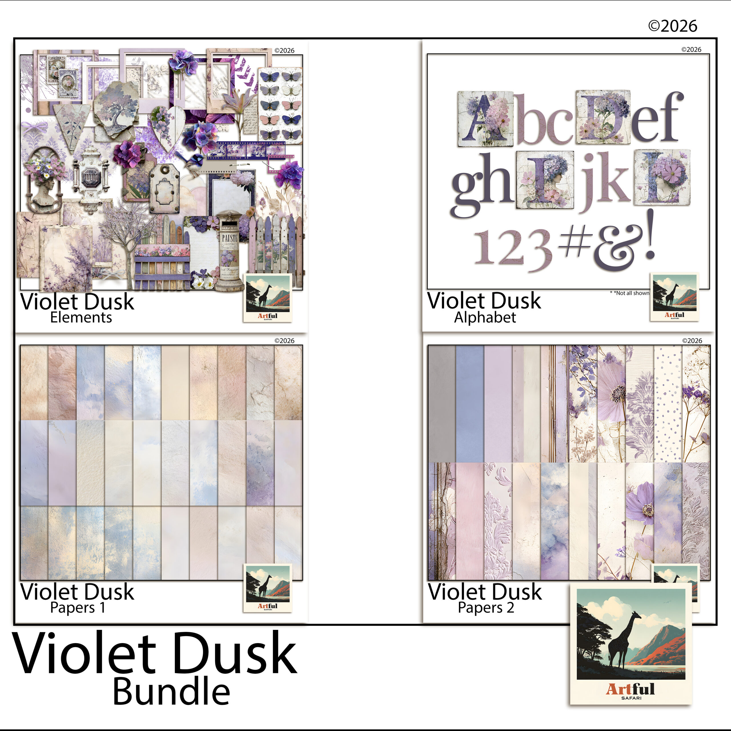
    For more purple papers, see the Violet Dusk collection.

    Purple scrapbook ideas that actually hold together

    Purple goes wrong when you treat it as one colour. It is a family, and the family runs from pale lilac to near-black aubergine. Pick a lane before you start a page, then build around it.

    Purple scrapbook ideas that work pair one shade as the lead, one supporting neutral, and a single accent. The pages that fail use four purples at full strength and read like a bruise. Restraint is the whole game here.

    ShadeMoodPairs well with
    Lavender / lilacSoft, airy, springCream, sage, warm grey
    VioletBright, cheerfulWhite, soft yellow, blush
    Plum / aubergineMoody, autumnal, richGold, charcoal, dusty rose
    Mauve / dusty purpleVintage, quietTaupe, antique brass, off-white
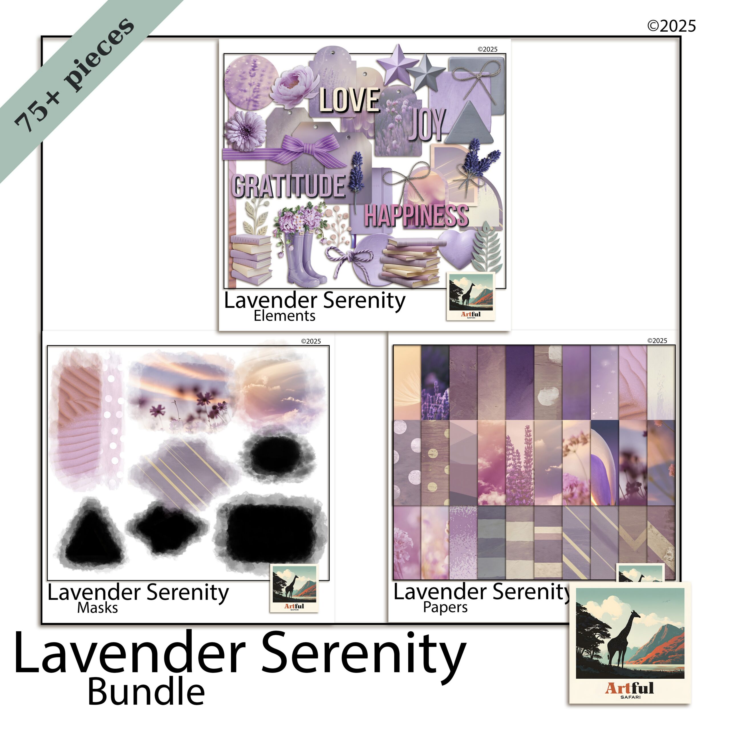
    Lavender Serenity digital scrapbook bundle with soft lilac papers and florals
    For the soft end, lilac washes and florals: the Lavender Serenity Digital Scrapbook Bundle.

    Lavender vs violet vs plum: which to reach for

    The three get muddled, so here is how I choose.

    Lavender for soft, everyday spreads

    Lavender is the low-key one. Use it for spring photos, garden days, slow weekends and anything you want to read as light. It plays nicely with lots of white space, so do not crowd it.

    Violet for energy

    Violet has more punch. It suits celebration pages, birthdays and bright summer shots. Because it is loud, give it a clean neutral background or it competes with your photos.

    Plum for depth

    Plum and aubergine carry weight. They are made for autumn pages, evening events and anything you want to feel rich. Lift plum with a metallic gold accent so it does not go flat.

    How do you pair purple without it looking childish?

    The fastest way to make purple look grown-up is to mute it and ground it with a neutral.

    • Cut the saturation. Dusty, greyed purples read as designed; primary purple reads as a school folder.
    • Anchor with a neutral. Cream, taupe or warm grey gives the eye somewhere to rest.
    • Add one warm accent. Gold, brass or dusty rose stops a purple page going cold.
    • Keep one purple dominant. Let the others support at smaller sizes or lower opacity.

    For more on why the soft-purple look took off and how to lean into it, my Lavender Scrapbooking Trend post covers the background.

    Violet Dusk bundle showing deep purple scrapbook ideas and plum papers
    Purple scrapbook ideas from the deeper end of the palette: the Violet Dusk Digital Scrapbook Bundle.

    Five purple scrapbook ideas to try

    Concrete purple scrapbook ideas you can build tonight.

    1. Lilac wash + single photo. A pale lavender paper, one large focal photo, a thin cream mat, a script title. That is the whole page. The space does the work.
    2. Plum grid. Aubergine background, a 2×2 grid of photos with narrow white gutters, gold journaling tags between them.
    3. Floral border. Cream centre, lavender florals trailing down one side, photos stacked in the open space.
    4. Ombre tones. Move lilac to violet to plum across a two-page spread, lightest on the left, to carry the eye through a day of photos.
    5. Mauve memory page. Dusty purple paper, a vintage frame PNG, one photo, and a long journaling block. Low-key and quiet.

    Which florals and elements suit a purple page?

    Purple loves botanicals, but the wrong flower fights the palette. Match the bloom to the shade.

    • Lavender sprigs and wisteria for lilac pages, since they echo the colour without adding a clashing hue.
    • Roses and peonies in blush or cream to warm up a violet spread that risks going cold.
    • Dark dahlias, thistle and dried seedheads for plum and aubergine, which suit a moodier, autumnal page.
    • Greenery in sage or eucalyptus rather than bright leaf green, which sits more easily next to muted purples.

    For metallic touches, gold and antique brass flatter every purple. Silver works with cool lilac but can look cold against plum, so test before you commit.

    Fonts and titles

    A flowing script in a deeper purple than the background reads as elegant. For a punchier page, a clean serif in cream or gold over a violet block holds up better than another purple, which would vanish into the paper.

    Seasonal purple scrapbook ideas

    The same family carries you through the year if you shift which shade leads.

    • Spring: lavender and lilac with cream and sage, for garden and Easter pages.
    • Summer: bright violet with white and soft yellow, for festival and holiday shots.
    • Autumn: plum and aubergine with gold and charcoal, for cosy evening and harvest pages.
    • Winter: deep violet with silver and icy grey, for a frosted, quiet feel.

    Purple scrapbook ideas for a digital workflow

    Working in Procreate, Photoshop or Canva makes the purple family easy to test, because you can recolour and re-tone without committing.

    • Drop opacity on a purple paper layer to mute it instantly, instead of hunting for a duller sheet.
    • Use a colour-fill layer set to a low percentage over a neutral paper to tint it lilac.
    • Sample from a coordinated bundle so your title text and elements share the same purples as your papers.
    • Keep a swatch page of your three chosen purples plus the neutral, and pull from it for every spread in the album.

    A coordinated lavender or violet bundle does the palette work for you, since the papers, florals and elements are already toned to sit together. That is the part that takes longest to get right by hand.

    Key takeaways

    • Treat purple as a family: lavender, violet, plum and mauve each set a different mood.
    • Pick one purple to lead, anchor with a neutral, and add a single warm accent.
    • Mute the saturation to keep purple looking designed rather than childish.
    • Digital tools let you tone and test purples fast, and a coordinated bundle pre-solves the palette.
    • The strongest purple scrapbook ideas repeat one palette across the whole album.

    Frequently asked questions

    What colours go with purple in a scrapbook?

    Cream, taupe and warm grey ground purple well, and a warm accent like gold, brass or dusty rose keeps it from going cold. Match the neutral to the purple’s depth: cream for lavender, charcoal and gold for plum.

    What is the difference between lavender, violet and plum?

    Lavender is pale and soft for low-key pages, violet is brighter with more energy for celebrations, and plum or aubergine is deep and rich for autumn and evening pages.

    How do I stop purple looking childish on a page?

    Cut the saturation so you are using dusty, greyed purples rather than primary ones, anchor the page with a neutral, and let one purple dominate while the others support at smaller sizes.

    Which purple scrapbook ideas suit autumn pages?

    Plum and aubergine. They carry weight and pair beautifully with gold, charcoal and dusty rose, which suits evening events and autumn photos far better than pale lavender.

  • Hiking Scrapbook Layout Ideas: 4 Stunning Mountain Pages

    Hiking Scrapbook Layout Ideas: 4 Stunning Mountain Pages

    The best hiking scrapbook ideas build each page around the trail itself: a topographic or contour-line background, a tight grid of summit and trail photos, an elevation-profile strip down one edge, and a trail-log card with distance, time and weather. That structure turns a phone full of mountain photos into a page that actually tells the walk.

    Mountains photograph big and wide, so your layout should give the photo room and keep the decoration to the margins.

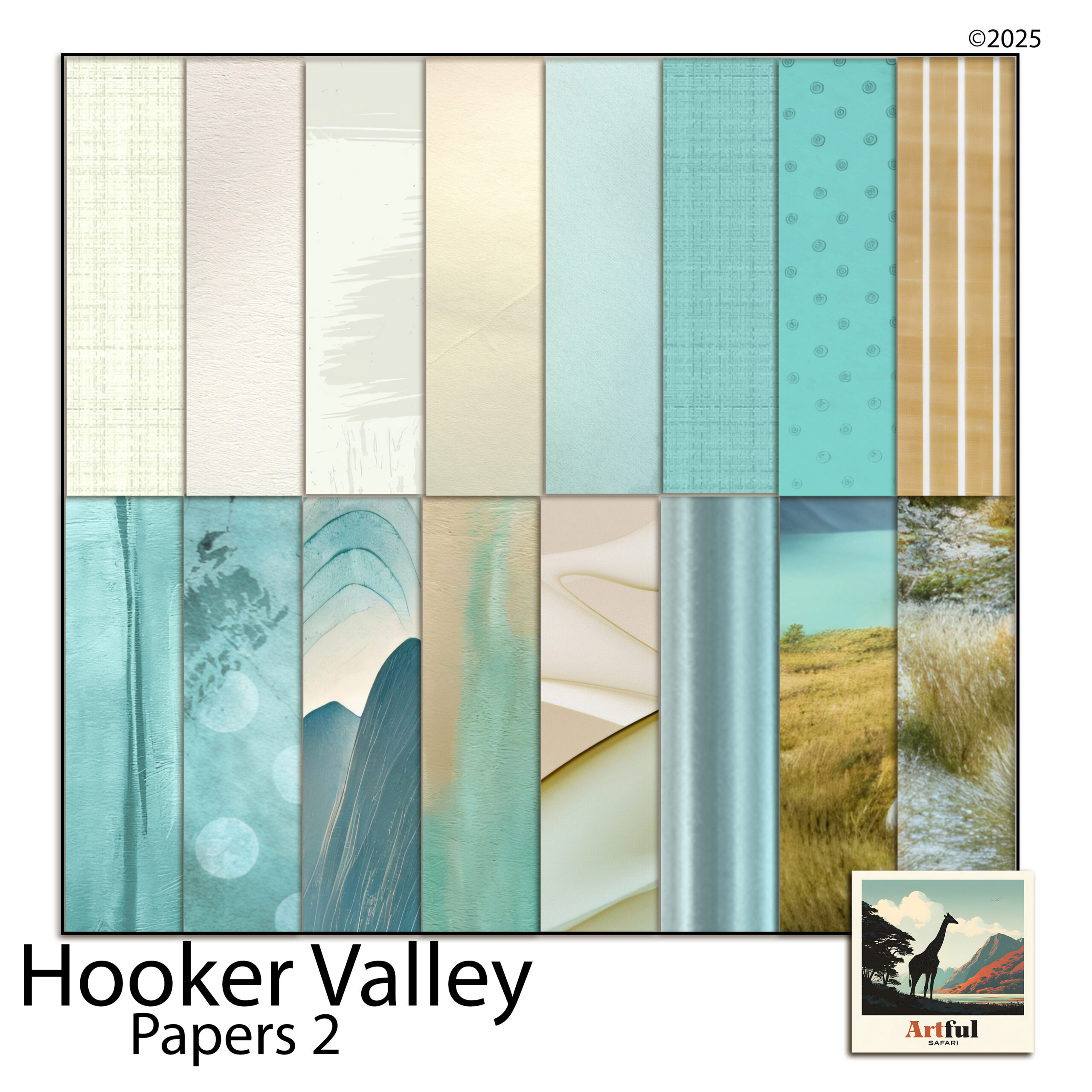
    For mountain and hiking pages, have a look at the Hooker Valley collection.

    What hiking scrapbook ideas work best for a trail album?

    Four layouts cover almost every walk. Pick one per page and repeat them through the album so it reads as one trip, not a random gallery.

    • The hero shot: one full-bleed summit or valley photo, a thin caption strip, nothing else competing.
    • The summit grid: four to six photos in a clean grid over a stone or contour paper.
    • The trail story: photos in walking order, start to summit to descent, read left to right.
    • The data page: a trail-log card plus a small map or elevation strip, light on photos.
    Hooker Valley mountain hiking digital bundle used for hiking scrapbook ideas
    Hiking scrapbook papers and trail elements in the Hooker Valley Mountain Hiking Digital Bundle.

    The Hooker Valley Mountain Hiking Digital Bundle gives you the papers, frames and trail-marker elements to build all four without mixing mismatched styles.

    Match the layout to the day. A short, scenic walk with a few standout views suits the hero shot. A long summit day where every hour looked different suits the trail story, read in order. Do not force a data-heavy page onto a quick stroll; not every walk needs an elevation chart.

    Give the big photo room to breathe

    Mountain photography is about scale, and scale needs space. A full-bleed summit shot with a 5mm border says more than the same photo shrunk into a corner with four stickers around it. When in doubt, make the best photo bigger and remove an element rather than adding one. The empty stone or sky in a landscape is part of the picture, not a gap to fill.

    Topographic textures and colours for a hiking scrapbook

    Hiking scrapbook pages live in cool stone and slate, with one warm accent so they do not turn grey and lifeless.

    • Slate, granite and fog for backgrounds and contour-line papers.
    • Pine or moss green for borders and trail markers.
    • One warm accent: sunrise gold or trail-sign orange, used only on small details.

    Contour-line and topographic papers do a lot of quiet work here. Run a contour texture at low opacity behind a photo grid and the whole page reads “mountains” before anyone looks closely. The Alpine Mountain Digital Scrapbook Papers carry that stone-and-contour feel across a full set.

    Alpine mountain digital scrapbook papers with stone and topographic textures
    Stone and contour textures in the Alpine Mountain Digital Scrapbook Papers set.

    Keep the texture subtle. Contour papers at full strength compete with your photos. Drop them to around 30 to 50 percent so they sit behind the page rather than on top of it, and let the mountain in the photo be the loudest thing on the spread.

    Sequencing a multi-day hike across a spread

    A single day fits on one page. A multi-day trek needs a running order, or the hiking scrapbook turns into a pile of similar ridgelines with no sense of progress.

    The clearest approach is one spread per day, with a small repeating header: day number, the hut or camp you started and finished at, and the day’s distance. Readers (and you, later) can flip through and feel the trip move forward.

    • Day header strip across the top of each spread, identical layout every time.
    • A thin route line or arrow showing direction of travel, so the eye follows the walk.
    • One standout photo per day sized larger than the rest, usually the high point or the view that stopped you.

    Repetition is the point. The same header in the same place each day is what makes six different valleys feel like one journey.

    The elevation-profile page that tells the climb

    An elevation profile, that jagged line showing how steeply you climbed, is the one element unique to a hiking scrapbook. It instantly signals effort in a way a flat map cannot.

    How to build one

    1. Screenshot the elevation graph from your hiking app or GPS watch.
    2. Drop it as a strip along the bottom or one side of the page.
    3. Mark the summit point and trailhead with a small element or label.
    4. Pair it with the single hardest photo of the day.

    It works as a spine for a whole spread: profile down the side, photos filling the rest in the order you walked them.

    No GPS data? Sketch a rough profile yourself. A simple hand-drawn line that rises to a peak and comes down the other side still reads as the shape of the day, and the slightly imperfect line suits a scrapbook better than a clinical graph anyway. Label the summit height and the trailhead and it does the same job.

    Trail-log journaling cards that finish the page

    Photos show where you were. The log card says what it was actually like. Keep a small card on most pages with the facts and one line in your own words.

    FieldExample
    TrailHooker Valley Track
    Distance / time10 km, 3 hrs
    Elevation gain120 m
    WeatherClear, cold wind off the glacier
    One line“The swing bridges were worse than the climb.”

    That last line is what you will reread in ten years, not the distance. Write it the day you get home while the walk is fresh.

    Mixing photos with maps

    A small map crop next to the photos grounds the page in a real place. Screenshot the section of trail you walked, crop it tight, and set it as a card rather than a full background so it stays a reference, not the whole show. A dotted line from trailhead to summit makes it instantly readable.

    One map per spread is plenty. The photos are the memory; the map is just there to say where.

    Common hiking scrapbook mistakes

    The same few habits weaken otherwise good hiking scrapbook pages.

    • Twelve near-identical summit photos. Pick the three best and cut the rest. Sameness reads as filler.
    • Loud backgrounds. A full-strength contour paper behind a busy grid turns the page into noise.
    • No facts at all. Beautiful photos with no distance, date or weather lose half their meaning in a few years.
    • Forgetting the start. The trailhead sign, the car park, the first muddy boot photo set the scene. They are worth a corner.

    Building a wider trip album around the hike? My step-by-step on How to Make a Travel Scrapbook covers title pages and sequencing for the whole trip, with the trail pages slotting in as one chapter.

    Key takeaways

    • Build each page on a contour or stone background and give the mountain photo room to breathe.
    • Repeat four layouts (hero, grid, trail story, data page) so the album reads as one walk.
    • An elevation-profile strip is the element that makes a hiking scrapbook page unmistakably a hiking page.
    • A trail-log card with one line in your own words is the part you will reread years later.

    Frequently asked questions

    What should go on a hiking scrapbook page?

    A topographic or stone background, your best summit or trail photos, and a small trail-log card with distance, time, elevation gain and weather. An elevation-profile strip ties it all together.

    What colours suit a mountain scrapbook?

    Cool stone, slate and fog for backgrounds, pine or moss green for borders, and one warm accent like sunrise gold used sparingly so the page does not turn grey.

    How do I add an elevation profile to a layout?

    Screenshot the elevation graph from your hiking app or GPS watch and drop it as a strip down one side or along the bottom, then mark the summit and trailhead with small labels.

    How many photos should a hiking scrapbook page have?

    One full-bleed hero shot for big views, or a clean grid of four to six for a summit day. Crowding more than that fights the scale of the landscape.

  • Woodland & Botanical Junk Journal Ideas: 5 Beautiful Pages

    Woodland & Botanical Junk Journal Ideas: 5 Beautiful Pages

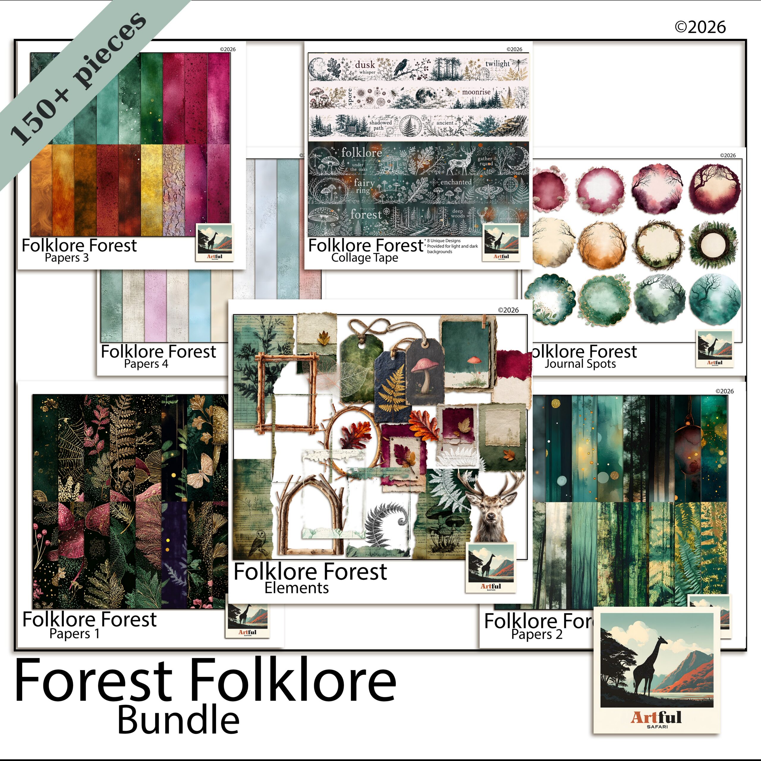
    A botanical junk journal is a handmade or digital journal built around forest and plant motifs: stag and fern silhouettes, mossy greens, pressed leaves and aged paper that looks like it spent a winter in a cabin drawer. You make one by picking a forest-folklore kit, layering a few botanical papers, adding one or two animal elements per spread, and leaving room to write.

    The trick is restraint. A woodland theme reads best when the paper does the heavy lifting and the clipart stays sparse.

    What makes a botanical junk journal feel like the woods?

    Three things carry the whole look: the paper texture, a tight green palette, and a handful of forest motifs used sparingly. Get those right and even a beginner spread reads as woodland.

    Texture matters most. Aged, foxed, slightly mottled papers say “old field notebook” far better than a clean white background ever will. Layer a torn-edge paper over a plain mossy one and you already have depth.

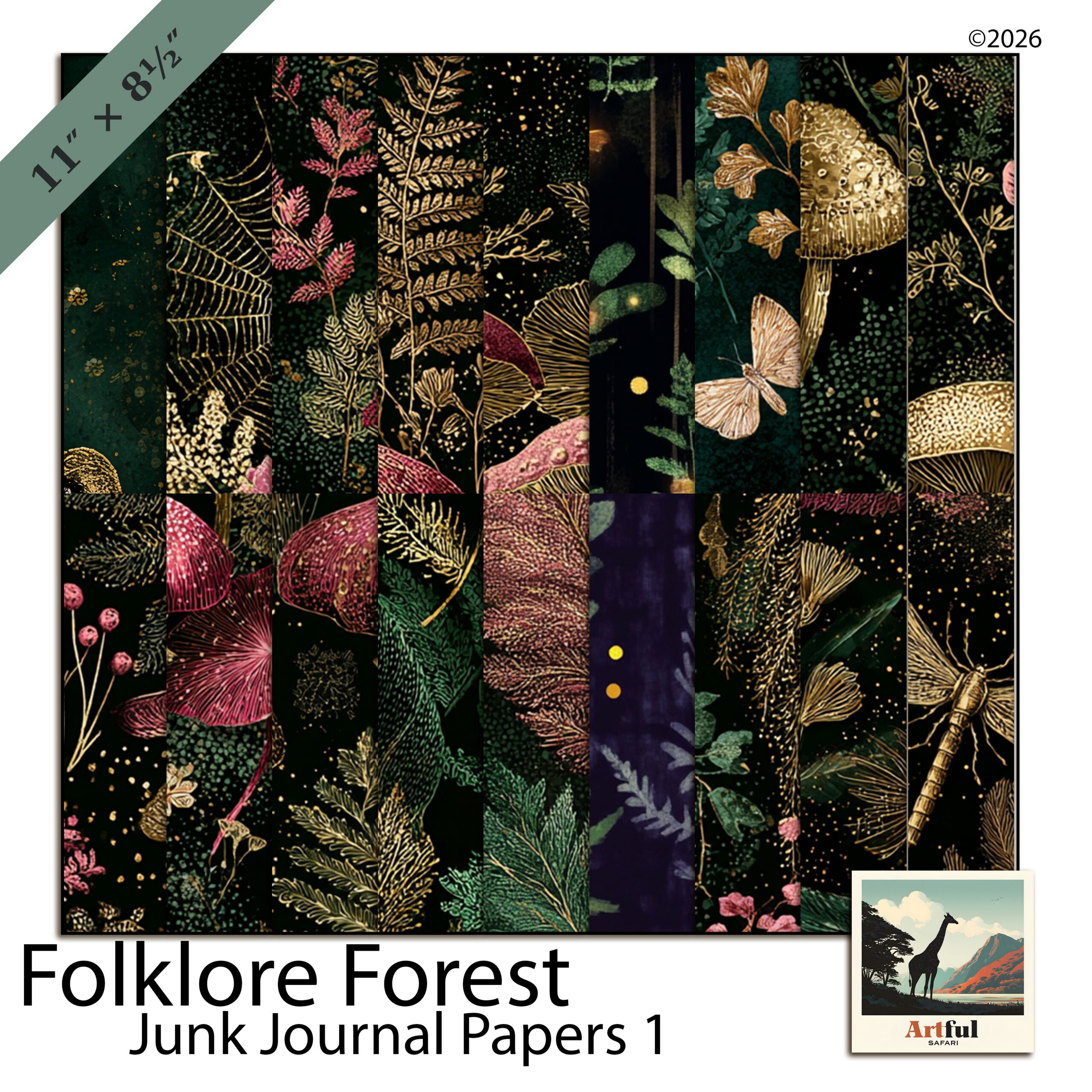
    Folklore Forest woodland junk journal bundle with fern papers and stag clipart
    A full forest-folklore set in the Folklore Forest Botanical Junk Journal Bundle.

    The Folklore Forest Botanical Junk Journal Bundle gives you the papers, fern overlays and animal elements in one place, so you are not hunting for matching greens across five different sets.

    The emerald and moss palette that holds it together

    Woodland lives in a narrow band of greens with warm neutrals underneath. Pick two greens and one neutral, then repeat them across every page so the botanical junk journal looks like one book and not a scrapbook of offcuts.

    • Deep emerald for borders, ribbon and the darkest leaves.
    • Soft moss or sage for the main paper fields, where your writing sits.
    • Warm kraft or tea-stained cream as the neutral that stops the greens going flat.

    A touch of rust or mushroom-brown reads as autumn woodland. A touch of grey-blue tips it toward misty morning forest. Add one accent, not both.

    If a spread starts to feel muddy, it is usually too many mid-greens fighting each other. Pull one of them out and let a cream paper carry the space instead. Contrast is what makes the dark leaves and the stag read; an all-green page goes flat fast.

    How to age and layer the papers

    Layering is what separates a flat single-paper page from one that looks like it has history. Work from the back forward:

    1. Lay a plain moss or kraft paper as the base.
    2. Tear or rough the edge of a second, more textured paper and set it slightly off-square on top.
    3. Add a strip of darker emerald along one edge as a spine or border.
    4. Drop your photo or journaling block last, so it sits clearly above the texture.

    For a more foxed, aged look on printed pages, a light coffee or tea wash over the cream paper deepens it. On digital pages, a low-opacity texture overlay does the same job without the mess.

    Stag, fern and pressed-botanical page ideas

    Build each spread around a single focal element. A stag, a single fern frond, one pressed flower. Crowd the page with five animals and it turns into a children’s sticker book.

    Layouts that work

    1. Stag title page: one large stag silhouette off-centre, a script title across the antlers, fern sprigs in two corners.
    2. Pressed-botanical spread: a grid of three or four leaf or flower elements with handwritten Latin names underneath, like an old herbarium sheet.
    3. Pocket page: a kraft pocket holding tags, with a fern overlay on the pocket front and a stag tag peeking out.
    Botanical woodland junk journal kit with stag motif and moss-green papers
    Stag and fern motifs for a botanical junk journal, from the Botanical Woodland Junk Journal Kit Stag.

    The Botanical Woodland Junk Journal Kit Stag leans into that herbarium feel, so it pairs well for the pressed-botanical pages above.

    Page typeFocal elementSupporting layer
    Title pageStag silhouetteFern corners + script title
    Nature logSingle fern frondLined or grid insert for notes
    Herbarium spread3-4 pressed leavesHandwritten labels
    Pocket pageKraft pocket + tagMoss paper background
    Quote pageWreath or branch frameEmerald border ribbon

    Woodland journaling prompts that fill the blank pages

    A botanical junk journal stalls when the pages look good but say nothing. Keep a running list of prompts so you always have something to write.

    • A walk you took this week, and what the light was doing.
    • Five sounds you would hear standing still in a forest.
    • A tree you remember from childhood.
    • Something you want to let go of, written and then covered with a leaf.
    • A seasonal list: what is fruiting, flowering or fading right now.

    If you are still working out the basics of what goes in one of these, my walkthrough on What Is a Junk Journal? covers the structure before you start gluing or layering.

    Ephemera, pockets and tags

    The bits that make a junk journal feel collected rather than designed are the small inserts: tuck spots, tags, pockets and folded notes. Woodland leans naturally into these because the outdoors gives you so much to slot in.

    • Tags shaped like leaves or printed with a single fern, hanging from a ribbon at the page edge.
    • Pockets from folded kraft paper, holding pressed-flower cards or a folded walk map.
    • Fold-outs for longer journaling, so a page can open into a wider view of a forest scene.

    Keep these in the same palette as the rest, or they shout. A tag in an off-tone pink will pull the eye straight off your stag.

    Digital or printed: which botanical junk journal suits you?

    You can build the whole thing in an app, or print the papers and elements and make a physical book. Junk-journal papers are designed to be printed, so this is the one place where printing is the point.

    If you want…Go digitalGo printed
    No mess, undo buttonYesNo
    Real texture and stitchingNoYes
    To reuse papers endlesslyYesReprint as needed
    A book on the shelfNoYes

    For printed work, run the papers on a slightly heavier stock, around 120gsm, so ink does not bleed and pages take glue without buckling. For digital, drop the same papers into Procreate or GoodNotes and layer them the same way you would by hand.

    Three woodland mistakes that flatten a spread

    Most disappointing pages come down to the same handful of habits. Catch these and the rest takes care of itself.

    • Too many animals. A stag, an owl, a fox and three birds on one page reads as a cartoon, not a forest. One creature, occasionally two.
    • No texture. Clean white space under clipart looks like a presentation slide. Always put a paper down first.
    • Title fighting the focal point. If a big stag is the hero, the title goes small and to the side. Two loud elements cancel each other out.

    Start your first botanical junk journal with two or three spreads, not twenty. You will work out your own palette and spacing quickly once real photos are in, and a short finished journal beats a long abandoned one.

    Key takeaways

    • Lead with aged texture and a two-green-plus-neutral palette; that combination is what makes a botanical junk journal read as woodland.
    • One focal motif per spread. Stags and ferns work best with space around them.
    • Keep a prompt list so finished-looking pages actually hold memories.
    • Printed suits texture lovers; digital suits anyone who wants to reuse the same papers forever.

    Frequently asked questions

    What goes in a botanical junk journal?

    Nature notes, walk logs, pressed-style botanical pages, seasonal lists and quotes, layered over forest papers with stag, fern and leaf motifs. Keep one focal element per page and leave room to write.

    What colours suit a woodland theme?

    Two greens and one warm neutral: deep emerald, soft moss or sage, and a kraft or tea-stained cream. Add a single accent like rust for autumn or grey-blue for misty forest, not both.

    Can I make a botanical junk journal digitally?

    Yes. Drop the same papers and elements into Procreate, GoodNotes or Canva and layer them as you would by hand. The undo button and reusable papers are the main upsides over a printed book.

    Do I print botanical junk journal papers?

    You can. Junk-journal papers are made to be printed, ideally on around 120gsm stock so ink does not bleed and pages take glue without buckling.

  • Regency Scrapbook Ideas: 5 Beautiful Bridgerton-Style Pages

    Regency Scrapbook Ideas: 5 Beautiful Bridgerton-Style Pages

    A regency scrapbook captures the Bridgerton look through damask and watercolour-rose papers, pearl and gold accents, flowing script fonts, and wax-seal or handwritten-letter ephemera, kept soft so the page reads romantic rather than busy. Think drawing-room elegance, not a costume drama crammed onto one spread.

    (Bridgerton is a Netflix series. These are styling ideas in the same spirit, not an official tie-in.)

    What makes a regency scrapbook look “Bridgerton”?

    The on-screen revival of the Regency era, roughly the 1810s, brought a particular palette and set of motifs back into fashion. A regency scrapbook recreates it with a handful of recognisable pieces:

    • Damask and floral papers in dusty blue, blush, lavender and cream.
    • Roses and peonies, painted in soft watercolour rather than bright botanical.
    • Pearls, gold filigree and ribbon as small accents and frame corners.
    • Script or copperplate fonts for titles and quotes.
    • Wax seals, letters and calling cards as ephemera.

    Restraint is what separates elegant from theme-party. One or two of these per spread is plenty. The show itself pairs ornate detail with a lot of open, airy space, and that ratio is the part worth borrowing.

    The look suits more than a TV-themed album. It carries a wedding or engagement spread, a tea-party page, a Jane Austen reading journal, or a Mother’s Day keepsake. Anything you want to feel a little ceremonial sits well in this palette.

    It also reads as timeless rather than tied to one show, which matters if you are keeping the album for years. The damask and rose vocabulary predates Bridgerton by two centuries, so a regency scrapbook page will not look dated the way a sharply on-trend theme can. You are borrowing the era, not the series.

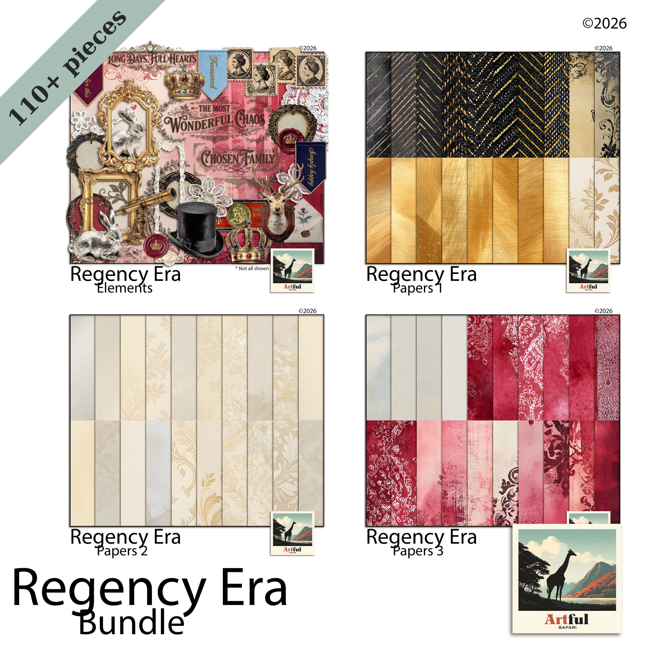
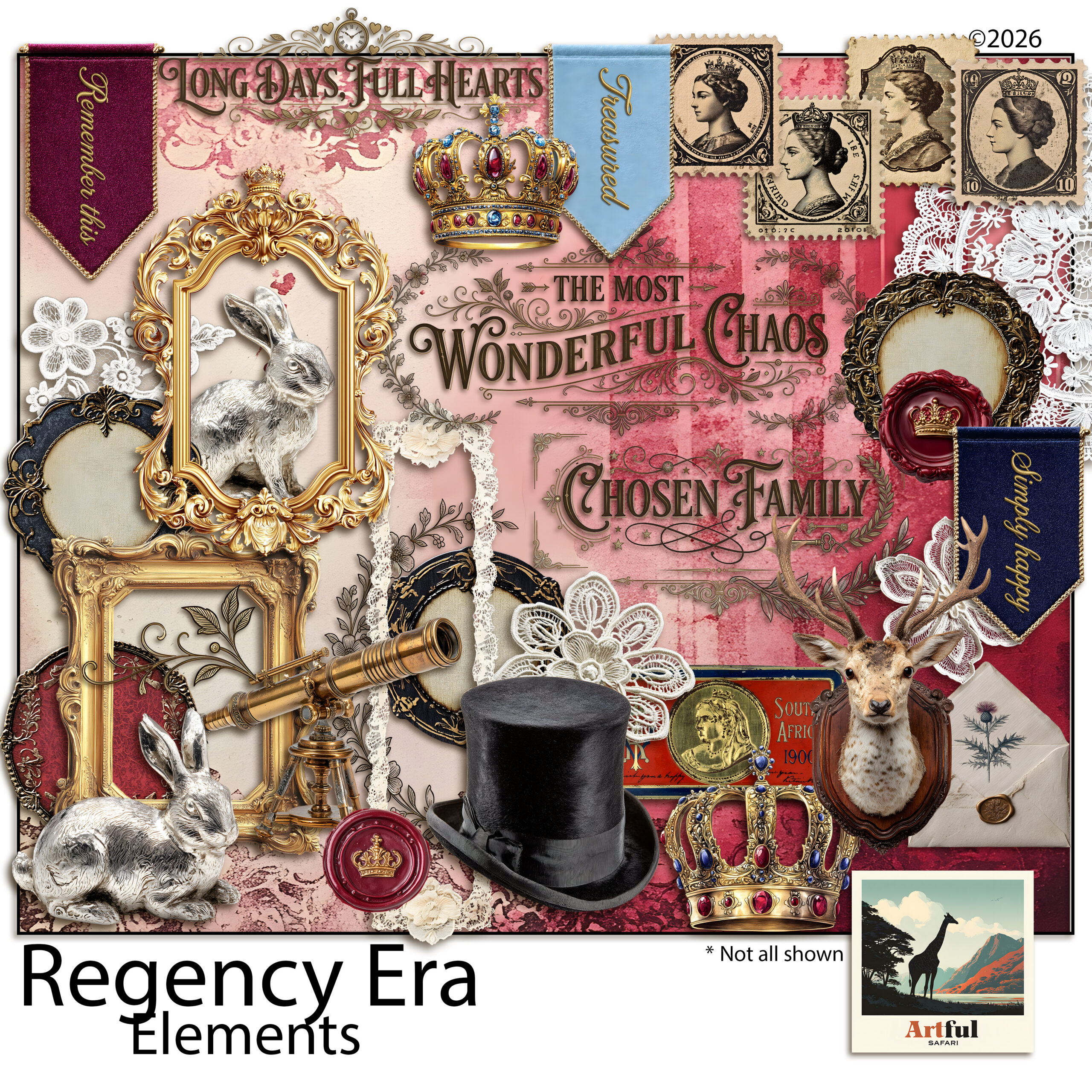
    Regency scrapbook papers with watercolour roses and damask pattern
    Soft damask and bloom sheets for a regency scrapbook: the Regency Era Watercolor Rose Damask papers set the period tone.

    Choosing damask, rose and watercolour papers

    Papers do most of the styling, so pick them first and build the page around them. A page reads as Regency from the background up, so the paper choice settles the mood before a single photo or title goes down. For a regency scrapbook, lean on:

    • Damask for a formal backdrop. Use it on one panel, not the whole spread, or it overwhelms.
    • Watercolour florals as the softer, photo-friendly base.
    • Plain textured cream or blush as a resting space behind journaling.

    A safe formula: one patterned paper, one soft solid, and a small floral cluster to link them. Let the damask be the loudest thing and keep everything else quiet. If two patterns must share a page, separate them with a band of plain colour so they do not clash.

    Watch the scale of the pattern, too. A large damask repeat suits a full-page background, while a tiny repeat works better as a thin border or a journaling-card backing. Mixing one large pattern with one small one reads as designed; two patterns at the same scale tend to fight.

    Motifs that sell the era: pearls, wax seals, script

    Small details carry the theme more than big patterns do. These are the accents that read instantly as Regency:

    MotifWhere it worksKeep it tasteful
    Pearl strandsPhoto corners, dividing linesOne short strand, not a full border
    Wax sealPinning a journaling card or letterOne per page as a focal point
    Gold filigreeFrame corners and flourishesThin lines; avoid heavy gilding
    Script titlePage heading, short quotesPair with a plain font for the body
    Ribbon and bowTying a stack of cards togetherMuted satin tones, not glossy

    Fonts that feel period-correct

    Two fonts are enough. Use a flowing script or copperplate for the title and a clean serif for dates and body text. Skip anything chunky or modern sans-serif; it pulls the page straight out of the era. For a real letter look, set the body text slightly grey rather than pure black, the way faded ink reads.

    Give the title room. A script font crammed edge to edge loses its shape, so let the curls and tails have space around them. If the script is hard to read at a glance, sit it on a plain cream band or add a faint shadow, and keep the longer journaling in the simpler serif where legibility matters more than flourish.

    Letter and ephemera pages

    The letter is the signature Bridgerton image, so a correspondence spread feels right at home in a regency scrapbook. Layer a handwritten-style letter under a tilted photo, add a wax seal and a calling card, and let a single rose spill over one corner. The slight tilt is what stops it looking like a form; real letters are never laid down perfectly straight.

    A junk-journal kit makes this easy because it already includes the ephemera, tags and pockets. To take the vintage-ephemera approach further, my steampunk junk journal ideas use the same layering logic with a different palette.

    For the journaling itself, lean into the letter conceit. Date the entry in the top corner, open with a line like a real note, and sign off at the bottom. Even a short paragraph reads as a keepsake when it is framed as correspondence rather than a caption.

    Pockets earn their keep on these pages. Tuck a folded note, a pressed-flower tag or a ticket from the day behind a corner of paper, and the spread gains something to open and read later. A length of ribbon or a small wax seal holds the pocket closed and adds one more period detail without crowding the layout.

    Jane Austen regency scrapbook junk journal kit with letters and roses
    The Jane Austen Regency Junk Journal Kit Bundle brings papers, letters, seals and florals together.

    Five regency scrapbook page ideas to try

    If you want a starting point, copy one of these and swap in your own photos. Each leans on a single focal idea, so none of them tip into clutter:

    1. The ballroom invite: damask panel, a script title, a wax seal pinning a single photo.
    2. The garden walk: soft floral paper, two framed photos, a trailing rose along one edge.
    3. The love letter: a handwritten-style letter as the base, a calling card and pearl strand on top.
    4. The portrait page: plain cream paper, one photo in a gold filigree frame, a short quote beneath.
    5. The keepsake pocket: a tucked tag and pressed-flower clipart in a journal pocket, ribbon tie.

    Colour palettes for a regency scrapbook

    The era reads as muted and romantic, never neon. Build from one of these palettes and the whole album stays cohesive:

    • Drawing room: dusty blue, cream, soft gold.
    • Garden party: blush, sage, antique rose.
    • Evening ball: deep plum, lavender, pearl grey.

    Pick three colours, use the lightest as your main background, the mid tone for panels, and the darkest only for accents and titles. That ratio keeps pages soft and stops any single spread from shouting.

    Stick to one palette across the album rather than a new colour scheme every page. A run of spreads in the same three tones reads as a collection, and it makes the few gold or wax-seal accents feel like a deliberate thread running through the book.

    Key takeaways

    • Damask, watercolour roses, pearls, gold filigree and script fonts are the core regency scrapbook ingredients.
    • Limit the loud elements to one or two per spread so it reads elegant, not crowded.
    • Letter-and-seal spreads are the most recognisable Bridgerton-style page.
    • Choose a three-colour muted palette and reuse it across the album.

    Frequently asked questions

    What is a regency scrapbook?

    It is a scrapbook styled around the Regency era of the early 1800s, using damask and watercolour-floral papers, pearls, gold filigree, script fonts and wax-seal or letter ephemera. The look has surged in popularity thanks to Bridgerton.

    What colours suit a Bridgerton-style scrapbook?

    Muted, romantic tones: dusty blue, blush, lavender, sage, cream, soft gold and pearl grey. Use the lightest shade as your background and the deepest only for accents and titles.

    What papers do I need for a regency theme?

    Damask patterns for formal backdrops, watercolour florals for softer bases, and plain textured cream or blush for journaling space. Use one patterned paper per spread so it does not overwhelm.

    What fonts look right for a regency scrapbook?

    Pair a flowing script or copperplate for titles with a clean serif for dates and body text. Avoid modern sans-serif fonts, which break the period feel.

    Is this affiliated with Bridgerton?

    No. Bridgerton is a Netflix series. These are styling ideas inspired by the same Regency aesthetic, not an official or licensed product.

  • Steampunk Junk Journal Ideas: 5 Easy Spreads to Copy

    Steampunk Junk Journal Ideas: 5 Easy Spreads to Copy

    A steampunk junk journal is a vintage-industrial album built from aged papers, brass cogs and keys, old correspondence and ledger pages, layered so the textures read as worn machinery rather than a pile of clutter. The trick is restraint: pick one focal motif per spread and let the paper carry the rest.

    Below are the pieces that make the look work, five layouts you can copy, and where most pages go wrong.

    What goes in a steampunk junk journal?

    Steampunk borrows from the Victorian age of steam engines, brass instruments and handwritten ledgers, then ages it all another fifty years. A steampunk junk journal recreates that feel with a few repeating ingredients. Once you have these, almost any spread comes together:

    • Aged base papers in sepia, rust, oxidised copper and ink-stained cream.
    • Mechanical clipart: cogs, gears, keys, pocket-watch faces, pressure gauges and rivets.
    • Ephemera: old tickets, postage, handwritten letters, maps and ledger fragments.
    • Metallic accents in brass, copper and antique gold for frames and corners.
    • A script or serif font for titles, so the lettering matches the era.

    You do not need all of it on one page. A single key over a tea-stained letter says more than ten gears fighting for space. If you are buying a kit, look for one that bundles the papers, the mechanical clipart and a few frames together so the tones already match. Mixing a brass kit with a silver one is a common mismatch; pick a metal and stay with it across the whole album.

    It helps to decide what each spread is for before you start. A travel page, a portrait page and a ledger page all use the same ingredients, but the focal photo and the journaling change. Knowing the purpose stops you reaching for every gear in the folder.

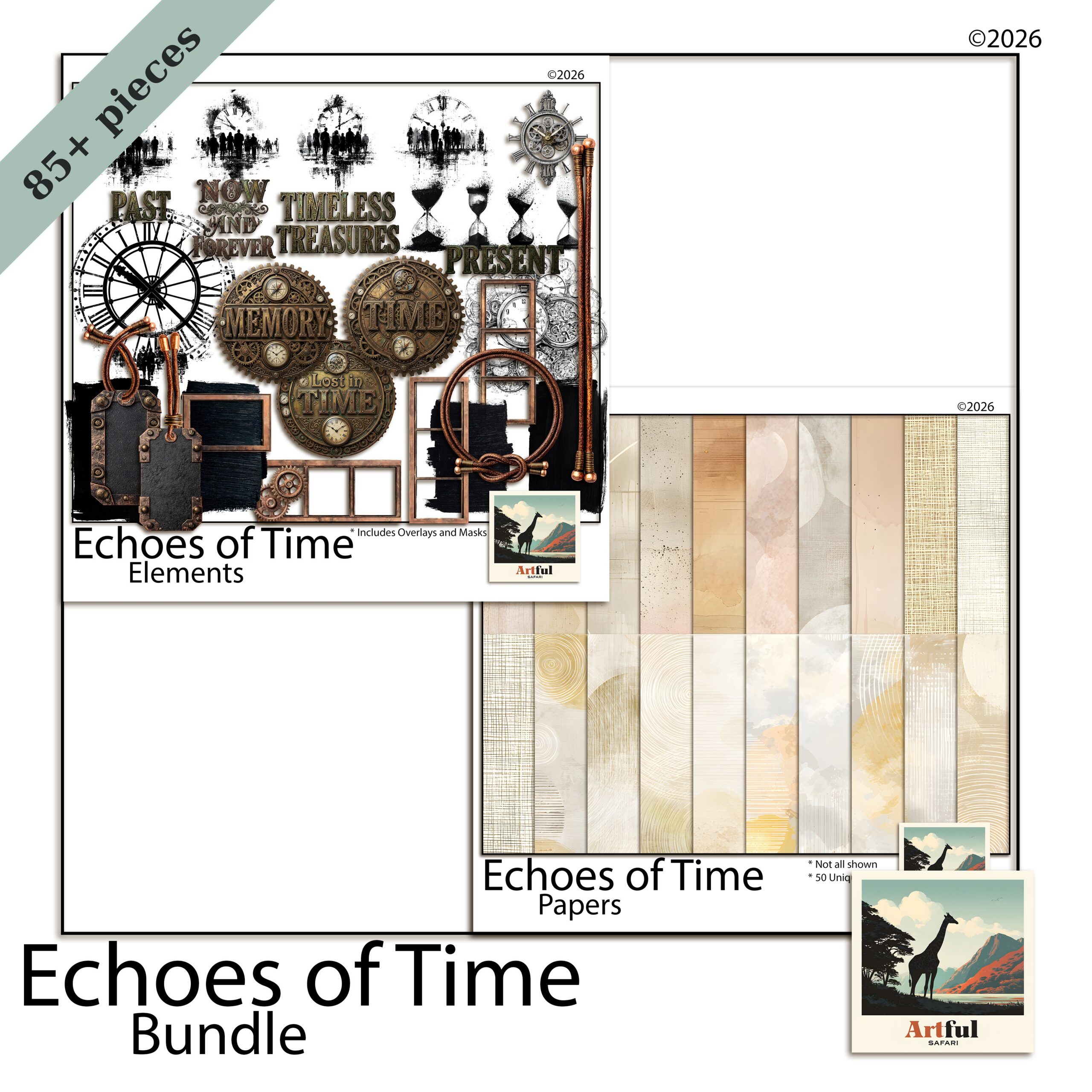
    Steampunk junk journal bundle with cogs, keys and aged paper
    The Vintage Steampunk Digital Scrapbook Bundle covers steampunk junk journal papers, cog and key clipart, and metallic frames in one kit.

    Which steampunk junk journal papers set the mood?

    The base paper does most of the work. Industrial-era pages are rarely bright, so reach for low-contrast, weathered surfaces and let your photos or journaling be the lightest thing on the spread.

    Textures that read as “steampunk”

    • Tea-stained and coffee-ringed cream for letters and journaling cards.
    • Oxidised copper and verdigris green for metal-panel backgrounds.
    • Faded blueprint and grid paper behind diagrams or gauges.
    • Cracked leather and parchment for cover pages and pockets.

    Lay a darker aged paper as the full background, then float a lighter cream panel in the centre for your writing. That single move keeps the page readable while still feeling worn. If a spread starts to look flat, swap one paper for a different texture rather than adding more clipart.

    Aged vintage digital scrapbook papers in sepia and rust tones
    Weathered base sheets from the Vintage Digital Scrapbook Papers (Aged) set keep the contrast low.

    How do you use cogs, keys and gears without clutter?

    This is where most steampunk junk journal pages fall apart. Gears are fun, so people scatter dozens of them, and the spread turns into visual noise. A few rules keep it under control:

    1. Pick one hero element. A large pocket watch or a single ornate key anchors the page. Everything else supports it.
    2. Cluster, don’t sprinkle. Group three small cogs in one corner instead of dotting them across the whole spread.
    3. Use metal at the edges. Corners, spine and frame work let the centre breathe.
    4. Vary the size. One large gear, one medium, one small reads as a designed cluster, not a clip-art dump.
    5. Leave empty space. Bare paper around your photo is what makes the busy bits feel intentional.

    A quick test: squint at the finished page. If your eye can find the photo or title in a second, the clutter is under control. If everything blurs together, take an element away. Most spreads improve when you remove the last thing you added rather than adding one more.

    Layering depth also sells the machinery. A small drop shadow under a cog or key lifts it off the paper so it reads as a real object sitting on the page, not a flat sticker. Keep the shadow soft and short, the way an object casts a shadow in dim lamplight.

    Five steampunk junk journal spreads you can copy

    Stuck on where to start? These five layouts each lean on one idea, so they stay readable:

    1. The inventor’s desk: ledger background, a tilted blueprint, one large gear lower-right, journaling card centre.
    2. The travel log: a faded map paper, a postage stamp and ticket stub, a key clipped to a torn-edge photo.
    3. The pocket-watch portrait: a single photo framed in brass, a pocket watch as the only accent, plenty of bare parchment.
    4. The correspondence page: a handwritten letter under a wax seal, one rose or feather quill for softness.
    5. The specimen sheet: grid paper, three small labelled cogs in a row, a tag tucked into a pocket.

    Building a readable ledger or letter spread

    Ledger and letter pages are the heart of a steampunk junk journal, and they double as journaling space. Old account books, with their ruled columns and faded numbers, make a brilliant backdrop for handwriting or a printed quote.

    A reliable layout:

    • Full ledger or letter paper as the background.
    • A cream journaling card, slightly tilted, pinned with a brass corner or wax seal.
    • One key or small gear cluster lower-right to balance the title upper-left.
    • A torn paper edge or postage stamp to break the rectangle.

    Pockets and tucked tags are worth the extra few minutes here. A small kraft pocket on the ledger page holds a folded letter or a spare tag, and pulling it out is part of what makes a junk journal fun to handle rather than just look at. Add a ribbon or string pull so the tag is easy to find.

    New to the format? My beginner walk-through, What Is a Junk Journal?, covers the basics of pages, pockets and signatures before you add the steampunk styling on top.

    Digital or printed: which suits a steampunk journal?

    You can build a steampunk junk journal either way. Working in Procreate, Photoshop or Canva keeps everything tidy and re-editable. Junk journals are also one of the few digital kits made to be printed, so if you want a chunky physical book you can print the papers onto a heavier stock, age the edges, and bind real pockets and tags.

    ApproachBest forWatch out for
    Fully digital (tablet/desktop)Clean layering, easy redo, sharing onlineLoses the tactile, handled feel
    Printed and boundReal pockets, tags, stitched signaturesInk and paper cost; use heavier stock
    Hybrid (print papers, add art first)Planned spreads, best of bothMore steps before you start gluing

    My own habit is to design the spread digitally, where I can move a gear five times without re-gluing, then print the finished papers if I want a physical copy. You get the planning of digital and the texture of paper.

    Key takeaways

    • One hero motif per spread; cluster small cogs instead of scattering them.
    • Low-contrast aged papers carry the mood, so keep your journaling the lightest element.
    • Ledger and letter pages give you a backdrop and writing space at once.
    • Steampunk junk journal papers print well, so go physical if you want real pockets and tags.

    Frequently asked questions

    What is a steampunk junk journal?

    It is a junk journal styled around the Victorian-industrial steampunk aesthetic: aged and tea-stained papers, brass cogs, keys and gauges, old letters, and ledger pages, often with metallic frames and script titles.

    What do I put on a steampunk junk journal page?

    Start with an aged base paper, add one focal element like a pocket watch or ornate key, a cream journaling card for writing, and a small cluster of gears or a wax seal to balance it. Leave empty space so the busy parts read as deliberate.

    What colours work for steampunk journaling?

    Sepia, rust, oxidised copper, verdigris green, ink-stained cream and antique gold. Keep contrast low and let metallic accents sit at the edges of the page.

    Can I print steampunk junk journal papers?

    Yes. Junk-journal papers are made to be printed, so you can run them onto heavier stock, age the edges, and bind real pockets and tags for a physical book.

  • Safari Scrapbook Theme Ideas: 6 Vibrant African Sunset Pages

    Safari Scrapbook Theme Ideas: 6 Vibrant African Sunset Pages

    A safari scrapbook theme works on one idea: warmth held with restraint. Build pages on sand and cream bases, lift them with sunset golds and burnt orange, ground the text in deep brown, and use animal clipart like seasoning rather than a parade.

    Get that balance and a safari scrapbook feels like golden hour, not a gift shop. Here are the palettes, frames and prompts I reach for.

    What makes a safari scrapbook theme work

    A safari theme lives or dies on warmth. Think the half hour before the sun drops: golds, dusty oranges, deep browns and a sky that goes from amber to rose. Get the colours right and the rest falls into place.

    The trap is treating it like a zoo gift shop, every animal on every page, bright green grass, cartoon giraffes. Restraint is the whole skill. One strong animal motif per spread, a warm paper behind it, and your photos doing the heavy lifting.

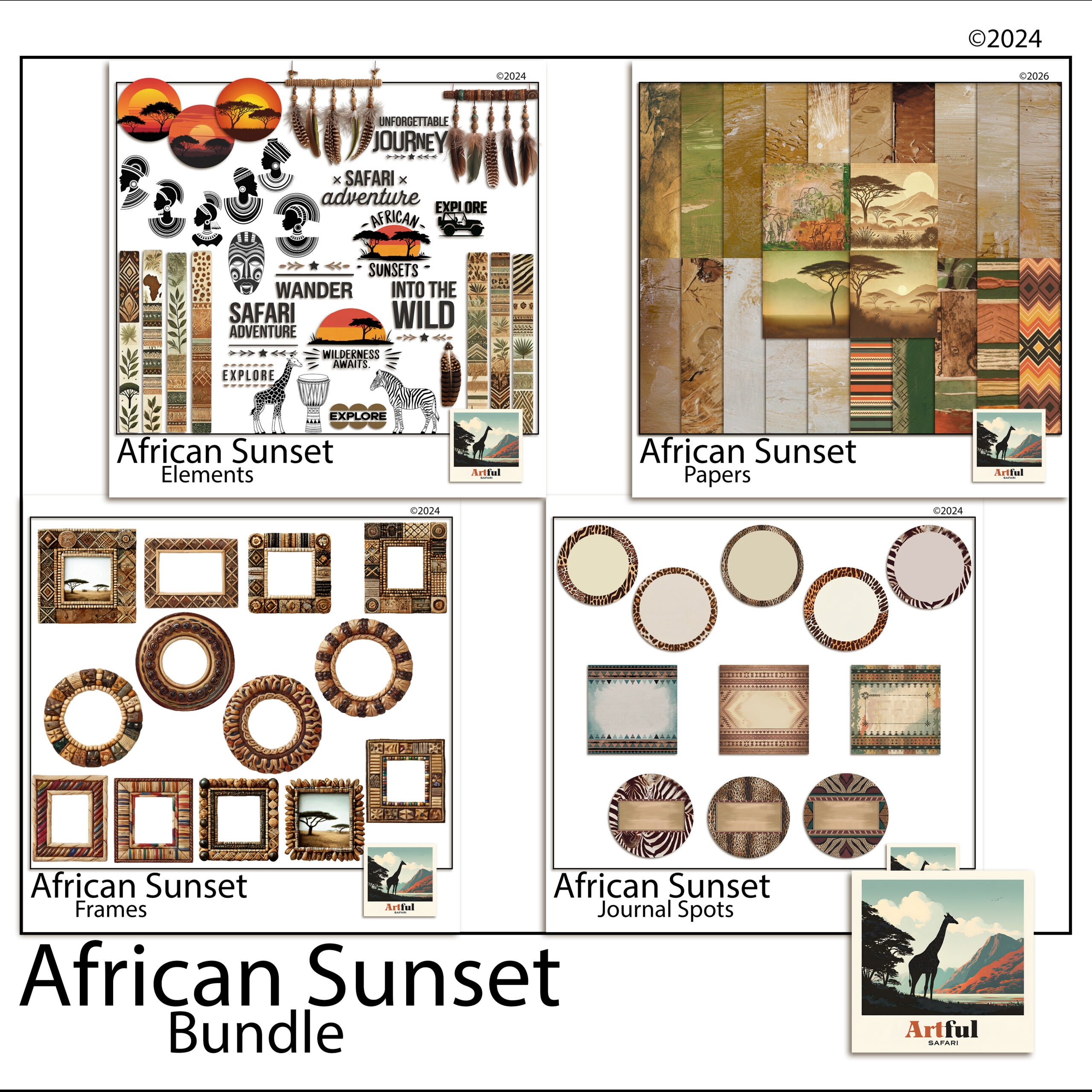
    Safari scrapbook theme pages built from the African Sunset digital bundle
    Warm sunset pages from the African Sunset Digital Scrapbook Bundle.

    This theme suits more than a real safari. Zoo days, wildlife parks, a child’s animal-mad birthday, even a golden-hour camping trip all sit happily under the same warm palette.

    What ties all of those together is the light. A safari scrapbook page is really a golden-hour page with animals in it. If you keep coming back to that idea, the colour choices and the clipart restraint both start to make sense, because everything you add either supports that warm low sun or fights it.

    Building a warm safari scrapbook theme palette

    A safari scrapbook theme works best on four or five colours, not ten. Pick a base, a feature and an accent, then hold the line across every page.

    • Base papers: sand, dust, warm cream. These sit behind everything and let photos breathe.
    • Feature tones: sunset gold, burnt orange, terracotta. Use these for title bars and frames.
    • Grounding darks: deep brown, charcoal, the colour of an acacia silhouette. A little goes a long way for text and edges.
    • One accent: a dusty rose or a faded teal, used sparingly, stops the page going flat.

    If you only remember one thing: warm base, warmer feature, dark text. That three-layer build covers most safari pages on its own.

    A word on greens. Real savanna is dry and dusty for much of the year, so bright grass green is the fastest way to make a page look like a cartoon. If you want a green, pull it toward olive or khaki and use it small. The eye reads muted green as real and bright green as a sticker.

    To pull a palette straight from your own trip, open one of your sunset photos and sample three colours from it: the brightest part of the sky, a mid tone, and a shadow. Those three almost always make a workable safari palette, because they came from the light you were actually standing in.

    Using animal clipart with restraint

    Animal clipart is where safari scrapbook pages tip into kitsch fastest. The fix is to treat it like seasoning.

    One silhouette of a giraffe or an elephant in a corner reads as confident. Five animals marching across the top reads as a sticker sheet. Place a single motif where the eye already wants to rest, near a title or a photo corner, and leave the rest of the page clear.

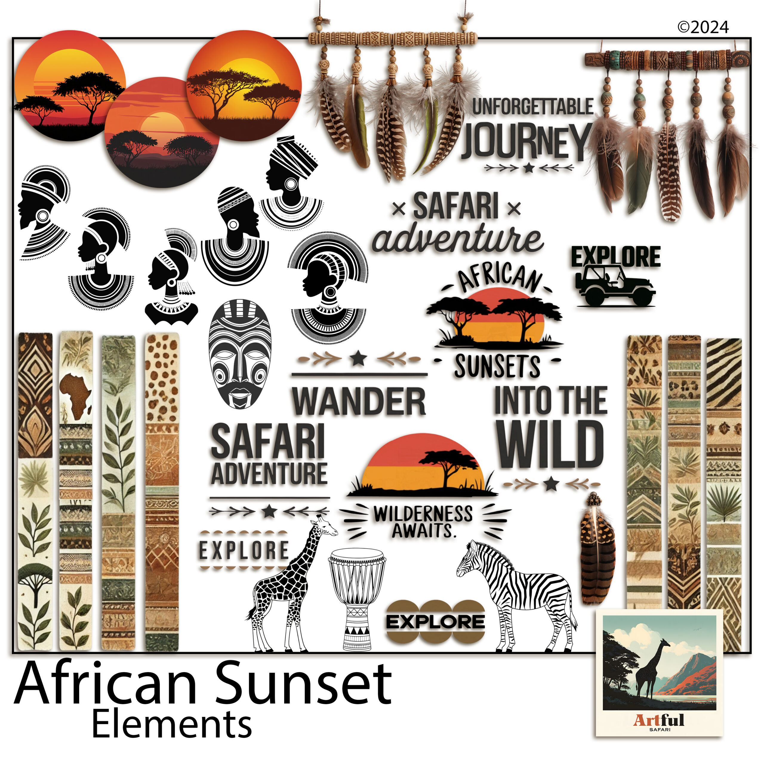
    Safari animal clipart and sunset elements for scrapbook pages
    Animal silhouettes and warm accents for safari scrapbook pages, from the Safari Clipart African Sunset Digital set.

    Silhouettes age better than full-colour cartoon animals. They sit against any warm paper, they never clash with a photo, and they keep the focus on your trip rather than the artwork.

    A handy ratio: for every piece of clipart on a page, ask whether it earns its place or just fills a gap. If it fills a gap, the gap was probably doing useful work. Empty space around a photo is part of the design, not a problem to solve with another giraffe.

    Safari scrapbook pages beyond the wildlife

    Animals are the headline, but a full album needs the quieter pages too, and these are where a safari theme often outshines a plain photo dump.

    • The camp page. The tent, the early coffee, the view from the deck. Warm neutrals suit these and they slow the pace between big-animal spreads.
    • The landscape page. Wide shots of the plains with no animals at all. Let one photo run large with a thin gold rule and a single line of journaling.
    • The detail page. Tracks, feathers, the pattern on a zebra, a tree against the sky. Small close-ups grouped together add texture to the album.
    • The map page. A route line across the reserve with pins for each sighting. A footprint or jeep accent keeps it on theme.

    Spread these between the wildlife pages and the album breathes. A book that is all big cats, page after page, tires the eye faster than you would think. The quiet pages are also where your own voice comes through, since anyone can photograph a lion but only you were there for the coffee at dawn and the long drive in.

    Beaded frames, gold accents and journaling cards

    The details are what lift a safari spread above a coloured background with photos on it.

    Beaded and woven frame styles nod to the craft of the region without leaning on cliche. A thin gold rule around a title block catches the sunset idea. Journaling cards in a kraft or aged-paper finish give you somewhere to write that does not fight the warm palette.

    Keep the metallics quiet. A hairline of gold reads as warmth. A thick gold border on every photo reads as a wedding invitation. The trick is to suggest the shine, not pour it on. One framed hero photo per spread is plenty, with the rest sitting on the paper directly or in a plain mat.

    Journaling prompts that suit a safari or a zoo day:

    • The first animal we saw and how everyone reacted.
    • The sound at dawn or the moment the light turned gold.
    • What the youngest in the group remembers most.
    • The one photo that almost did not happen.

    Write the prompts on a card before you place photos, not after. A blank journaling card stays blank, but a card with a question already on it pulls a sentence out of you while the day is still fresh in your head.

    A safari page plan you can copy

    Here is a layout plan for a safari scrapbook or wildlife album. Match it to your photo count rather than forcing every row.

    PagePalette moveClipart and accents
    Title pageSand base, sunset-gold title barOne acacia or animal silhouette, gold rule
    The journey inWarm cream baseMap line, small jeep or footprint accent
    Big-five spreadBurnt-orange feature blocksOne silhouette per photo cluster, no more
    Golden-hour pageAmber-to-rose gradient paperBeaded frame, minimal clipart
    People pageDust and charcoalJournaling card, faces over wildlife
    Closing pageSand base, one hero photoGold rule, a few lines of journaling

    If you are pairing this theme with a longer trip album, my guide on how to make a travel scrapbook covers the page-by-page workflow that this palette drops straight into.

    Key takeaways

    • Build a safari scrapbook theme on warmth: sand and cream bases, sunset golds, dark grounding text.
    • Hold the palette to four or five colours across every page.
    • Use animal clipart like seasoning, one silhouette per spread, not a parade.
    • Beaded frames and a thin gold rule carry the theme without cliche.
    • Journaling cards and prompts keep the people in the story, not just the animals.

    Frequently asked questions

    What colours suit a safari scrapbook theme?

    Sand, warm cream and dust for the base, sunset gold and burnt orange as features, and deep brown or charcoal for text. Hold it to four or five colours across the whole album.

    How much animal clipart should I use?

    Less than you think. One silhouette per spread reads as confident. Several animals across a page tips into a sticker-sheet look and pulls focus off your photos.

    Does a safari theme work for a zoo day, not just a real safari?

    Yes. The warm palette suits zoo trips, wildlife parks, animal-themed birthdays and golden-hour camping just as well as an actual safari.

    What frames suit a safari scrapbook?

    Beaded or woven frame styles nod to the region’s craft, and a thin gold rule around a title block echoes the sunset without leaning on cliche.

  • Grandparents Scrapbook: 5 Easy Pages Your Family Will Keep

    Grandparents Scrapbook: 5 Easy Pages Your Family Will Keep

    The photos are already there. Grandad teaching someone to fish, the two of them on the bench outside the dairy, a small boy in enormous gumboots following a large man across a paddock. They sit in phones, backed up and unlooked-at. A grandparents scrapbook is the difference between having those photos and keeping them.

    This post lays out five pages you can build from photos you already have, plus a way to get the words that make a grandparents scrapbook worth opening in twenty years. National Grandparents Day lands in early September in the US, which makes the next few weeks a natural deadline, but none of these pages needs an occasion.

    What makes a grandparents scrapbook different

    Most scrapbook pages record an event. A grandparents scrapbook records a relationship, and relationships live in repeated, ordinary moments rather than milestones. The pages below are deliberately built around errands, habits and sayings instead of birthdays.

    The other difference is time. This is the scrapbook most likely to be pulled out at a ninetieth birthday or read aloud at a funeral. Words matter more here than in any other album, which is why two of the five pages are mostly writing.

    Five grandparents scrapbook pages worth making

    1. The errand page

    One photo of a completely unremarkable outing: the hardware shop, the bakery, the car wash. Caption it with the actual errand and the date. In a grandparents scrapbook the mundane pages become the treasures, because nobody else thought to keep them.

    2. The silhouette page

    Two figures, one large and one small, side by side. If you have a photo of the two of them from behind, use it; if not, silhouette clipart carries the same shape. Denim and kraft papers keep the page masculine and quiet, and the height difference does all the emotional work.

    3. The “things he says” page

    No photo at all. Collect five or six phrases everyone in the family can hear in his voice and set them in word art on a newsprint background. If titling pages is not your strength, our guide to scrapbook page titles covers how to make text carry a layout.

    4. Then and now

    Grandad at seven on the left, the grandson at seven on the right. Same age, sixty years apart. Old family photos work even when they are creased and underexposed; the imperfection is the texture of the page.

    5. The letter page

    Ask him to write, or record him talking and transcribe it. One page, his words, addressed to the grandchild by name. This is the page that turns a grandparents scrapbook from a nice object into a family document.

    Getting the stories out of him

    Most grandfathers will not volunteer stories but will answer questions. StoryCorps’ great questions list is the best starting set there is, and the Library of Congress has a practical guide to family oral history for going deeper.

    Record the conversation on a phone while you look through old photos together. The photos are the prompt; the transcript becomes captions for half the grandparents scrapbook without anyone sitting down to write.

    Building the pages digitally

    Every page above can be made on a tablet or laptop by layering papers, silhouettes and word art, and a digital grandparents scrapbook has one advantage a physical one cannot match: it duplicates. Build it once, print a copy for grandad and export a PDF for every branch of the family.

    If you have never assembled a digital page, start with our digital scrapbooking for beginners walkthrough; the first page takes an evening and the skills carry to everything else on this site.

    Putting it together: a worked example

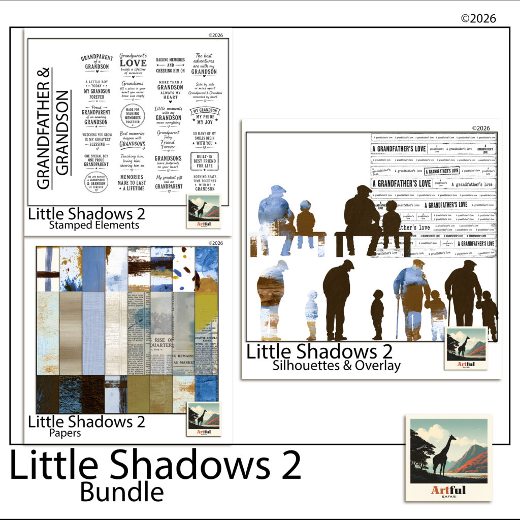
    The pages in this post use the Little Shadows grandpa-and-grandson bundle: 58 coordinated pieces including denim, kraft, olive, weathered grunge and newsprint papers, grandad-and-grandson silhouettes and word-art sentiment stamps, all at 300 DPI.

    Little Shadows kit for a grandparents scrapbook — denim papers, silhouettes and word art
    The Little Shadows bundle: papers, silhouettes and sentiment stamps in one muted palette.

    The silhouettes and sentiments in the Little Shadows grandpa and grandson bundle are drawn for exactly the five pages above, and the muted palette means pages built months apart still sit together as one album.

    Make the errand page first

    It takes one photo and ten minutes, and it teaches the core lesson of a grandparents scrapbook: the ordinary stuff is the good stuff. The letter page can wait until you have momentum. The errand page can be done tonight.

  • Christmas Junk Journal: 5 Easy Victorian Pages to Start Now

    Christmas Junk Journal: 5 Easy Victorian Pages to Start Now

    Nobody starts a christmas junk journal in December. There is no time in December. The crafters who have one ready to fill by Christmas Eve started it in the quiet months, and July, oddly enough, is the traditional moment: Christmas-in-July is a real fixture on the craft calendar for exactly this reason.

    This post is a plan for starting one now, built around the look that suits a christmas junk journal better than any other: the Victorian parlour. Aged letters, sheet music, poinsettias, plum and burgundy washes, a little gold. If you are new to the format, our guide to what a junk journal is covers the basics; here we get straight into pages.

    For a darker, Victorian-gothic take on Christmas pages, see the Gothmas collection.

    Why the Victorian look works for a christmas junk journal

    Most of what we recognise as Christmas was assembled by the Victorians. The first commercial Christmas card was printed in London in 1843, the same year Dickens published A Christmas Carol, and the V&A keeps the original card in its collection.

    That is why aged paper, copperplate handwriting and deep reds read as instantly festive. A christmas junk journal in this palette borrows 180 years of association and does not have to try very hard. It also ages well: pages that lean on old letters and music look better every year, while glitter-and-cartoon pages date fast.

    Five christmas junk journal pages to build before December

    Five pages is a realistic summer target. One a fortnight, and the journal is ready before the season starts.

    1. The sheet-music base

    Use a page of aged sheet music as the full background and cluster three poinsettias in the bottom corner. Add a strip of torn burgundy wash down one edge. This page needs no photo and sets the register for the whole journal.

    2. Letters home

    Layer two or three aged letters at angles, as if they had just been unfolded. On top, one journal line of your own: what you want to remember about this year. The contrast between old handwriting and yours is the whole point of the page.

    3. The ornament frame

    One photo inside an antique-gold ornament frame, centred on a plum wash. Frames like this carry a lot of visual weight, so resist adding anything else. If the page feels empty, it is finished.

    4. The quiet page

    Every christmas junk journal needs one page with almost nothing on it: a burgundy painterly wash, a single sprig, gold foil catching one corner. It gives the eye somewhere to rest between the busy spreads, the same way a rest works in music.

    5. The Christmas Eve spread

    Leave this one intentionally unfinished until the night itself. Build the background now, sheet music on the left and a plain wash on the right, and pencil in the spaces for one photo and a few written lines. A christmas junk journal with a page waiting for the actual evening is far more likely to get completed than one you assemble entirely in hindsight.

    Digital first, printed if you like

    All five pages work in Procreate, Canva or GoodNotes, layering transparent PNG elements over paper backgrounds. If you have not built pages this way before, our walkthrough on how to make a digital junk journal covers the mechanics in six steps.

    Working digitally also means the journal can become December gifts: a finished spread prints as a card, and grandparents are reliably undone by a printed page with a child’s photo inside a gold frame.

    For period atmosphere while you work, the Charles Dickens Museum in London is a good browse: the house where A Christmas Carol was written, kept much as it was, and a reminder of where this whole aesthetic comes from.

    Putting it together: a worked example

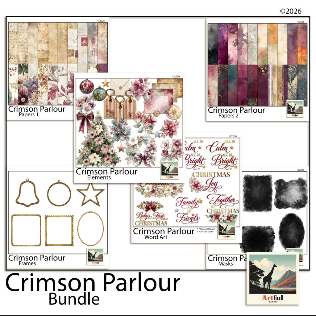
    The pages above use the Crimson Parlour bundle: 92 coordinated pieces including aged letters and sheet music, plum and burgundy painterly washes with gold foil, poinsettias and antique-gold ornament frames, all 12 x 12 inches at 300 DPI.

    Crimson Parlour Victorian kit for a christmas junk journal — aged letters, sheet music and poinsettias
    The Crimson Parlour bundle: letters, sheet music, washes, poinsettias and gold frames in one palette.

    Because every piece in the Crimson Parlour digital scrapbook bundle is drawn in the same palette, the five pages above stay consistent without any colour-matching work, and the journal reads as one object rather than five experiments.

    Start with the sheet-music page

    It is the easiest win and it teaches the layering habit the rest of the christmas junk journal depends on. One page in July, and December-you inherits a journal instead of a to-do list.