
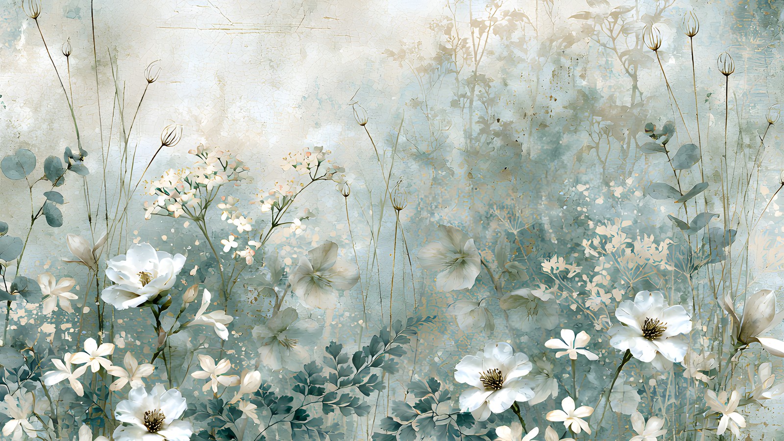
A sage green palette is one of the easiest colour schemes to fall for, and one of the easiest to get wrong. It photographs beautifully on someone else’s layout and then goes strangely lifeless on yours.
The reason is almost always the same. Sage is a muted, low-saturation green, so a sage green palette built entirely from other muted, low-saturation colours has nothing to push against. Below are five pairings that fix it, and two colours worth keeping off the page.
Table of Contents
Why a sage green palette goes flat
Sage sits between grey and green, which is exactly what makes it restful. It is a desaturated shade of green with a lot of grey mixed in, so its natural instinct is to recede.
That works in your favour behind a photo. It works against you when every other element on the page is also receding.
A page needs somewhere for the eye to land first. If your sage green palette is six soft greens and a cream, there is no first. The eye skims the whole thing and moves on, which is why the layout reads as pleasant but forgettable.
The fix is not more colour. It is one or two deliberate points of contrast, placed where you want the reader to look.
1. Warm cream does more than white
White next to sage looks clinical. The green picks up the grey in the white and both go cold.
Warm cream, ivory and unbleached paper tones do the opposite. They read as light without draining the warmth out of the green, and they give you somewhere to put journaling that is not fighting the background.
If you are matting a photo, try a cream mat rather than a white one and compare the two side by side. The difference is larger than it sounds.
2. Dusty rose, in small amounts
Rose and sage sit near enough to opposite on the colour wheel to create contrast, but both are muted enough that it never turns loud. This is the pairing that rescues most soft green layouts.
Keep the ratio uneven. Roughly one part rose to five parts green is plenty, applied as a flower, a strip of paper, or a bit of ribbon rather than a whole background sheet.
We went into this pairing in more depth in our guide to layering dusty rose paper, and most of it transfers straight across.
3. One charcoal anchor
Every soft page benefits from one genuinely dark element. Not black, which reads as a hole, but a warm charcoal or a deep forest green pulled from the darkest part of your papers.
Use it once. A charcoal title, a dark photo corner, or a single deep-toned leaf cluster gives the eye its landing point and makes everything around it look intentional.
This is the single most effective change you can make to a sage green palette that feels washed out.
4. Terracotta for warmth
If rose is too sweet for the page, terracotta does a similar job with more earth in it. It suits travel pages, garden pages and anything with a photo taken in strong sunlight.
Terracotta and sage together read as a sage green palette that has been outside. Rose and sage read as one that has been indoors near a window.
Both are correct. They just set a different mood, so pick whichever matches the photograph.
5. Brass rather than yellow gold
Bright yellow gold sits badly against grey-greens. It looks like it was added afterwards, because tonally it was.
Antique brass, aged gold and soft copper have enough brown in them to sit down properly into a sage green palette. A thin brass line, a small aged charm or a few flecks of metallic in the paper itself is usually all it takes.
If you are building your combination from scratch, dropping your greens into the Adobe colour wheel and looking at the analogous and split-complementary sets is a quick way to test a metallic before you commit to it.
Two colours to keep out of a sage green palette
Bright white. Covered above, but it is worth repeating because it is the most common mistake. Swap it for cream everywhere, including your journaling cards.
Navy. Navy and sage both want to be the calm, cool anchor on a page, so together they argue. If you want that depth, take it from a dark forest green or a warm charcoal instead, which keeps the page in one family.
Dusty blue is the exception worth knowing about, since it is light enough not to compete. We wrote about warming up dusty blue pages separately, and the same warming tricks apply here.
Which photos suit a sage green palette
This is the step most people skip, and it decides more than the paper choice does.
Sage flatters photographs taken in soft, indirect light. Overcast days, shade, window light, anything where the shadows are open rather than hard. Those photos already share the palette’s low contrast, so the page holds together without any effort from you.
It fights bright, saturated photos. A midday beach shot or anything with strong primary colours in it will pull every bit of attention off the page, and no amount of careful layering wins that argument.
Two ways round it if you love the photo. Print or export it slightly desaturated so it sits closer to the papers, or lean into the clash and treat the photo as the single loud element, keeping the rest of the sage green palette almost bare.
Black-and-white photographs are the safe option and worth remembering. They pick up whatever warmth is around them, so a sage green palette makes them read as soft rather than stark.
Putting a sage green palette on the page
Here is the order that works, whether you are cutting paper or working in Procreate, Canva or Photoshop.
- Start with the quietest sheet you have as the background. A plain wash, not a floral.
- Mat the photo in warm cream, slightly larger than the photo itself.
- Add one floral element, weighted to a corner rather than centred.
- Place your single dark anchor opposite it, on the diagonal.
- Finish with the metallic, sparingly, last.
The floral corner is doing most of the work, so it is worth having sheets where the florals already sit around an open centre rather than across the middle of the page.
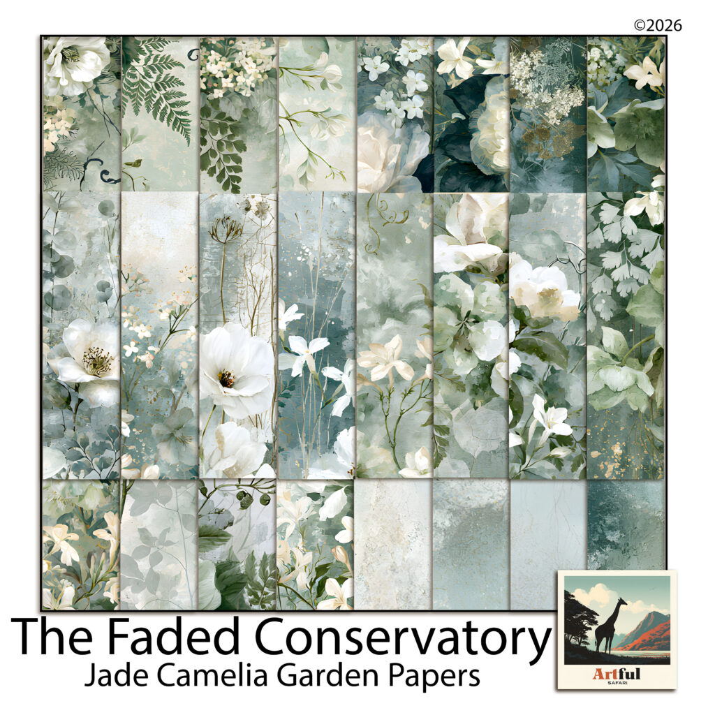
The pages above come from our Jade Camelia Garden paper kit, which was put together with exactly this problem in mind. Roughly a third of the sheets are near-plain washes, precisely so there is somewhere quiet to put a photo.
Any set of soft green papers will do the same job. The thing to check before you buy or before you start cutting is that the collection includes blenders, not only florals.
Where most people go wrong
The instinct with a beautiful set of floral papers is to use the most beautiful sheet as the background. It almost never works, because the photo then has to compete with the paper for attention.
Put the loudest sheet somewhere small. A strip along one edge, a mat behind a tag, the inside of a folded pocket. Give the background to the sheet you would otherwise skip.
Do that, add the charcoal anchor, and a sage green palette stops being restful in the bad sense and starts being restful in the way you wanted.