
Category: Scrapbooking Tutorials

How-to guides for digital scrapbooking and memory keeping – layouts, albums and techniques.

  • How to Build a Woodland Junk Journal in 5 Easy Steps

    How to Build a Woodland Junk Journal in 5 Easy Steps

    There’s a reason so many junk journals end up full of trees. A woodland palette โ€” bark white, sage, cream, a bit of charcoal โ€” sits comfortably behind almost anything you glue on top of it: old receipts, handwriting, pressed leaves, a train ticket from 2011. If you’ve been wanting to make a woodland junk journal but you’re not sure where the “look” actually comes from, this is the walkthrough I wish I’d had: how to pick a forest palette, how to balance showy pages against quiet ones, and how to print and layer it all so the finished journal feels collected rather than assembled.

    Start your woodland junk journal with a palette walk, not a supply haul

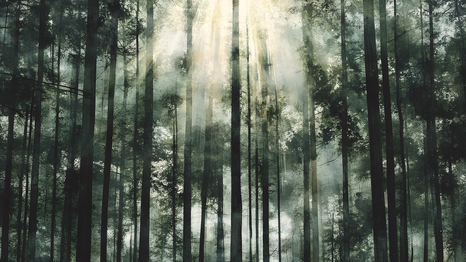
    The fastest way to a cohesive woodland junk journal is to steal your palette from one real landscape instead of collecting “forest things” from everywhere. A birch stand is a brilliant one to steal from because it’s mostly neutrals: chalky white trunks, black bark scars, leaves that read as sage and soft yellow-green rather than primary green, and whatever the sky is doing behind them โ€” usually a grey-blue mist.

    Write your palette down before you gather anything. For birch it looks like this:

    • Bark white โ€” not printer-paper white; a warm, chalky off-white
    • Sage and yellow-green โ€” the canopy colours, kept dusty
    • Dusty blue-grey โ€” mist, shadow, winter sky
    • Blush and cream โ€” the warmth that stops it going cold
    • Deep charcoal โ€” the bark scars; your contrast colour, used sparingly

    Now everything you add to the journal gets tested against that list. A ribbon, a scrap of book page, a paper clip rusted just so โ€” if it doesn’t sit inside the palette, it waits for another journal. This one rule does more for the finished look than any technique.

    Feature pages and quiet pages โ€” the 1:2 rule

    Open any junk journal that feels “professionally” made and you’ll notice the rhythm: a painterly, look-at-me page, then a couple of subdued ones, then another feature. The quiet pages are doing real work โ€” they give journaling, tuck spots, and ephemera somewhere to live without fighting a busy background.

    A ratio of roughly one feature page to every two quiet pages keeps a woodland junk journal breathing. In practice:

    • Feature pages โ€” full painted scenes: a birch grove, a misty forest path, big expressive trunks. Use them as spread openers, section dividers, or backdrops for a single photo or tag.
    • Quiet pages โ€” textures and near-solids in your palette. These become pockets, tags, journaling cards, mats behind photos, and the “rest” pages between features.

    When you shop or print papers, count with that ratio in mind. A kit that ships only showstoppers is harder to bind into a usable journal than one that includes its own supporting cast.

    Layering that looks collected, not crafted

    Woodland junk journal pages take beautifully to the classic moves, and the palette does half the work for you:

    • Tear, don’t cut, your horizons. A torn edge across a misty forest page reads like a hill line. Tear towards yourself for a white deckled edge that echoes birch bark.
    • Ink your edges in charcoal, not brown. Vintage-style journals usually reach for sepia distress ink; on a birch palette, a soft grey-black edge keeps the cool, misty mood. Save brown for autumn kits.
    • Let one tree cross the gutter. If a painted trunk runs off the right-hand edge of one page, place the next page so a branch or trunk picks up on the left. It stitches the spread together without a single embellishment.
    • Use the quiet pages for the machine-stitched bits. Pockets, belly bands, and tabbed dividers cut from texture pages hold the journal’s structure, so the scenic pages never get buried under hardware.

    Printing woodland papers so they look hand-painted

    Woodland junk journal papers are the one corner of digital scrapbooking where printing is the whole point, so it’s worth doing properly. Three settings matter more than the printer you own:

    • Paper weight: 120โ€“160gsm matte. Standard 80gsm copy paper wrinkles under glue and ink; heavy cardstock fights the needle when you bind. The middle weight folds, stitches, and tears like an old book page.
    • Finish: always matte or uncoated. Painterly birch art on glossy stock looks like a brochure; on matte it looks like a print you found in a folio.
    • Scale: pages designed at 11 ร— 8.5 inches print full-bleed on US Letter and trim cleanly to A4, A5, or whatever your signature size is. Print a test page at 100% first โ€” never “fit to page”, which shrinks and re-borders the art.

    One quiet advantage of printable pages over sourced ephemera: you can tear a woodland junk journal page badly, glue it down crooked, or overwrite it entirely, then print another. That freedom changes how boldly you work.

    Putting the woodland junk journal together

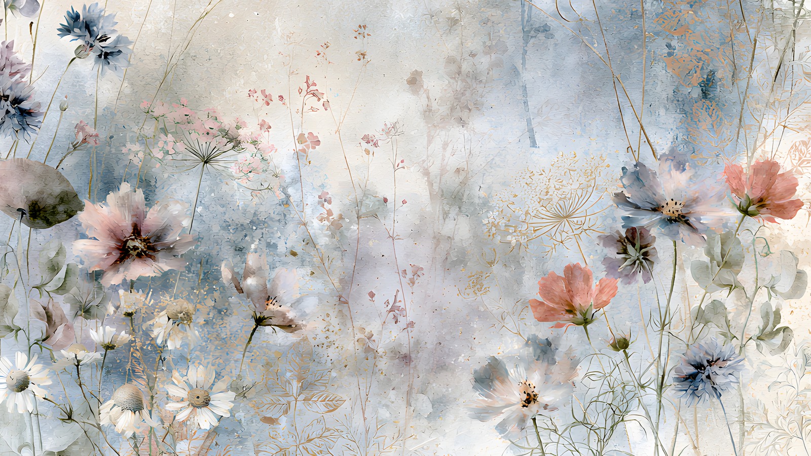
    Woodland junk journal papers from the Birch Trees kit โ€” 23 printable pages of painted birch scenes and coordinating textures
    The worked example for this guide: 11 painted scenes and 12 quiet coordinating woodland junk journal textures in one kit.

    Here’s how this plays out with a real kit. The Birch Trees junk journal papers follow exactly the feature-to-quiet rhythm above โ€” 11 painted birch and woodland scenes (groves, misty paths, big expressive trunks) alongside 12 coordinating texture pages in bark white, cream, blush, sage mist, dusty blue, and deep charcoal.

    A single print run gives you enough for two signatures: scenes as spread openers and dividers, textures folded into pockets and tag blanks, and the charcoal page cut into edging strips and photo corners for that sparing touch of contrast.

    If you’re binding your first woodland junk journal, start small: one signature, five sheets folded to ten leaves, three feature pages spaced through it. Bind it with waxed linen thread, ink the edges grey, and leave every pocket half-filled โ€” a junk journal wants room to keep collecting.

    A last thought on restraint

    The woods aren’t busy. That’s the whole appeal โ€” a birch forest is a few colours, repeated with variation, given room. Let the journal work the same way: one palette, a steady rhythm of feature and quiet pages, charcoal used like punctuation. Restraint is what makes a finished woodland junk journal feel like a walk somewhere real rather than a craft project about one.

  • How to Make a Tuscany Scrapbook (5 Easy Page Ideas)

    How to Make a Tuscany Scrapbook (5 Easy Page Ideas)

    To make a Tuscany scrapbook, start with your strongest 30 to 40 photos, pick one warm Italian kit so every page already matches, then build outward from a title page using papers, olive and lemon clipart, and a few lines of journaling.

    That order matters. Choose the kit before you touch a single page and the colour-matching that usually eats an afternoon just disappears.

    What you need before you start a Tuscany scrapbook

    A Tuscany trip throws a lot at you: hill towns, long lunches, that gold light at five oโ€™clock. If you open a blank page and try to fit all of it, you stall. So gather three things first.

    • Your photos, copied into one folder. Phone shots are fine.
    • One themed kit so every page already agrees with the next. A warm Italian palette saves you the colour-matching headache.
    • A rough order of the trip, day by day or place by place. You donโ€™t need a plan, just a thread.

    I work in whatever I already have open. Procreate on the iPad, Photoshop on the desktop, Canva in the browser. The steps below hold up in all three. You donโ€™t need a paid app or any design training. If you can drag a photo around a screen, you can build this album.

    One more thing worth doing up front: decide roughly how long you want it. A weekend in Florence and a three-week loop through Chianti are very different albums. Knowing the rough size keeps you from sprawling.

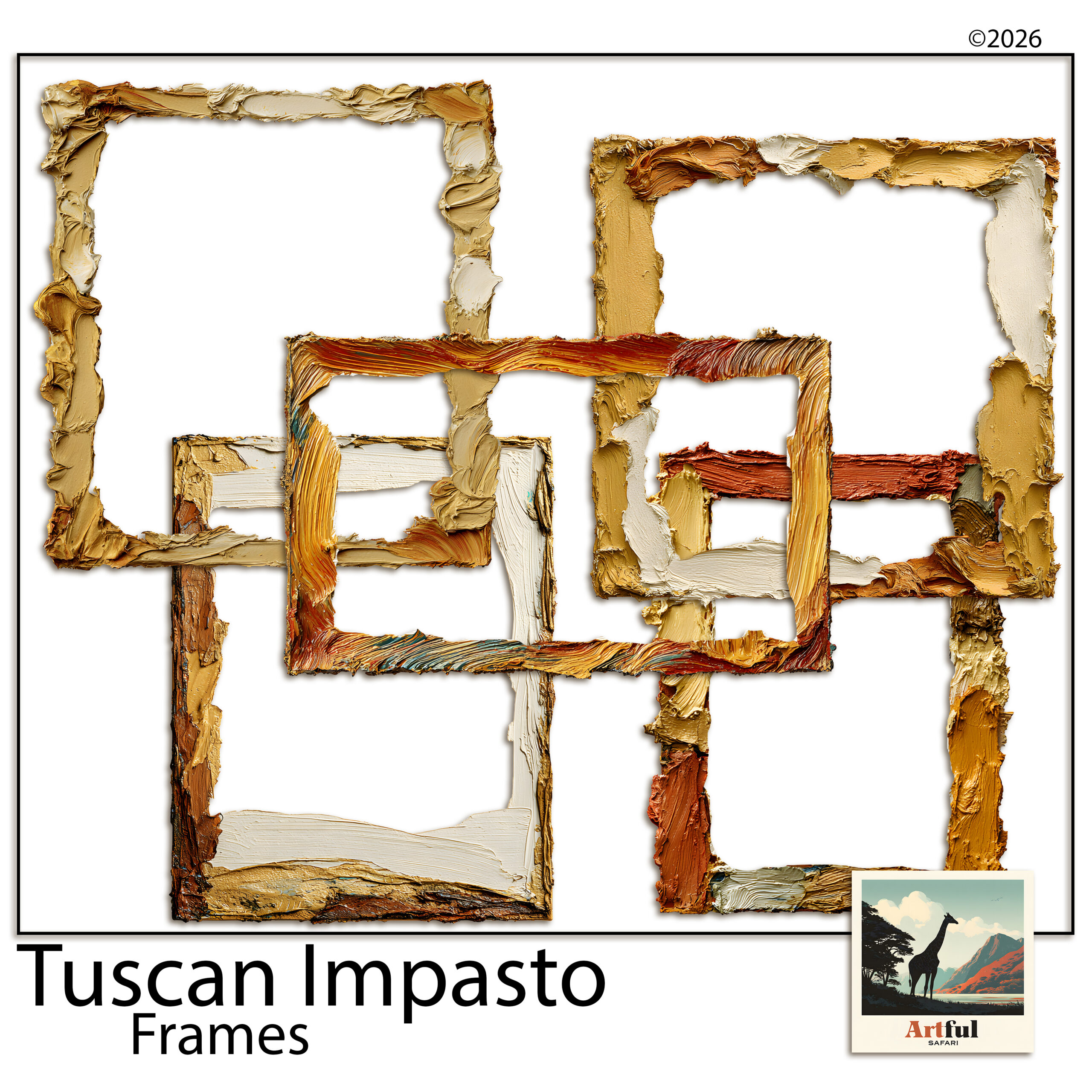
    Tuscany scrapbook bundle with warm ochre papers, olive clipart and frames
    Everything matched out of one kit: the Tuscan Impasto Digital Scrapbook Bundle.

    How do you choose photos for a Tuscany trip album?

    Cut harder than feels comfortable. Thirty to forty photos make a tidy album. Two hundred make a chore you never finish, and the album that never gets finished is the one nobody sees.

    Sort them into three piles:

    1. Anchor shots โ€” the view from the vineyard, the duomo, the bowl of pasta you still think about. One per page, big.
    2. Detail shots โ€” a tile, a lemon on a wall, your wine glass. These go small, in clusters.
    3. People โ€” the ones where someone is actually laughing, not posing.

    If two photos say the same thing, keep the better one and bin the other. Your album gets stronger every time you delete. And donโ€™t worry about chronological order yet. You can shuffle pages later; for now youโ€™re just deciding what earns a place.

    The shots people forget to keep

    Wide, empty shots are the ones I almost always wish I had more of. The road in, an empty piazza at dawn, a table laid before the food arrives. They give a page somewhere to breathe and they set the scene better than another close-up of a plate. If you have a few, hold them back for title pages and quiet spreads.

    Building the title page of your Tuscany scrapbook

    The first page sets the mood, so give it room. Drop a warm paper as the background, sit your best wide shot in the middle, and add a short title. โ€œTuscany, May 2026โ€ does more than a paragraph would.

    Layer order that works

    Think of it as stacking real paper on a table. Background paper at the bottom, then a photo or a frame, then clipart, then text on top. Keep text on its own layer so you can nudge it without disturbing anything underneath.

    Olive-toned Italian digital scrapbook papers for backgrounds
    Backgrounds do the heavy lifting in a Tuscany scrapbook: the Italian Digital Scrapbook Paper Olive set.

    The papers carry most of the feeling here. A faded ochre or an olive-print background reads as Italy before youโ€™ve added a single lemon.

    Tuscany scrapbook spreads, page by page

    You donโ€™t need a new idea for every page. Five layouts on rotation will carry a whole album. Hereโ€™s what I lean on.

    SpreadWhat goes on itClipart to use
    The long lunchOne food anchor shot, three detail shots in a row underneathOlives, lemons, a sprig of rosemary
    Hill townA wide rooftop view, a journaling card with the town nameAn ornate frame, a single olive branch in a corner
    Vineyard afternoonTwo photos side by side, plenty of paper showingGrapevine, a wine motif, kept small
    The marketA photo grid of four, tight togetherLemons and produce around the edges
    Quiet detailOne small photo, a lot of empty background, a line of journalingAlmost none โ€” let the paper breathe

    Notice the last row. A near-empty page every few spreads gives the eye a rest and makes the busy ones land harder.

    A note on clipart restraint

    Lemons are charming until there are forty of them. One or two pieces per page, tucked into a corner or overlapping a frame, reads as styling. Scattered everywhere, it reads as a sticker sheet that fell over.

    Which parts of a Tuscany scrapbook kit do the most work?

    A Tuscan bundle gives you papers, clipart, frames and journaling cards. They donโ€™t pull equal weight. Hereโ€™s what each one is really for.

    Papers carry the mood

    This is the part most people underuse. The background paper decides whether a page feels like sun-baked Italy or a generic photo dump, before any photo goes on. Pick a warm, muted paper and your job is half done. I tend to keep two or three papers in rotation across the album so it hangs together without going flat.

    Clipart adds the small touches

    Olives, lemons, a vine, a wine bottle. These are seasoning, not the meal. Use them to fill an awkward gap in a corner or to link a photo to a journaling card, then stop. The album should look like Tuscany, not like a produce aisle.

    Frames and journaling cards do the structure

    A frame tells the eye โ€œlook here firstโ€, so save the ornate one for your strongest photo on each spread. Journaling cards are where the trip actually lives: the name of the trattoria, the road you got lost on, what the wine cost. Photos show what it looked like. The cards are what youโ€™ll be glad you wrote down in ten years.

    Digital or printed: how to finish your Tuscany scrapbook

    Once the Tuscany scrapbook pages are built, you have two ways to keep them.

    • Digital โ€” export each finished page as a high-quality JPG or PDF and keep them in an album on your iPad, or share the set with the people who were on the trip.
    • Printed โ€” send your finished page exports to a photo-book service, or print them at home and slot them into an album. Youโ€™re printing your own completed layouts here, which is exactly what theyโ€™re built for.

    My own habit is to keep the album digital and order one printed photo book a year as a keepsake. You get the easy sharing and the thing you can hold, without printing every page yourself.

    For a step-by-step on the wider travel-album workflow, the same one I use for any trip, see How to Make a Travel Scrapbook.

    Key takeaways

    • Pick one warm Italian kit first so every page matches without effort.
    • Thirty to forty photos beats two hundred โ€” cut hard, the album gets better.
    • Five rotating spreads carry a full album; one near-empty page every few pages gives the eye a rest.
    • Finish digitally for sharing, or print your completed page exports into a photo book.

    Frequently asked questions

    How many pages should a Tuscany scrapbook have?

    Ten to fifteen pages suits most one-week trips. That gives roughly thirty to forty photos room to breathe without the album dragging.

    What colours say ‘Tuscany’ on a page?

    Warm ochre, faded terracotta, olive green and a soft cream. Keep them muted rather than bright and the pages read as sun-worn Italy.

    Do I need design software to make one?

    No. The same steps work in Procreate, Photoshop or Canva. If you already use one of them for anything, you have what you need.

    Can I print a digital Tuscany scrapbook?

    Yes. Export each finished page as a high-quality JPG or PDF, then send those exports to a photo-book service or print them at home and slot them into an album.