40% off until 31 October on selected products·8 days left

Author: Helene

  • Cottage Garden Scrapbook Pages: 5 Easy Ways to Layer Florals

    Cottage Garden Scrapbook Pages: 5 Easy Ways to Layer Florals

    A cottage garden scrapbook page goes wrong in a specific way. You start with one lovely floral paper, add a spray of roses, add a second spray because the corner looked empty, tuck in a butterfly, and somewhere around the fourth element the page stops reading as a garden and starts reading as a pile. Everything on it is beautiful. Together they are noise.

    The fix isn’t fewer flowers. Real cottage gardens are crowded — that’s the whole point of the cottage garden style, hollyhocks leaning over the path and roses swallowing the fence. What real gardens have that a flat layout doesn’t is depth: things sit in front of other things, at different distances, with air between them. Here are five ways to build that into a cottage garden scrapbook page.

    1. Decide where the ground is

    Before you place a single element, decide which edge of the page is the ground. Almost every cottage garden scrapbook layout that falls flat has flowers floating at the same height all over it, like wallpaper.

    Pick a horizontal line — usually the bottom third — and let the heavier elements sit on it. Benches, watering cans, baskets, jam jars. These are the objects with weight, and weight belongs low. Flowers can then climb up out of that line, which is what they actually do.

    The exception is anything that trails or climbs. Honeysuckle, climbing roses and sweet pea want to come down from the top edge or across a corner, because in a garden they’re on a wall or an arch. A trailing stem entering from the top corner does more for a page than three more blooms in the middle.

    2. Work in three depths, not one

    This is the single biggest change you can make. Sort every element on your cottage garden scrapbook page into background, middle and foreground before you start:

    • Background — soft, pale, slightly out of focus. Faded florals printed into the paper itself, a wash of leaves, a ghosted damask. Nothing here should have a hard edge.
    • Middle — the working layer. Journal cards, photos, seed packets, postcards, tags. This is where the reader’s eye does its actual reading.
    • Foreground — one or two sharp, saturated pieces sitting on top of everything. A single rose overlapping the corner of a photo. A butterfly on the edge of a card.

    The foreground layer is the one most people skip, and it’s the one that sells the depth. A flower that overlaps a photo corner tells the eye that the photo is underneath, which instantly gives a cottage garden scrapbook page three dimensions instead of one.

    3. Let things overlap badly on purpose

    Tidy placement reads as digital. If every element sits neatly in its own space with a respectful margin, the page looks like a catalogue of stickers rather than a garden.

    Overlap deliberately and unevenly. Let a leaf run off the edge of the page. Let a stem disappear behind a journal card and not come out the other side. Let one bloom half-cover a postmark so you can only read part of the date. Cottage garden scrapbook pages are at their best when they look slightly overgrown, because that’s the aesthetic you’re borrowing from.

    The rule of thumb: if you can draw a clean box around every element without touching another one, you haven’t overlapped enough.

    4. Keep the palette narrower than you want to

    Cottage garden scrapbook kits are colourful by nature, and it’s tempting to use all of it. Don’t. Pick two dominant colours and one accent, and hold that line across the page.

    Blush and sage with a warm cream accent is the classic pairing and it’s hard to get wrong — the pink reads as the flowers, the green as the foliage, the cream as light. If you want something warmer, swap the accent to soft gold. If you want it quieter, drop the pink to dusty rose and let the greens carry the page.

    What breaks a cottage garden scrapbook page is a fourth colour arriving late. A bright blue element, a saturated red, a cool grey — any of them will pull the eye straight to itself and flatten everything else. If a piece you love doesn’t sit in the palette, it belongs on a different page.

    5. Use paper ephemera as the quiet layer

    Flowers are loud. Paper is quiet, and a cottage garden scrapbook page made only of flowers has nothing for the eye to rest on.

    This is what seed packets, library cards, ticket stubs, bingo cards and postmarked envelopes are for. They’re rectangular, they’re muted, and they hold text — so they read as pauses between the florals. They also do something the flowers can’t: they suggest a story. A seed packet says somebody planted this. A postmark says somebody wrote about it.

    Tuck them at slight angles — five to eight degrees is plenty, more starts to look like a mistake — and let the florals overlap their corners. A journal card sitting perfectly square in the middle of a page is the fastest way to make a layout look untouched.

    Putting a cottage garden scrapbook page together

    Here’s how those five ideas stack on one cottage garden scrapbook page. Start with a soft floral background paper, not a busy one — you want somewhere for the eye to rest. Lay a wash of pale foliage across the bottom third to establish the ground. Set your photo and one or two journal cards in the middle layer, slightly off square, overlapping each other at a corner. Add a bench or a watering can sitting on the ground line. Then bring one climbing stem down from the top corner and place a single sharp rose over the corner of the photo. Stop there.
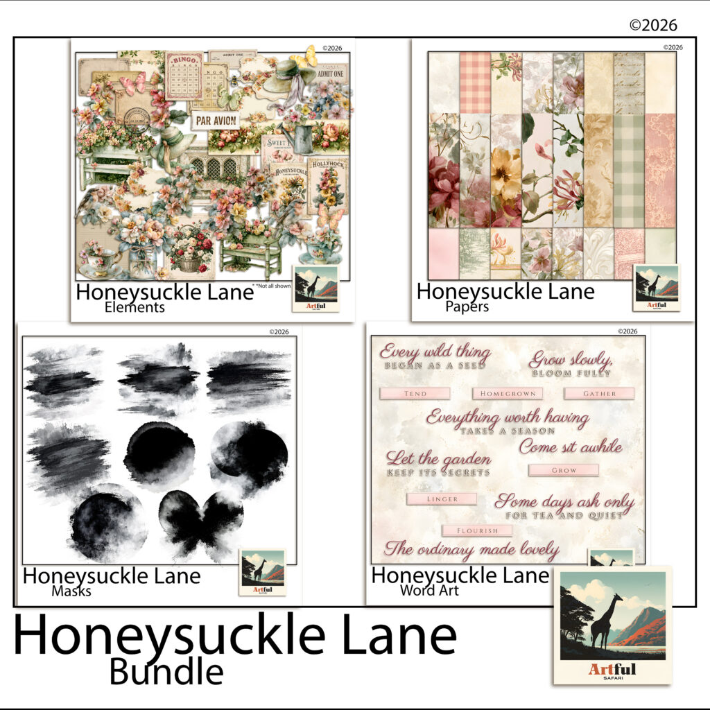
    Honeysuckle Lane cottage garden digital scrapbook collection — floral papers, garden clipart, word art and blending masks
    The Honeysuckle Lane collection — papers, cut-out elements, word art and masks in one palette.

    Working from a single kit makes the palette rule easy to keep, because the colours have already been decided for you. The Honeysuckle Lane collection was built for cottage garden scrapbook pages along these lines — watercolour florals and soft solids for the background layer, garden objects and paper ephemera for the middle, and cut-out roses, robins and butterflies sharp enough to sit on top.

    A last thought on restraint

    The hardest part of a cottage garden scrapbook layout is stopping. There’s always one more bloom that would look lovely in that gap, and the gap is usually the thing holding the page together.

    If you’re unsure whether a page is finished, save it and come back the next day. Nine times out of ten the answer is that it was finished two elements ago — and the version you nearly made is still sitting in your undo history if you disagree.

  • Memory Keeping Ideas for August: 6 Easy Pages Worth Making

    Memory Keeping Ideas for August: 6 Easy Pages Worth Making

    The best August memory keeping ideas start with the photos already on your phone: a summer recap grid, a fuller back-to-school page, and one ordinary day you’d otherwise forget. Pick a theme, pull four or five photos, write one true line, and the page is done.

    August is an easy month to capture because the pace drops and the raw material is fresh. You don’t need a big album, just a few pages that tell the truth about where the month went.

    If you’d rather start with a complete set, our scrapbook bundles put matching papers, clipart and frames in one download.

    Why August is good for memory keeping

    August sits on a seam. Summer is winding down, the new school year is days away, and your phone is full of photos nobody has done anything with yet. That gap is the easiest time to make pages, because the raw material is fresh and the story half tells itself.

    You don’t need a big memory keeping project. One or two pages that capture where the month actually went will be worth more in five years than a perfect album you never finish. The aim is to get the month onto a page while you still remember the small details, not to build a museum.

    Simple memory keeping ideas for the end of summer

    Start with the photos you already have, not the ones you wish you’d taken. Pick a theme, pull four or five pictures, write one true line, done. Here are prompts that work without much fuss:

    • Summer recap grid. Nine small photos, one per week or one per outing, on a single page.
    • Last days of the holiday. The quiet end-of-summer shots: bare feet, late dinners, the messy car boot.
    • What we actually ate. Ice creams, barbecues, the same picnic three times. Food dates a summer better than almost anything.
    • The place we kept going back to. One beach, one park, one pool, photographed across the season.
    • Things they said. A page of overheard lines from the kids, no photos needed.
    • The summer reading pile. A photo of the stack, and a line about which one stuck.

    None of these need a special occasion behind them. That is the trick with August memory keeping: the ordinary stretch of the month is the story, so you don’t have to wait for an event to start a page.

    Stories Grow digital scrapbook bundle used for August memory keeping ideas
    Soft, everyday papers from the Stories Grow Digital Scrapbook Bundle suit recap and back-to-school pages.

    Back-to-school pages that aren’t just the first-day photo

    The doorstep first-day photo is lovely, but it is one shot. Build a page around it so the moment has some company:

    • The shoes, the bag and the lunchbox laid out the night before.
    • A “this year they are into” list: the song, the snack, the obsession.
    • Height against the doorframe, or a hand traced and scanned.
    • The walk to school, not just the pose at the gate.
    • A short note in your own words about how they seemed, nervous or itching to go.

    A memory keeping page plan you can fill in fast

    If a blank page stalls you, work from a simple plan. Decide the theme, then the photos, then one journaling line. The line is the bit future-you will actually read.

    Page promptPhotos to pullJournaling line
    Summer recapOne photo per week“The summer we mostly stayed home and it was better for it.”
    First day of schoolDoorstep, walk, gate“You wanted to go in on your own this year.”
    Everyday AugustBreakfast, garden, bedtime“Nothing happened today and I want to remember it.”
    The last beach dayThree or four wide shots“We stayed until the car park emptied.”
    What we ateMeals and treats“Ice cream three days running, no regrets.”

    Journaling lines when you’re stuck

    If the words won’t come, answer one small question instead of trying to sum up the whole day. What did it smell like. Who laughed. What was on in the background. What did you almost not photograph. One concrete detail beats a paragraph of “we had a lovely time”.

    How do you tell the story across a spread?

    A single memory keeping page captures a moment. Two facing pages can carry a whole stretch of the month. Give the left page the wide view, the right page the close detail, and let them talk to each other.

    • Left: the big group shot or the landscape. Right: the small things, the hands, the ticket, the sandy feet.
    • Keep one paper or colour running across both pages so they read as a pair.
    • Put the date once, on the left, rather than repeating it.

    Everyday memory keeping pages worth making

    The pages people treasure later are rarely the big events. They are the ordinary ones: the kitchen table, the dog asleep on the wrong chair, the view from the back step. August is full of these because the pace drops.

    Keep them plain. A single large photo, a soft paper behind it, one date, one line. Resist filling every corner. The story is the photo, and the page is just there to hold it.

    New Stories digital scrapbook bundle for everyday-life memory pages
    The New Stories Digital Scrapbook Bundle is built for everyday memory keeping, the ordinary days that turn out to matter most.

    Which papers and colours suit August pages?

    End-of-summer memory keeping pages tend to look right in warm, slightly faded tones: sand, sun-bleached blue, soft green, a touch of gold. Back-to-school pages can take a sharper note, a deeper blue or a brick red, to mark the change of season. Pick one paper as your background and one or two as accents, then stop. Three patterns fighting for attention will bury the photo.

    Journaling cards do a lot of quiet work here. A plain card behind your text gives the words a clear place to sit, so they don’t float over a busy paper and turn to mush. If a kit comes with matching cards, use them; if not, a soft rectangle at low opacity does the same job. Keep the text dark on light, or light on dark, and leave a little breathing room around the edges.

    Mixing photos with no photos at all

    Not every memory keeping page needs a picture. A list page, a quote your child said, a ticket stub scanned in, or a hand-written caption can carry a spread on its own. These no-photo pages often age better than the posed shots, because they hold the words you’d otherwise forget. Slot one or two between your photo pages and the album reads less like a slideshow and more like the month as it felt.

    A small memory keeping routine that stops it piling up

    The reason August photos sit untouched is that the job feels big. Shrink it. Once a week, give memory keeping twenty minutes: pick your favourite five photos from those days and build one page. Five photos, one paper, one line. By the end of the month you have four pages and a record, instead of two thousand photos and good intentions.

    If even that slips, do a single catch-up at the end of the month. Pull the standout shots, group them by week, and make one page per week. It is rougher than the weekly habit, but a finished rough memory keeping album beats a perfect one that lives only in your head.

    How many pages should an August album have?

    As few as it takes to tell the truth about the month. Six strong pages beat twenty padded ones. If you only make three, make them the recap, the first day back, and one ordinary Tuesday.

    If you are brand new to memory keeping, the Digital Scrapbooking for Beginners guide walks through setting up a 12×12 page and dropping in your first photo. Once that feels easy, the prompts above give you a month of pages to aim at.

    Key takeaways

    • Work from the photos you already have, not the ones you meant to take.
    • One theme, a few photos and one true journaling line make a finished memory keeping page.
    • Build the first-day photo into a fuller back-to-school page so the moment has context.
    • A few real memory keeping pages beat a long padded album you never close out.

    Frequently asked questions

    What should I put in an end-of-summer scrapbook page?

    Start with a recap: a grid of photos across the season, the food you ate, and the one place you kept going back to. Add a single journaling line so the page means something later.

    How do I make a back-to-school page more than the first-day photo?

    Build context around the photo. Add the laid-out uniform, a short list of what they are into this year, a height mark, and the walk to school rather than just the pose at the gate.

    How many pages do I need for one month?

    Fewer than you think. Three to six strong pages capture a month better than twenty padded ones. If you only make three, choose a recap, the first day back and one ordinary day.

    What colours suit end-of-summer pages?

    Warm, slightly faded tones work well: sand, sun-bleached blue, soft green and a little gold. For back-to-school pages, a sharper deep blue or brick red marks the change of season.

    I am new to digital scrapbooking. Where do I start?

    Set up a 12×12 page, drop in one photo, place a paper behind it and add a date. The beginners guide on the blog walks through the whole first page step by step.

  • Solo Journaling Game: A Simple Guide to Your First 7 Quiet Nights

    Solo Journaling Game: A Simple Guide to Your First 7 Quiet Nights

    A solo journaling game is a game you play alone, with a notebook, where the only thing you produce is writing. Nobody is playing against you and there is nothing to win. You draw a card or roll a number, the game tells you what happened, and you write down what your character made of it. That is the whole loop, and it has quietly become one of the most popular corners of tabletop gaming.

    If you already keep a journal, you are most of the way there. What a solo journaling game adds is the thing a blank page never gives you: something to react to.

    What a solo journaling game actually is

    The format grew out of tabletop role-playing games, but it stripped out almost everything people find intimidating about them. There is no group to organise a night around, and the rules usually fit on a page.

    What is left is a prompt engine. A typical solo journaling game gives you a randomiser — most often a standard 52-card deck — and a table that maps each result to a situation. You draw, you read, you write. A session is usually one draw, and one draw takes about ten minutes.

    The randomiser matters more than it sounds. Left to yourself, you write about the same three things forever. A solo journaling game keeps handing you material you would not have chosen, which is exactly why the writing gets interesting.

    What you need to start

    Almost nothing, which is the appeal.

    • A deck of playing cards, or dice if the game asks for them
    • Something to write in — a notebook, a junk journal, a document on your laptop
    • Something to write with
    • Ten quiet minutes

    That is genuinely the whole list. Some games add printable components — a map, a character sheet, cards to cut out — but a solo journaling game that requires a shopping trip before you can start has got the format wrong.

    Your first 7 nights, one at a time

    Most people stall on night one because they are waiting to feel ready. Here is what the first week usually looks like instead.

    Night 1 — make somebody up

    Draw two or three cards and let them tell you who you are playing. Where they came from, what they carried with them, what they are afraid of. Write four sentences. Do not design a person; discover one.

    Night 2 — write badly on purpose

    Draw one card, read the result, write half a page without editing. The first entry in any solo journaling game is always the worst one, and getting it over with is the entire task.

    Night 3 — add a physical thing

    Stick something in. A ticket, a leaf, a scrap of patterned paper. This is where journalling and gaming meet, and it is the point at which the book starts feeling like an object rather than a notebook.

    Night 4 — let it be boring

    Some draws are quiet. Write the quiet one anyway. A year of only dramatic nights reads like a soap opera, and the flat entries are what make the loud ones land.

    Night 5 — go back and read night 2

    You will notice a thread you did not plant. Follow it. This is the moment most people realise a solo journaling game is not a writing exercise but an actual story.

    Night 6 — skip a night

    On purpose. The format survives interruption; that is its advantage over a daily-streak app. Come back on night seven and nothing is broken.

    Night 7 — look at the spread

    Seven entries is enough to see a shape. Some people find they want to make the pages beautiful. Some find they only want to write. Both are correct, and knowing which one you are shapes every game you pick from here.

    Why a solo journaling game beats a prompt list

    Prompt lists are the obvious comparison and they fail in a predictable way. You read down the list, pick the one you like, and end up writing what you already wanted to write. A solo journaling game removes the choosing, and the constraint is what makes it work.

    The second difference is that a game has an ending. A prompt list runs until you get bored. A game with 52 cards runs for 52 nights and then stops, and finishing something is rarer and more satisfying than most people expect.

    How to pick your first solo journaling game

    The category is large now and the quality is uneven, so three questions save most of the wasted money.

    How long is a full game? Look for a stated length — 52 nights, 30 entries, twelve chapters. A game with no defined ending is a prompt list wearing a costume, and you will drift away from it in week two.

    What does it ask you to do each turn? Some games want a paragraph. Some want a page. Some want you to draw. None of those is better, but the one that matches how you actually like to spend ten minutes is the one you will finish.

    Does it assume you have played before? A good solo journaling game for a first-timer includes a walkthrough of the opening session and at least one worked example of a finished entry, so you can see what “right” looks like rather than guessing. If the rules jump straight to the prompt tables, it was written for people already in the hobby.

    Three mistakes in a first game

    • Treating it as homework. Ten minutes is a real session. A solo journaling game that has to be an hour will be skipped.
    • Buying a beautiful notebook first. The good notebook makes the first entry harder. Use a rough one.
    • Picking a game that destroys your work. Some designs ask you to tear out or black over pages you made. If you have spent half an hour on a spread, that is not tension, it is a reason to quit. Check for this before you buy.

    Putting it together: one worked example

    Here is how the pieces fit in practice. Folklore Forest is a solo journaling game about a wood that is forgetting itself. You have inherited the last keeper’s notebook, and you walk out at dusk with a pencil.

    The suit of the card decides which part of the wood you walked into. The number decides what you found — a stone that is always warm, a doorstep with no house, a saucer of milk that hasn’t turned. You write the entry in your own words, and then every entry ends with something to make: mount the specimen, tape the edge, draw the thing badly and label it anyway.

    One night, start to finish

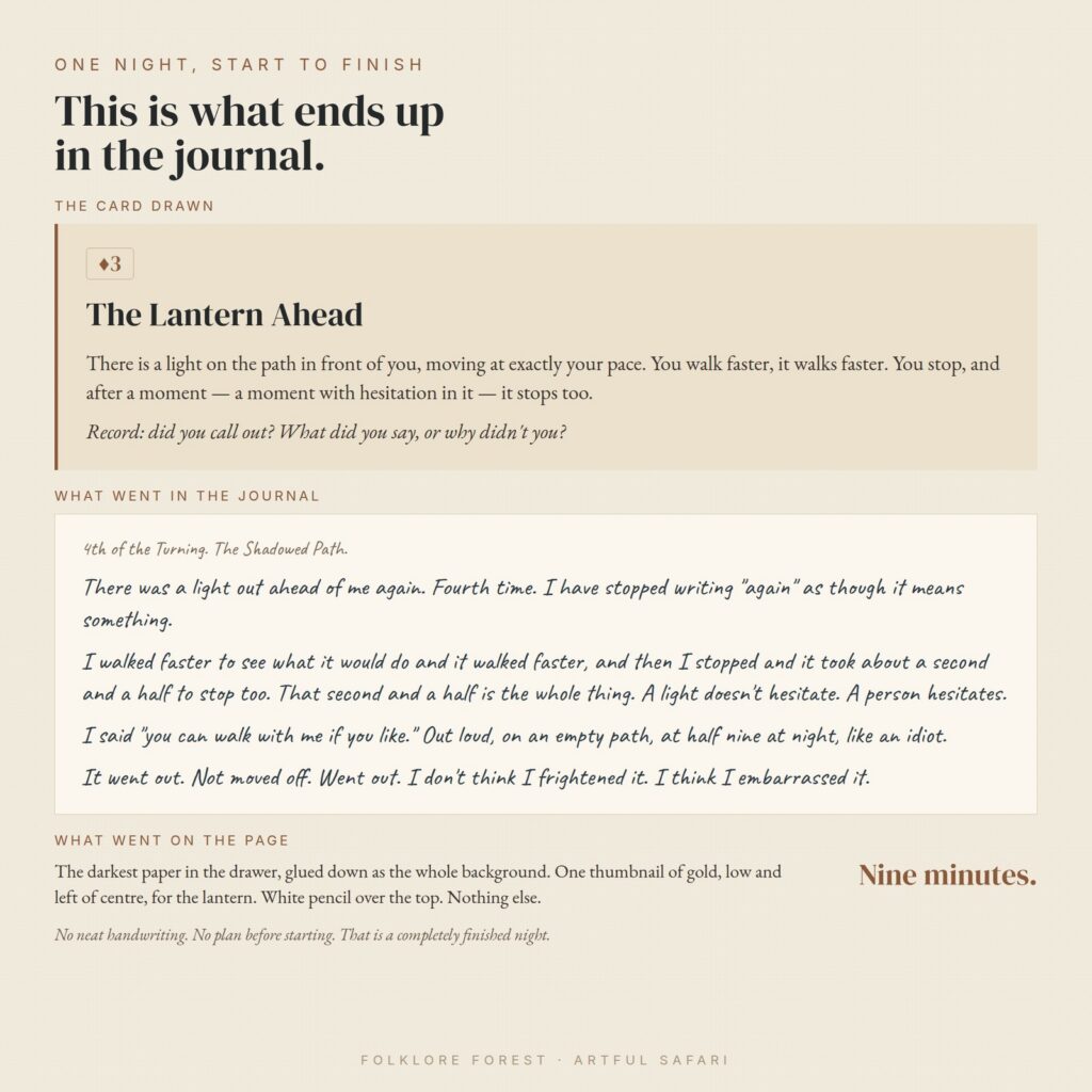
    Descriptions of the format only go so far, so here is a single night in full. The card was the three of diamonds. Diamonds is the Shadowed Path, which made the entry The Lantern Ahead: there is a light on the path in front of you moving at exactly your pace, and when you stop it stops, after a moment with hesitation in it. Underneath, the book asks one question. Did you call out, and what did you say.

    What went into the journal, unedited:

    4th of the Turning. The Shadowed Path.

    There was a light out ahead of me again. Fourth time. I have stopped writing “again” as though it means something.

    I walked faster to see what it would do and it walked faster, and then I stopped and it took about a second and a half to stop too. That second and a half is the whole thing. A light doesn’t hesitate. A person hesitates.

    I said “you can walk with me if you like.” Out loud, on an empty path, at half nine at night, like an idiot.

    It went out. Not moved off. Went out. I don’t think I frightened it. I think I embarrassed it.

    Then the page. The darkest paper in the drawer went down as the whole background, one thumbnail of gold low and left of centre stood in for the lantern, and the writing went over the top in white pencil. Nothing else. The whole night took nine minutes.

    One night of a solo journaling game start to finish: the card drawn, the journal entry it produced and what went on the page
    The card, the entry it produced, and the page that came out of it.

    Notice what did not happen there. No neat handwriting. No plan for the page before it was started. No attempt to write well. Four short paragraphs, one of them a joke at the writer’s own expense, and that is a completely finished night. This is the part most people are trying to picture before they start, and seeing one real entry usually settles it faster than any amount of explanation.

    That last instruction is what separates this kind of solo journaling game from a pure writing one. The year leaves you holding a book rather than a folder of notes. If you want to see how a woodland spread comes together physically, our guide to building a woodland junk journal covers the layering, and if the whole junk-journal side is new, start with what a junk journal actually is.

    Where to go from here

    Pick something with a defined length, play it badly for a week, and see whether you are a writer who likes making pages or a page-maker who likes writing. A solo journaling game is cheap to try and impossible to fail at, which makes it one of the few hobbies where the sensible move is simply to start tonight and find out.

    Seven nights is enough to know. Fifty-two is enough to have made something.

  • Dark academia scrapbook pages: 5 simple ways to stop them going flat

    Dark academia scrapbook pages: 5 simple ways to stop them going flat

    A dark academia scrapbook page fails in a very specific way: you pick beautiful moody papers, layer them up, and the whole spread turns into one dark smudge. The photo disappears. The journaling disappears. Everything you liked about the individual pieces cancels out.

    The fix isn’t lighter papers. It’s contrast — and there are only a handful of places you need to put it.

    The dark academia papers, elements and word art are all in the Enchanted Hours collection.

    Why a dark academia scrapbook page goes flat

    Dark academia as an aesthetic borrows from old libraries, natural-history cabinets and candlelit portraiture. If you want the background, the style’s origins sit in classic-literature and campus-novel imagery, which is why it leans so hard on ink, oxblood, brass and faded olive.

    Those colours all share a problem. They’re mid-to-dark in value, and they’re all slightly desaturated. Put two of them next to each other and your eye can’t find an edge.

    Painters solved this centuries ago with chiaroscuro — deliberately extreme light against deliberately extreme dark, with very little in between. A layout works the same way. You need a genuine light and a genuine dark on the page, not four shades of “quite dark”.

    1. Give every dark academia scrapbook layout one true light

    Pick one element that is properly pale — parchment, bone, unbleached cream — and let it carry the photo and the journaling.

    It doesn’t need to be large. A single cream card floating on an ink-black ground reads as intentional. The same card on a mid-olive ground reads as a mistake.

    The practical test: squint at the page. If you can still see a clear light shape, it works. If it all mushes together, your lightest element isn’t light enough.

    2. Use pattern scale to separate your layers

    When two papers sit at similar darkness, scale does the work colour can’t.

    • Large, open pattern underneath — a wide damask, a loose botanical, a big harlequin diamond.
    • Tight, dense pattern on top — fine lace, small repeating motifs, a close cobweb lattice.
    • Plain between them — a solid or near-solid mat that stops the two patterns arguing.

    The jump in scale is what your eye reads as depth. Two patterns at the same scale, however different their motifs, will always look like one busy sheet — which is the single most common reason a dark academia scrapbook layout stalls.

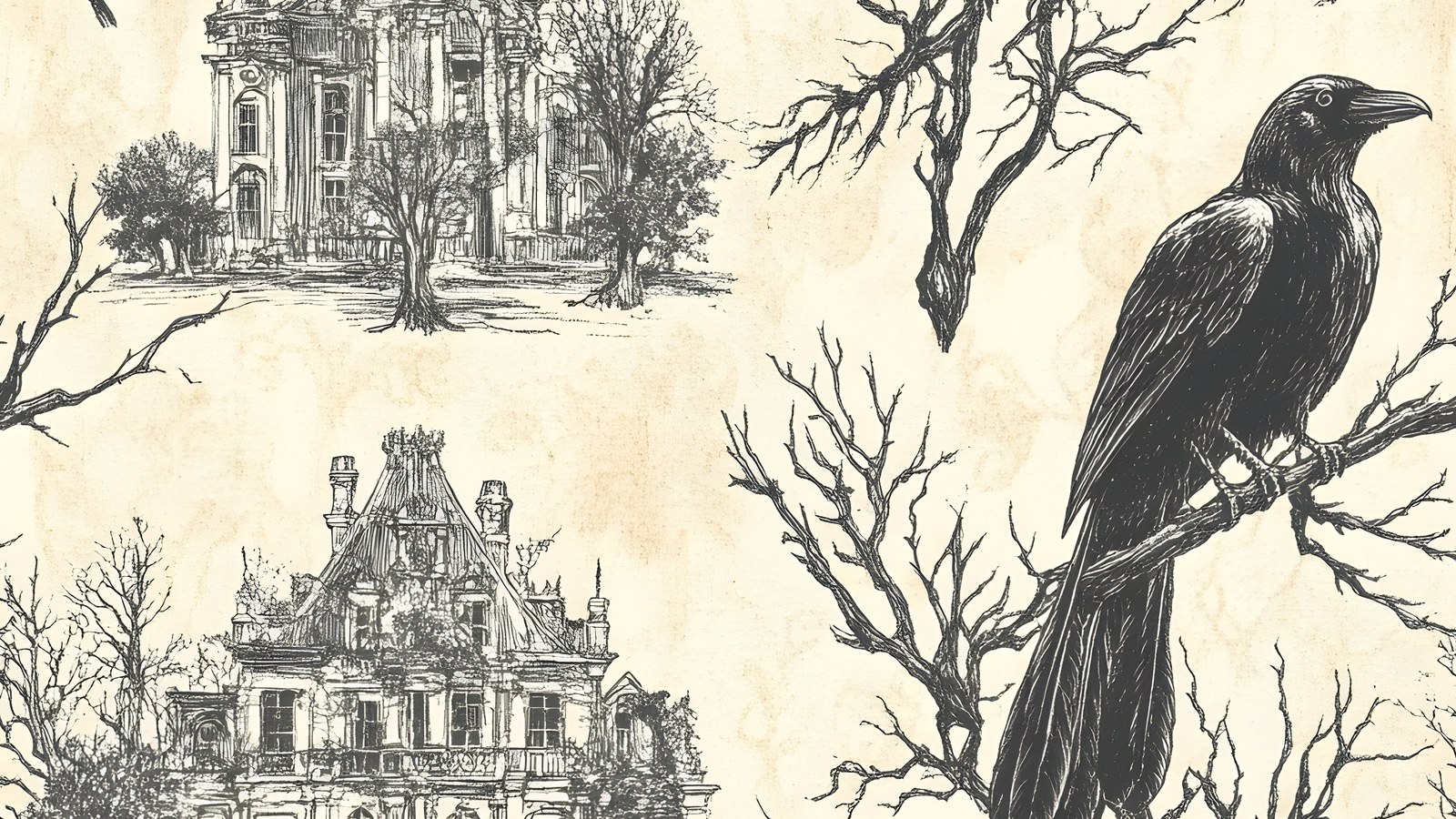
    3. Borrow the toile trick for scene-setting

    Line-drawn scenic papers — houses, bare branches, birds — are the closest thing this aesthetic has to a cheat code. Toile prints put detailed dark line work on a pale ground, so they’re simultaneously busy and light.

    That combination is rare and very useful. A toile paper can be your “true light” from point one while still carrying enough detail to set a mood, which means it can sit directly behind a photo without needing another mat.

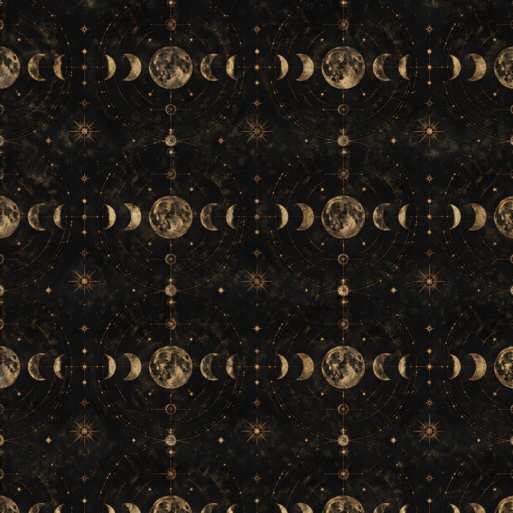
    Moon phase paper for a dark academia scrapbook page, gold crescents on near-black
    Metallic motifs on a near-black ground give a dark academia scrapbook page its glint without lifting the overall value.

    4. Add metal, not colour

    The instinct when a page feels dull is to add a brighter colour. In this palette that usually backfires — a clean bright hue looks modern and snaps the spell.

    Add a metallic instead. Antique gold, tarnished brass and dull silver read as highlights rather than as new colours, so they lift the page without breaking the period feel.

    Keep it to two or three placements. Metallics work as punctuation; used as a wash they turn everything ornamental and a dark academia scrapbook page loses the quiet that makes it convincing.

    5. Leave one area genuinely empty

    This is the hardest one and it matters most on a dark spread. Dense dark layouts need somewhere for the eye to rest, and “rest” means empty, not “filled with a subtler texture”.

    The still-life painters knew this. A vanitas composition is mostly shadow with a few objects catching light — the emptiness is what makes the objects read.

    Aim for roughly a quarter of your page carrying nothing but background. It will feel wrong while you’re building it and right when you step back — and on a dark academia scrapbook spread it’s usually the change that finally makes the photo read.

    Putting a dark academia scrapbook page together

    Working through those five points in order, a spread comes together quickly: pick your true light, choose two patterns at different scales, set the mood with a scenic or celestial paper, add two touches of metal, then protect the empty quarter.

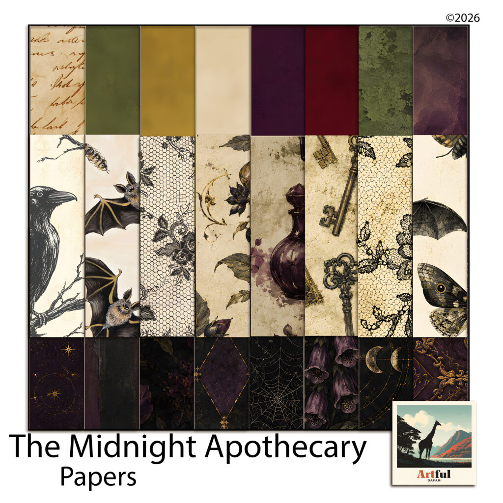
    For a worked example I’ve been using the Midnight Apothecary paper collection, which was built around exactly this problem — it pairs genuinely dark grounds with pale toile and parchment sheets, so the light and dark ends are both actually there.

    Midnight Apothecary papers used as a dark academia scrapbook palette
    A dark academia scrapbook palette needs both ends: ink and olive grounds alongside parchment and toile.

    A quick palette that works

    • Ground — ink black or deep olive, large open pattern.
    • Mat — deep plum or oxblood, plain.
    • Light — parchment or cream toile, carrying photo and journaling.
    • Highlight — antique gold, two or three placements only.

    If you want to push it warmer for autumn spreads, the same structure holds with the ground swapped — the burnt orange palettes post covers how to keep a warm dark from going muddy.

    Choosing papers for a dark academia scrapbook

    Most digital paper packs in this aesthetic are sold on mood, and mood is not the thing that determines whether a layout works. When you’re assessing a set, ignore the styled preview and count value ranges instead.

    A usable dark academia scrapbook set needs at least three things, and a surprising number of packs only have two.

    • Genuinely dark grounds — not “deep grey”, but papers that read as near-black or near-black-green at a glance.
    • Genuinely pale sheets — parchment, bone, aged cream. These are what most moody packs skip, and their absence is why the layouts go flat.
    • Plain or near-plain mats — solid-ish papers with texture but no motif, to sit between two patterns.

    Patterned mid-tones are the easy part and every pack has plenty. If a set is all mid-tones, you can still use it, but you’ll be supplying the light from elsewhere every single time.

    The other thing worth checking is whether the scenic sheets are usable as backgrounds or only as focal pieces. A scenic paper with a busy centre can’t sit under a photo; one with detail around the edges and a quieter middle can do both jobs, which is much better value in a dark academia scrapbook context.

    How many papers you actually need

    Fewer than you’d think. A double-page dark academia scrapbook spread rarely uses more than five papers — a ground, two patterns at different scales, a mat and a light. Everything beyond that is choice, not necessity.

    Which is why a mid-sized pack with genuine range beats a huge pack of variations on one value. Count the distinct value steps, not the file count.

    Common mistakes worth avoiding

    A few things come up again and again on moody layouts.

    • Dark photo on a dark ground. If your photograph is low-key, the mat has to be the light, not the ground.
    • Black text on a dark paper. Use the parchment card. Dark-on-dark journaling is unreadable in print and worse on screen.
    • Every element aged. If the papers, the frames and the ephemera are all distressed, nothing looks old — it just looks noisy. Keep one clean element.
    • Too many motifs. Moths, ravens, moons, keys, bottles and skulls on one page is a catalogue, not a layout. Pick two motifs and repeat them.

    None of this is specific to one palette, incidentally — the same contrast logic rescues any dark scheme. The purple layouts post works through the lighter end of the same idea.

    Where to start

    If you’ve had a dark academia scrapbook page sitting half-finished because it went muddy, don’t rebuild it. Pull one element out and replace it with something genuinely pale, then clear a corner.

    Most flat layouts are one true light and one empty quarter away from working.

  • How to Use Photo Frame PNGs in 5 Easy Steps

    How to Use Photo Frame PNGs in 5 Easy Steps

    A photo frame PNG is a transparent border you drop on top of your photo, so the frame sits on its own layer and the picture shows through the open middle. Put the photo on a layer underneath, the frame on a layer above, and you get a framed photo in seconds with nothing to cut out by hand.

    The trick is keeping the layers in the right order and resizing the photo frame PNG without squashing it. Both are quick once you know what to look for.

    What does a photo frame PNG actually do?

    A frame PNG is one image with the middle cut out. Because it is saved as a PNG, that cut-out stays see-through, so whatever sits on the layer below shows through the opening. Slide your photo underneath and the frame looks like it wraps around the picture.

    The transparency is the whole point of the PNG format. A JPG can’t do this. JPG has no see-through areas, so the centre would be a solid block sitting on top of your photo. If a frame ever covers your picture with a white square, you’ve been handed a JPG by mistake, not a PNG.

    Three things make a frame easy to work with:

    • A clean transparent centre, so the photo slots straight in.
    • A high-resolution file at 300 DPI, so the edges stay sharp when you scale it.
    • The frame trimmed close to its own edges, so it doesn’t drag a wide invisible margin across the canvas.

    You’ll see photo frame PNGs sold on their own and tucked inside full kits. A kit version usually matches the papers and clipart around it, which saves you guessing whether a border belongs on the page.

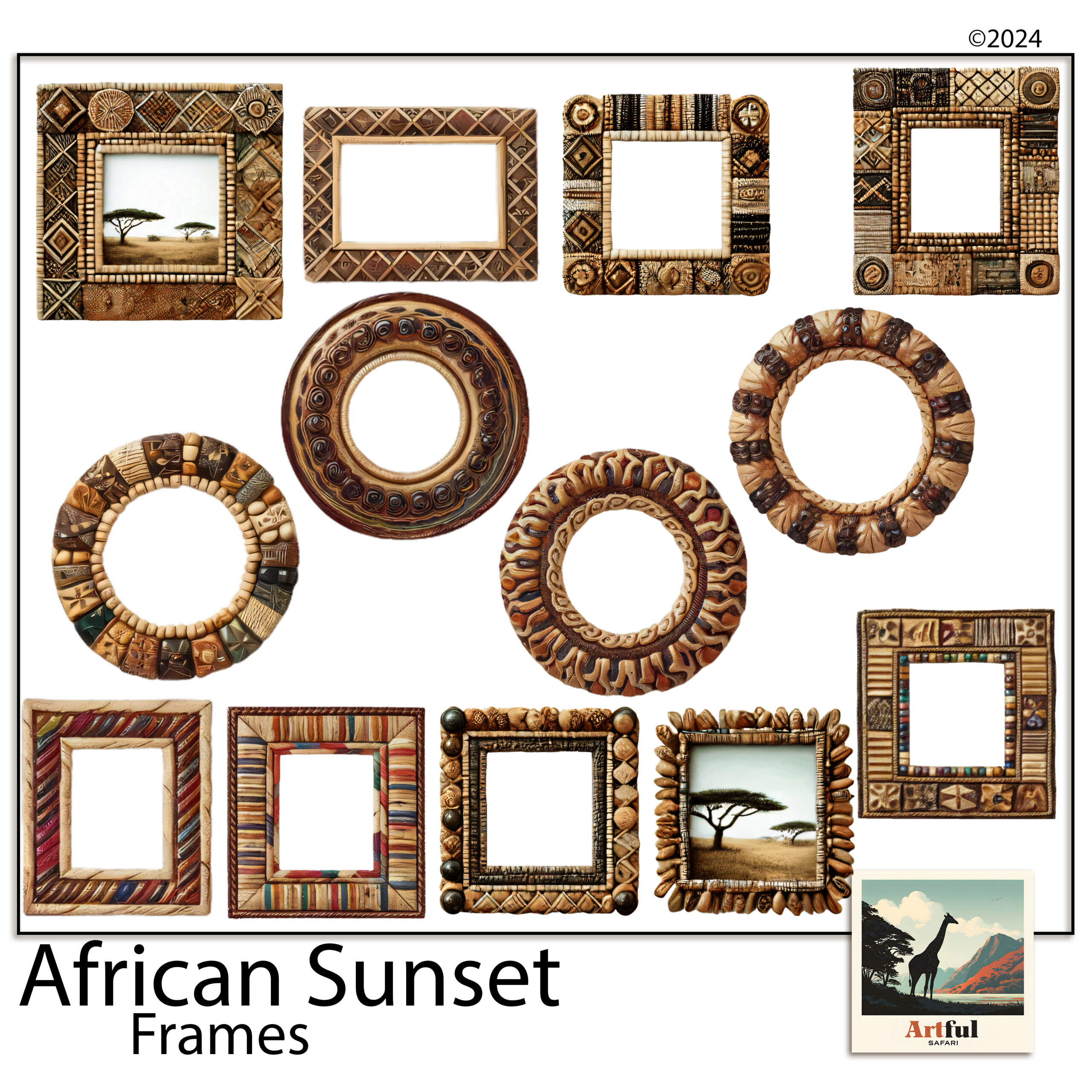
    African Sunset beaded photo frame PNG dropped over a safari scrapbook layout
    Beaded photo frame PNG borders from the African Sunset Photo Frames PNG Beaded set, each with a clear transparent centre.

    How do you place a photo behind a photo frame PNG?

    Layer order decides everything. The photo goes underneath, the frame goes over the top. Most apps stack each new layer above the last, so bring in the photo first and the frame second.

    1. Open your page and add the photo on its own layer.
    2. Add the photo frame PNG on a new layer above the photo.
    3. Move and scale the photo until the part you want sits inside the opening.
    4. Nudge the frame so the beads or brush strokes line up the way you like.
    5. Group the two layers so they travel together after that.

    Procreate, Photoshop and Canva all handle this

    In Procreate, drag the PNG in from Files and it lands as a fresh layer. In Photoshop, use File then Place Embedded. In Canva, upload the PNG, drop it on the page, then send the photo to the back. The principle never shifts: frame on top, photo behind. Once it looks right, lock or group the pair so a stray tap doesn’t knock the photo out of the opening.

    Should you clip the photo or just stack it on top?

    Stacking the photo behind the frame is the quick way, and for a frame with a solid border it is all you need. The trouble starts when bits of the photo poke out past the frame’s edge, which happens a lot with thin or open borders.

    That is where a clipping mask helps. Clip the photo to the frame’s opening and anything outside the window disappears, so the edges stay tidy with no manual rubbing-out.

    When to stack

    Use plain stacking when the frame has a wide, solid border that hides the photo’s edges anyway. It is faster and there is less to manage.

    When to clip

    Clip when the border is thin, when the opening is an odd shape, or when the page behind is busy and you can’t have stray photo edges showing. I walk through clipping step by step in the Digital Scrapbook Papers in Procreate layering guide. Both routes work; clipping is the tidier one on a crowded spread.

    How do you resize a photo frame PNG without distorting it?

    Distortion creeps in when width and height scale by different amounts. A round frame turns into an egg, beads stretch into ovals, and the page looks wrong without you spotting why.

    The cure is to lock the proportions while you resize. Drag a corner handle, never a side handle, and most apps hold the ratio for you.

    • Procreate: choose Uniform in the Transform menu, then drag a corner.
    • Photoshop: free transform keeps the ratio by default now, so drag from a corner.
    • Canva: always pull a corner handle, not the middle of an edge.

    One more habit worth keeping: scale a photo frame PNG down rather than up. A 300 DPI frame shrinks cleanly. Push it to twice its size and the edges go soft. If you know a frame will sit large on the page, drop in the biggest version the kit gives you and work down from there.

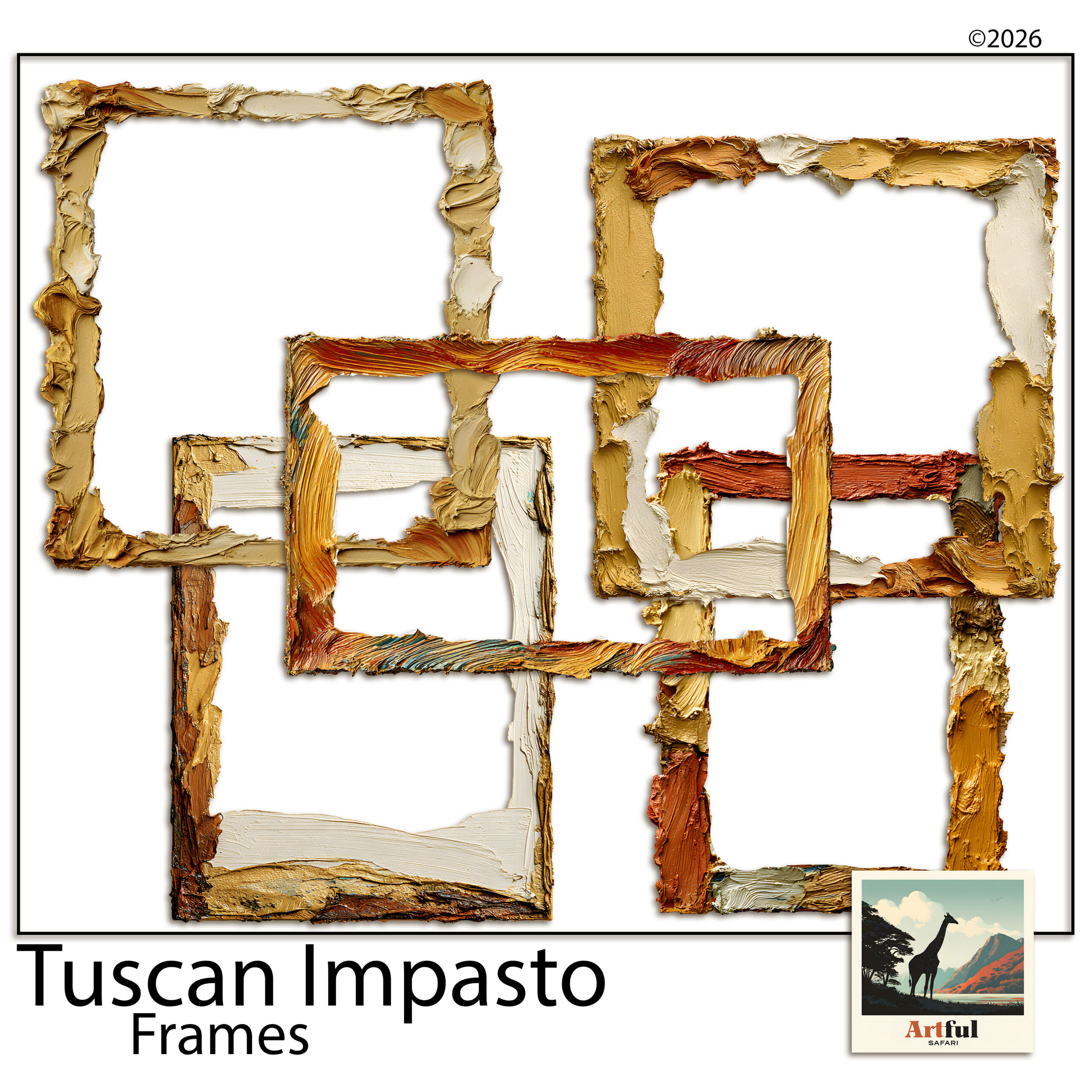
    Brushy oil-paint frames layered over a soft Tuscan scrapbook paper
    Painterly frames from the Tuscan Frame Clipart Italian Oil Paint set sit well over warm patterned papers.

    Layering photo frame PNGs over patterned papers

    A photo frame PNG earns its place when it gives a busy photo room to breathe. Drop one onto a patterned paper and it carves out a quiet window, so the pattern stops competing with the face you’re trying to show.

    A few things that help:

    • Add a soft shadow under the frame so it lifts off the paper. A small offset at low opacity reads as real; anything heavier looks pasted on.
    • Match the frame to the paper’s mood, not its exact colour. A warm oil-paint frame over a soft Tuscan paper beats a precise colour match that falls flat.
    • Leave a margin around the frame. Jammed into a corner it feels cramped. Give it space and the page settles.

    Getting the shadow right

    In Procreate you can add a shadow by duplicating the frame, filling it dark, blurring it and dropping the opacity. In Photoshop, a Drop Shadow layer style does it in one box. In Canva, the Shadows effect under a photo or element gives you a quick version. Keep the angle the same on every framed photo across a spread, or the page looks like the light is coming from four directions at once.

    Can you mix different frame styles on one page?

    You can, as long as you pick a thread that ties them together. A beaded frame and an oil-paint frame on the same spread will clash unless they share a palette or a theme. On a safari page, beaded and woven frames belong together because they come from the same world. On a Tuscan page, two brushy painted frames sit happily side by side.

    My rule of thumb: vary the shape, keep the family. Two frames that differ in size and angle but share a style read as a set. Two frames from different kits, different eras and different colours read as an accident.

    Which frame style suits which page?

    Frame styleWorks best forWatch out for
    Beaded or wovenSafari, travel and boho pagesCrowds very small photos
    Oil-paint or brushyTuscan, Mediterranean, art journalsStrong edges fight busy paper
    Thin botanicalSpring, wedding and soft palettesGets lost on dark backgrounds
    Ornate goldRegency, vintage and heritage pagesReads heavy when oversized

    Common photo frame PNG mistakes

    Most photo frame PNG problems come down to a handful of repeat offenders:

    • Frame under the photo. The picture covers the border. Move the frame layer up.
    • Stretched to fit a portrait photo. Rotate the frame instead, or pick a portrait-shaped one.
    • No shadow at all. The frame looks printed onto the paper rather than placed on it.
    • Five styles on one spread. Cut it back to one or two and the page settles.
    • Blown-up low-res frame. Soft, fuzzy edges. Start from the largest file and scale down.

    Key takeaways

    • A photo frame PNG keeps its centre transparent, so the photo shows through from the layer below.
    • Frame on top, photo behind, then group the two so they move as one.
    • Clip the photo to the opening when the border is thin or the page is busy.
    • Resize from a corner to hold the proportions, and scale down rather than up.

    Frequently asked questions

    What is a photo frame PNG?

    It is a frame saved as a PNG image with a transparent centre. Because the middle is see-through, you can place a photo on the layer below and the frame appears to wrap around it.

    Why does my frame cover the photo with a white box?

    You are almost certainly using a JPG, not a PNG. JPG files can’t hold transparency, so the centre stays a solid block. Swap it for the PNG version of the frame.

    How do I stop a round frame turning into an oval?

    Resize from a corner handle so the width and height scale together. Side handles change only one dimension, which is what distorts the shape.

    Should I clip the photo or stack it behind the frame?

    Stack it for frames with a wide solid border. Clip the photo to the opening when the border is thin or the page behind is busy, so no stray photo edges show.

    Can I use frame PNGs in Canva?

    Yes. Upload the PNG, drop it on your page, then send your photo to the back so the frame sits on top. Drag corner handles when resizing to keep the proportions.

  • Purple Scrapbook Ideas: 5 Gorgeous Layouts from Lilac to Plum

    Purple Scrapbook Ideas: 5 Gorgeous Layouts from Lilac to Plum

    The best purple scrapbook ideas start by treating purple as a family, not one colour: pick a lead shade from lavender, violet, plum or mauve, anchor it with a neutral like cream or warm grey, and add a single warm accent such as gold.

    Do that and a purple page looks designed. Skip it and it reads childish. Here is how to choose and build.

    For more purple papers, see the Violet Dusk collection.

    Purple scrapbook ideas that actually hold together

    Purple goes wrong when you treat it as one colour. It is a family, and the family runs from pale lilac to near-black aubergine. Pick a lane before you start a page, then build around it.

    Purple scrapbook ideas that work pair one shade as the lead, one supporting neutral, and a single accent. The pages that fail use four purples at full strength and read like a bruise. Restraint is the whole game here.

    ShadeMoodPairs well with
    Lavender / lilacSoft, airy, springCream, sage, warm grey
    VioletBright, cheerfulWhite, soft yellow, blush
    Plum / aubergineMoody, autumnal, richGold, charcoal, dusty rose
    Mauve / dusty purpleVintage, quietTaupe, antique brass, off-white
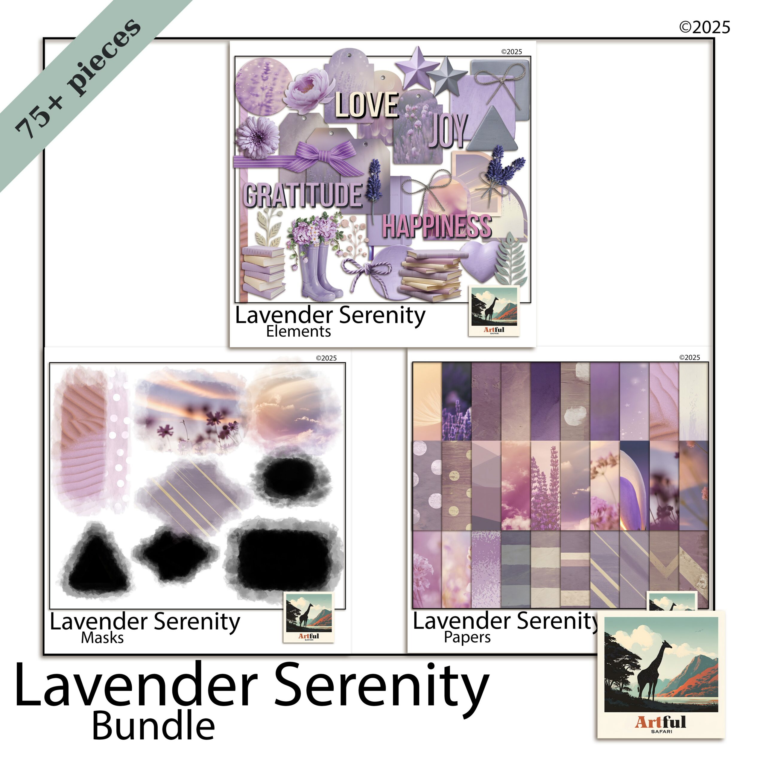
    Lavender Serenity digital scrapbook bundle with soft lilac papers and florals
    For the soft end, lilac washes and florals: the Lavender Serenity Digital Scrapbook Bundle.

    Lavender vs violet vs plum: which to reach for

    The three get muddled, so here is how I choose.

    Lavender for soft, everyday spreads

    Lavender is the low-key one. Use it for spring photos, garden days, slow weekends and anything you want to read as light. It plays nicely with lots of white space, so do not crowd it.

    Violet for energy

    Violet has more punch. It suits celebration pages, birthdays and bright summer shots. Because it is loud, give it a clean neutral background or it competes with your photos.

    Plum for depth

    Plum and aubergine carry weight. They are made for autumn pages, evening events and anything you want to feel rich. Lift plum with a metallic gold accent so it does not go flat.

    How do you pair purple without it looking childish?

    The fastest way to make purple look grown-up is to mute it and ground it with a neutral.

    • Cut the saturation. Dusty, greyed purples read as designed; primary purple reads as a school folder.
    • Anchor with a neutral. Cream, taupe or warm grey gives the eye somewhere to rest.
    • Add one warm accent. Gold, brass or dusty rose stops a purple page going cold.
    • Keep one purple dominant. Let the others support at smaller sizes or lower opacity.

    For more on why the soft-purple look took off and how to lean into it, my Lavender Scrapbooking Trend post covers the background.

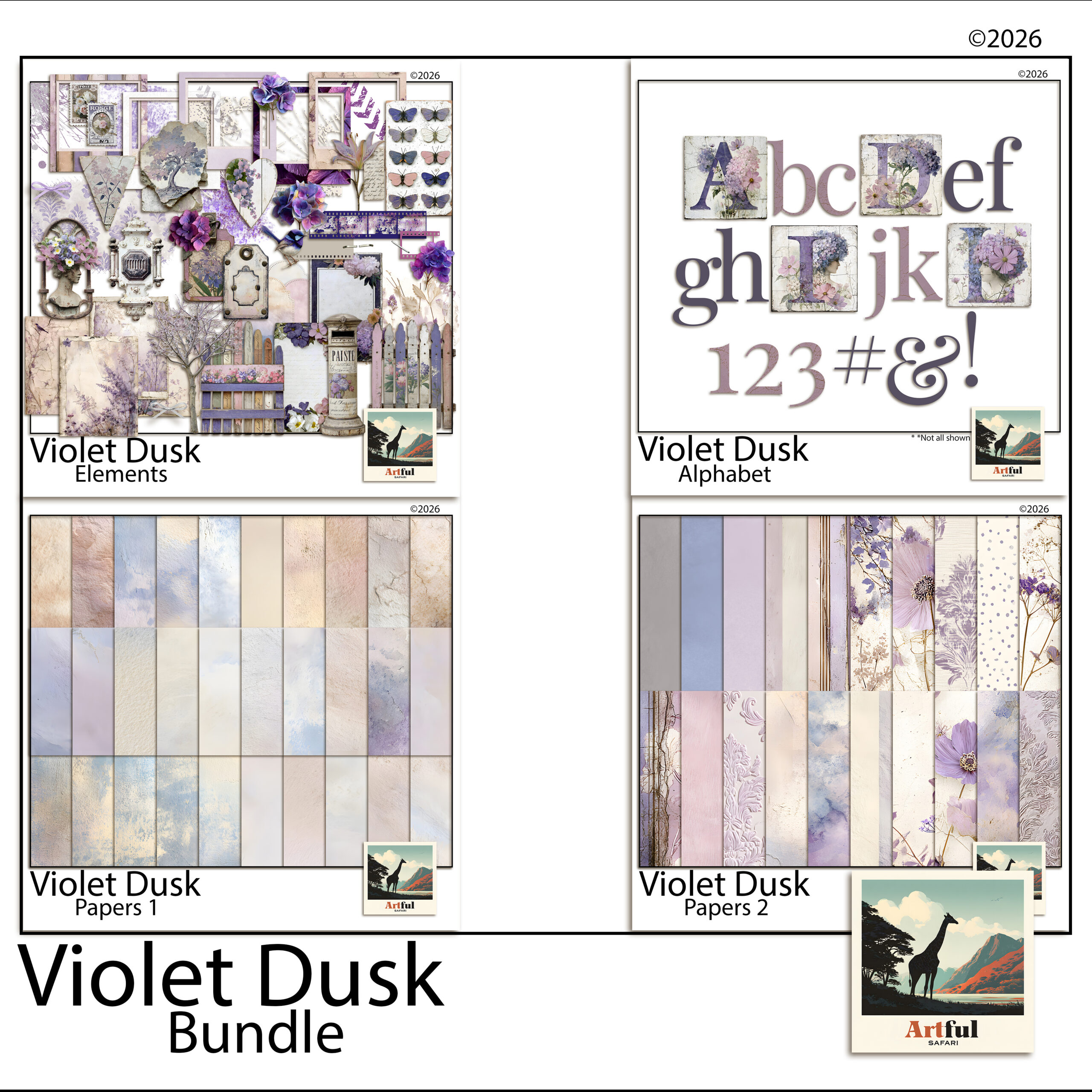
    Violet Dusk bundle showing deep purple scrapbook ideas and plum papers
    Purple scrapbook ideas from the deeper end of the palette: the Violet Dusk Digital Scrapbook Bundle.

    Five purple scrapbook ideas to try

    Concrete purple scrapbook ideas you can build tonight.

    1. Lilac wash + single photo. A pale lavender paper, one large focal photo, a thin cream mat, a script title. That is the whole page. The space does the work.
    2. Plum grid. Aubergine background, a 2×2 grid of photos with narrow white gutters, gold journaling tags between them.
    3. Floral border. Cream centre, lavender florals trailing down one side, photos stacked in the open space.
    4. Ombre tones. Move lilac to violet to plum across a two-page spread, lightest on the left, to carry the eye through a day of photos.
    5. Mauve memory page. Dusty purple paper, a vintage frame PNG, one photo, and a long journaling block. Low-key and quiet.

    Which florals and elements suit a purple page?

    Purple loves botanicals, but the wrong flower fights the palette. Match the bloom to the shade.

    • Lavender sprigs and wisteria for lilac pages, since they echo the colour without adding a clashing hue.
    • Roses and peonies in blush or cream to warm up a violet spread that risks going cold.
    • Dark dahlias, thistle and dried seedheads for plum and aubergine, which suit a moodier, autumnal page.
    • Greenery in sage or eucalyptus rather than bright leaf green, which sits more easily next to muted purples.

    For metallic touches, gold and antique brass flatter every purple. Silver works with cool lilac but can look cold against plum, so test before you commit.

    Fonts and titles

    A flowing script in a deeper purple than the background reads as elegant. For a punchier page, a clean serif in cream or gold over a violet block holds up better than another purple, which would vanish into the paper.

    Seasonal purple scrapbook ideas

    The same family carries you through the year if you shift which shade leads.

    • Spring: lavender and lilac with cream and sage, for garden and Easter pages.
    • Summer: bright violet with white and soft yellow, for festival and holiday shots.
    • Autumn: plum and aubergine with gold and charcoal, for cosy evening and harvest pages.
    • Winter: deep violet with silver and icy grey, for a frosted, quiet feel.

    Purple scrapbook ideas for a digital workflow

    Working in Procreate, Photoshop or Canva makes the purple family easy to test, because you can recolour and re-tone without committing.

    • Drop opacity on a purple paper layer to mute it instantly, instead of hunting for a duller sheet.
    • Use a colour-fill layer set to a low percentage over a neutral paper to tint it lilac.
    • Sample from a coordinated bundle so your title text and elements share the same purples as your papers.
    • Keep a swatch page of your three chosen purples plus the neutral, and pull from it for every spread in the album.

    A coordinated lavender or violet bundle does the palette work for you, since the papers, florals and elements are already toned to sit together. That is the part that takes longest to get right by hand.

    Key takeaways

    • Treat purple as a family: lavender, violet, plum and mauve each set a different mood.
    • Pick one purple to lead, anchor with a neutral, and add a single warm accent.
    • Mute the saturation to keep purple looking designed rather than childish.
    • Digital tools let you tone and test purples fast, and a coordinated bundle pre-solves the palette.
    • The strongest purple scrapbook ideas repeat one palette across the whole album.

    Frequently asked questions

    What colours go with purple in a scrapbook?

    Cream, taupe and warm grey ground purple well, and a warm accent like gold, brass or dusty rose keeps it from going cold. Match the neutral to the purple’s depth: cream for lavender, charcoal and gold for plum.

    What is the difference between lavender, violet and plum?

    Lavender is pale and soft for low-key pages, violet is brighter with more energy for celebrations, and plum or aubergine is deep and rich for autumn and evening pages.

    How do I stop purple looking childish on a page?

    Cut the saturation so you are using dusty, greyed purples rather than primary ones, anchor the page with a neutral, and let one purple dominate while the others support at smaller sizes.

    Which purple scrapbook ideas suit autumn pages?

    Plum and aubergine. They carry weight and pair beautifully with gold, charcoal and dusty rose, which suits evening events and autumn photos far better than pale lavender.

  • How to Print Junk Journal Papers at Home: 5 Easy Settings

    How to Print Junk Journal Papers at Home: 5 Easy Settings

    To print junk journal papers at home, use an inkjet printer with 100–120 gsm matte paper, set quality to High, pick the matte paper type in the driver, and print at 100% with “fit to page” turned off.

    That single setup fixes the two things people get wrong: washed-out colour and pages too stiff to fold. The rest of this guide covers weights, sizing, double-sided printing and sealing.

    Every kit in our junk journal collection is made to print at home this way.

    What you need to print junk journal papers at home

    You do not need a studio printer. A regular home inkjet handles junk journal papers well, and inkjet ink actually takes water-based glue and gesso better than most laser toner.

    • An inkjet printer (laser works too, but ink layering is harder over toner)
    • Paper in the right weight (more on that below)
    • The PNG or JPG sheets from your kit, at full size
    • Optional: a bone folder, a glue stick, and a sealant if you want to layer wet media

    If you are brand new to the format, my What Is a Junk Journal? guide covers what these papers are for before you commit a stack of them to the printer.

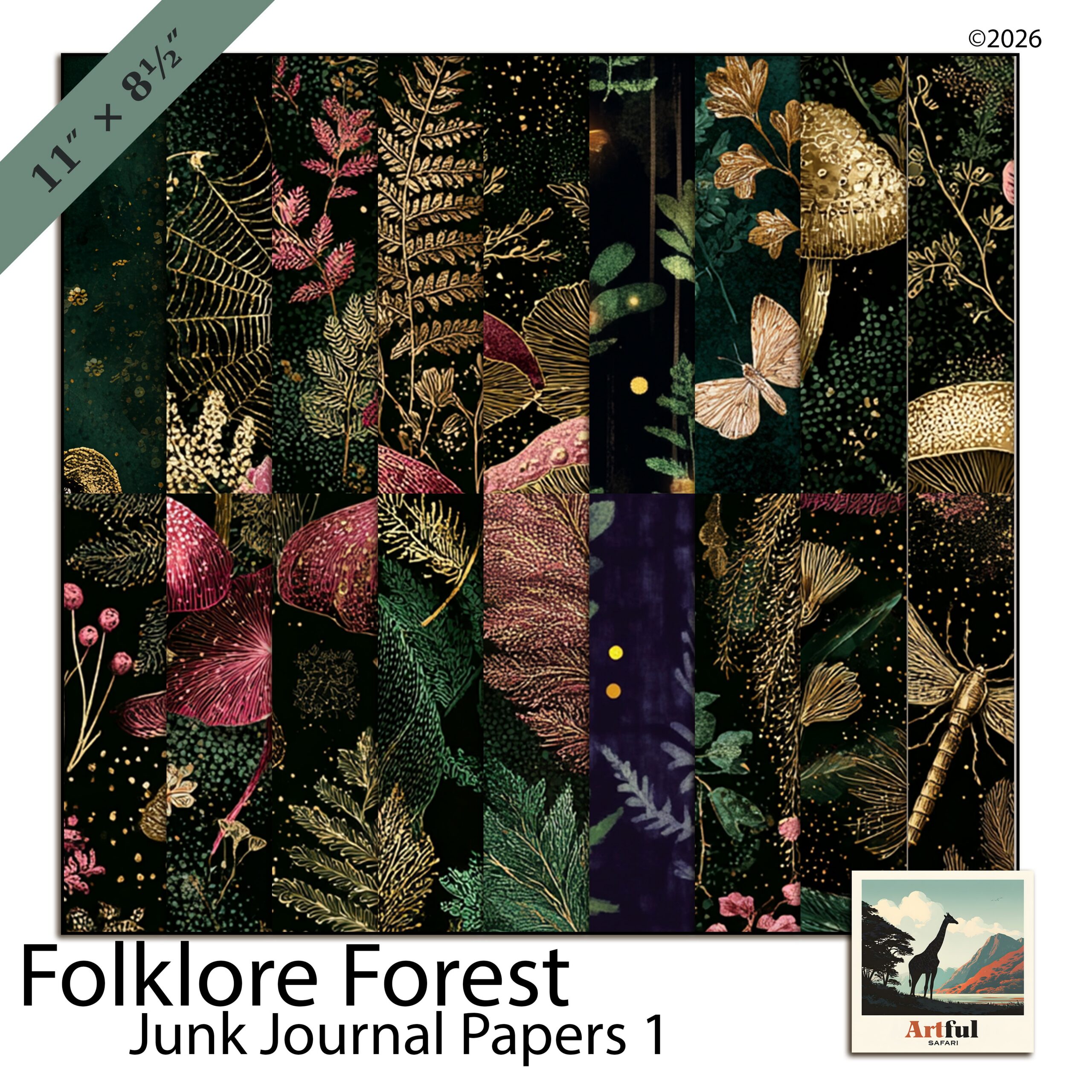
    How to print junk journal papers at home using Folklore Forest botanical sheets
    Botanical sheets I print onto text-weight paper for soft, foldable pages: the Folklore Forest Junk Journal Papers.

    What paper weight should you print junk journal papers on?

    This is the question that makes or breaks the result. Junk journal pages need to fold, tear and glue without cracking, so you want lighter stock (measured in gsm) than you would use for a greeting card.

    Paper weightFeelBest for
    80–90 gsm (text weight)Thin, foldable, slightly see-throughTip-ins, pockets, layered ephemera
    100–120 gsmSturdy but still bendableEveryday journal pages, double-sided sheets
    160–200 gsmFirm, holds a crease hardTags, dividers, signature covers
    250 gsm+ (card)RigidCovers only, not page interiors

    My default is 100–120 gsm for pages and a heavier 160–200 gsm for tags. Anything above 250 gsm fights you when you try to fold a signature.

    Matte beats glossy

    Use matte or uncoated paper. Glossy photo paper resists glue, smudges under a pen, and looks wrong for an aged, papery aesthetic. Matte takes stamping, writing and distress ink the way you want.

    Printer settings that get the colours right

    Default settings print junk journal papers too pale and too small. Fix these before you waste a sheet.

    1. Set quality to High or Best. Draft mode bands the soft washes that make these papers look good.
    2. Choose the matching paper type. Pick “Matte” or “Presentation” in the driver so the printer lays down enough ink. Selecting “Plain” underinks; selecting “Glossy” overinks.
    3. Turn off “Fit to page” and print at 100%. Scaling shrinks the sheet and adds a white margin you do not want.
    4. Set borderless if your printer supports it. Junk journal papers are designed edge to edge; a white border breaks the layered look.
    5. Print one test sheet first. Check the colour on the actual paper before you run the batch.
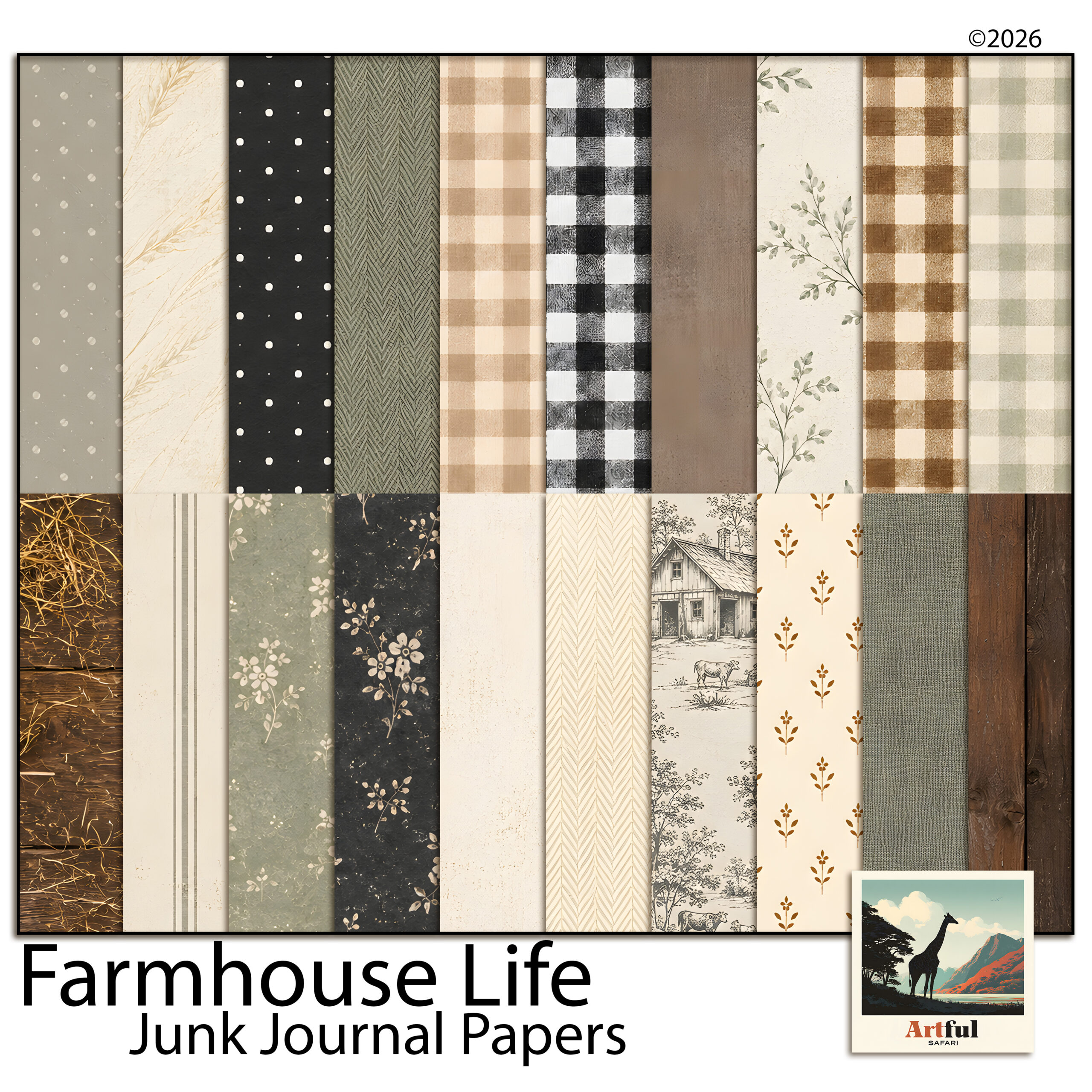
    Farmhouse Life junk journal papers printed double-sided
    Linen and kraft textures that hold up well double-sided: the Farmhouse Life Junk Journal Papers.

    How to size junk journal papers to A4 or Letter

    Most kits come as 12×12 inch sheets or A4-ready files. Here is how to get them onto your home paper without losing the design.

    A4 and Letter

    If a sheet is supplied at A4 (210 x 297 mm) or Letter (8.5 x 11 in), print at 100% with no scaling and it lands correctly. This is the simplest path and what I reach for when I want full pages fast.

    12×12 sheets onto smaller paper

    A 12×12 sheet will not fit A4 at full size. You have two clean options:

    • Scale to fit in your printer dialog or PDF reader, which shrinks the whole design to about 8 inches and keeps the full pattern.
    • Crop in an editor to A4 proportions first if you would rather keep the print at full scale and lose the outer edge.

    For pockets and tip-ins, smaller is fine, so scaling down a 12×12 sheet gives you several usable pieces from one print.

    Printing double-sided junk journal pages

    Double-sided pages feel like real book pages and use half the paper. The trick is registration so the back lines up with the front.

    1. Print the front, note which edge fed first, then reload following your printer’s flip guidance.
    2. Use “Flip on long edge” for portrait pages so the second side is upright.
    3. Let the first side dry for a minute on an inkjet so it does not offset onto the rollers.
    4. Run one test pair before batching; printers vary by a few millimetres and you want to learn yours.

    If your printer has no duplex mode, print the two designs on separate sheets and glue them back to back. Simpler for beginners, and it lets you mix two patterns into one page.

    Sealing and finishing printed pages

    Inkjet ink is water-based, so wet glue or a damp brush can smear it. If you plan to paint, ink or use watery glue over a printed page, seal it first.

    • Spray fixative or matte sealer in light coats stops smudging and dulls any sheen.
    • A thin layer of matte gel medium brushed on also seals, and gives a faint texture.
    • Skip sealing if you are only using a glue stick and dry embellishments; it is not needed for dry work.

    Tea or coffee staining over a sealed inkjet print works, but test a scrap first. Unsealed, the ink will run.

    Common printing mistakes and how to avoid them

    Almost every wasted sheet comes down to one of these.

    • Pages come out pale. The driver is set to “Plain paper” or quality is on Draft. Switch to a matte paper type and High quality.
    • A white border appears. Either “Fit to page” is on or your printer cannot go borderless. Turn off scaling, and if you need full bleed, trim a couple of millimetres off with a guillotine after printing.
    • Colours look right on screen, wrong on paper. Screens are backlit and paper is not, so prints always read a touch darker and warmer. Run a test sheet and judge the paper, never the monitor.
    • Ink smears when you glue. You skipped sealing before wet work, or did not let the print dry. Seal first, glue second.
    • The page cracks when folded. The stock is too heavy. Drop to 100–120 gsm for anything you need to fold into a signature.

    How many pages does one ink cartridge print?

    Junk journal papers are ink-heavy because they cover the whole sheet edge to edge. Expect far fewer pages per cartridge than plain documents, often in the dozens rather than hundreds. If you print in volume, a tank-style inkjet pays for itself fast, and high-yield cartridges help on a standard machine.

    Storing and reusing your printed papers

    Print a few extra of your favourite sheets while the file is open; it is the same setup time. Keep spares flat in a folder or a poly sleeve so they do not curl, and away from direct sun so the colours hold. A small stash of pre-printed pages means you can sit down and make without firing up the printer every time.

    Key takeaways

    • Print junk journal papers on 100–120 gsm matte stock for pages, heavier for tags.
    • Set quality to High, pick the matte paper type, and print at 100% with no “fit to page”.
    • A4 and Letter files print at full size; scale 12×12 sheets down to fit smaller paper.
    • Seal inkjet prints before any wet media, and let ink dry before duplexing.

    Frequently asked questions

    What paper is best for printing junk journal papers?

    Matte or uncoated text weight, around 100 to 120 gsm, for pages, and 160 to 200 gsm for tags. Avoid glossy photo paper, which resists glue and smudges under a pen.

    Can I print junk journal papers on a normal home printer?

    Yes. A standard home inkjet works well, and inkjet ink takes water-based glue and gesso better than laser toner. Just set quality to High and choose the matte paper type.

    How do I print 12×12 junk journal papers on A4?

    A 12×12 sheet will not fit A4 at full size, so scale to fit in the print dialog to keep the whole design at about 8 inches, or crop to A4 proportions first if you want full-scale printing.

    Do I need to seal printed junk journal pages?

    Only if you plan to use wet media over them. Inkjet ink is water-based and will smear under damp glue or paint, so seal with a light spray fixative or matte gel medium first. Dry work needs no sealing.

    How do I print double-sided junk journal pages?

    Use your printer’s duplex mode with flip on long edge for portrait pages, let the first side dry before flipping, and run a test pair to check registration. With no duplex mode, print two sheets and glue them back to back.

  • Wildflower scrapbook pages: 5 easy ways to stop them going mushy

    Wildflower scrapbook pages: 5 easy ways to stop them going mushy

    Soft floral papers are the easiest thing in the world to fall for and one of the harder things to actually build a page on. A wildflower scrapbook page starts out beautiful in the thumbnail, and then you add a photo, a title and a bit of journaling, and the whole thing turns to porridge. Nothing is wrong exactly. Nothing stands out either.

    The cause is almost always contrast, not composition. Meadow papers are painted in a narrow band of value — everything sits in the pale-to-mid range, with no true darks and no true whites. That is what makes them restful, and it is also what makes a wildflower scrapbook layout collapse into one soft grey mass the moment you put something on top of it. Below are five fixes, in the order I would try them.

    Why wildflower scrapbook papers go mushy

    Squint at a meadow paper. The flowers, the stems and the background wash all read as roughly the same lightness. Your eye has nothing to grab.

    Photos make it worse, because a snapshot usually carries a full range of value — real blacks, real highlights. Drop that onto a low-contrast wildflower scrapbook background and the photo either shouts or, if it is also pale, disappears entirely. Every fix below is really the same fix: put back the contrast the paper deliberately left out.

    1. Pick one flower to be the loudest

    A meadow paper has ten or twelve flower types scattered across it. Choose one — the poppy, the cornflower, whichever colour you want the page to be about — and let everything else recede.

    In practice that means cropping. Instead of using a whole 12×12 paper as a background, take a section where your chosen flower is dominant and enlarge it. You lose the busy edges and gain a page with an obvious subject. It is the cheapest way to make a wildflower scrapbook page feel designed rather than assembled.

    If you want to know which flower you are actually looking at, the Wildlife Trusts’ cornflower page is a good reference for the blue one that turns up in nearly every meadow print.

    2. Give the page one hard edge

    Watercolour meadow papers have no edges at all. Everything fades. Add a single crisp rectangle — a photo with a clean border, a solid strip of colour behind your title — and the whole layout snaps into focus.

    One is the number. Two hard edges start competing; three looks like a template. A wildflower scrapbook spread only needs one place where the softness stops.

    3. Steal your text colour from the darkest flower

    Black type on a faded meadow looks pasted on. Pure white vanishes. The colour you want is already in the paper: zoom in on the deepest flower centre, the darkest stem, the shadow under a petal, and use that.

    On a dusty blue meadow that usually lands somewhere near a deep slate or indigo. On a warmer one it will be a bruised plum or a dark olive. If you want to check that the colour actually reads as a family with the rest of your palette, drop it into the Adobe Color wheel and look at its neighbours before you commit.

    This one trick fixes more wildflower scrapbook titles than any font change will. The same principle applies to cool-toned pages generally — the paper already contains the answer.

    4. Let the blender papers carry the weight

    Most floral kits ship a handful of plain washed papers alongside the busy ones, and most of us ignore them. They are the reason the busy papers work.

    Use a plain plaster-wash paper as your base layer, then bring in the flowered paper as a band along one edge, or as a torn strip behind the photo cluster. You get all the atmosphere of the meadow and a large calm area to put things on. A wildflower scrapbook page built this way holds two or three photos comfortably. The same page built on a fully flowered background holds one, badly.

    5. Crop tighter than feels comfortable

    Because the background is busy, a mid-distance photo has to fight it. A tight crop does not.

    Faces, hands, a single object filling the frame — anything with a clear shape wins against a field of scattered petals. Try cropping to about half of what feels right, and you will usually find the wildflower scrapbook layout underneath was fine all along; the photo was just too quiet.

    Putting it together

    Here is what the five look like as one page. Plain blender paper as the base. A band of meadow paper across the bottom third. One photo, cropped tight, with a clean white border — the single hard edge. Title in a deep slate lifted out of the cornflowers. Journaling in the clear space at the top, where the paper was never busy in the first place.

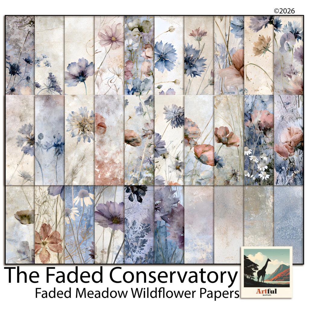
    Faded Meadow Wildflowers wildflower scrapbook paper kit, 30 watercolour meadow designs
    The Faded Meadow Wildflowers kit — border papers, spray papers and the plain blenders that make them work.

    The kit I built that page from is Faded Meadow Wildflowers, from The Faded Conservatory series. It is set up for exactly this: eleven papers with the flowers along the bottom edge and the top left open, plus four plain plaster washes and four darker dusk versions for when a page needs more weight. Any meadow kit with a similar spread will do the same job.

    Working digitally

    All five fixes are quicker on a screen than on paper, because cropping and recolouring are non-destructive. In Procreate, Photoshop, Canva or Affinity, the workflow is the same: blender paper on the bottom layer, meadow paper above it with a layer mask to fade one edge, photo and text on top. If you are new to layering this way, the dusty rose layering guide walks through the same stack with a warmer palette.

    The quick version for wildflower scrapbook pages

    • Crop the paper so one flower dominates instead of twelve.
    • Add exactly one hard edge — usually a bordered photo.
    • Pull your text colour out of the darkest part of the paper, never black or white.
    • Build on a plain blender and use the floral paper as a band, not a full background.
    • Crop photos tighter than instinct says.

    None of it is about adding more. A wildflower scrapbook page nearly always fails from too little contrast rather than too few elements, and the paper you already have contains everything you need to fix it.

  • Dusty blue scrapbook pages: 4 easy ways to warm them up

    Dusty blue scrapbook pages: 4 easy ways to warm them up

    There’s a particular kind of scrapbook page that looks fine in the thumbnail and slightly sad up close. The papers are lovely, the layout is tidy, and the whole thing feels like a waiting room. Nine times out of ten the culprit is an all-cool palette with nothing warm anywhere in it.

    Dusty blue is the usual suspect, partly because it’s so easy to work with. It layers beautifully, it never clashes with itself, and you can stack six papers from the same kit and get something coherent on the first try. That same obedience is what makes a page go flat. Below is how to keep the colour and lose the chill.

    What “cool” is actually doing to the page

    Colour temperature isn’t decoration, it’s depth. Warm colours advance towards the viewer and cool colours recede. It’s the same trick landscape painters use to push a mountain range into the distance, and your eye reads it automatically without being told. If you want the underlying theory, colour temperature is worth a quick read.

    So when every element on a spread is dusty blue, every element recedes. Nothing steps forward, and the page reads as one soft plane rather than as layers. Adding a warm note isn’t about making the page warmer in mood. It gives your eye something in the foreground to hold onto, so the blues finally read as background instead of as everything.

    The 10% rule

    You need far less warmth than you’d think. Roughly one tenth of the visible page is enough, and it works best concentrated in one or two places rather than sprinkled evenly.

    Good places to put it, in rough order of how well they tend to work:

    • The photo mat. A warm cream or soft kraft mat under the photo, instead of a white or grey one, does most of the job on its own.
    • The title. Antique gold, warm brown or a soft rust for your page title against a dusty blue background is a reliable combination.
    • Small hardware. A brass brad, an aged tag, a bit of twine. Tiny, but warm metals carry a lot of temperature for their size.
    • One flower. If your kit has anything in a warmer tone, a single stem tucked into the cluster is often all a cool page needs.

    What tends not to work is warming the dusty blue background paper itself. You lose the dusty blue you picked the kit for and end up somewhere muddy in the middle.

    Use the cream that’s already in the paper

    Here’s the shortcut most people miss. A good dusty blue paper is almost never pure blue. Look closely at a watercolour floral and you’ll usually find parchment, ivory or a warm grey sitting underneath the wash, especially in the areas the artist left open.

    Zoom in, sample that cream directly with the eyedropper, and use it for your mats and journaling blocks. Because it’s already present in the paper, it never looks bolted on, and it’s warmer than any white you’d have reached for. This one habit fixes more cold-looking pages than any amount of colour theory.

    Why plain white is the problem on a dusty blue page

    Pure white next to dusty blue reads as blue-white, and it makes the surrounding paper look grubby by comparison. Warm cream does the opposite: it makes the same blue look deliberate and slightly aged. If a spread feels clinical, swap every white on it for cream before you change anything else.

    Give the blues a range

    A page built entirely from mid-tone dusty blue has no contrast to work with, and low contrast is what makes a layout look unfinished. You want three levels: something pale for the base, something mid for the middle layers, and something genuinely dark for anchoring.

    The dark is the one people skip. Most dusty blue kits ship plenty of pale and mid tones and almost no deep ones. Indigo, deep slate or a near-black navy used sparingly, in the title text or a thin border, gives the eye somewhere to land. Without it, a soft blue spread drifts. With it, the same papers suddenly look intentional.

    Putting it together

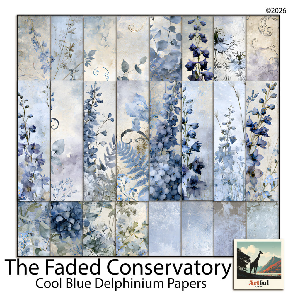
    To show what this looks like in practice, here’s a kit built entirely in this range. Cool Blue Delphinium is 24 papers of watercolour delphinium spires, hydrangeas and grey scrollwork, and it’s a useful example precisely because it’s so committed to one temperature.

    Dusty blue watercolour delphinium scrapbook papers in french blue, ivory and parchment cream
    Twenty-four dusty blue papers: delphinium borders, wildflower sprays, corner bouquets and plain blenders.

    A page from it might run like this. Take a plaster blender as the base, so the busiest florals stay off the photo area. Sample the parchment out of the wash and build the photo mat from that rather than from white. Pull the deepest indigo out of a delphinium spire for the title text. Then add one warm thing that isn’t in the kit at all, usually a brass brad or a kraft tag, and let it sit near the photo.

    The result still reads as a blue page. It just has a foreground now.

    The quick version for dusty blue pages

    • Keep the palette cool and add warmth at about 10%, concentrated in one or two spots.
    • Eyedropper the cream out of your own papers instead of using white.
    • Work in three values: pale, mid and one genuinely dark anchor.
    • Warm the mat, the title and the hardware, never the background paper.

    Dusty blue rewards a light touch here. One warm note on a cool spread reads as a considered choice, and three or four start pulling the page towards a different palette altogether. If you’re unsure whether you’ve gone too far, take the warmest element off and see whether you miss it.

  • Burnt orange beyond autumn: 3 simple palettes for warm year-round pages

    Burnt orange beyond autumn: 3 simple palettes for warm year-round pages

    Burnt orange has a reputation problem in scrapbooking. Everyone buys it in September, uses it on two autumn layouts, and then leaves it sitting in the folder until the following year. Meanwhile it’s one of the most useful colours in a digital kit, and the reason it feels seasonal has almost nothing to do with the orange itself.

    What makes a page read as October is the company the colour keeps. Change what sits next to burnt orange and the same papers will carry a wedding album, a travel spread or a plain family page in March without anyone thinking about pumpkins.

    Why burnt orange reads as autumn

    Burnt orange is a dark, desaturated orange with brown underneath it. On its own that’s just a warm earth tone, and earth tones are seasonally neutral. Terracotta pots, clay, brick and rust all sit in this range and none of them say October.

    The autumn signal comes from three specific companions: deep gold, forest green and near-black brown. Put those around burnt orange and you’ve built a harvest palette, because that combination is what leaves actually do. Take them away and the colour goes quiet again.

    The two accents to avoid year-round

    If you want a burnt orange page that isn’t seasonal, keep mustard yellow and dark olive off it. Those two do more autumn signalling than the orange ever does, and they’re often hiding in a kit’s element pack rather than in the papers, which is why a page can tip seasonal even when the background looked fine.

    Three pairings that move it out of autumn

    Each of these keeps burnt orange as the warm note and changes what it’s read against.

    • Burnt orange with soft grey and cream. The most useful of the three. Grey strips the warmth out of the surrounding page, so the orange reads as a single considered accent rather than as a season. This is the combination that carries wedding and portrait pages.
    • Burnt orange with dusty blue. Blue and orange sit opposite each other on the colour wheel, so this has real contrast in it. Keep both desaturated and it looks vintage rather than sporty. Good for travel and coastal spreads.
    • Burnt orange with sage and stone. The quietest option. Sage is green but it’s a cool, grey-leaning green, so it doesn’t trigger the harvest read the way forest green does. Works all year for garden and everyday pages.

    Let the orange be the smallest thing on the page

    Warm colours advance, which means burnt orange takes up more visual room than it physically occupies. A strip of it will hold its own against half a page of grey. Once you know that, you can stop using it as a background and start using it as punctuation.

    In practice: a burnt orange title on a cream page, a thin torn strip along one edge, a single bloom in a cluster of otherwise neutral flowers, or the mat behind a small photo. Any one of those carries the colour without committing the layout to it.

    The pages that end up looking dated are usually the ones where burnt orange is doing the background job as well as the accent job. Pick one.

    Photos matter more than papers here

    This is the bit most colour advice skips. Burnt orange sits very close to skin tones, which is why it’s flattering behind portraits and why it can also go badly wrong. If your photo has warm indoor lighting, a burnt orange page will make the whole thing look like it was shot through a filter.

    Two fixes, both easy. Put a cream or grey mat between the photo and the paper so the two warm surfaces never touch. Or pick the cooler papers from your kit for the photo area and keep the orange to the edges of the spread. If a page feels overcooked and you can’t work out why, this is nearly always it.

    Putting it together

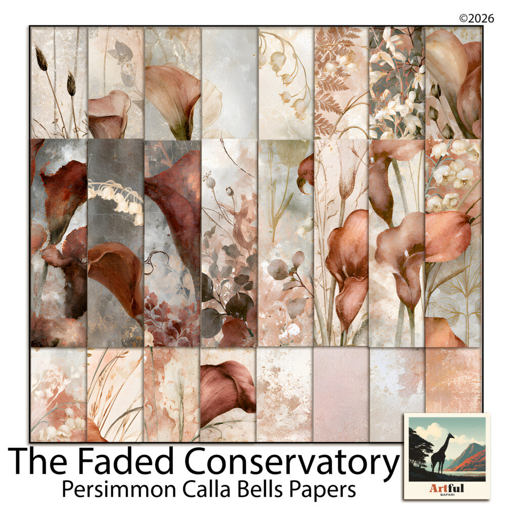
    As a worked example, here’s a kit built around this range. Persimmon Calla Bells is 24 papers of terracotta calla lilies, white lily-of-the-valley bells and dried botanicals, and it’s a good test case because it pairs the burnt orange with white and warm grey rather than with gold and forest green.

    Burnt orange floral scrapbook papers with terracotta calla lilies and white bell sprays
    Twenty-four papers pairing burnt orange calla lilies with white bells and warm grey washes.

    The white bell sprays are what keep it out of autumn. White is a cool interruption in a warm palette, and the kit uses it constantly, so the burnt orange never gets to build a harvest run with gold and green. That’s a deliberate choice you can copy with any kit by adding white or cream elements to a warm cluster.

    A page from it might be: a plain persimmon blender at low opacity as the base, a botanical spray paper layered over the lower third, a warm grey mat under the photo, and the calla lilies used only as a corner cluster. The title goes in the darkest rust in the kit rather than in gold. Nothing about that page says October.

    The short version

    • Burnt orange isn’t seasonal, its usual companions are.
    • Keep mustard, dark olive and forest green off the page if you want it year-round.
    • Pair it with grey and cream, dusty blue, or sage and stone.
    • Use it as an accent or as a background, never both on one page.
    • Always put a cool mat between a warm photo and burnt orange paper.

    Colours read in context rather than in isolation, and colour scheme choices do more work than the individual shades. Change the neighbours and burnt orange stops being a September colour and starts being one of the more flexible things in your folder.